


Why does your business need a Pinterest strategy?
Pinterest helps businesses attract customers and drive traffic. Unlike regular social media posts, Pins stick around longer and show up in search results, making your content visible for longer. Plus, people on Pinterest are actively searching for ideas and products to buy, which makes it great for driving sales.
Businesses find Pinterest invaluable for driving traffic and sales. Pinterest boasts over 2 million active advertisers, leveraging the platform for targeted marketing.
People use the platform to explore the world’s best ideas, whether that’s home decor, recipes (hello, easy chicken dinner ideas!), or even software tools. And the best part? Pinterest users are often in shopping mode, meaning they’re actively looking for things to buy.
A strong photo can capture attention and encourage engagement, which might lead to a sale.So whether you’re setting up your page, installing the Pinterest app on iOS, or just figuring out what you want to try next, start thinking about how to make Pinterest work for your business.
How to get the best Pinterest photos: 10+ easy tips
TL;DR: To make your Pinterest photos stand out, focus on good lighting, clean backgrounds, and strong visuals that grab attention. Keep your brand identity consistent and format your images correctly to perform well on the platform.
Now, let’s get to the 10+ tips to get the best Pinterest photos:
- Find the perfect natural light
- Create a clean, clutter-free background
- Remember the rule of thirds
- Generate emotional appeal with people and animals
- Choose colors that pop on the Pinterest feed
- Experiment with angles for dynamic shots
- Create depth with shadows and texture
- Edit photos for a professional finish
- Add text overlays that stand out
- Align photos with your brand identity
- Optimize photos for Pinterest’s dimensions
1. Find the perfect natural light
Lighting can make or break your photos. The right light enhances colors, sharpens details, and gives your images a polished, professional look. This is true whether you’re using an expensive DSLR camera or your smartphone.
For the best results, use soft, natural light. Midday sunlight is harsh and can create shadows. So instead of shooting at noon, plan to shoot during the “golden hour,” the time just after sunrise or right before sunset. This time of day gives you softer light with fewer harsh shadows, whether you want a warm or cool look.


Image Source
If you’re indoors, position your setup near a window for natural lighting. Be mindful of the angle: photographing directly in front of a window can make the background too bright and the subject too dark. To balance the light, try positioning the subject at an angle to the window or use a sheer curtain to diffuse harsh light
Invest in a small ring light if natural light isn’t an option or if you work in an office without windows. Ring lights create a bright, even glow perfect for Pinterest photos featuring flat lays. Most ring light models allow you to choose the light temperature and intensity to fit the context of the shot.
When you get the lighting right, your photos will look sharp and clear, even before you do any editing.
2. Create a clean, clutter-free background
A messy background can distract from your subject and weaken the photo’s impact. Pinterest users are drawn to images that spotlight your product or idea. Keep the background simple and intentional so that your product is the center of attention.
Before taking your photo, look for plain, neutral surfaces like a white table, a hardwood floor, or a solid-colored wall. If you’re snapping photos of products, poster boards or foam boards can serve as inexpensive DIY backdrops. If you paint a background, make sure that the colors complement your brand and don’t take away from the subject.


Image Source
Clutter-free also means effectively using white space. No, we don’t mean literal white color in your photo. White space, sometimes called “open space” or “negative space” is the blank space between the edge of the photo and your image or between elements in the shot.
Similarly, avoid overlaying your product against patterned backgrounds unless it serves a creative purpose (check out tip #7 for this). Blurred or “bokeh” backgrounds are much more effective in keeping focus on the subject.
3. Remember the rule of thirds
Ever wonder why some photos look naturally balanced and pleasing to the eye? It’s usually because the person behind the camera used the rule of thirds.
This classic photography principle divides your screen into nine equal parts using two vertical and two horizontal lines. When you position elements along these lines or at their intersections, you create a photo that’s more pleasing to the eye.
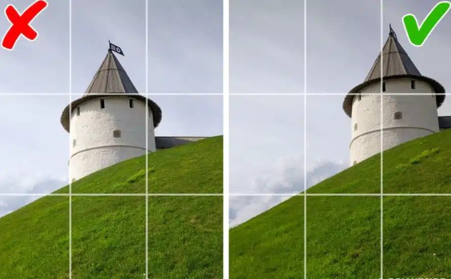

Image Source
Most smartphones and a built-in grid feature to make this easy. Go to your camera settings and turn it on. When framing your shot, align your subject along one of the grid lines rather than centering it directly in the middle. This subtle adjustment makes your photo feel more natural.
4. Generate emotional appeal with people and animals
People and animals naturally draw attention and help create an emotional connection with your audience. Including one or both in your photos can make your Pinterest profile feel warmer, more relatable, and increase engagement.

Image Source
You can probably figure out how to use people in your photos. But if you don’t sell cat food or dog kennels, how can you use animals? TLet’s say you’re a home goods retailer.
You might show a family enjoying a cozy moment by the fire in a living room with their golden retriever. That communicates a sense of comfort and connection your customers can relate to.
The key with people and pets is to use images that align with your brand’s values and appeal to your target audience. A person who’s smiling conveys happiness and trust, while a playful animal might evoke joy and innocence.
Whatever you do, be sure that the people or animals you feature are a natural part of the scene, not just extras for decoration. Every element of your photos should enhance the goal of the image, not distract from it.
5. Choose colors that pop on the Pinterest feed
Choosing the right colors for your Pinterest photos can significantly impact how your image performs. Colors that stand out in someone’s feed capture attention and encourage users to engage with your content (even if they don’t actively think about it!).
This is where color psychology comes in. Colors have a way of tapping into our emotions. Blue gives off a sense of trust and authority, while lighter shades feel calm. Red feels bold and passionate, and orange brings a fun, creative vibe. Orange is associated with optimism and creativity.
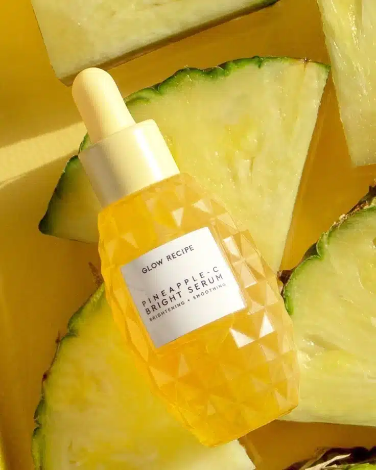

Image Source
Pinterest users scroll quickly, and bright, contrasting colors are what makes an image pop and compel them to stop. However you choose to use colors, remember to stay true to your brand’s identity. It’s best practice to stay consistent with your colors from image to image and experiment with unexpected color combinations to create something unique.
In general, remember not to go overboard using colors that aren’t in your brand’s palette. Instead, test different colors to see what resonates with your audience. A pop of color can make your pin stand out and catch more eyes, which may lead to more shares and engagement. At the same time, the wrong color might cause people to scroll right past.
6. Experiment with angles for dynamic shots
Using different angles can transform a good photo into a great one. Rather than always taking pictures at eye level, get creative with your shooting perspective. A different angle–any angle–will add depth and dimension.
A flat-lay angle, where the camera is positioned directly above the items, is great for showcasing products like clothing or beauty items. This shot lets you fit multiple items in a single frame while keeping everything neat and organized.


Image Source
On the other hand, shooting from a low angle can make products seem larger, more impressive, or even more dramatic, adding a sense of grandeur and excitement to the image.
If you run a personal training business, for example, an action shot from an unusual angle, such as a yoga pose from above or a runner in motion from the ground up,can help express a sense of energy
7. Create depth with shadows and texture
Depth adds a sense of realism and sophistication to your photos. Highlighting textures and playing with shadows can transform a flat image into something that feels alive and, in a special way, almost tangible.
Shadows also play a big role in creating depth. Position your subject near a natural light source, like a window (or just go outside), and let the light fall at an angle to create soft shadows. This effect adds dimension and makes your photos pop.
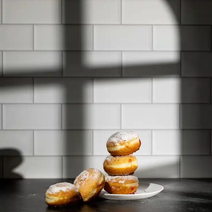

Image Source
If you’re using text (see tip #11), add a light shadow to the letter to help them stand out and add perspective.
8. Edit photos for a professional finish
Editing your photos can be time-consuming, but it’s usually always worth it. Even if you’ve captured the perfect shot, a little editing can refine your image and take it to the next level.
Editing allows you to adjust the lighting, exposure, brightness, contrast, and so much more. For instance, brightening a photo can make colors appear more vibrant than they are in real life.
Adjusting the contrast can add definition to your subject. Sharpening an image just slightly ensures that no detail is lost, especially for users on mobile devices with smaller screens.
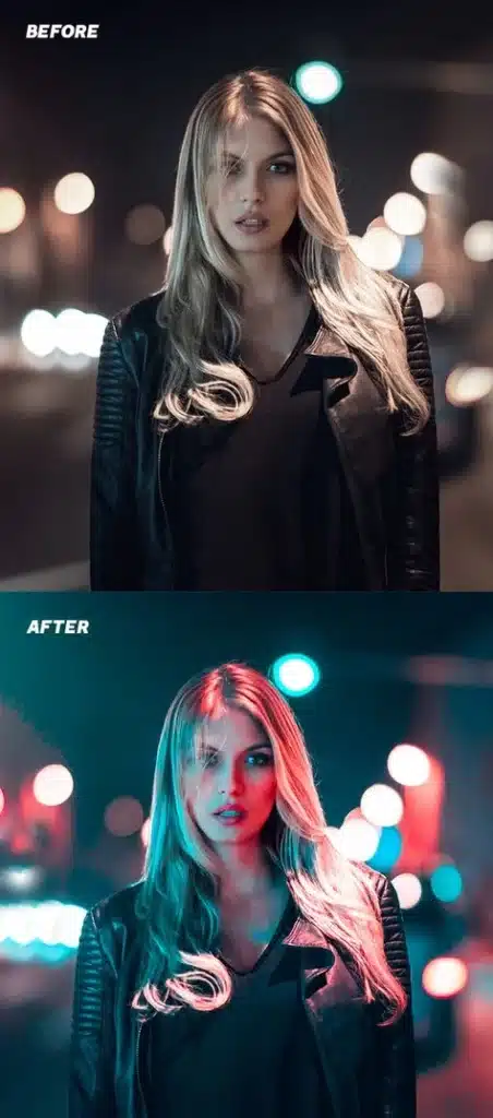

Image Source
Here are three of our favorite go-to apps for editing photos on your smartphone. Each app has a free version option:
- Snapseed: A great app for brightening and fine-tuning photos.
- Lightroom mobile: Perfect for batch editing if you have several photos to edit.
- Canva: Great for filters, color adjustment, and cropping
Don’t be afraid to experiment with preset filters to create a cohesive vibe across your Pinterest profile. As with any of our tips, avoid overdoing it. Too much editing will make your photos feel fake. Your edits should be subtle, so the image still feels natural.
An image that’s edited properly not only helps improve its quality but also boosts your brand’s credibility, making it more likely users will trust you and engage with your content.
9. Add text overlays that stand out
Text on images is often necessary and can be very helpful when used appropriately. Text overlays are one effective way to add context and emphasis to an image. Whether you’re promoting a product, sharing a quote, or highlighting a special offer, text can provide additional information that grabs a user’s attention.


Image Source
To ensure your text stands out, follow these simple rules:
- Use large, bold fonts that are easy to read.
- Choose high-contrast colors, such as white text on a dark background and vice versa.
- Use your brand’s fonts on your graphic and limit yourself to 2 or 3 on a single image.
If you’re promoting a sale, a text overlay like “50% OFF” or “Hurry! Limited Time!” will immediately catch a user’s eyes if you follow those three rules.
Overlays are also a great way to add a CTA, such as ‘Click to Shop’ or ‘Learn More.’ You can also use text to encourage sign-ups for your marketing text message updates.
A simple overlay with ‘Text JOIN to get VIP deals!’ or ‘Message us!’ can turn a Pinterest browser into an engaged customer. Just be sure the text remains clear and doesn’t overpower the image.

