


6. Test layouts and optimize for all devices
Your custom thumbnails should look good on any screen, whether it’s a desktop or mobile device. A great YouTube thumbnail remains clear and readable even when reduced in size.
To check how your thumbnail design holds up:
- Preview it on different devices before uploading.
- Test different layouts. Sometimes shifting the text or background image can improve visibility.
- Make sure key elements aren’t cropped when displayed on YouTube’s left menu or in playlists.
7. A/B test thumbnails for better performance
Even if you follow all the YouTube thumbnail best practices, not every design will perform well. That’s why A/B testing is useful. By creating multiple thumbnail templates and testing them over time, you can see which designs get the best click-through rate.
YouTube doesn’t offer built-in A/B testing, but you can track your video performance in YouTube Studio by comparing engagement rates after changing your custom thumbnails.
8. Stay updated on trends to stay relevant
YouTube trends change constantly, and what works today might not be effective tomorrow. Keep an eye on what’s popular in your niche by analyzing successful channels and their thumbnail designs.
Look at how other creators use background images, text placement, and colors in their YouTube thumbnail templates. If a certain image size, visual elements, or text style is gaining traction, consider testing a similar approach while keeping your branding intact.
5 YouTube custom thumbnail ideas that work (+examples)
Here are 5 examples to inspire you create thumbnails for YouTube:
- Big, bold text on a simple background
- Close-up reaction faces to add emotion
- Before-and-after images to spark curiosity
- Minimalist designs for a clean, pro look
- Blur or pixelate the background to create a sense of mystery
1. Big, bold text on a simple background
Text can help explain what your YouTube video is about, but too much can clutter the design. Keep it short and easy to read, using sans serif fonts in a bold style. Stick to a few words, around 3 to 5, so viewers can quickly understand your custom thumbnail.
To make the text pop, use contrasting colors against the background image. White text on a dark background or black text on a bright background works well. If you’re using the YouTube Studio app, preview how your thumbnail looks in different sizes to ensure readability.
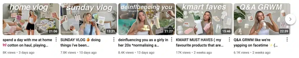

The vlogs in the image above use large, white text over a soft-colored background image. The text is easy to read, and the layout is clean, making the thumbnails stand out in the thumbnail section. The contrast between the text and the background helps ensure that even on mobile devices, the message is clear.
2. Close-up reaction faces to add emotion
People are drawn to emotion. A YouTube thumbnail featuring a face with strong facial expressions, like excitement, surprise, or curiosity, can be more engaging than a plain image. If your video content includes people, use a high-quality frame from your video footage or take a separate photo for your custom thumbnail.
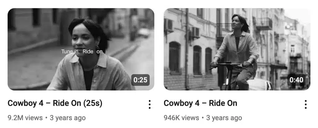

In the Cowboy 4 – Ride On thumbnails, the first image, featuring a close-up of the person’s face, has 9.2M views, while the second, a wider shot, has 946K views. The difference shows how a close-up, expressive custom thumbnail can impact video performance by making viewers more curious about the content.
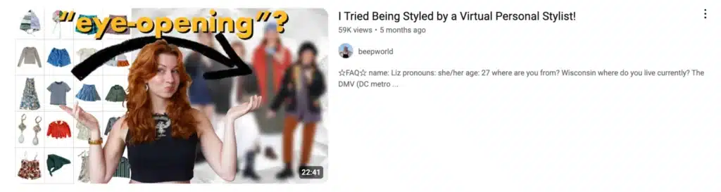
3. Before-and-after images to spark curiosity
Before-and-after images are a great way to get people interested in your YouTube video. They make viewers wonder what happened between the two stages, encouraging them to click and watch. This works especially well for transformation-based content, such as styling, fitness, home makeovers, and DIY projects.

How to create a before-and-after thumbnail:
- Make sure the before-and-after difference is clear.
- Use contrasting colors to highlight changes.
- Add text or arrows to emphasize the transformation.
- Keep the image background clean so the change stands out.
The thumbnail above features a before-and-after contrast, making viewers curious about the change. The arrow pointing to the subject further guides attention. This setup works because it visually teases the transformation without giving away the full story.
4. Minimalist designs for a clean, pro look
A minimalist thumbnail keeps things simple, avoiding unnecessary clutter and making the main subject stand out. This style is popular among vloggers and storytellers who want their videos to feel natural and engaging. A clean custom thumbnail looks polished and professional without relying on too many design elements.
Take a look at Emma Chamberlain’s YouTube channel, known for her effortless yet effective YouTube thumbnail design.
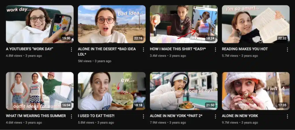

Each thumbnail uses a simple background image, natural facial expressions, and short, direct text like “bad idea” or “I’m so smart…”. The text is subtle but adds personality, keeping the focus on Emma herself. The result is an aesthetic that feels casual yet intentional.
5. Blur or pixelate the background to create a sense of mystery
Blurring or pixelating the background image helps direct attention to the main subject while adding a sense of mystery. This technique works well for product reveals, suspenseful content, or storytelling videos where you want to keep some details hidden.
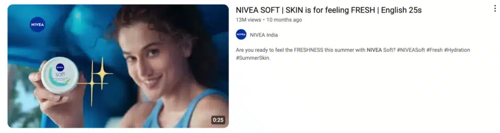

The NIVEA Soft thumbnail in the image uses a blurred background image, keeping the focus on the product while making the subject look fresh and glowing. The blur effect creates a smooth, clean look that makes the thumbnail feel more high-end.

