


7 examples of successful Facebook pages
There’s no single formula for a “perfect” Facebook page. A local restaurant, a consultant, and a global brand will all use the platform differently, and that’s exactly the point.
The businesses below are doing a great job with their Facebook pages in their own way. Some focus on visuals, others on education, community, or video. What they all have in common is that they use Facebook with intention. Their pages feel active, clear, and worth following, not like an afterthought or a box to tick.
Here are 10 successful Facebook pages:
- Midtown Grill Restaurant
- Murami Consulting
- New York Immigration Lawyer
- TRIB3 Global
- Nude Project
- Monzo
- Wakuli
1. Midtown Grill Restaurant
Midtown Grill is a good Facebook page example that does exactly what a restaurant page should do: it shows you what it’s like to be there.
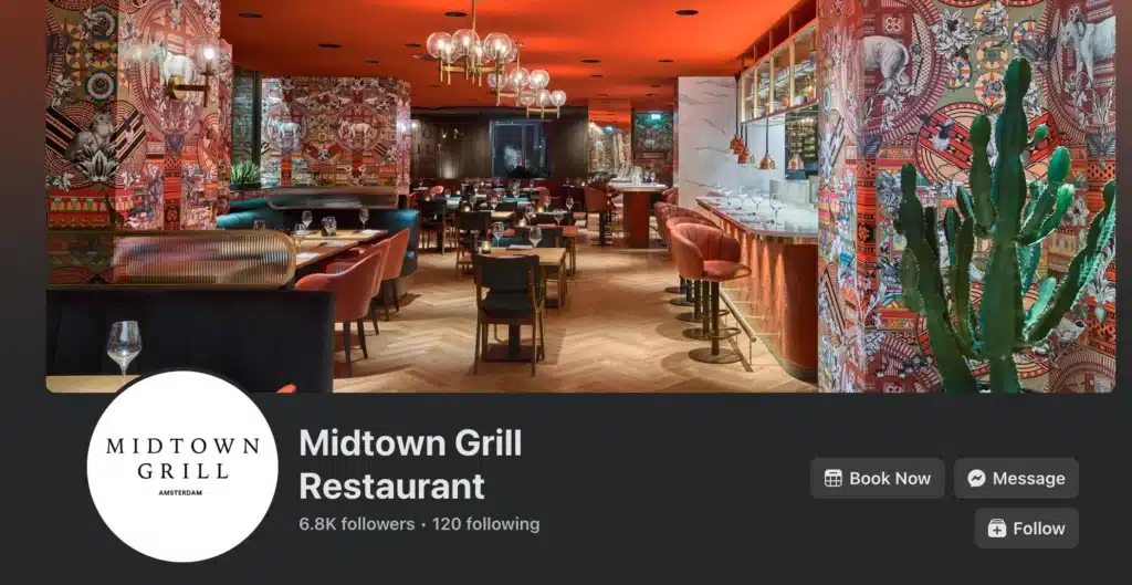

The cover photo sets the tone straight away. You see the interior, the atmosphere, the level of detail. You don’t need to read much to understand what kind of place this is. For a restaurant, that’s already half the job done.
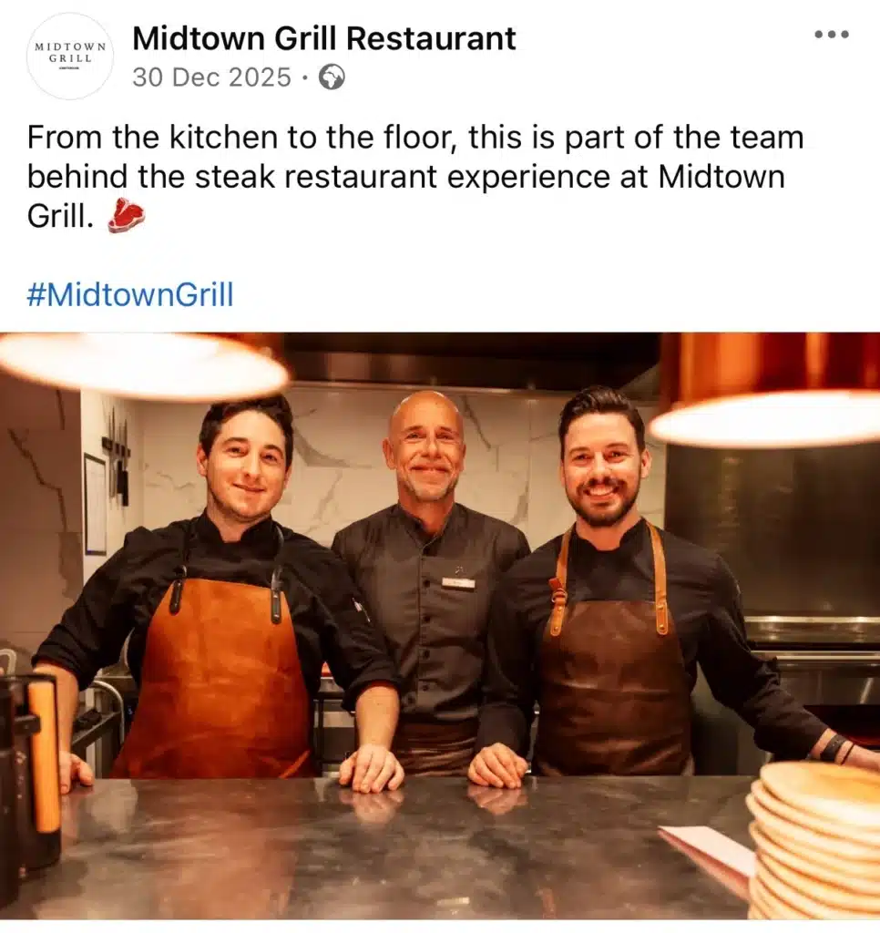
When you scroll, the content stays practical. Team photos give a face to the place. You see the people behind the kitchen and the floor, which makes the restaurant feel more human and less like a brand. These posts aren’t trying to go viral. They just show the team doing their job well.

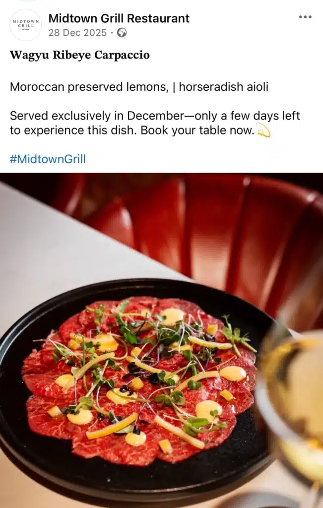
The food posts follow a simple, repeatable format that works well for restaurants:
- one clear, high-quality photo of the dish
- a short caption explaining what it is and what makes it special
- a practical detail, such as availability, seasonality, or how to book
The Wagyu carpaccio post is a good example of this approach. It shows the dish clearly, explains why it’s worth ordering, and sets expectations around timing. There’s no extra storytelling or sales language, just the information someone needs to decide.

This works because the page is selective about what it shares. Posts focus on dishes, offers, or updates that actually matter to customers, rather than posting daily filler content. Each post has a clear goal: inform, remind, or prompt an action.
For local restaurants, this is a practical model to follow. You don’t need to post often, but when you do, make sure each post answers three questions:
What is this? Why should I care? What should I do next?
2. Murami Consulting
Murami Consulting’s Facebook page is a good example of how a service-based business can keep things simple and effective.
Right away, the page tells you who they are and what they do. The intro is clear, practical, and written like a real business talking to real people. Just a straightforward explanation of their work and standards, which already builds trust before you even scroll.
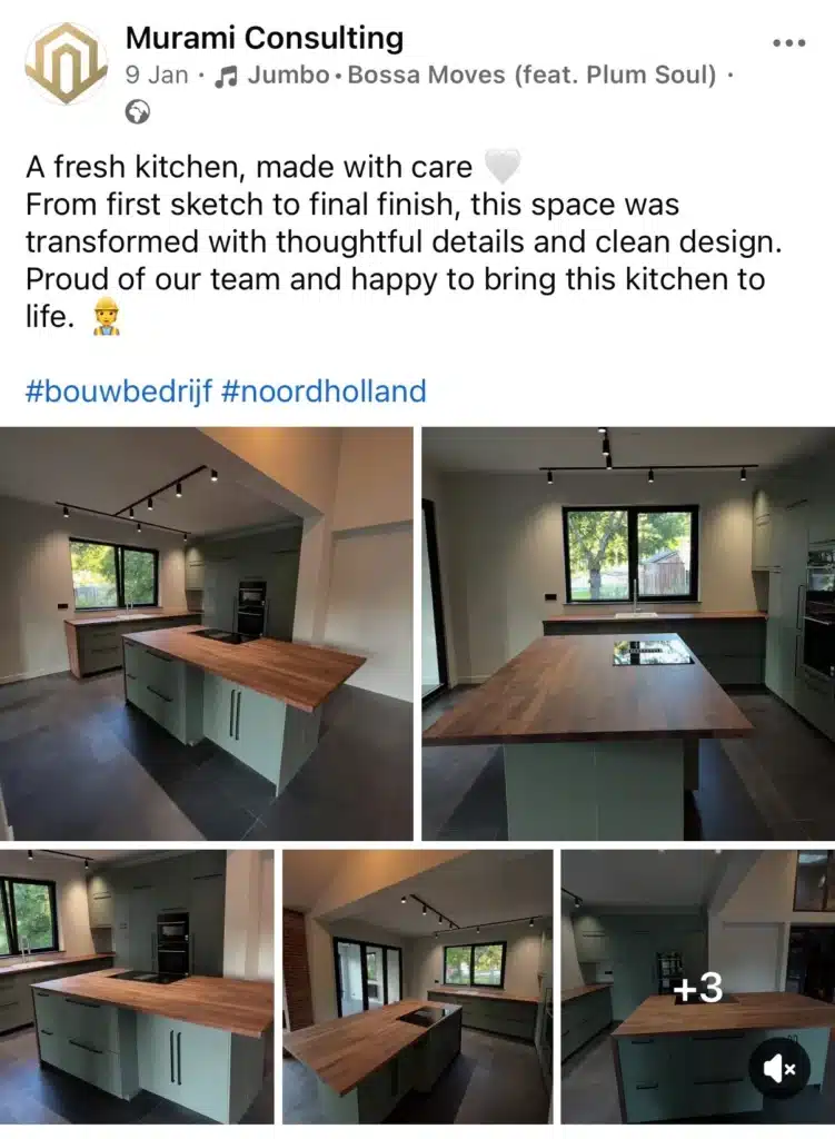

Most of their content focuses on finished projects, particularly kitchen and bathroom renovations. The visuals do the heavy lifting. Clean angles, good lighting, and multiple shots of the same space allow potential clients to clearly assess the quality of the work without needing long explanations.
What stands out here is how clearly the page demonstrates expertise through outcomes. Instead of talking about skills, process, or promises, the page shows repeated, tangible results. Visitors can quickly scan the feed and understand what Murami delivers, what level of finish to expect, and whether the style matches their needs.
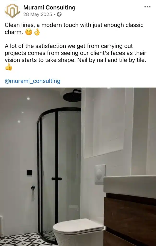

This approach works especially well for service-based businesses. By prioritizing visual proof over promotional language, the page reduces friction in the decision-making process. Potential clients don’t need to imagine the end result. They can already see it.
Key takeaway: For project-driven businesses, showcasing clear, repeatable outcomes builds credibility faster than persuasive copy. Showing the work consistently creates confidence without having to sell aggressively.
3. New York Immigration Lawyer
This Facebook page does one thing very well: it answers real questions for real people.


The cover image is clear and functional. It immediately communicates who the service is for and what problem it helps solve. For users landing on the page from the news feed or search, there’s no guesswork involved. The message is direct, which matters on a platform with billions of monthly active users and very limited attention.
Most posts focus on specific immigration topics, such as J-1 waivers or visa requirements. The captions are longer than average, but they’re written to inform, not to perform.


You can skim them quickly on the Facebook wall and decide whether the information applies to your situation.
For an audience under stress, short on time, and dealing with a clear pain point, this kind of clarity is far more valuable than posting fun pictures or generic engaging content.


Reviews are also used strategically. Sharing customer testimonials from Google isn’t visually exciting, but for professional services it’s highly effective.
Trust is the primary driver here. Seeing real feedback helps strengthen customer relationships and gives potential clients confidence without having to sell aggressively.
What this page does well is understanding its role within social media. It doesn’t try to behave like a lifestyle brand, a computer software company, or a restaurant sharing recipe and meal ideas.
It also doesn’t rely on engaging videos, interactive posts, or branded infographics to compete for attention. Instead, it focuses on education, credibility, and making the next step obvious.
Practical takeaways for Facebook pages:
- A good Facebook page doesn’t need to use every format available. It needs to match content to audience intent.
- For local Facebook pages offering professional services, clarity builds trust faster than creativity.
- Longer text can work when it’s useful and written for target customers, not algorithms.
- Customer testimonials are a powerful tool for building credibility on brand pages where decisions carry real weight.
- A steady stream of relevant, informative posts is more effective than chasing trends or posting fun pictures that don’t serve a purpose.
This page is a great example of how a brand’s Facebook presence can drive traffic, support decision-making, and build a reliable fan base by prioritizing usefulness over entertainment. For professional services, more customer-centric content almost always outperforms visual-heavy or trend-driven strategies.
4. TRIB3 Global
TRIB3’s Facebook page is a good example of a brand that knows exactly what it wants to show and sticks to it.
Most of the content is built around the workout experience itself. High-intensity visuals, strong lighting, and clear messaging make it obvious what kind of training people can expect. Posts like The Intensity Zone don’t need much explanation. You see the effort, the sweat, the atmosphere. That’s enough to stop the scroll.


What works well is how they mix performance with people. Alongside workout visuals, TRIB3 regularly highlights coaches and members. The coach appreciation post is simple, but effective. It gives recognition, shows community, and makes the brand feel more human.
For fitness businesses, that matters. People don’t just sign up for workouts; they sign up for the people running them.
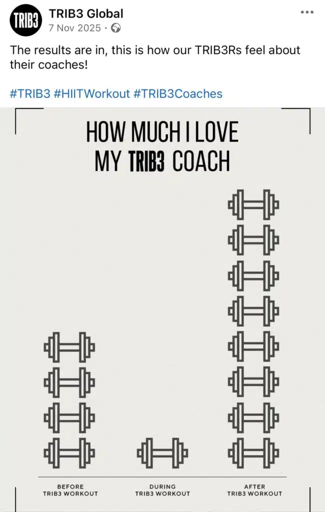

TRIB3 also uses branded graphics in a practical, light-hearted way. Posts like “how much I love my TRIB3 coach” are clearly meant to be fun. The format is easy to understand at a glance, visually consistent with the brand, and repeatable without feeling overproduced.
Clear takeaways for other brands
- Be clear about what experience you are selling and show it repeatedly
- Use visuals to set expectations instead of overexplaining
- Highlight people alongside performance to build emotional connection
- Use branded templates that are simple, recognizable, and easy to reuse
- Keep “fun” content clear and on-brand rather than overly polished
- Focus on consistency and familiarity instead of chasing viral moments
Overall, TRIB3’s Facebook page works because it reinforces the same message from multiple angles. Performance, people, and community all point back to the same brand experience.
5. Nude Project
Nude Project is a Spanish streetwear brand founded in 2018, built around youth culture, community, and everyday life. The brand focuses less on seasonal fashion drops and more on identity, belonging, and shared experiences. Its communication avoids traditional fashion marketing and leans into authenticity, simplicity, and cultural relevance.
On social media, Nude Project consistently uses low-production, observational content. The focus is rarely on direct product promotion. Instead, the clothing is woven into the story in a way that feels natural and unforced.
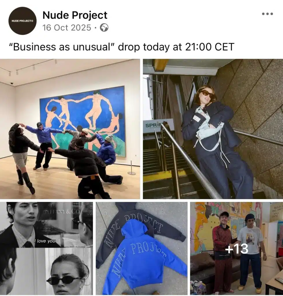
In this post, the brand subtly showcases its products by featuring film photos taken by a couple, where Nude Project pieces appear as part of the moment rather than the subject of it. The clothes are worn, lived in, and captured casually, which reinforces the idea that the brand fits into real life rather than being styled for the camera.
The busy city setting works as a familiar backdrop, not a travel reference. The caption “give the camera to a couple so u don’t have to work” adds a layer of irony and self-awareness, hinting at the minimal effort behind the content while still delivering brand visibility. The product appears without being explicitly introduced, maintaining the brand’s effortless and authentic tone.


Source
When it comes to product drops, Nude Project doesn’t suddenly change its style. Instead of switching to hard-selling posts, they blend product photos into lifestyle content.
The clothes are visible, but they’re not the only focus. This makes the drop posts feel like part of an ongoing story rather than a one-off promotion.

Source
From a practical point of view, this page is a strong reference for brands that want to stay visible without posting every day. Nude Project doesn’t rely on high posting frequency, but on consistent output over time. There are no long gaps followed by sudden bursts of content.
Instead, the brand maintains a steady rhythm, a clear visual direction, and repeated formats. This consistency helps followers recognize the brand and sets clear expectations, even when posts aren’t published daily.
The takeaway isn’t to post constantly, but to post regularly and intentionally. A predictable cadence combined with a recognizable style is more effective than switching between frequent posting and complete silence.
6. Monzo
Monzo is a UK-based digital bank built as an alternative to traditional banking. While the product itself is financial and functional, the brand positions itself around reducing stress, removing friction, and making money feel less intimidating. That positioning shapes how Monzo uses Facebook.
Monzo’s Facebook page is not used to explain banking features, pricing, or app functionality. Instead, it plays a very specific role in the brand ecosystem:
to humanise the brand, reinforce tone, and stay culturally present in people’s daily lives.
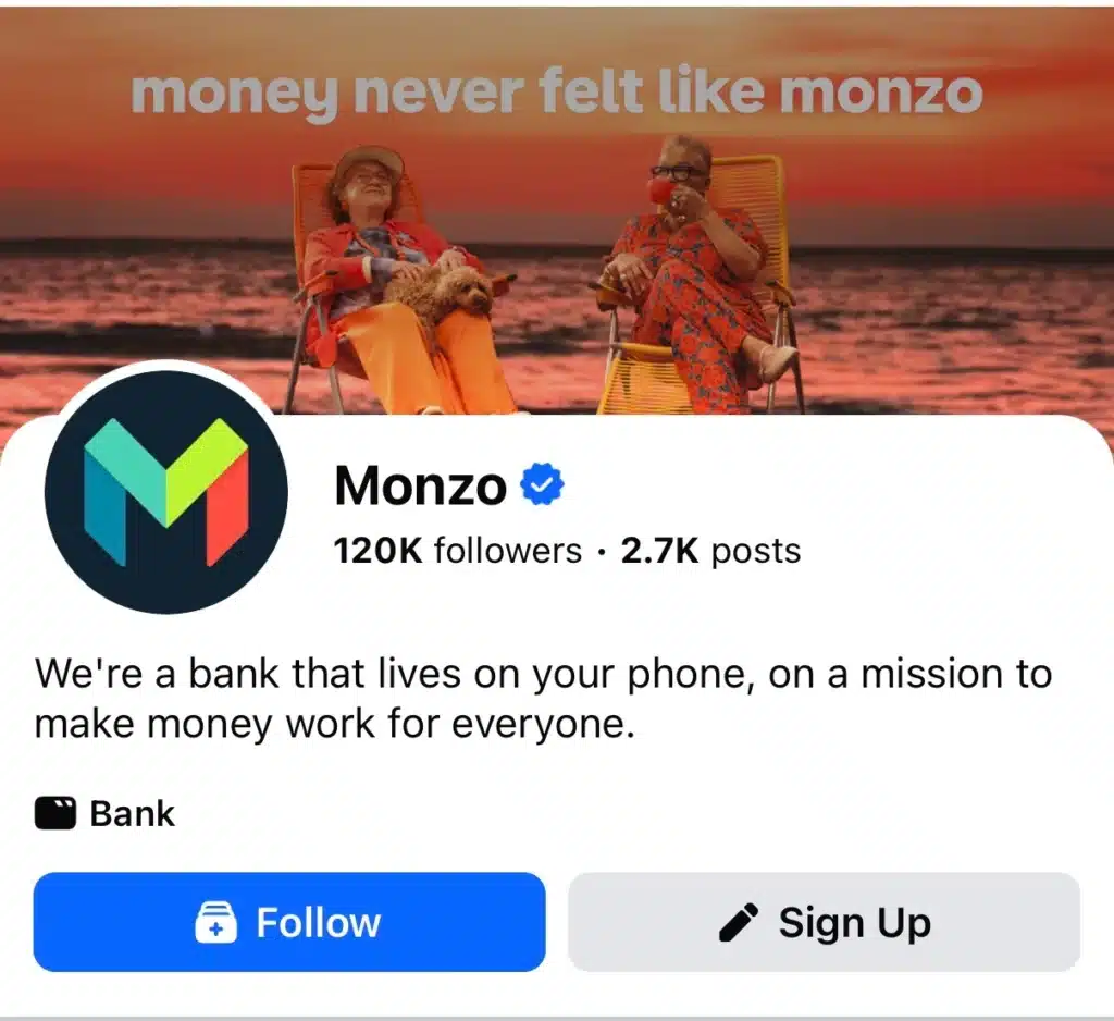

This is visible immediately in the cover image. Two older women sitting by the sea, warm colours, relaxed body language, and the line “money never felt like monzo.” There’s no product explanation because there doesn’t need to be one.
The goal here is emotional framing, not education. Visitors understand how the brand wants to feel before they understand what it does.
That first impression is intentional. On a platform where people scroll quickly and often arrive via the news feed rather than the homepage, clarity of tone matters more than completeness of information.
Looking at individual posts, Monzo consistently avoids overproduced or overly branded content. A post like the mock letter to the UK weather gods contains:
- no product mention
- no CTA
- no attempt to explain the service


Yet it works because it feels familiar, culturally relevant, and easy to read. In the news feed, it blends in naturally with personal posts rather than standing out as advertising. This lowers resistance and increases the likelihood that people will read, react, or comment.
Importantly, these posts are short and skimmable. Monzo understands that Facebook is not a platform where people want to decode brand messaging. The copy reads like something a real person might write, which reinforces the brand’s “human bank” positioning.
One of Monzo’s strongest tactical choices is how it treats the comment section.
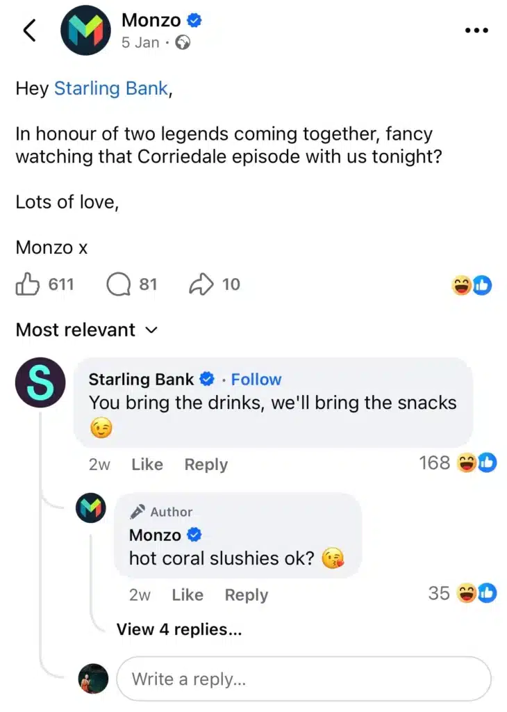

Casual back-and-forth exchanges with other brands, like Starling Bank, aren’t accidental. They serve multiple purposes:
- they show confidence and comfort with their brand voice
- they encourage people to jump into the conversation
- they extend the lifespan of the post beyond the initial publish moment
Instead of posting and leaving, Monzo actively participates. The replies are on-tone, playful, and consistent with the main post. This turns comments into an extension of the content rather than a separate moderation task.
For Facebook specifically, this matters. The platform rewards interaction, but more importantly, users read comments as social proof. A lively, brand-led comment section signals approachability and trust.
Monzo understands that Facebook is not where people go to compare banking features. That happens on websites, review platforms, or app stores.
Facebook is used to:
- build familiarity
- reinforce brand personality
- stay top of mind without selling aggressively
By separating product education from brand presence, Monzo avoids overwhelming users and instead focuses on long-term trust. Over time, this consistency makes the brand feel familiar and safe, which is critical in financial services.
Practical takeaways for other brands on Facebook:
- Decide what role Facebook plays in your overall strategy before posting
- Don’t force product explanations into every post, especially for complex services
- Write copy that works at scroll speed: short, clear, and human
- Treat comments as part of the content, not just engagement metrics
- Keep voice consistent across posts, replies, and visuals
- Use cultural relevance and everyday moments to reduce brand distance
Monzo is a strong example of how keeping things simple doesn’t mean being lazy. It means being deliberate.
7. Wakuli
Wakuli is a Dutch coffee brand focused on direct trade. They work directly with farmers and cooperatives, building long-term relationships instead of buying through layers of middlemen. The idea is simple: better coffee, fairer prices, and more transparency about where the beans come from.
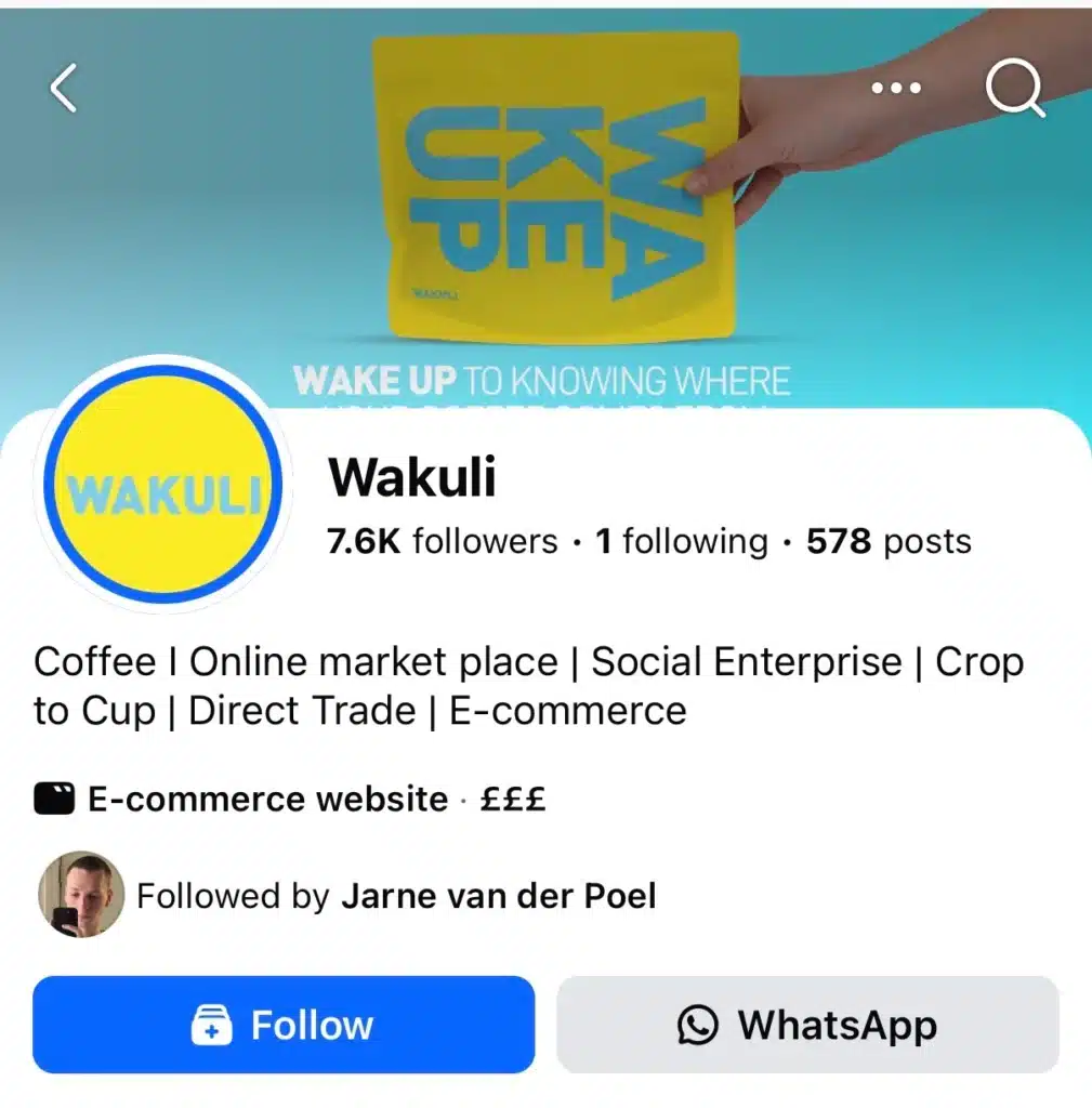

That comes through clearly on their Facebook page. The About section explains what they do in plain language. No buzzwords, no big promises. If you land on the page for the first time, you understand the business quickly. It feels like a company explaining itself, not trying to sell you something.
If you look at their page over time, a few clear content pillars stand out.
First, there’s origin and partner content. Wakuli regularly posts about where their coffee comes from, who grows it, and how those partnerships work. This isn’t deep-dive education, but short, readable explanations paired with real photos.
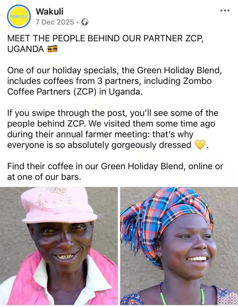

The goal isn’t to teach everything, it’s to make sourcing visible and credible. Over time, this builds trust without repeating the same message in a loud way.
Second, they share process and behind-the-scenes content. You’ll see posts about roasting, tasting, or how they make certain decisions. These posts help people understand that Wakuli is hands-on and involved, not just reselling coffee. Again, the tone stays practical. Just showing how things are done.
Third, there’s product-focused content, but it’s used selectively. Product posts tend to be tied to something concrete: a seasonal drink, a limited release, or a specific moment like the holidays.
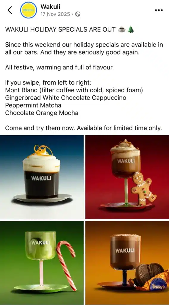

The visuals are clean and consistent, and the message is clear at a glance. They don’t push products constantly, which makes these posts feel more relevant when they do appear.
They also post light educational content. Things like brewing tips, explanations of coffee varieties, or small bits of context that help customers get more out of what they’re buying. These posts are short and practical. They assume interest, but not expertise.
What they don’t post is just as important. You won’t see a lot of trend-jumping, meme content, or posts that feel disconnected from the product or mission. They’re not trying to be funny for the sake of engagement. Everything ties back to coffee, sourcing, or how people drink it.
From a strategy point of view, Wakuli uses Facebook as a support channel, not a performance channel. The page reinforces trust, explains the business, and stays top of mind without shouting. It’s steady, predictable, and calm.
That’s why it works. People know what to expect when they see a Wakuli post. Over time, that consistency builds familiarity and confidence in the brand.
Key takeaways for other Facebook pages:
- Use a few clear content pillars and stick to them
- Show process and people to build credibility over time
- Use product posts sparingly and tie them to real moments
- Educate lightly, don’t lecture
- Avoid posting just to fill space
Key elements of a successful Facebook Business page
A successful Facebook Business page isn’t defined by how often you post or how many followers you have. It’s defined by how clearly your page communicates value, how consistently it shows up in the news feed, and how well it supports your broader content strategy and customer relationships.
These are the core elements that strong Facebook brand pages get right:
- A complete and credible page setup
- Clear positioning for the right audience
- Strong visual identity
- Engagement-focused posts
- Social proof and credibility signals
- Balanced use of organic content and advertising
- Consistency over perfection
1. A complete and credible page setup
Before content even comes into play, the fundamentals matter. A clear profile picture or profile photo (usually your logo), a high-quality cover photo, and a well-written About section immediately signal credibility.

Many high-performing pages use their cover photo to highlight a founder’s mission, an upcoming event, or a clear value proposition. It’s a useful space, but it doesn’t need to do all the work.
Getting the basics right helps remove friction, especially for first-time visitors. An incomplete page can create doubt, but a complete page on its own won’t drive results. Think of this as hygiene, not strategy.
2. Clear positioning for the right audience
Strong Facebook pages know exactly who they are speaking to and create content with that audience in mind. Whether you’re a local business, a software company, or a consumer brand, your messaging should reflect your target customer, their context, and their main pain points.
This clarity makes it easier to create content that feels relevant rather than generic. It also helps Facebook’s algorithm understand who your posts are for and when to show them.
To build an effective Facebook strategy, brands need a clear understanding of:
- who their audience is (demographics, interests, level of awareness)
- what problems or questions they are trying to solve
- what type of content they find useful, entertaining, or worth engaging with
- how they typically interact with brands on Facebook (watching videos, saving posts, commenting, sharing)
The most effective pages translate this insight into consistent, customer-centric content, instead of relying on constant promotion. Rather than pushing products, they focus on providing value in ways that feel natural to their audience.
Customer-centric Facebook content can include:
- sharing practical tips or insider knowledge
addressing common questions or challenges - offering inspiration, such as recipe ideas, lifestyle content, or product use cases
When positioning and content work together, Facebook pages feel more intentional, more relevant, and easier to engage with.
3. Strong visual identity
A strong Facebook presence starts with a recognizable visual style, not just good-looking content. Users should be able to recognize a brand’s post in their feed even before reading the caption.

To build a clear visual on Facebook identity, brands should define and consistently use:
- a limited color palette
- a consistent editing or filter style (bright, muted, warm, high-contrast, etc.)
- recurring compositions (close-ups, lifestyle shots, flat lays, street-style, UGC)
- consistent typography for text overlays or branded graphics
- a clear balance between product-focused and lifestyle visuals
Video and photo content should follow the same visual rules. Short videos, photo galleries, and static images should all feel part of the same system, even if the format changes.
Authenticity matters more than perfection. Content that feels real and on-brand often performs better than overly polished visuals that could belong to any brand. The goal isn’t to make every post look identical, but to make every post feel familiar.
A strong visual identity builds recognition over time, increases trust, and makes it easier for users to engage with the brand consistently.
4. Engagement-focused posts
Engagement on Facebook doesn’t just “happen.” Pages that get comments and reactions usually ask for them in a simple, natural way.
That doesn’t mean gimmicks or forced questions. It can be as basic as asking for an opinion, inviting people to share an experience, or reacting to something familiar. The best engagement posts feel like something a person would say, not a brand trying to boost numbers.
What also matters is what happens after people respond. Strong pages don’t just post and move on. They reply, like comments, and stay present in the thread. That back-and-forth turns a post into a conversation and shows that there are real people behind the page.
This kind of interaction does two things at once. It keeps the post alive in the feed, and it quietly builds trust. When people see a page responding consistently, it signals good customer service and makes the brand feel more approachable.
The key isn’t to chase engagement for its own sake. It’s to create moments where interaction makes sense and then actually show up when it happens.
5. Social proof and credibility signals
User-generated content, customer testimonials, and social proof play a major role in building trust. Highlighting real customers, resharing tagged posts, or featuring reviews shows that your brand delivers real value beyond marketing claims.

This is especially important for smaller brands competing with large brands for attention.
6. Balanced use of organic content and advertising
Organic reach still matters. But the pages that perform best don’t rely on it alone. They use Facebook advertising to support what’s already working. Most strong Facebook ad examples start as regular posts in the news feed. If something gets higher engagement, it’s a good signal. That’s when ad spend makes sense.
The best Facebook ad examples focus on simple ad creative and clear ad copy. You have just a few seconds to grab attention, so short sentences help. A clear call to action or CTA button matters more than clever wording. These facebook carousel ad examples work because they show the product clearly, answer questions, and speak to a specific target audience or ideal customer.
Good ad campaigns don’t try to force people to leave Facebook immediately. They build interest first, then use a strong call to action to drive traffic when it makes sense. When done right, this approach leads to higher engagement from Facebook users and better results overall.
7. Consistency over perfection
Finally, the most important element is consistency. A simple Facebook approach, maintained over time, outperforms sporadic bursts of activity. Pages that stay visible in the news feed, keep content fresh, and adapt to current events build stronger fan bases and long-term brand equity.


