


In May, Netflix announced a massive redesign of its user interface for its mobile and TV apps, the first in over a decade. However, the design wasn’t available for Apple TV owners until today.
Initially spotted by Redditors (via 9to5Mac), the updated, if controversial, design appears to have gone live with the most recent tvOS update. If you’re not seeing it on your Apple TV 4K, make sure you have the latest version of the Netflix app installed.
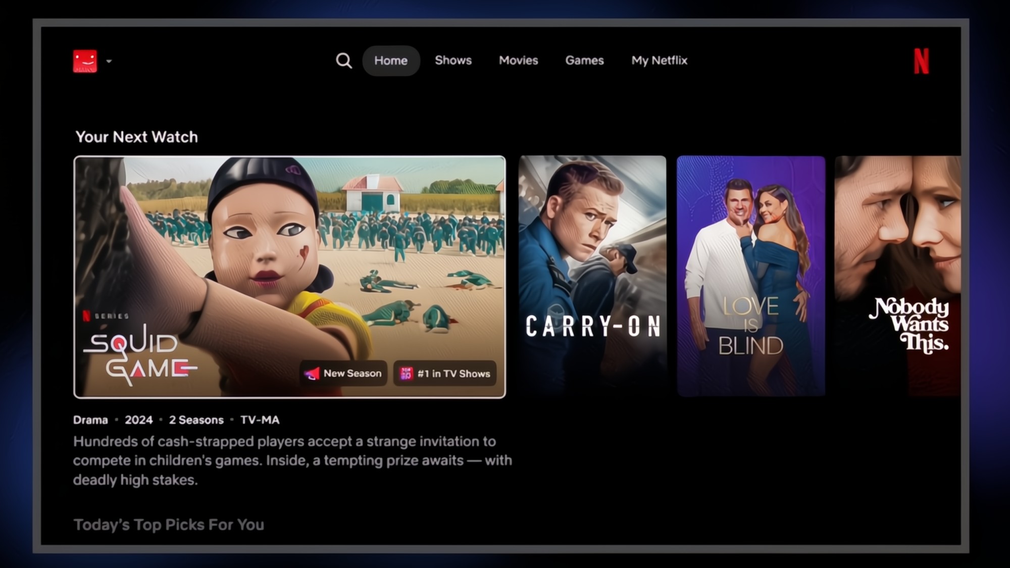
The update gives the app a fresh look with a new homepage that is focused on clarity and speed. Movie and TV show titles will now show more information upfront, including whether or not it’s trending or award-winning.
Some navigation tools have been moved. Shortcuts like My List and Search, previously in the sidebar, are now at the top of the screen. My List has been renamed My Netflix and will contain your Continue Watching, My List and Remind Me tabs.
As with everything else, Netflix is dipping its toes into generative AI. The streamer version involves natural language to describe your mood. So typing something like “I want something funny and upbeat” should bring back titles that fit those descriptions.
More like Apple TV
While the design has stirred criticism from many, Apple TV users might find the redesign more welcome as Netflix and Apple now resemble each other.
The Apple TV app already uses a similar navigation bar at the top of the screen. Apple is also giving its app a visual update with tvOS 26 which is also supposed to be more fluid and simple.
Reportedly, Apple is going to launch a new Apple TV 4K streaming device later this fall with more smart home updates and a better chip. We could see it debut during the September iPhone 17 launch event or possibly in October.
What do you think of the new Netflix tvOS app design? Let us know.
Follow Tom’s Guide on Google News to get our up-to-date news, how-tos, and reviews in your feeds. Make sure to click the Follow button.

