Choosing a logo font sounds simple, until you’re 87 tabs deep, squinting at “Montserrat vs. Lato” and wondering why they all start looking the same. If you’re designing a logo from scratch (and doing it yourself), you’re in the right place.
We’ll show you 34 best logo fonts for 2025, curated by brand personality, readability, and licensing (yes, free options included). You’ll discover what works, why it works, and how to choose a font that actually fits your brand and doesn’t look like a rushed Canva template. Let’s make your logo look legit without the unneeded meltdowns.
How to choose a logo font
Before we get to the list of best logo fonts, let’s quickly talk about what makes a good logo font. Not all great-looking fonts work for logos, and the last thing you want is to choose something trendy that falls flat when your brand name’s in it.
Start with your brand’s personality
Think about how you want your brand to come across. Is it calm and minimalist? Loud and fun? The right font helps that feeling come through. So before scrolling through font sites, write down a few words that describe your brand. Then keep those in mind as you browse. We’ll show you some fonts below, along with tips on when each one works best.
Make sure it’s easy to read
Your logo needs to work everywhere – your website header, a tiny Instagram icon, hoodies, and more. If someone has to squint to figure out what it says, that’s a problem. Stick with fonts that are clear at small sizes. If you love a more decorative style, use it sparingly (like in a tagline or just one word) so it doesn’t take over.
Keep it simple
Choosing logo fonts can feel like a lot. But keeping it simple actually works in your favor. Some of the most iconic logos just use one well-choosen font, and that’s because it keeps things clean and easy to remember. You don’t need to mix a bunch of styles to make an impact. One strong font that matches your brand’s vibe can look way more confident and put-together than a bunch of clashing ones.
Check the license (always)
If you’re planning to use your logo on a product, website, or even social media, make sure the font is free for commercial use. Google Fonts is a great place to start – they’re free, safe to use commercially, and super easy to test. If you’re downloading from another site, double-check the license first. It’s an easy step that saves a lot of stress later.
Try it with your actual brand name
A font might look amazing in a preview image, but things change fast once you type in your own name. Test a few styles with your brand name, try it in all caps, lowercase, bold – see how it feels. Sometimes a font that seems boring at first can look perfect once you see it in action. Those are usually the best fonts for logos.
By focusing on your brand’s personality, readability, and simplicity, you’ll be well on your way to choosing the best logo fonts for your brand.
A quick guide to logo font styles
Before we jump into the list, let’s break down the four main font types you’ll come across. Understanding these helps you choose a font that matches your brand’s tone.
- Serif: These fonts have little feet or strokes at the ends of each letter. They feel classic, trustworthy, and elegant. Great for traditional or high-end branding.
- Sans Serif: No feet here—just clean lines. Sans serifs are modern, minimal, and super versatile. They’re great for tech brands, startups, and anything digital-first.
- Script: These fonts mimic handwriting or calligraphy. They can be stylish or playful but are often tricky for logos due to legibility issues. Best used sparingly or for accents.
- Display: Display fonts are bold, unique, and built to stand out. Think of them as the attention-grabbers. Use these when you want your logo to have a distinct, unforgettable look.
29 best logo fonts by category
All the best logo fonts in this list are free for commercial use (via Google Fonts) and curated to make choosing a logo font easier based on your brand’s personality. They’re readable at different sizes, scalable across formats, and versatile enough to pair if needed. We’re not showing them in mockup logos yet, just in plain text so you can see their style clearly. You’ll be able to see each font in regular, italic, semi-bold, and bold (in that order) to get a full sense of how it looks.
Note: If you’re using Canva for your design, many of the best fonts for logos below, like Montserrat, Playfair Display, and Bebas Neue, are available there, and you can test them in templates after you’ve reviewed them.
Modern & minimalist
For startups, tech brands, or anyone who wants a clean and confident look.
1. Montserrat
Montserrat is geometric, balanced, and super reliable. It gives Google-esque clarity and is a go-to for many DIY brands thanks to its instantly professional look. If your goal is to look professional and digital-first, this one gives you a strong foundation. Just note: since it’s very popular, it might not feel unique compared to other best logo fonts out there.
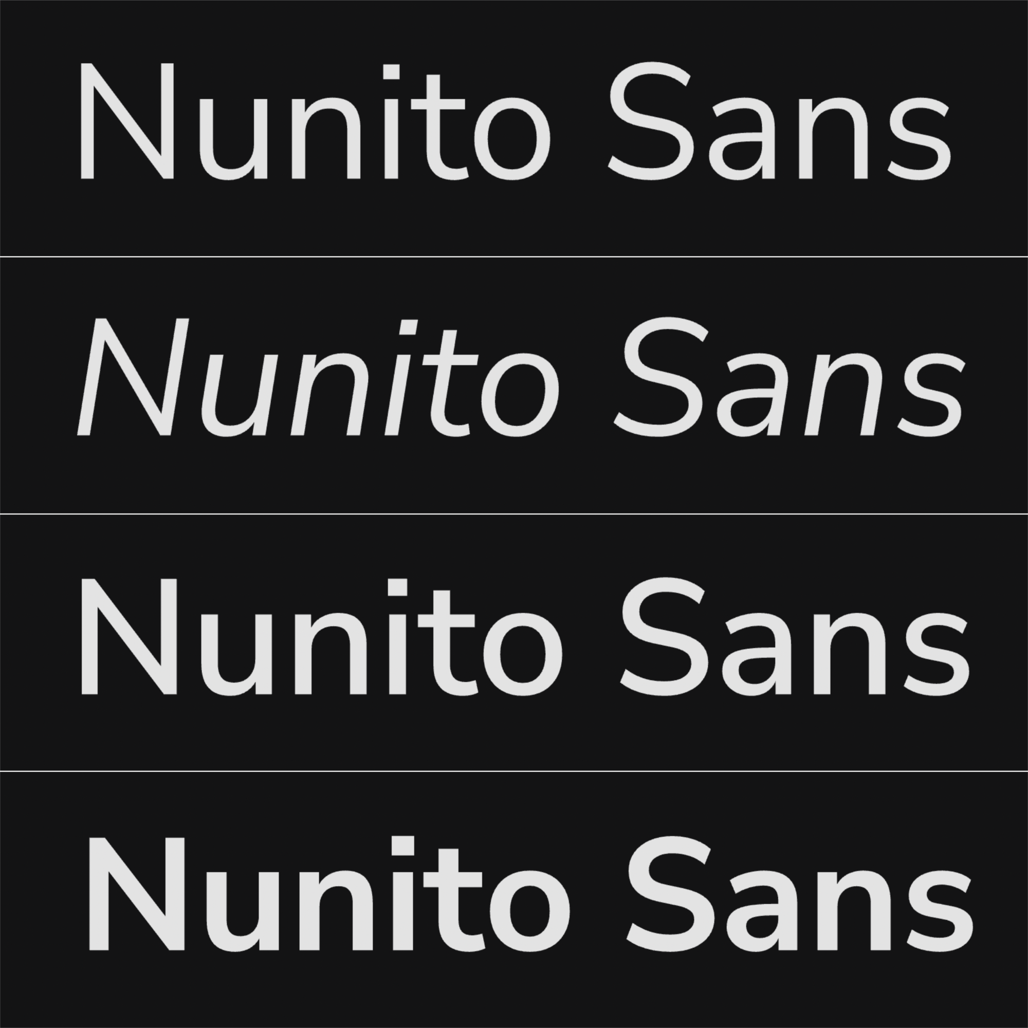
2. Nunito Sans
Nunito Sans is a little softer around the edges than many minimalist fonts. It brings friendly energy to a modern layout. This font works especially well for SaaS products or creative startups that want a clean look with a welcoming tone.
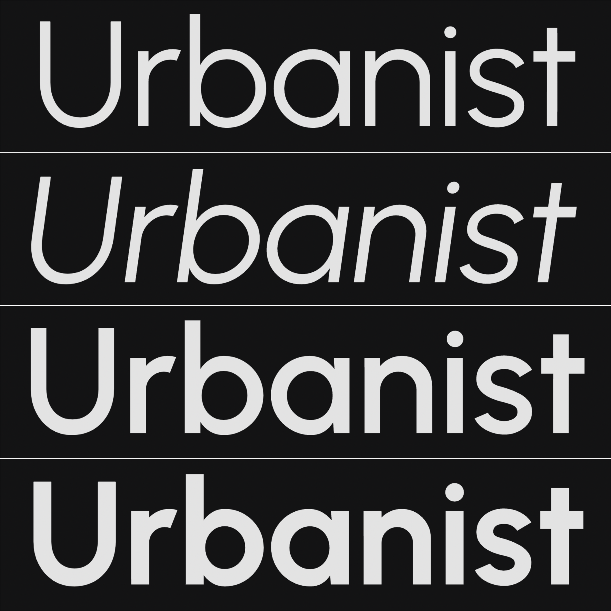
3. Urbanist
Think of Urbanist as Montserrat’s calmer cousin, geometric but not cold or robotic. It’s more rounded at the edges, so the c’s and o’s almost look like perfect circles. This creates a subtle warmth that’s perfect for newer brands aiming to feel modern and human. Use it if you’re building a modern brand with personality, like a design studio or a tech platform with heart.
Elegant & timeless
For luxury brands, fashion, beauty, or anything that leans classic and sophisticated.
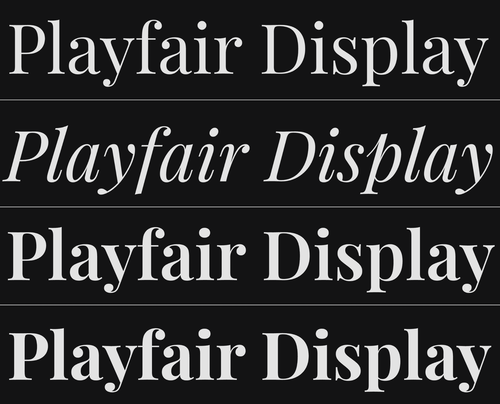
4. Playfair Display
This font brings an upscale magazine feel, like Vogue headers or luxury product labels. It’s great for names that need to stand out with elegance. Just make sure you use it at a large enough size. If you’re after the best fonts for logos that exude luxury, Playfair Display is an excellent choice.
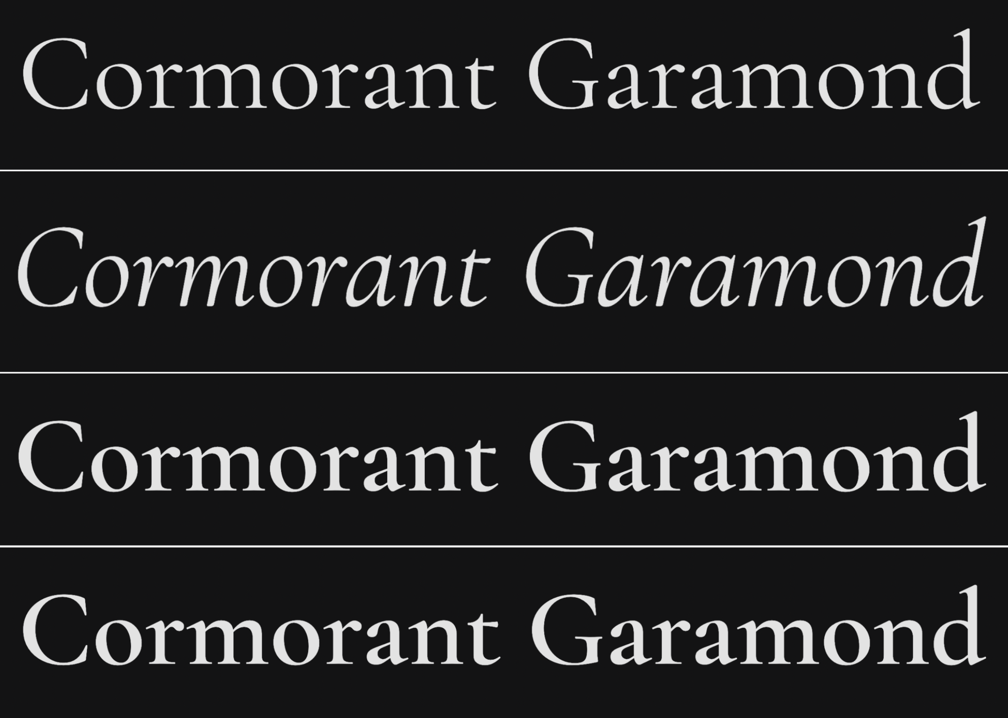
5. Cormorant Garamond
A modern take on a classic. Cormorant Garamond is refined and graceful, making it perfect for wedding professionals, high-end services, or anyone aiming for old-school charm with a fresh twist. It’s one of the best logo fonts for brands that need to feel both timeless and unique.
6. Cinzel
If you want to channel prestige and drama, Cinzel’s your best bet. It was inspired by Roman engravings and brings a formal, commanding presence, ideal for heritage or luxury brands that need to feel established.
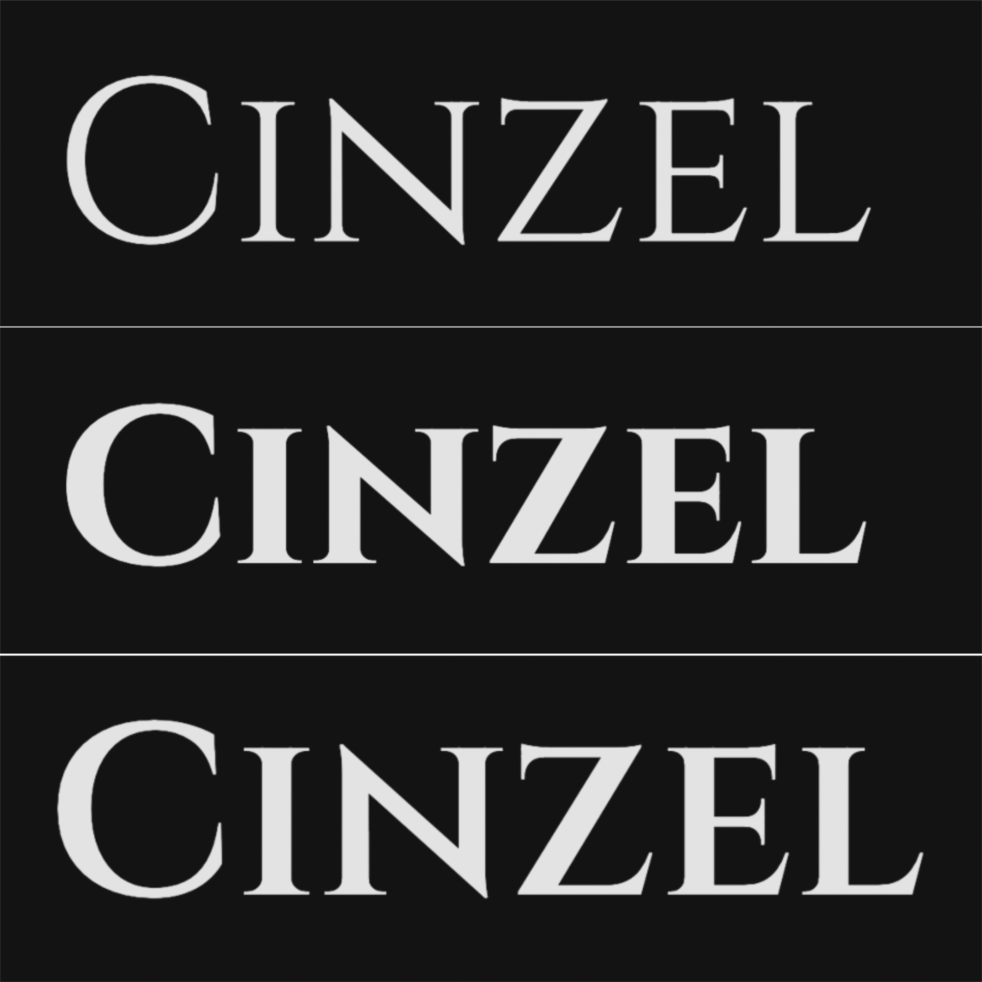
Note: Cinzel doesn’t have an italic version.
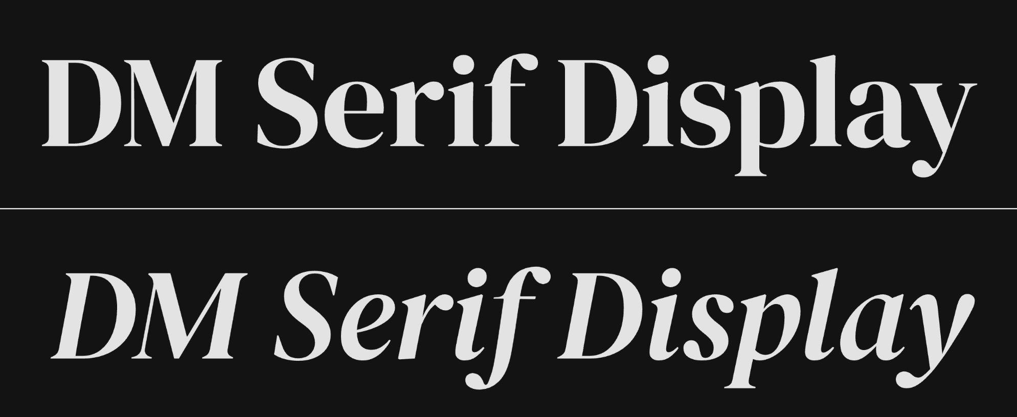
7. DM Serif Display
This one’s expressive without going overboard. It pairs beautifully with minimalist layouts and shines in fashion, editorial, or premium lifestyle brands. But note that DM Serif Display doesn’t have bold or semi-bold options.
4 more elegant logo fonts
- Libre Baskerville: Timeless serif with great readability. Works for logos and body text.
- Lora: A serif with subtle curves that give it warmth and sophistication.
- EB Garamond: Classic old-style serif, great for traditional or heritage-inspired brands.
- Prata: High-contrast serif that feels both modern and luxurious.
Friendly & Fun
For creatives, kid-focused brands, wellness, or handmade shops.
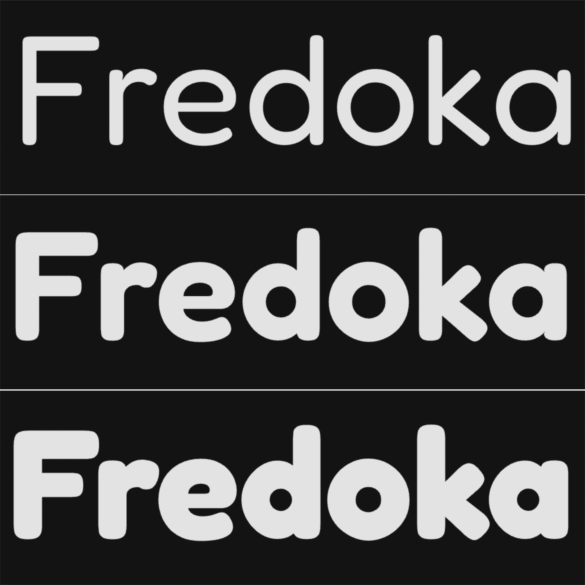
12. Fredoka
Round and bold with a touch of playfulness, Fredoka is great for brands that want to come across as approachable and upbeat. It works well in bold logos, especially in color. It’s a bit “soft” for more serious or flexible logo needs, so make sure it fits the brand image well. Also, keep in mind that, like Cinzel, Fredoka doesn’t have an italic version.
13. Pacifico
If your brand wants to say “laid-back creative,” Pacifico’s retro, handwritten style will do the trick. It’s perfect for food trucks, handmade products, or sunny lifestyle brands, but keep it short and simple. It can be confusing with a long text or tiny formats. As a unique one among the best logo fonts for creative vibes and carefree spirit.
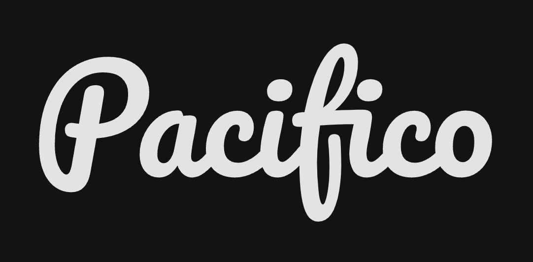
Note: Pacifico is available only in a regular form – no italic or bold.
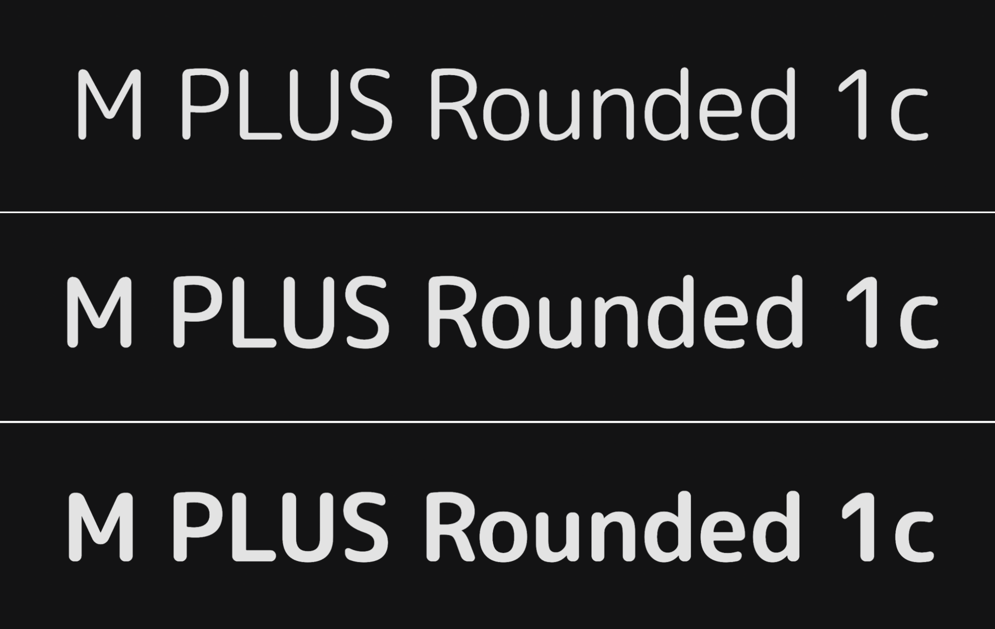
14. M PLUS Rounded 1c
This font is a mix of tech and friendliness. It works great in app branding or soft tech environments where accessibility and personality are both priorities. If you’re looking for the best fonts for logos in the tech space, this one’s a reliable pick. However, the italic version is not available for this font as well.
4 more friendly logo fonts
- Cabin: A rounded sans serif with a hint of personality, but still professional.
- Caveat: A casual script with a handwritten vibe, ideal for brands that want to feel approachable, personal, and a little playful.
- Asap: Compact and roundish without going full cartoonish. Great for longer brand names.
- Varela Round: Soft but structured, excellent for wellness and self-care brands.
Bold & impactful
For logos that need to grab attention fast. Great for fitness, food, entertainment, or product brands.
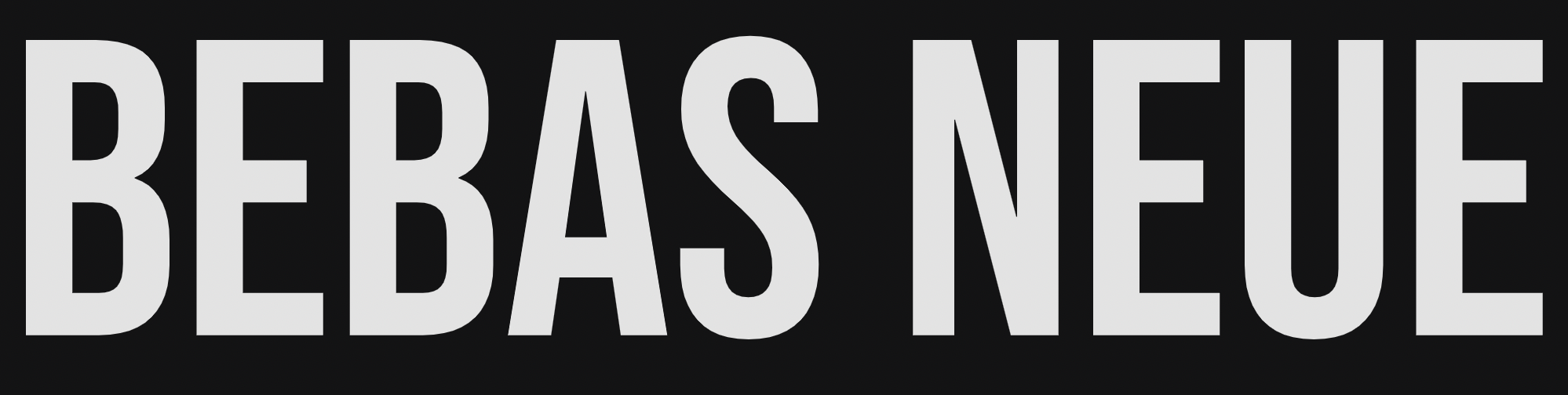
19. Bebas Neue
A favorite for bold, all-caps logos. Although the all-caps limits the flexibility, it’s great for certain industries. This font screams presence, which is why it shows up in gym logos, music branding, and food packaging. Use it big, and pair it with a lighter font for balance. Like Pacifico, Bebas Neue doesn’t have italic or bold forms.
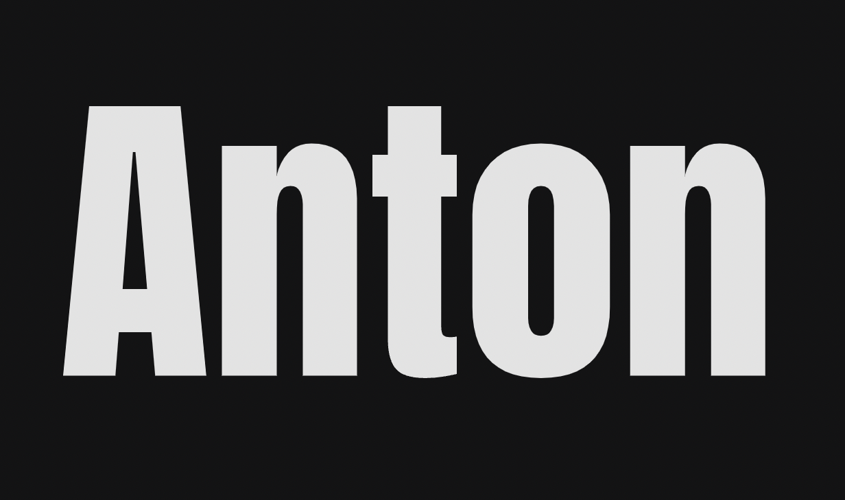
20. Anton
Anton is a heavy-hitter. Use it when you want to be impossible to ignore. It works for short brand names and punchy visuals. Too much of it can visually overwhelm, so pairing is important. Here as well, only the regular form of the font is used.
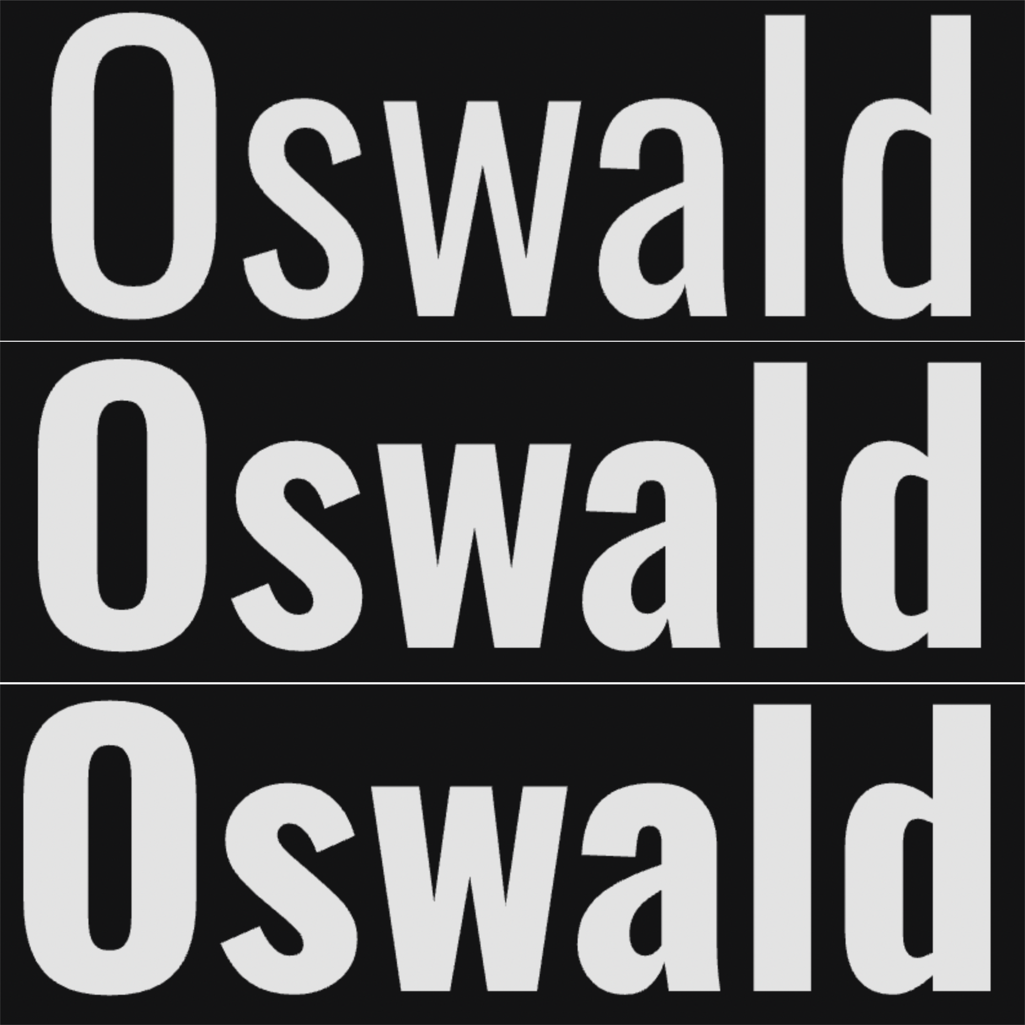
21. Oswald
Reliable and refined, Oswald’s condensed style fits everywhere from magazine layouts to ecommerce headers. It adapts well and keeps things tight without sacrificing clarity. And as you’ve noticed, Oswald doesn’t have an italic form.
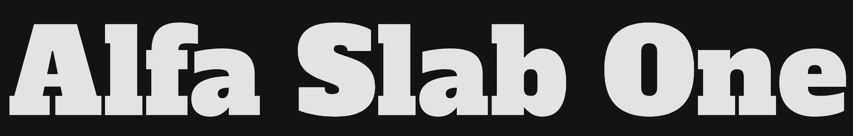
22. Alfa Slab One
Alfa Slab One has the vibe of vintage diner signs and retro posters, adding both heft and a nostalgic touch. Great for restaurant brands after something bold yet friendly. As one of the best fonts for logos with a retro feel, it balances impactful and approachable perfectly.
3 more bold logo fonts
- Archivo Black: A heavyweight sans serif with presence. Excellent in all caps.
- League Spartan: Wide, clean, and bold. Feels editorial and commanding.
- Jost: Inspired by Futura but softer, modern, and more versatile.
Vintage & retro
For brands with character, nostalgia, or a handcrafted feel, like barbershops, breweries, coffee roasters, or anything with an old-school soul. All the fonts in this category are available only in a regular form, as their effect would get lost if you try to artificially bold or italicize them.
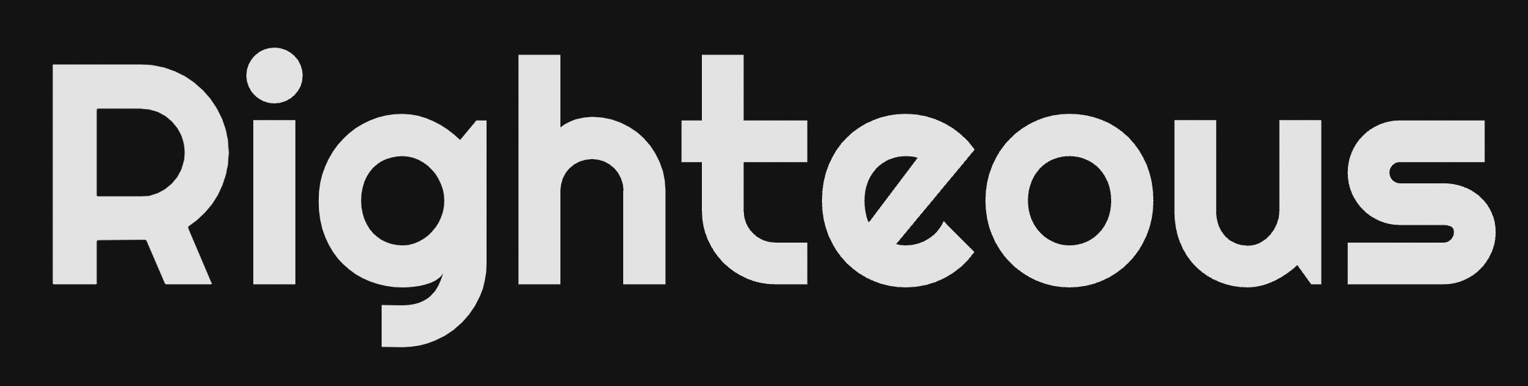
26. Righteous
This one brings in retro charm with a hint of playfulness. Use it if your brand wants to feel fun but grounded. It can be on event posters, creative merch, or studio branding. It’s definitely among the best logo fonts for adding a unique, nostalgic touch.
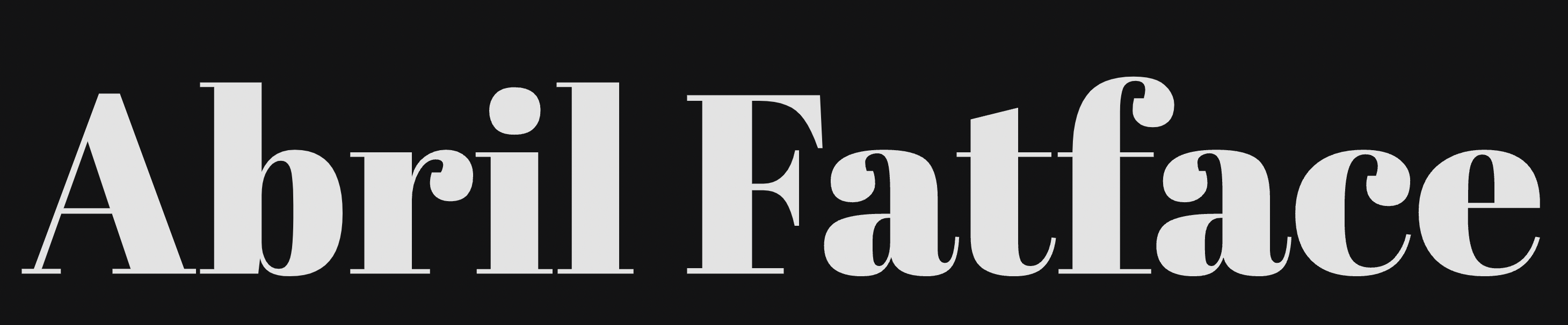
27. Abril Fatface
Inspired by bold vintage headlines, Abril Fatface is dramatic and attention-grabbing. It’s best used big and bold – perfect for editorial brands or creative packaging.
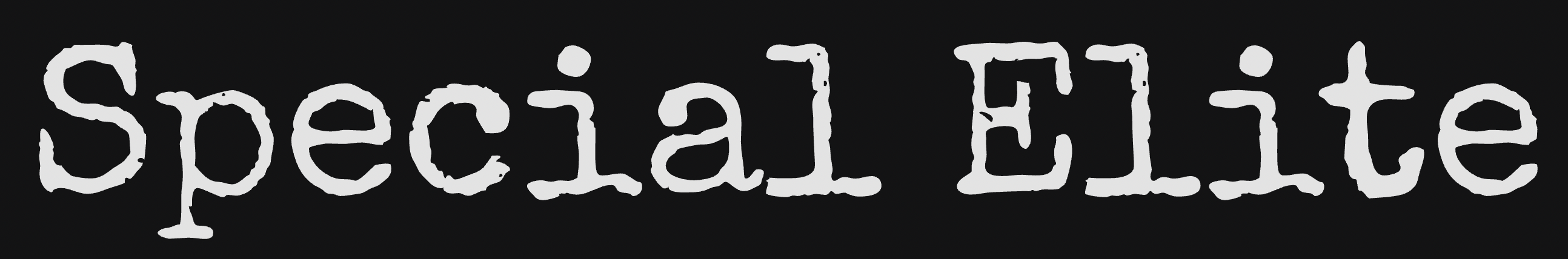
28. Special Elite
It looks like Special Elite came straight off a vintage typewriter, with texture and grit. Use it when your brand wants to lean into rebellion, analog flair, or underground cool. Not for the faint of heart, but among the best fonts for logos that want to break the mold.
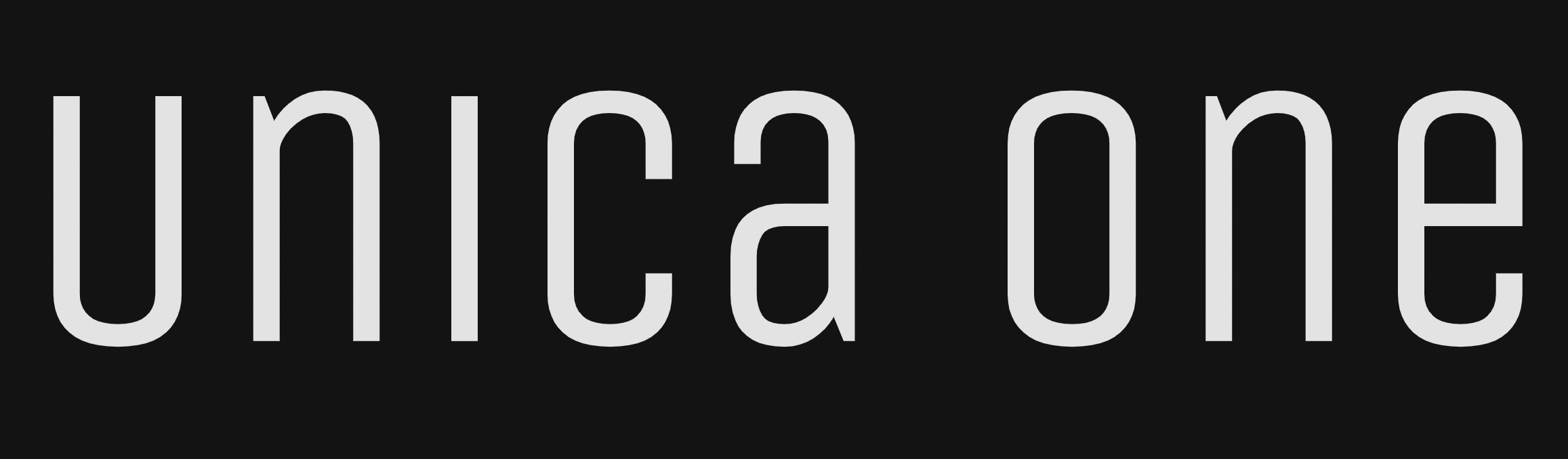
29. Unica One
Unica One has a cool look that stands out without trying too hard. The letters are clean and a bit narrow, so it grabs attention but still stays easy to read. It’s a great option if you want your logo to feel fresh and a little different.
5 more free fonts from Fontshare
Before we look at what logo fonts to avoid, there’s one more set of best free logo fonts worth calling out. These five aren’t from Google Fonts, they’re from Fontshare, another free and commercial-use-friendly directory that deserves more love. Each of these options brings something unique to the table, and if you’re still looking for the right fit, they’re definitely worth trying out.
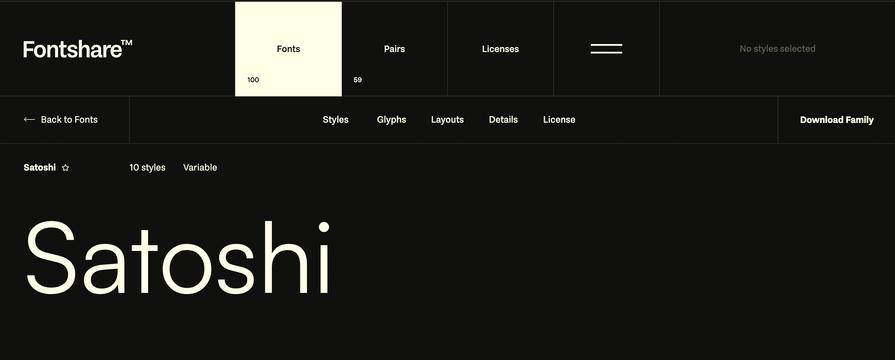
1. Satoshi
Style: Modern, geometric sans serif
Satoshi is from Indian Type Foundry. It’s quickly becoming a go-to among indie designers and brands alike. It feels sleek and neutral but still has personality, which makes it incredibly flexible. It performs beautifully in all-caps logos or minimalist wordmarks. The spacing is well-balanced, so it stays clear even in tight layouts or mobile headers.
Use for: Startups, personal brands, digital products, and tech companies that want a clean but confident voice.
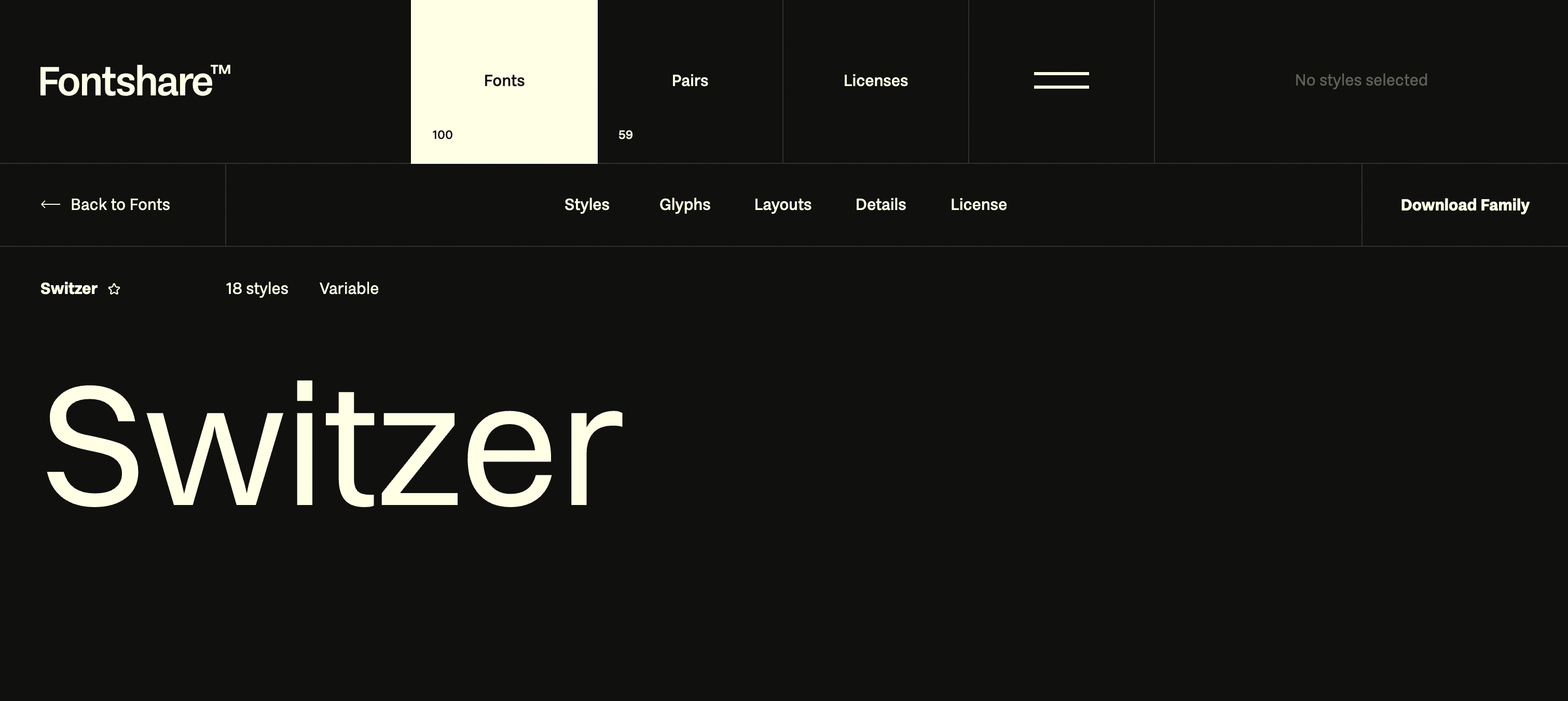
2. Switzer
Style: Neo-grotesque sans serif
Switzer gives you that Helvetica/Inter vibe without feeling too mechanical. It’s sharp, neutral, and quietly authoritative – great for brands that don’t want to shout but still want to be taken seriously. It’s one of the best fonts for logos when you need something that looks clean and professional without being too stiff. Its structure gives you excellent readability, especially in logos that need to appear across multiple formats (print, web, signage).
Use for: Corporate logos, agency portfolios, minimalist eCommerce brands, and clean product packaging.
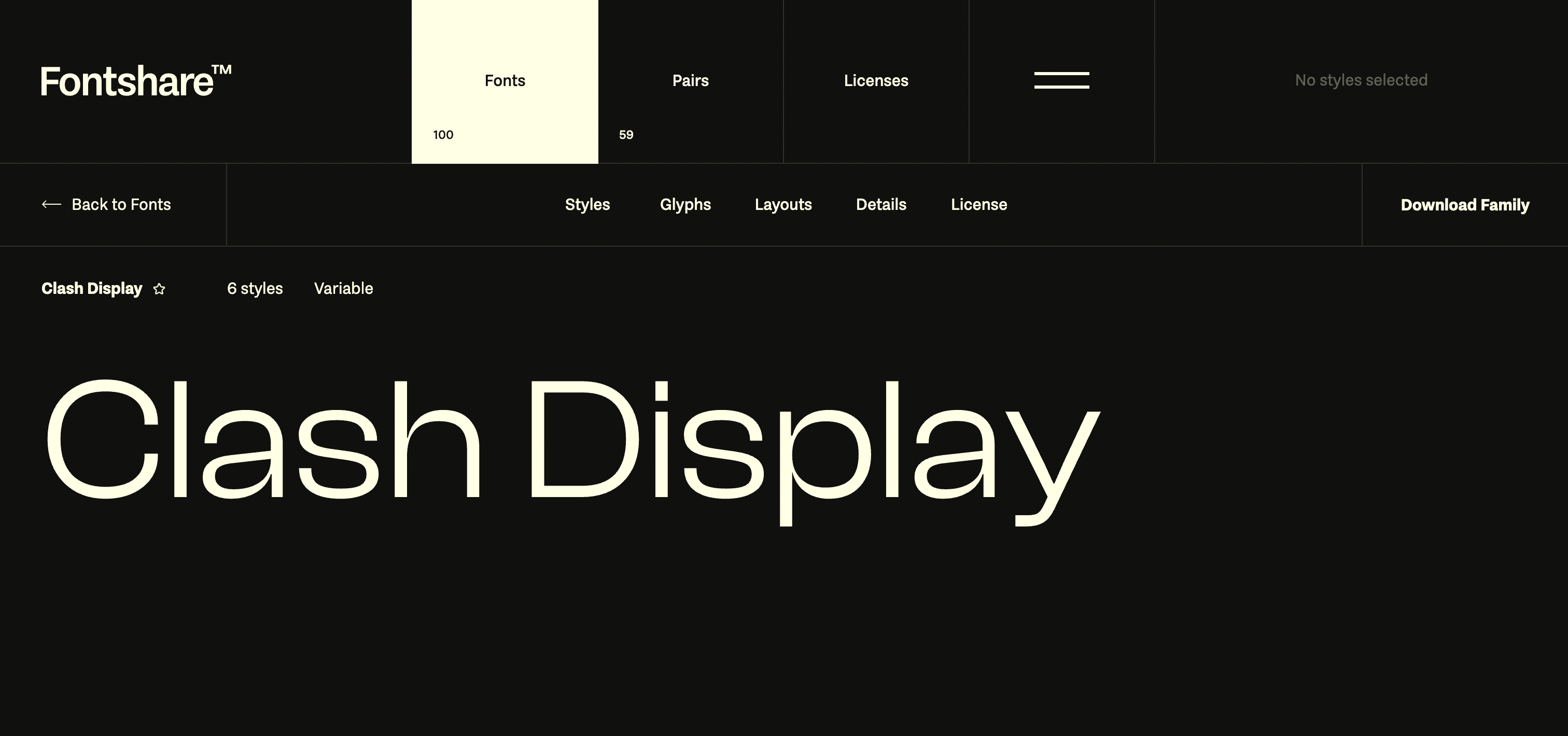
3. Clash Display
Style: High-contrast display serif
If you need your logo to pop in a stylish way, this one’s for you. Clash Display feels bold, artistic, and editorial, without being unreadable. It’s high-impact but still smart. This one’s best when you want your brand name to double as a visual centerpiece.
Use for: Fashion-forward businesses, design studios, and editorial brands that want a dramatic yet tasteful look.
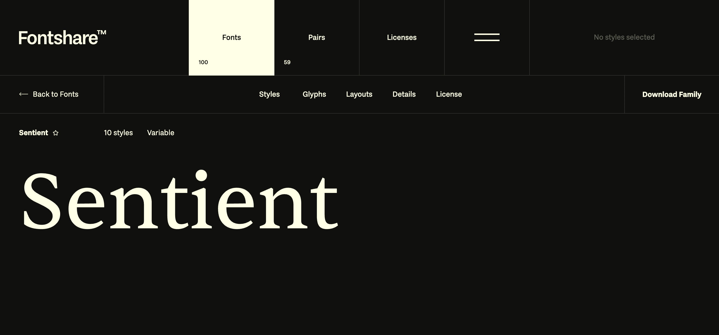
4. Sentient
Style: Serif with calligraphic influence
Sentient mixes classic serif elegance with a subtle, human touch. It’s expressive and elegant, but not fussy, great if you want your brand to feel premium and approachable. It adds sophistication without the stiffness of traditional serifs. It holds up well in headlines, logo marks, and even product packaging.
Use for: Beauty, boutique lifestyle brands, design-forward services, or any brand that leans refined and stylish.
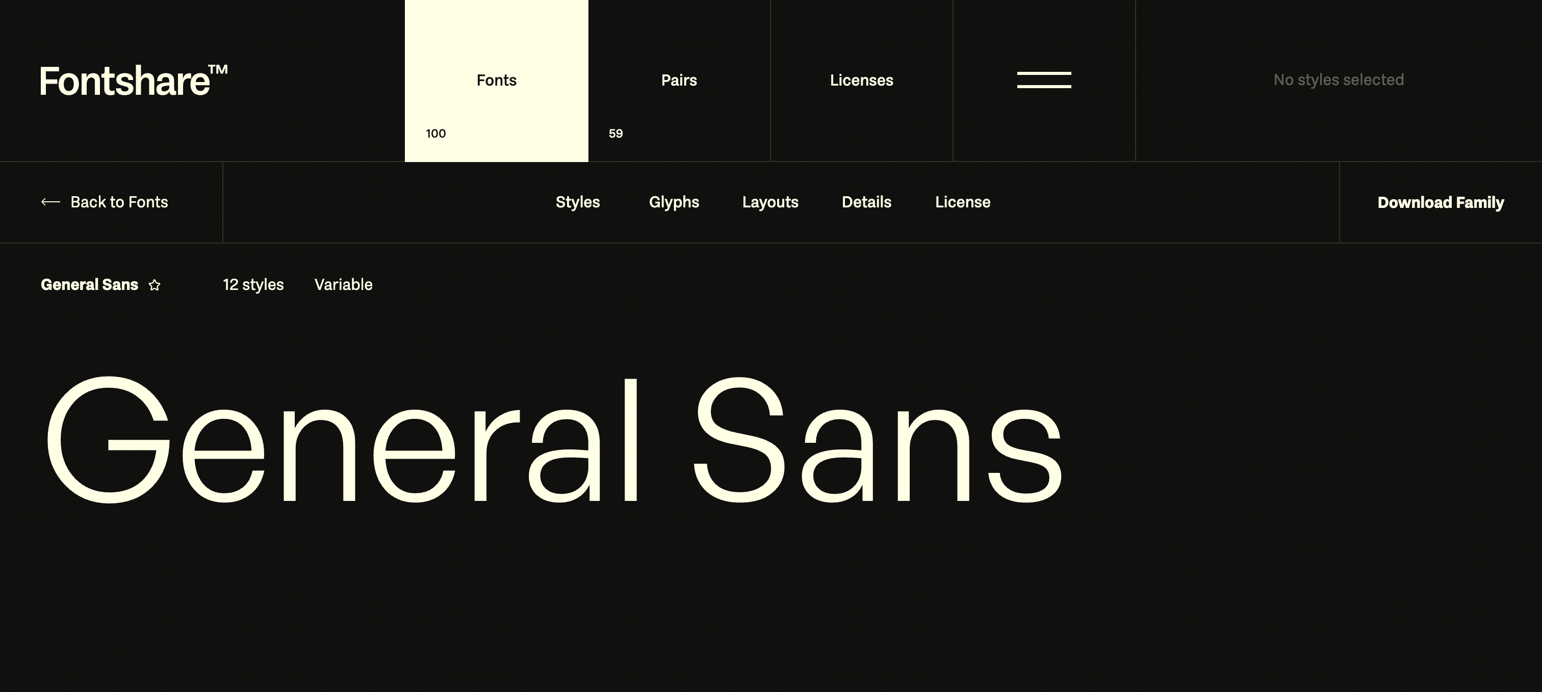
5. General Sans
Style: Clean, contemporary sans serif
General Sans is just… good. It’s one of those best logo fonts that fits almost anywhere and somehow always looks polished. It’s readable at small sizes, sturdy in bold weights, and plays nicely with others. You could use it solo or pair it with a serif to strike a clean balance.
Use for: Just about anything – modern brands, service businesses, creators, tech products, or anyone who wants a no-fuss, confident identity.
Fonts to avoid in logos (and why)
Before we look at a couple of useful tips for your logo, let’s talk about something just as important: what fonts not to use. Even though some of these fonts are free, popular, or fun to use, they can create more problems than they solve in a logo. Here’s a quick list of fonts that are best left out of your brand identity, and why they might not be serving you well:
- Comic Sans: It’s friendly, sure—but it’s also become a global punchline. It lacks the structure and balance needed for a strong logo, and most people won’t take a brand seriously if they see it.
- Papyrus: Often used to seem “earthy” or spiritual, Papyrus tends to feel outdated and overly stylized. It’s difficult to pair with anything and doesn’t scale well.
- Lobster: This script font is overused and overly decorative. It can work in rare cases, but in logos, it usually looks cramped or hard to read—especially in smaller sizes or longer names.
- Raleway Dots: It’s a fun novelty font, but it was never designed for brand identities. The dotted letterforms collapse at smaller sizes and don’t offer the clarity you need in a logo.
- Handwritten fonts (most of them): While they can look expressive or personal, most handwritten fonts lack structure, legibility, and consistency. They often don’t scale well and can feel unpolished. If you do go this route, test it thoroughly and avoid using them as your main logo type.
The bottom line: a good logo font needs to hold up in real use. These fonts either fall apart at small sizes, lack professionalism, or have been used (and misused) to the point of distraction. This is also how you can identify best fonts for logos for yourself.
Font pairing tips for logos
Great logos often use just one font, but when you need a second (like for a tagline), pairing smartly is important. Here are a few quick tips:
- Keep contrast in mind: Pair a bold header font with a lighter, simpler font underneath. For example, Bebas Neue + Open Sans Light.
- Avoid pairing two “look-at-me” fonts: Let one do the talking. If you’re using something decorative like Playfair Display, stick with a neutral sans like Manrope for support.
- Try pairing a serif with a sans serif: This combo almost always works. Try Cormorant Garamond + Inter for a classic-modern mix.
- Stick to two max: More than two fonts in a logo usually ends in chaos. Simple is memorable.
Free tools like FontPair, Fontjoy or Typ.io let you explore font combos in real time.
Conclusion
Your logo font helps shape that first impression, it’s worth spending a little extra time to get it right. Don’t stress about finding “the one” right away. Think about how you want your brand to feel, and explore fonts that give off that same energy. The given 34 best logo fonts can be a great place to start.
You don’t need fancy design skills. You just need curiosity, a few solid font tools, and a bit of trust in your taste. Play around, test things out, and when something clicks, you’ll know. You’re on the right path.
FAQ
Do I need a designer to choose the right font?
Not at all! While a designer can help refine your choices, this guide is built to help you choose the best logo fonts on your own—even if you’re not design-savvy.
Should I use the same font on my website and logo?
It depends! You can use the same logo font for consistency, or pair your best font for logo design with a complementary one for your site’s headings or body text. Just keep it cohesive.
How many fonts should I use in my logo?
Usually just one. If you add a tagline or submark, you might use two—but stick with a clear hierarchy and strong contrast when mixing logo fonts.
What file formats do I need when exporting my logo?
You’ll want vector formats like SVG or PDF for scaling without losing quality, and PNG for web use. Make sure your logo font is embedded or outlined when exporting.
How do I test if a font works with my brand name?
Type your brand name in different weights, cases, and layouts. Look at it on mobile, print, and in color vs black and white. If it holds up everywhere—it’s one of the best fonts for logos.
What is the best font for logos?
There’s no single best font for logo use—because it depends on your brand. That said, clean and versatile choices like Montserrat, Satoshi, and Playfair Display are consistently strong choices among the best fonts for logos.
What font is most pleasing to the eye?
Fonts with balanced proportions and clean spacing tend to feel the most comfortable to read. Try Inter, Lora, or General Sans—some of the best logo fonts for a soft but professional vibe.
What are the top 5 font styles?
The main font styles you’ll see in logo fonts are: Serif, Sans Serif, Script, Display, and Slab Serif (a bold variation often used for impactful brands). These styles form the foundation of the best logo fonts.
What is the best font for a minimal logo?
Minimalist logos do best with clean sans serifs like Urbanist, Manrope, or Switzer—often considered among the best free logo fonts because they let your brand breathe and work across all platforms.
Where can I find free fonts?
Start with Google Fonts and Fontshare. Both offer some of the best free logo fonts, are easy to use, and great for commercial projects.
Can I use these fonts for commercial purposes?
Yes—as long as you’re downloading from trusted sources like Google Fonts or Fontshare. Many of the best logo fonts there are free for commercial use, but always double-check licensing if you’re grabbing fonts from elsewhere.
Is Canva good for logo fonts?
Yes! Canva includes many of the good logo fonts on Canva and makes it easy to test them in context. It’s a great tool for DIY logo fonts—just be sure to upgrade if you need access to their premium fonts or full licensing.


