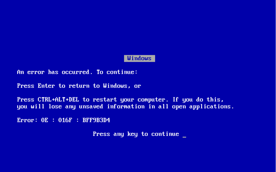
Error pages, particularly the ubiquitous “404 Not Found,” have undergone a remarkable transformation since the early days of the internet. What began as cryptic, technical messages aimed at developers has evolved into strategic touchpoints that enhance user experience, reinforce brand identity, and even delight visitors.
In the 1990s and early 2000s, encountering an error page meant hitting a dead end filled with intimidating technical jargon. Today, these same pages represent opportunities for brands to showcase personality, provide helpful navigation options, and maintain user engagement even when things go wrong.
Three Distinct Eras of Error Pages
Era 1: Technical Foundations (1990s-early 2000s)
During this period, error pages served a purely functional purpose. Pages displayed standardized HTTP status codes like “404 Not Found” or “500 Internal Server Error” with minimal explanation. These pages were designed by developers for developers, with little consideration for the average user’s understanding or experience.
Key characteristics:
- Technical language and error codes prominently displayed
- Minimal guidance for users
- No brand elements or personality
- Limited or non-existent navigation options


Era 2: Basic User Consideration (Mid-2000s-2010)
As websites became more mainstream and competition increased, companies began recognizing the importance of keeping users on their sites, even when errors occurred. This period saw the first attempts to make error pages more user-friendly.
Key developments:
- Simplified language explaining what went wrong
- Basic navigation options (usually a link back to the homepage)
- Limited brand elements (logos, colors)
- Clearer instructions for users


Era 3: Strategic Experience Design (2010-Present)
The current era represents a complete rethinking of error pages as strategic assets rather than technical necessities. Companies now view these moments as opportunities to reinforce brand identity, delight users, and provide valuable alternatives.
Key innovations:
- Brand-consistent messaging, design, and tone
- Interactive elements and gamification
- Personalized suggestions based on user behavior
- Integrated feedback mechanisms
- Mobile-optimized experiences


Creative Approaches: Turning Errors Pages Into Opportunities
Brand-Aligned Humor and Personality
Innovative companies use error pages to showcase their unique personalities:
GitHub’s Star Wars Theme
GitHub transformed their 404 page into an engaging Star Wars reference with a search droid and “This is not the web page you are looking for” message—a clever nod to the famous Obi-Wan Kenobi line while maintaining their tech-forward brand identity.


Lego’s Playful Approach
Lego’s error page perfectly aligns with their product with the message: “We’ll try not to lose our heads over this, but if we do… we’ll put it back on.” This is accompanied by an animation of a Lego figure whose head pops off and back on—turning a potential frustration point into a brand-reinforcing moment.


Pixar’s Emotional Intelligence
Pixar cleverly uses characters from “Inside Out” on their error page, showing the character Sadness looking at a broken page. This not only reinforces their brand but creates an emotional connection through their own intellectual property.


Functional Enhancement and User Guidance
NPR’s Content Redirection
Instead of showing a standard error page, NPR redirects users to archived stories and popular content. This strategy maintains engagement by immediately offering valuable alternatives.


Airbnb’s Helpful Navigation
Airbnb’s error page shows an animation of a little girl dropping ice cream—a universal symbol of disappointment—while providing helpful links to popular destinations, search functionality, and customer support options.


Interactive Elements
Google Chrome’s Dino Game
Perhaps the most famous example of error page innovation is Google Chrome’s offline dinosaur game. This simple but addictive game appears when users lose internet connection, turning a frustrating situation into an entertaining experience that has become so popular that many users deliberately disconnect to play it.


Current Trends in Error Page Management
Error pages are evolving to be more functional, ensuring users can quickly recover from disruptions without frustration. Modern trends focus on engaging and entertaining users, offering an uninterrupted experience. It is no longer a dead-end but a chance to share the brand’s message and vision.
Personalization of Error Messages
Companies tailor error messages based on context. For example, an e-commerce site may suggest alternative products instead of showing a “Page Not Found” error. Streaming services suggest similar content when a searched title is unavailable, while SaaS platforms offer targeted troubleshooting based on user history. These personalized messages keep users engaged and help them quickly find alternatives.
Emphasis on User Experience
Error pages now prioritize clarity and usability, ensuring users can recover quickly. Instead of dead ends, they offer structured guidance through intuitive navigation, search bars, and alternative content suggestions. Real-time status updates reduce confusion, while smart redirects, retry options, and self-help resources ensure users remain engaged.
Integration of Feedback Mechanisms
Error pages now incorporate feedback options, enabling users to report issues via forms or buttons. This helps businesses identify and resolve recurring problems efficiently. Automated logging further enhances error tracking, allowing proactive fixes before they affect more users.
Branding, Consistency & Accessibility
Today’s effective error pages seamlessly blend brand identity with universal usability. Netflix maintains its cinematic aesthetic with custom illustrations while ensuring screen readers can interpret the content. Etsy’s error page keeps its crafty personality through hand-drawn elements paired with keyboard-navigable recovery options. Shopify combines its distinctive blue palette and conversational tone with WCAG-compliant contrast ratios and simple instructions that accommodate cognitive differences. These companies demonstrate that brand consistency and accessibility aren’t competing priorities—they’re complementary elements that together create error experiences that truly work for everyone.
The Future of Error Experience Design
As technology continues to evolve, we can anticipate several new directions for error pages:
- AI-Powered Suggestions: Using machine learning to predict what users were looking for.
- Voice Interface Adaptations: Creating appropriate error responses for voice-activated devices.
- Augmented Reality Integration: Using AR to guide users through troubleshooting steps.
- **Predictive Error Prevention:**Systems that identify and address potential errors before they occur.
Conclusion: Transforming Obstacles into Opportunities
The evolution of error pages represents a broader shift in digital design—from technical-focused to human-centered approaches. By treating errors not as technical failures but as opportunities for brand expression and user assistance, companies can turn potential moments of frustration into meaningful interactions.
The most successful error pages balance practical functionality with brand personality, providing clear guidance while maintaining user engagement. What was once an afterthought in the development process is now recognized as a critical touchpoint in the overall user experience journey.
As you consider your own error page strategy, remember that these moments of disruption often create the strongest impressions. A thoughtfully designed error experience can transform a potential exit point into a defining moment that strengthens user loyalty and reinforces your brand’s commitment to exceptional experience—even when things don’t go as planned.


