Learn how to optimize your visuals for each platform with these 15 social media post design tips—simple, effective, and up to date.
If you’re a social media manager, one of the hardest parts of your job is keeping up with all the different platforms. While you can recycle some assets to create content faster, you need to know about the best-performing formats for each platform you use.
The job of posting on multiple social media sites at once can be overwhelming and, frankly, confusing. For example, Reels outperform traditional video posts on Instagram by 22%. Even within the same platform, you need to know the insider tips to get the best out of your posts.
To help, we’ve put together this handy guide for all your social media post design needs. Whatever the platform, we’ve got you covered.
Facebook Post Design Tips
Tip 1: Keep the mobile user in mind
Facebook has a wide array of features to use. They host photos and video content, live streams, and stories. Employing a wide variety of posting styles will improve your reach, but make sure they all look good on the small screen. A massive 98% of Facebook Users access the platform via their cell phone, so it’s important to keep that in mind.
Tip 2: Add text to your photos to outsmart the caption-skippers
You may have lots of great things to say about a product, but your casual social media user might not be equally excited. When posting an image or video, overlay some keywords or a call-to-action (CTA). With this technique, you might be able to get the attention of the TL;DR crowd who’ll breeze right by your lengthy caption.
This jewelry brand has the ‘50% off’ front and center in their visual content to make sure you can’t miss it.
Instagram Post Design Tips
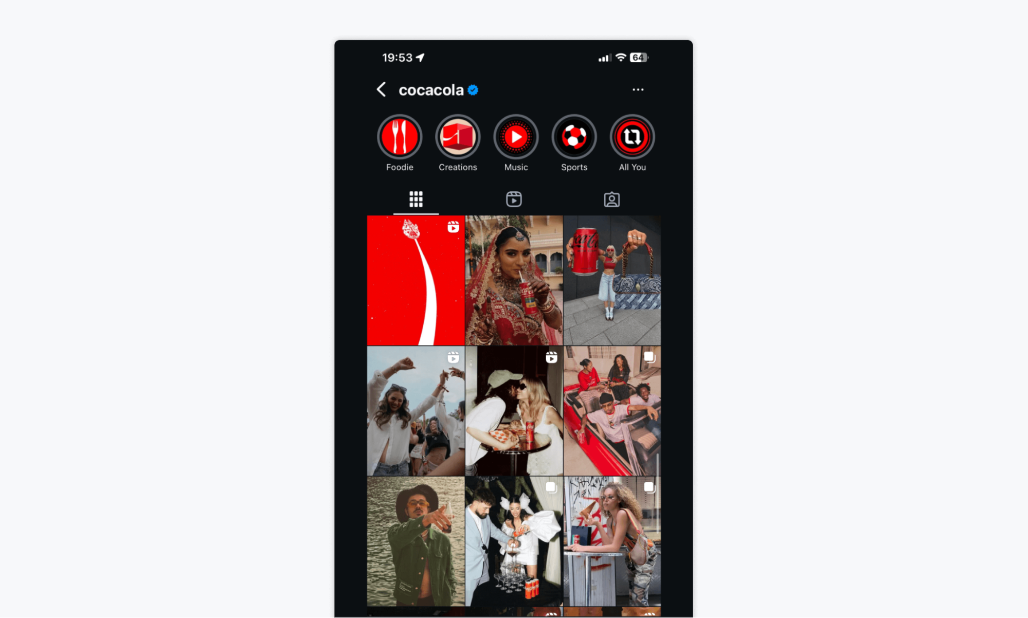
Tip 1: Design for a grid view—make your feed look cohesive
Although it can be tempting to mix it up with your Instagram posts, you need to keep a common thread among them. When users click on your profile, they see the grid in its entirety. Make sure it looks attractive and uniform. Creating a strong brand voice can foster more brand loyalty. Follow Instagram trends and see what big brands are doing to make their grids look good.
Coca-Cola has a great aesthetic. Their grid posts have a low-contrast vintage vibe but with a pop of that iconic red color. Just one glance and you’re thinking of Coca-Cola.
Tip 2: Prioritize vertical (4:5) for feed, 9:16 for Stories/Reels
In early 2025, Instagram shocked the social media world with a big change. Gone are the famous 1:1 grid squares in favor of a 4:5 aspect ratio. Stories and Reels are also in a different shape. Consider how your content will appear in each format. Preview your posts in the grid to ensure they look exactly how you envisioned them.
Tip 3: Use clear focal points and bold colors to stop the scroll
Something as simple as color psychology can have a huge impact on engagement. Consider your desired vibe and research what colors work best. Bold and contrasting colors can be great for grabbing attention.
Using a clear focal point is an old photography trick that guides eyes to the most important component of your image. Crop your images so that the viewer is drawn to what you want them to see. The faster you catch their focus, the longer they’ll look.
LinkedIn Post Design Tips
Tip 1: Use clean, professional visuals—avoid overly flashy templates
LinkedIn is known for being the most professional of the social media platforms, so it makes sense that their aesthetic follows suit. Users mean business, so think about that when you’re considering what to post on LinkedIn. They don’t need all the bells and whistles you might use on Instagram or X. Stick to the facts and keep it slick, no glittery stickers necessary.
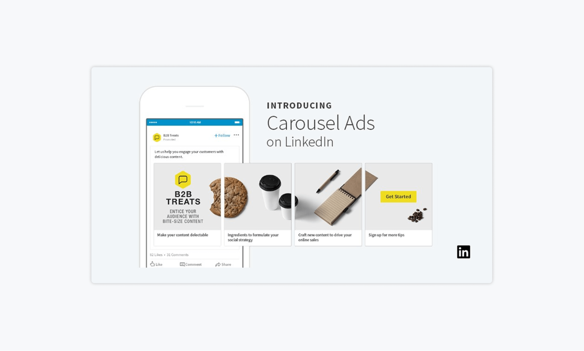
Tip 2: Use carousel posts to break down info step-by-step
LinkedIn’s carousel feature is a great way to break down your long-form content into easily digested small bites. You can repurpose your blog posts by cherry-picking the juiciest tidbits for your carousel. Entice the user to click through to the next tile. Pique the viewers’ interest to drive them to your original content and earn double the clicks.
X / Twitter Post Design Tips
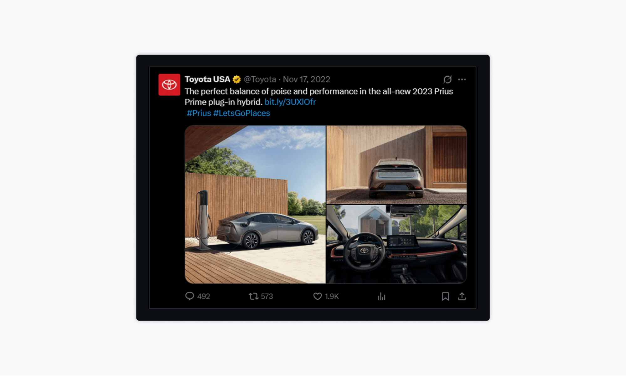
Tip 1: Use eye-catching thumbnails for image/GIF/video posts
By nature, X has a lot of text. Incorporating visual content into your feed can help you stand out. Consider adding a GIF to your post. This increases the chance that users will stop and read your post, as movement draws the eye.
For still images, try out multiple photos that work together as a set. Toyota USA keeps the text brief and lets the images do the talking on their X account.
Tip 2: Keep graphics minimal—this platform favors fast, scannable visuals
Even with the recent extended character limit, X users are used to short posts. This maybe isn’t the best place for infographics with large amounts of information. Use scannable visuals to make the most out of the scroll-by.
TikTok and Reels Design Tips
Tip 1: Use on-brand captions/subtitles to boost watch time
Believe it or not, captions and subtitles can boost your watch time. Although there are a few loud exceptions on the subway, 80-85% of users watch videos on social media with the sound off. Adding captions/subtitles is a great way to hook people in, as they can understand the video even if they forgot their headphones.
Tip 2: Design cover thumbnails that align with your grid and attract clicks
The ability to choose a cover thumbnail that aligns with your aesthetic is a great asset. Instead of underflattering video stills, you can keep your TikTok/Reels grid looking cohesive no matter the content.
It’s important to choose a thumbnail that not only looks good, but also intrigues viewers. You can use text that spikes interest or poses questions. You can use bold colors and striking visuals. You can post an ‘end result’ thumbnail that entices users to click on the video and learn about whatever process got you there.
Pinterest Post Design Tips
Tip 1: Use vertical pins to take up more screen space
Vertical pins fit the Pinterest format best and therefore are the most visually appealing. If you fail to use the optimal format, you risk your content being cropped on the feed or appearing in a way you didn’t intend. Stick to the 2:3 ratio for success.
Tip 2: Add a bold text overlay to explain your pin
While Pinterest is an inherently image-based platform, adding a little text can really boost your numbers. If you want people to click into your profile and read your captions, they need to know what you’re trying to show them.
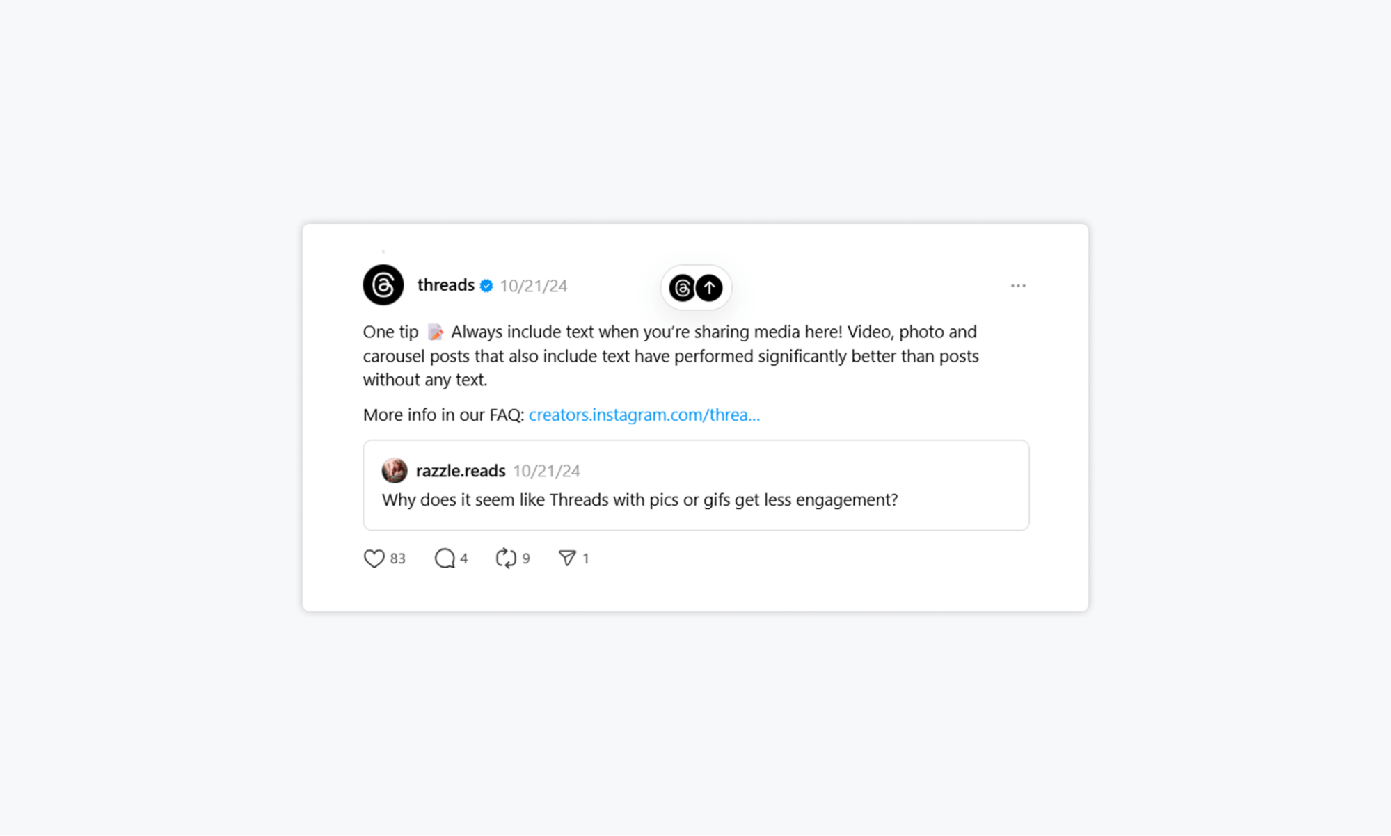
Threads Post Design Tips
Tip 1: Always add text with media
The people at Threads themselves have recommended this tip in response to a user who experienced low engagement on media posts. In order to cast your net wider, you need some searchable keywords alongside your photos and videos.
Tip 2: Experiment!
Threads is one of the more recent platforms on the scene, at just two years old. As there are no long-established best practices, Threads trends are always changing. Use text, video, and images to keep your feed varied and fresh. Take advantage of the relatively informal tone of the platform and throw in a meme or two. Have fun with it.
In Short
It’s vital that you pick up some platform-specific design tips if you want to maximize your social media performance. Each platform has unique features, audience behaviors, and visual preferences. A one-size-fits-all approach won’t cut it. You have to tailor your visuals if you want to stand out from the crowd.
A social media platform like Gain can help you create, manage, and approve your social media content and make it look good, too. With our handy preview feature, you can show your clients exactly how their Instagram grid will appear. You can see what looks great and what needs tweaking, all before it goes live. What’s not to love?
Try Gain for free today (no credit card required).


