Reminders in iOS 26 has a few new smart features with Apple Intelligence, and a restrained visual upgrade over iOS 18. Here’s how the two versions compare.
The Reminders app isn’t really an app that people think about that can do with some improvements. What Apple has at the moment is already a pretty good tool for making lists and following through with them.
With the introduction of iOS 26 at WWDC, Apple made quite a few alterations to the app. While the general structure remains untouched, it has refreshed the appearance as well as made it much smarter.
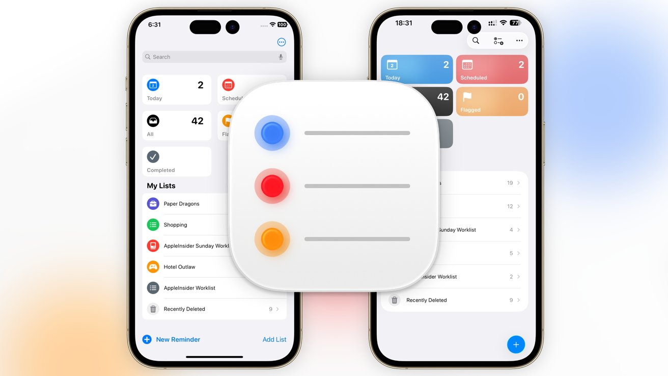
Reminders iOS 26 vs Reminders iOS 18 – Main screen
The first screen you see in Reminders is the first hint that there are changes at play for the app. The bones of the layout are identical across iOS 26 and iOS 18, with the main sections at the top and My Lists below, complete with items in each.
However, just like other first-party apps, Reminders has been hit by Liquid Glass, Apple’s new aesthetic for all of its operating systems.
The initial manifestation of this is a change from a small, round, colored icon on a white button for the top five sections to the opposite. Instead, the color-coded segments are filled up with color, while the white is reserved for the representative icons, which makes it quite a bit classier.
It’s almost as if Apple’s communicating that you can touch the entire button, whereas the circular icons almost seemed like smaller buttons on a larger white backdrop, though really the entire thing was the button.
There’s a little bit more whitespace around the My Lists section, which also makes it a little bit easier to tap each list individually.
In iOS 18, the interface included a dots icon in the top right to edit the lists and to load from a template. At the bottom were options to create a new reminder or to add a new list, while a search bar appeared if you pulled down.
The iOS 26 approach changes things up, so that a Liquid Glass lozenge in the top right has icons for search as well as to create a new list, and the edit lists/templates button. At the bottom is a single blue button with a plus symbol, which is to create a new reminder.
While this is fairly neat in iOS 26, it’s less intuitive than before, especially since Apple has switched away from text to ambiguous buttons for new lists and new reminders.
Reminders iOS 26 vs Reminders iOS 18 – Reminders and New Lists
Setting up a new reminder has changed quite a bit. Most of it is in a restructuring of what is asked of the user to generate the reminder.
In iOS 18, tapping New Reminder has boxes for Title and Notes, an option to select the list, and Details. The last one brings up toggles for Date, Time, Location, When Messaging, and Flag, with extra options for Tags, Priority, a URL, and an image that could be added.
The iOS 26 update lets you enter in a bit more information than before, with top boxes including Title, Notes, and URL. Toggles are also immediately presented for Date and Time, then a setting for the list itself.
A Details link is also available for the other items, including adding tags, flagging the item, setting priority, then Location and When Messaging for when to remind the user, and adding images.
Apple hasn’t changed the information requested here, nor the options. But, much like other changes in iOS 26, it’s a refinement that lets users add a lot more without necessarily needing to take the extra step to go into Details.
In stark contrast is New List, which is the way you add a new list to the collection. While Apple has refined the structure of making a new reminder, the list generation screen remains practically untouched.
Even when it’s a smart list rather than a standard one, everything in iOS 26 is identical to what’s shown in iOS 18, with a little added Liquid Glass spit and polish.
The only differences are a hint of Liquid Glass and the change from “Done and Cancel” at the top to a tick and a cross. There are no real changes here.
Sometimes, no changes are needed if the function works good enough.
Reminders iOS 26 vs Reminders iOS 18 – List views and Apple Intelligence
Opening one of your lists comes up with the usual view of items, which you can quickly add to or tick to say they are done. It’s quite similar across iOS 18 and iOS 26, which is to be expected for a list app.
The first obvious change is that iOS 18 has a “New Reminder” text at the bottom, making it obvious where to tap to add something new. In iOS 26, it’s the equally understandable Plus icon in the bottom right.
Icons in the top right open up the share sheet, as well as more options for the list. Both operating system versions have the same broad list of options, such as to show completed tasks, to select and rearrange reminders, to adjust the list information, to add sections, and to view as columns.
In the case of iOS 26, there’s the option to “Auto-Categorize,” complete with an Apple Intelligence logo. If selected, it will analyze the list and put all of the items into sensible categories.
For example, a shopping list could have sections for Dairy, Cleaning Supplies, and Fruits. You can create sections manually, but this seems to be quite robust and makes sensible categories where possible.
If you don’t like what Apple Intelligence selects for the categories, you can always disable them all with a few taps, return to a full-list view, or make them yourself.
This addition is quite helpful, but is especially so for lengthy lists of items or tasks that can be easily categorizable. Not everyone wants to manually sort out a list of 50 shopping list items by category, especially when there’s a button that can do it for you.
Of course, with Apple Intelligence being a major part of iOS now, it can do more in Reminders.
Apple says that Apple Intelligence will be able to suggest tasks to add to lists, grocery items to shopping lists, and other follow-up tasks. It will do so by detecting potential items based on emails and other readable text on the iPhone.
This could be handy if you use task lists regularly in your life, or if you feel you really need to, since Apple Intelligence will be nudging you to use Reminders more often.
Reminders iOS 26 vs Reminders iOS 18 – Smarter changes
The Reminders app was in a good place in iOS 18, in terms of how it looked and what it could do. As an app for keeping lists and reminding users, it was an excellent app that competed strongly with third-party rivals.
Apple’s revisions in iOS 26 keep the heart and the vast majority of the app intact. Anyone who uses Reminders in iOS 18 will be immediately at home in iOS 26 and quickly get what they need done.
While Apple has made tweaks to make it more productivity-friendly, the inclusion of Apple Intelligence is a big one. Especially since it doesn’t overwhelm or replace any features, but adds to the overall experience.
From the simple automatic categorization of list items to suggesting additions, these are fairly obvious areas where Apple Intelligence can help out.
The real question is to ask where Apple Intelligence can be even more assistive with the app.


