I recently updated my iPhone to iOS 26, and while there are some genuinely impressive features this year, the standout is clearly the new Liquid Glass design language. This is easily one of the best-looking versions of iOS Apple has ever shipped.
Everything feels shinier, more fluid, and almost futuristic. But as good as it looks, the more time I’ve spent with it, the more obvious it’s become that Apple has leaned a little too far toward aesthetics this time. The Liquid Glass design language is gorgeous in motion, but when it comes to actual practicality, it’s a step backward.
iOS 26 might be the prettiest iOS release yet, but that beauty comes at a cost.
iOS 26 made reading harder than ever
Pretty at first, painful later
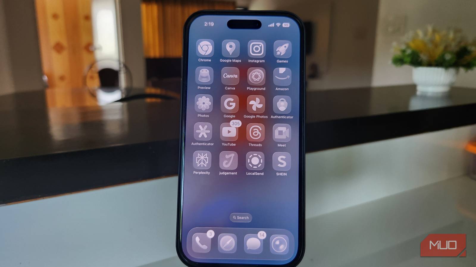
The Liquid Glass design definitely wins style points, but living with it has made everyday readability a chore. The biggest problem is contrast, or rather, the lack of it. A light wallpaper in the background is all it takes for text to start melting into it, leaving menus and labels looking scattered and unfinished. In apps where dark and light elements sit side by side, the problem is exacerbated.
As you scroll, iOS constantly switches text between black and white in an attempt to keep it visible, but instead of helping, it just makes the whole interface feel jittery and distracting. There is sometimes just too much going on at the same time.
Notifications are no better. I used to love pulling down the lock screen just slightly to get a quick glance at what I’d missed, but now those notifications float right on top of whatever I’m doing.
Half the time, they’re barely legible depending on the background behind them. The new Clear icons fall into the same trap. They’re gorgeous at first, but as soon as you add widgets, the text becomes so faint that I eventually gave up and disabled them altogether.
These iOS 26 tweaks finally fixed the problem
Going back to function over form
Thankfully, I’ve found a few fixes that helped improve legibility quite a bit. That said, I don’t recommend turning them all on at once. Instead, start with one and see how it feels, then add another if you’re still struggling.
Each of these tweaks comes with an aesthetic cost; things won’t look quite as polished or striking as Apple intended—but in exchange, they become far easier to read and live with day to day. It’s really about experimenting and finding the balance that works best for you.
Enable Reduced Transparency


Your iPhone comes with plenty of accessibility features, and sometimes they’re useful beyond their intended purpose, and this is one of those cases. There’s a setting you can toggle that tones down a lot of the Liquid Glass effects. Instead of every element refracting around, it replaces them with solid backgrounds, which makes everything much easier to read.
For me, this was the single biggest fix. Sure, the trade-off is that the interface looks a bit more basic, but I didn’t really mind losing a bit of visual flair in exchange for far better readability. You can turn it on by opening the Settings app and heading over to Accessibility > Display & Text Sizes, and toggling on the Reduce Transparency option.
Turning on Reduced Transparency replaces your Home Screen wallpaper with a solid color. Your Lock Screen wallpaper will, meanwhile, remain unaffected.
Change your wallpaper
If turning on Reduced Transparency feels a little too much, you can try switching to a simpler wallpaper instead. As much as I’d like to use my favorite wallpapers, I’ve found that going for something more neutral and darker makes a noticeable difference. Text becomes hardest to read when the wallpaper has both dark and light elements mixed together, so opting for a simpler background pays off. Darker wallpapers also generally look better than lighter ones with the new design.
One thing I’d avoid entirely is the new Clear icons. The icons themselves are fine, but they make widgets far harder to read. In fact, some third-party widgets don’t even render properly yet, which makes the whole setup more frustrating than it’s worth.
Enable Bold Text


I wasn’t personally a fan of keeping this option on, but it did make a big difference for some people I know who couldn’t stand the Liquid Glass design. As the name suggests, it makes all the text on your iPhone bolder. That extra bit of weight gives you better contrast and makes it easier to tell elements apart, though the overall look might not be for everyone.
You can make your text bold by heading over to Settings > Accessibility > Display & Text, and turning on the Bold Text option.
These small changes make Liquid Glass even better
In the end, Liquid Glass is one of those changes that really splits people. Some love how fresh and polished it looks, while others find it distracting or even frustrating.
My mom disliked it so much that she actually wanted to downgrade to iOS 18. I am not the biggest fan of it either, but iOS 26 still brings plenty of hidden improvements along with other features that make the trade-offs worth it. It is not perfect, but I can live with the compromises for everything else it adds.


