Mishaal Rahman / Android Authority
TL;DR
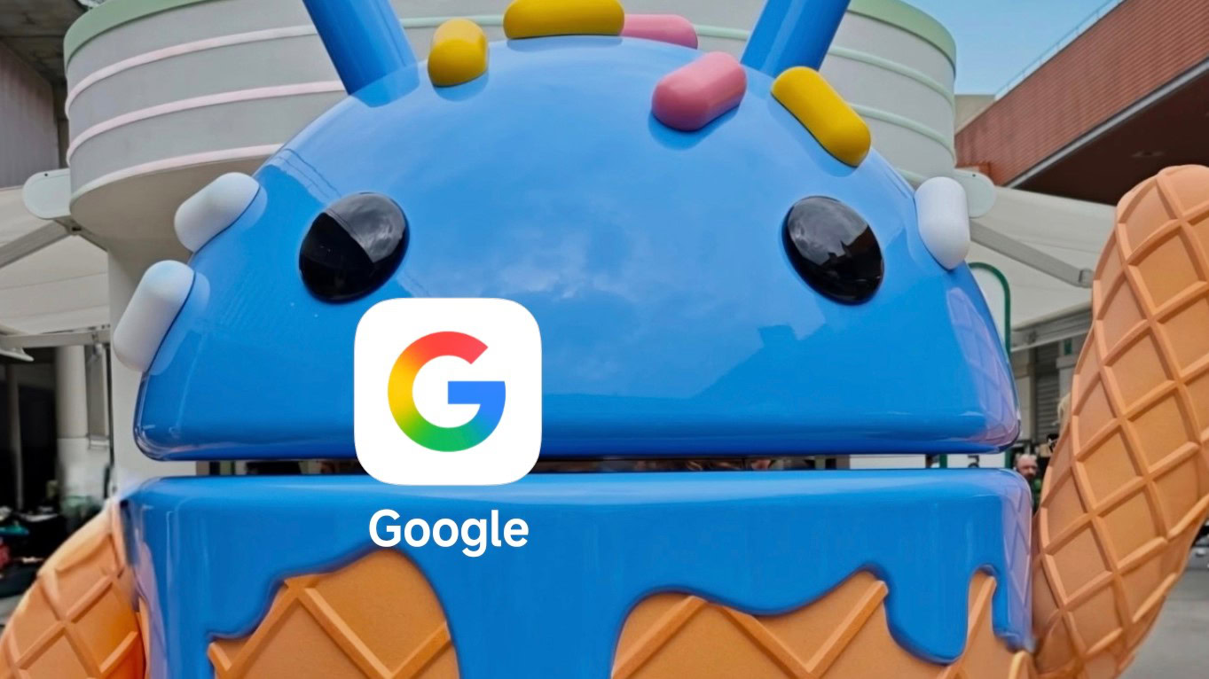
- Google updated the look of its multi-color G logo earlier this year with a new gradient design.
- First popping up attached to the Google app, we later saw the new colors spread to Gemini.
- Now Google’s going official with the redesign, and says we should see more of it soon.
This past summer was one just full of change, and that was especially true for Google’s Android apps. With the embrace of Material 3 Expressive, apps tried on a whole new look, introducing colorful, high-contrast interfaces. Back in May, we first spotted Google trying out another new look, as it updated its multi-color G logo with a fresh new rainbow gradient appearance. It didn’t take long before we started seeing the spread of this new icon, popping up attached to Gemini in early July. It’s been a few months since then, but apparently that new logo’s spread is just getting started, as Google announces plans to make it the official look of the brand, everywhere.
Don’t want to miss the best from Android Authority?
Google tells us that this new G “visually reflects our evolution in the AI era” — apparently the lighter, brighter colors are supposed to evoke feelings of creativity and innovation, and the gradient could show constant change being embraced.
What do you think of the new rainbow gradient G?
0 votes
Going forward, expect to see a lot more of this rainbow G across Google products and services, as the company updates the rest of its branding, both with this new icon itself, and also by using the same sort of color gradient.
Is this a move in the right direction for Google? We want to hear from you, both in our poll above, and also in the comments below with your more detailed thoughts on the rebranding. Is this just change for the sake of change? Let us know what you think.
Thank you for being part of our community. Read our Comment Policy before posting.


