Joe Maring / Android Authority
Like many of you reading this, I use YouTube multiple times per day. And for the past week, anytime I’ve watched YouTube on my computer, I’ve been distracted by the terrible, horrible, no good, very bad new UI.
Last Tuesday, Google announced a series of significant visual changes for YouTube, the most prominent being a redesigned video player. Some people have had access to it for a couple of months, but it’s now officially available to the masses, and I’ve been living with it for a little over a week. And, simply put, I really don’t like it.
Is this new YouTube UI the end of the world? The biggest problem facing YouTube right now? Of course not. But it’s not a positive change, and so much of it has me scratching my head, trying to understand what Google was thinking.
Do you like the new YouTube UI?
169 votes
Everything wrong with the new YouTube UI

Joe Maring / Android Authority
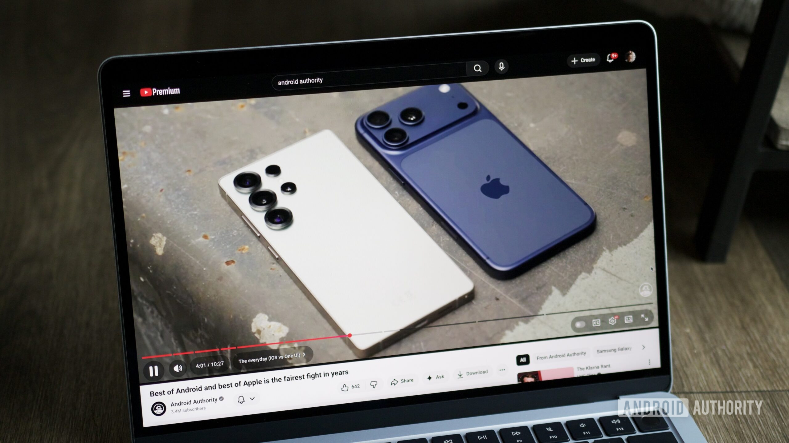
Previously, YouTube’s video player displayed all playback controls under the progress bar, with no fancy styling — just a series of icons for play/pause, volume, video settings, etc. All of the controls are still under the progress bar, but they now have a fresh coat of paint that’s just … strange.
On the left side are still controls for play/pause, volume, and the timestamp. However, each one is now housed in its own bubble with larger, cartoony icons that take up more space than the old design. The controls on the right side are largely the same as before. There’s an autoplay toggle, closed captions, video playback settings, theater mode, and full-screen — all familiar stuff.
But here’s where the “mess” part of my headline becomes clear. While the buttons on the left are displayed as standalone icons, those on the right are grouped into a large cluster. Why not just choose one or the other?
More importantly, everything now features a translucent gray background that (unfortunately) reminds me of Liquid Glass in iOS 26. And based on my time with the UI so far, it actually makes the icons more difficult to see than before. I think the translucent gray background was intended to help the buttons stand out more without distracting from the video you’re watching, but in practice, it has the opposite effect.
This is especially noticeable when you click the playback settings button. The menu layout is largely unchanged, but the gray background is much more translucent than before, to the point where it can be really challenging to read depending on the video you’re watching.
While the new UI hasn’t ruined my YouTube watching, that doesn’t excuse how unpolished and half-baked it looks. It really feels like a poorly designed fan-made concept rather than something created and shipped by a trillion-dollar company. And yet!
This could have been so much better

Joe Maring / Android Authority
I think what’s especially frustrating with this YouTube UI is that it could have been so much better. The old UI was fine, but if Google really wanted to change it, it has an excellent design language in Material 3 Expressive that it could have used instead.
I know not everyone is a Material 3 Expressive fan, but a lot of thought and intention has clearly gone into it — as we’ve seen with other Google apps that have adopted it. Why not use that for YouTube’s redesign instead of the current UI, which feels more like an iOS knockoff than anything else? Then again, why does Google do anything it does? That’s a question I ask myself frequently.
Do you have the new YouTube UI? Do you like it? Do you hate it? Am I crazy for writing 600 words about some silly UI changes? Let me know in the comments below, leave a Super Chat, and don’t forget to like and subscribe.
Thank you for being part of our community. Read our Comment Policy before posting.


