Joe Maring / Android Authority
TL;DR
- Google is addressing user complaints by adding a Calling Cards shortcut to the “Organize” tab in the Google Contacts app.
- The Google Phone app is receiving further Material 3 Expressive updates, specifically bringing a cleaner, card-based UI to the Call Screen settings.
- These features have not yet rolled out to the public.
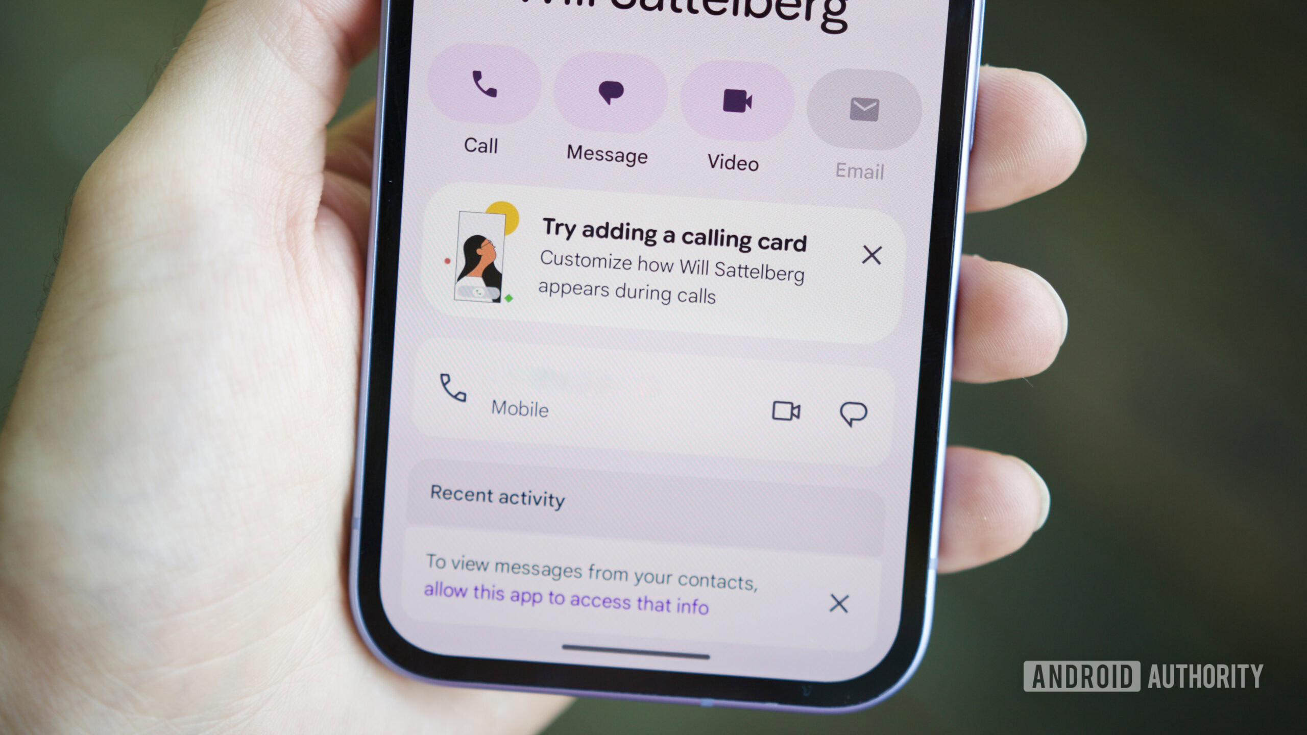
Calling Cards on Android is inspired by iOS’ Contact Posters, and Google has been spotted working on addressing the biggest complaint about them. In the process, Google is also working to address other shortcomings. Many users expect Calling Cards to be part of the Google Contacts app, but the feature is in the Google Phone app. To address this, Google could soon add a shortcut to Calling Cards in the Contacts app. The company has also been spotted refreshing more parts of the Phone app with Material 3 Expressive.
Google Contacts app is getting a shortcut to Google Phone’s Calling Cards
Currently, users can access the main Calling Card management screen only from within the settings menu of the Google Phone app, which is intended behavior. In Google Contacts v4.72.5.862509763, we’ve spotted code that suggests Google Contacts could also provide a shortcut to open the Calling Cards screen. We’ve managed to activate the shortcut to give you an early look:
As you can see, the Organize tab in Google Contacts could get a shortcut for Calling Cards. Tapping the option opens the Calling Cards management screen in the Google Phone app.
Don’t want to miss the best from Android Authority?


Expressive UI is coming to more parts of the Google Phone app
The Google Phone app has been revamped with Material 3 Expressive for the most part, but some settings sub-menus still use the older UI. Within Google Phone app v208.0.864581421, we’ve spotted Google working on bringing Material 3 Expressive to more parts of the UI, namely the Call Screen section. We’ve activated the new UI to give you an early look ahead of its release:
As you can see in the screenshots, the animation in the top area has been removed. Thanks to the card-based UI, the Call Screen settings look nicer and less cluttered.
These changes have not rolled out for users in either app. We’ll keep you updated when we learn more.
⚠️ An APK teardown helps predict features that may arrive on a service in the future based on work-in-progress code. However, it is possible that such predicted features may not make it to a public release.
Thank you for being part of our community. Read our Comment Policy before posting.

