When the first signs of Material 3 Expressive started showing up in Android’s QPR betas, I wasn’t impressed. Even as my colleague Mishaal raved about it and how good it looked and documented its progress in every beta, I still didn’t jump on that hype train. When the update finally landed with Android 16 QPR1, I avoided installing it for a few weeks. In my mind, I was protesting against another unnecessary design change.
Material You was good enough. It still looked nice, it worked well, I was used to it, and everyone I knew with a Pixel phone was used to it. It didn’t need a facelift and thousands of wasted development resources when Google’s teams could’ve spent that time implementing actually useful features instead of Material 3 Expressive. At least that’s what I thought. Then I set up my new Pixel 10 Pro XL and… I was smitten.
One month later, are you still enjoying Material 3 Expressive on your Pixel?
224 votes
Material 3 Expressive feels alive and playful
Rita El Khoury / Android Authority
I’m not alone in feeling this way. Two-thirds of you said you love Material 3 Expressive on Android. You said it’s “more vibrant,” “it looks better,” it’s “much better than I thought it would be,” and “an overall positive change.” Someone even left a ❤️ emoji as a comment — no other words needed. I didn’t want to agree with these comments; I tried to keep my grumpy, change-for-the-sake-of-change hating feelings, and shrug at the squiggly wiggly lines, bouncy icons, blurry backgrounds, and funky animations. I even tried to adopt Robert’s “Euclanoia” word to describe my feelings.
Material 3 Expressive looks like whoever designed it was having the time of their lives doing that, and it’s contagious.
But I admit, I was wrong. I love all of it. I love how playful and fresh everything looks, how smooth and natural the animations feel, how jolly the new typography looks, and how familiar yet still “new” my quick settings, notifications, app drawer, and lockscreen look. Everything is bolder, more colorful, and has more contrast now. It’s like every element on the screen pops up when I look at it. Material 3 Expressive looks happy, and young, but mostly happy. It seems like whoever designed it was having the time of their lives doing so. And it’s contagious; you can’t stay indifferent to that.
Don’t want to miss the best from Android Authority?


This design is a pure dopamine hit

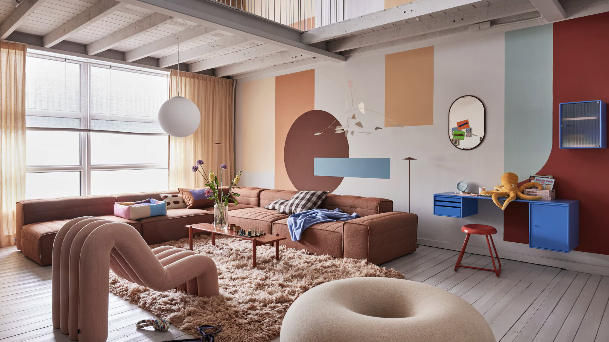
There’s a trend in interior design called Dopamine Decor that emphasizes vibrant hues and whimsical forms. Gen Z is all about it because the entire goal is to uplift your mood and reflect your individuality when you look at it, as opposed to the white, neutral minimalism that was prevalent in previous years. Dopamine Decor forces you to be happy because it just looks joyful with its bold colors, playful shapes and forms, slightly kitschy elements, and all of its layers and textures. Sounds familiar? Material 3 Expressive is precisely that, it’s Dopamine Decor applied to the one screen you look at all the time. It allows you to bottle that dopamine hit that a lively living room or bedroom can provide and take it with you on the go, everywhere.
Everything about Material 3 Expressive is entirely unnecessary, but I wouldn’t trade it back to Material You.
Yes, the squiggles are entirely unnecessary — everything is entirely unnecessary, to be fair — but I wouldn’t trade it back to Material You anytime soon. I can’t imagine going back to a perfect eight-grid large quick settings toggles alignment. I prefer my new, completely customizable, mismatched toggles. I don’t want the boring old lock screen or clock fonts, the stiffer fonts, the single-hue notification area or app drawer background, either. Nor do I want third-party apps like Backdrops Wallpapers to go back to their older design. Android 15 looks dull in comparison now, like it’s lacking the life that Android 16 has.
Form over function, or form over function?

Joe Maring / Android Authority
Look, there’s a part of me that still would’ve liked Google to not waste precious resources on embellishing a design that was already fine and that everyone was familiar with. I don’t want to re-teach my parents how to answer a phone call just because a designer on the Phone app team decided that up-down gestures to answer or reject should now go sideways. Nor do I want to keep showing them how to turn off their phone because the power button doesn’t do what its name says anymore.
Instead, I have lists upon lists of functional, useful features that I’d like Google’s teams to implement in Android and in their own apps. Search in channels on YouTube mobile, downloading full folders in Drive, natural language event entries in Calendar, a million improvements for pedestrians and transit users in Maps, actual Bluetooth support for Bluetooth trackers in Find Hub (they only work when you’re online, not on Bluetooth, can you imagine?), even more powerful routines in Google Home, a more customizable Pixel Launcher, per-app volume controls, auto-blurring of sensitive data in screenshots before sharing them, and on and on.
In my focus on wanting function over form, I forgot how important and impactful form is.
Fixing old and persistent bugs, adding this kind of extra functionality, those are the things that would tremendously impact my day-to-day use. But in my focus on wanting function over form, I forgot how important and impactful form is. Or how much it can improve my entire experience, even if the functionality remains largely unchanged behind it.
But now that we have this new look, and we finally have Mark as read in Gmail’s notifications, can we please focus for the next year or so on getting the rest of those essential features? Please, Google?
Thank you for being part of our community. Read our Comment Policy before posting.


