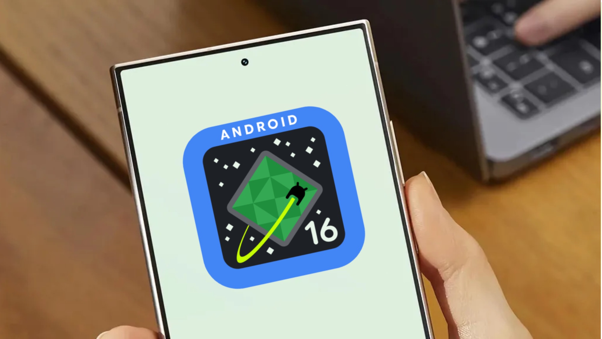
A new version of Android could be ready for Google I/O 2025 in less than a month — or sooner if Google’s planning to show off Android 16 at the May 13 edition of The Android Show happening a week before the developer conference. But based on Android 16 betas, the look of that release is pretty much set in stone.
That may not be the case for future Android 16 updates, though. Thanks to some code diving, we have an idea of what a redesigned Android 16 UI might eventually look like.
The potential Android 16 future UI comes to us via Mishaal Rahman of Android Authority. Reportedly, Rahman discovered the changes while exploring code in the Android 16 Beta 4.
Right now, the Android 16 Beta 4 is available, and it’s the final platform stability release before the full public launch. While Google might iron out some bugs, no new features or designs are going to emerge before Android 16’s release. Based on Google’s timeline, the updated OS should launch in May or June at the latest.
After that, though, some interface changes could be in the works, based on what Rahman found. And before diving into it, it’s important to remember that features shown may be works in progress or may not actually emerge it all.
Android 16 changes
While most of the images Rahman shows reveal a rounder selection of shapes, he also found different icon shapes in the Pixel Launcher with a suggestion that more “geometric” shapes might appear down the line.
The current shapes he found include a square, a “four-sided cookie,” and a “seven-sided cookie.” It looks like whatever design you pick will appear on the home screen and the app drawer.
The biggest change appears to be with the notification panel.

Currently, if you pull it down the panel, it sits on a black background. In the update, it would have a blurred look that kind of lets you see the colors of what’s behind.
Additionally, the redesign shows new tiles that appear rounder than they already are. The interior icons themselves appear to be squarer when pressed, which Rahman attributes to a new “one-tap” approach from Google.
Meanwhile, sliders appear thinner with a long rectangular bar with softer corners than the current pill-shape.

A smaller change across the whole look are altered fonts that are bolder. It’s most noticeable in the text clock, which appears larger and bolder than before. A new vertical bar indicates the position of the volume bar.
There’s also some pops of color in new areas including the battery icon which is green when charging and red when low.

These visual changes were forced by Rahman turning on code in the Android 16 beta that aren’t turned on. So, it’s not clear when or if these changes will actually appear down the line. Still, all of these changes do seem to find the Material 3 “Expressive” design ethos that Google introduced in the last year.
As a reminder, if this was launching with the expected public release of Android 16 later in May, or June, these feature would probably have been revealed in the beta 4 or 3. Presumably, they could release in later this year, possibly when the Pixel 10 lineup launches, which is expected to happen in August based on last year’s Pixel 9 rollout.


