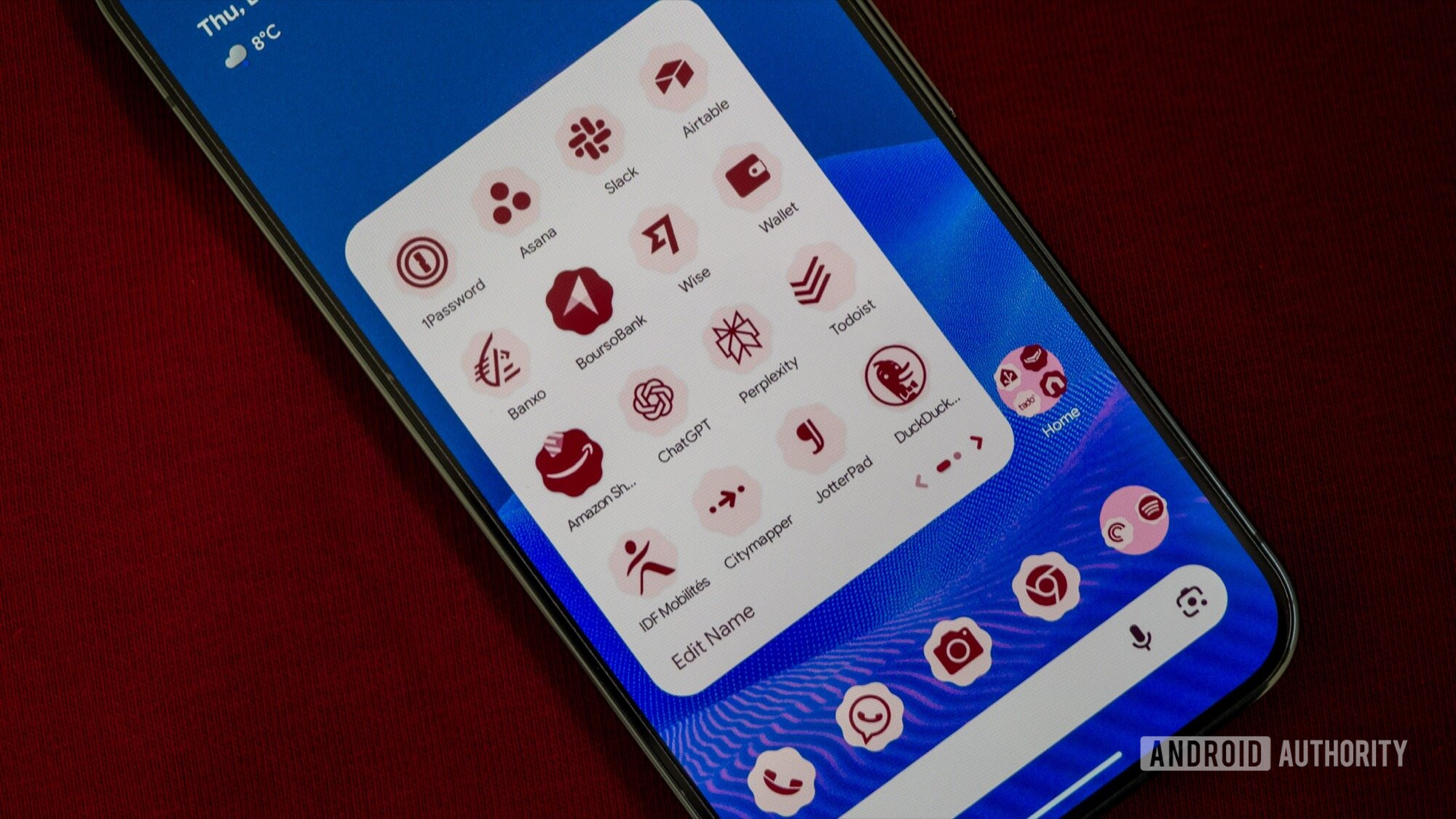
Android 16 got its second major update earlier this week, with QPR2 rolling out as the December update for Pixel phones. This was such a significant milestone with many features we’ve heard about for months stepping out of testing and coming to our phones on a stable build. Two of these features are centered around icon launcher customization, and as a Pixel Launcher fan, they’re the first two things I immediately checked when I updated.
First, Google has brought back icon shape customization, a feature that was available in the default Pixel Launcher up until Android 11, but was removed with Android 12’s Material You. Second, Google has finally implemented forced icon theming, which makes any icon adapt to your current Material color and shape choice, even if the developer didn’t implement it.
Here’s how to turn on both features and my impressions of how well they work.
Do you use themed icons on your Pixel phone?
227 votes
How to customize your Pixel’s home screen icons
Rita El Khoury / Android Authority
Prerequisites: A compatible Pixel on the December update
Before you do any of this, you need to ensure you have a compatible phone. Icon shapes and theming are available on all Pixel phones running the latest QPR2 December update, which includes any Google phone from the Pixel 6 onward. Here’s the full list.
- Pixel 6
- Pixel 6 Pro
- Pixel 6a
- Pixel 7
- Pixel 7 Pro
- Pixel 7a
- Pixel Tablet
- Pixel Fold
- Pixel 8
- Pixel 8 Pro
- Pixel 8a
- Pixel 9
- Pixel 9 Pro/9 Pro XL
- Pixel 9 Pro Fold
- Pixel 9a
- Pixel 10
- Pixel 10 Pro/10 Pro XL
- Pixel 10 Pro Fold
Next, your Pixel has to be running the December update. Go to Settings > About Phone > Build number and check if the number starts with BP4A.251205.006. If not, head back to Settings > System > Software updates > System update and Check for update, then wait for it to download and install.
Customize your icons
With that out of the way, all you have to do is tap and hold on an empty space on your Pixel home screen, choose Wallpaper & style > Icons, and you’ll see both options. The icon shape row lets you switch between five options: circle, square, four-sided cookie, seven-sided cookie, and arch. Meanwhile, the Themed icons toggle is still the same as before and still carries the “Beta” tag, but if you enable it now, it will really change every single icon on your home screen, not just the ones where the developers enabled that option.
Five icon shapes for every home screen look

Rita El Khoury / Android Authority
Ever since Google removed icon shapes in Android 12, I’ve found myself going to the Pixel Launcher’s settings on average once every six months to see if the option was back. Since I don’t customize my home screen a lot beyond just changing wallpapers every few weeks, icon shapes were a fun way for me to add a bit of style without hampering my productivity or upending a setup that’s worked for me for years. Alas, the option seemed forever gone.
I’m so happy to see it back now because I can finally add a bit of pizzazz to my home screen without messing with anything else. The circle will always be my default, but the square (with rounded corners) and the seven-sided cookie are definitely entering the rotation. The four-sided cookie and arch are a bit funky for my liking, but who knows, I might find an appropriate wallpaper to match them at some point. Oh, and the icon folder shape changes, too, switching between circle and square depending on which shape you choose.
Icon theming finally makes sense

Rita El Khoury / Android Authority
A lot of users lauded icon themes when they rolled out in Material You, but I just couldn’t adopt them. The mish-mash of icons that were themed and those that weren’t annoyed me to no end. I either wanted a homogenous look or I was willing to embrace the chaos of colors. Others were able to circumvent this by removing unthemed icons from their home screens, but my entire setup revolves around having every icon there; that’s how my brain works. This wasn’t an option for me, so every year, I’d give themed icons another try, but each time, I’d get disappointed that Google hadn’t yet figured out a way to force them like many other third-party launchers already had.
This isn’t an issue anymore with Android 16 QPR2. Check out the difference in the screenshots below, with the top row showing the previous themed icon look where only developer-made icons were themed, and the bottom row showing the new auto-forced theme.
This looks so much better! Amazon, Jotterpad, Adobe Lightroom, AllTrails, most of my smart home apps, and even Google’s own Analytics and NotebookLM didn’t adhere to the theme before. But Android now forces them to do so and generates a themed icon that looks noticeably in line with the rest of my apps. Even app shortcut icons, like Now Playing and Passwords (second screenshot), get themed, which was not possible on the previous Android 16 QPR1.
I love this homogenous style. It looks more finished and intentional than the cacophony of colors that was there in earlier Android 16 builds. And although I do miss the contrast of colors from all the default icons, the consistency makes me want to give it a try and see if I can adopt it in the long term. If you’d given up on themed icons as I had, I suggest you try them out, too. They definitely look more polished now.
Don’t want to miss the best from Android Authority?


Thank you for being part of our community. Read our Comment Policy before posting.


