Transcript
Morgan: Several years ago, I attended an XR conference. Similar to this is an event where every room’s buzzing with excitement, where you have developers and tech enthusiasts gathered to share the latest and greatest in the immersive space. I was there to network, meet with some colleagues, see some different presentations. As I navigated the halls, and I talked with people, specifically with my white cane, I could feel the glances, and almost like a quiet curiosity about me. It’s a feeling myself and many disabled people have grown accustomed to.
The feeling of standing out in spaces that you don’t feel like you belong, standing out in spaces that don’t feel like they were designed for you. As a visually impaired person, I’ve navigated spaces and systems that feel like they’re pushing back against me, both physically and digitally. While at the event, I was waiting for a presentation to begin, and someone came up to me and asked, “Why are you here?” I responded, “I’m the technical director at Mighty Coconut”. He interrupted me, he’s like, “No, I mean, why are you here?” I was thrown off by the question, because I realized he wasn’t asking about why I was there, he was asking why someone like me was there. He didn’t mean the question maliciously, but as we started talking, it became clear he just didn’t understand why someone with a visual impairment would want to be part of a field so dominated by visuals. We started talking and walked him through that, for me, XR isn’t just about the visuals, the sight, it’s about experience, interaction, and presence.
The irony is, for me, I can see better in VR than I can in real life. Just in general, XR, with some of the tools we saw with AR, this technology augments my ability to interact with the world in ways that I normally couldn’t. Because VR lets me shape my experience to meet my needs, something the physical world rarely allows. That’s why I’m really passionate about just XR in general, and just this new wave of interfaces, because it’s going to unlock a lot for people.
Background
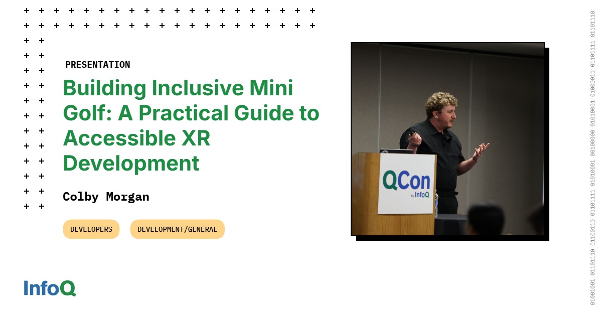
I want to share my journey, not just as a visually impaired user of XR technologies, but someone actively working in the space to make it more accessible and inclusive. I’m going to walk through some practical and technical examples we use at Mighty Coconut to make the products we make accessible and inclusive. I’m Colby Morgan. I’ve been working in the XR space for quite a bit. U.S. Army veteran, Accessibility Advocate, I’m really passionate about the space.
Walkabout Mini Golf, and Third Spaces
Are people familiar with, have heard about Walkabout before? Walkabout Mini Golf is a VR mini-golf game, got launched in September 2020, on the Quest platform. We’ve had a lot of success, and the platform’s grown a lot over the years. We’re now on pretty much every platform. We’re on the number one VR multiplayer experience. We really focused our core product on continual content releases by releasing a pair of new courses every six to seven weeks. Each of those courses takes about 10 months to develop from concept to launch. Then we have about 7 to 14 of those courses in active development at any given points. We’re very production pipeline focused, just keeping that as efficient as possible. We have a lot of that content continually coming out to users.
Over the years, we’ve started to focus more on the environments and the experience. Mini-golf has been a really great activity for people to get in, but we’re really starting to see the value that the experience is giving for users. We’re starting to see more users use Walkabout for connecting with family across the country, getting your grandparents in for weekly game nights, more folks using this for business meetings and connecting with folks, friends and family, different charity events, tournaments, really becoming a space. It’s this focus on this environment that we’ve had the opportunity to work with some really exciting partners. We got to work with Jim Henson to bring Labyrinth, Dark Crystal, and Fraggle Rock into the world of Walkabout. We’ve got to work with the artist over at Meow Wolf to bring one of their top attractions, Numina, their Denver facility into Walkabout. If you’ve never been to a Meow Wolf facility, I highly recommend. It is an amazing experience.
We got to work with Cyan as well to bring the mysteries and puzzles mechanics into Walkabout, that atmosphere. Then we had a blast working with Aardman to actually bring Wallace and Gromit to create two mini-golf courses inside of Wallace and Gromit’s house. We even got Feathers in there. Again, it’s this focus on the environments and the experience that’s really changed how we think about Walkabout and how we start designing more. The big part of that is really starting to think about this idea of virtual third spaces.
Are folks familiar with third spaces? The idea of third spaces got coined by this socialist, Ray Oldenburg. The idea of being a third space starts with the first place. First place is your home. It’s your community with your direct family. It’s those habits that you have at home. Your second place is your workplace. It’s where you physically go to work, but it’s also the connections that you have with your colleagues that you connect with every day. Third places are these magical, inclusive, informal environments that are not your home and they’re not your workplace, but where you go to connect with your community and relax and recharge. I think bars, cafes, coffee shops, libraries, parks, all that good stuff.
More and more, there’s emergence of virtual third spaces. We’ve had online communities, game communities for quite a while. The thing that XR brings is a whole new level of presence and connection with people that really takes this idea of a virtual third space to this next level. I think more inside the XR space, you see a big focus on the social aspect of connection and presence with people. This virtual third space just really highlights for us how important the inclusion and accessibility is just a cornerstone of what we’re designing in these environments. Because one of the key aspects of a virtual third space is it’s accommodating, accessible, and inclusive. Because you want it as easy as possible to get people to be able to participate in what they want and participate to the level that they want.
Design at the Core
These spaces obviously take a lot of work to create, and they just make themselves since they take a lot to design. It’s why design is really at the core of everything we’re doing at Mighty Coconut. For us, we’ve got a still relatively small team, but we have a lot of content we’re pushing out. It’s really important for us that these design core concepts for us is something that everyone on the team can embody and make sure that we’re keeping things moving in the right direction.
The first one for us is really the accessibility at the start. It’s really this mindset of, as you’re early in that pre-production phase, as you’re designing your products, whatever that is, really trying to think about how accessible this is going to be and how inclusive an environment you’re creating or a feature this is. It just becomes a really important bit. It’s part of that pre-production phase. It’s part of that thinking. Part of the benefit is there’s a lot of times you design around problems before they become problems. You don’t necessarily have to make features down the road. To make something more accessible, you solve problems again before they become problems.
The other big aspect for us that we see is, this mindset gives us what I always call invisible features. Invisible features are just features or design elements that add value or more access to users, but they’re seamlessly integrated in a way that the user doesn’t have to notice them. They can notice it, but the feature itself doesn’t require the user to notice it, to activate it, participate. It’s just there providing value for the users. For us, again, we’re mini-golf, so a handful of those examples that kind of really, I think, fit that model really well. We have our dynamic putter scaling. No matter how short or how tall you are, that putter is automatically, always dynamically changing height to fit whatever you need.
This also opens the door for people playing seated or playing from a wheelchair. Even we’ve talked with users who haven’t been able to get out of bed, but they’ve still been able to leverage this feature that adapts to them. That’s just really highlighting to, I think, a really core aspect of next-generation interfaces in general inside a lot of these new tech is just making things, designs and features that adapt to users.
Again, just that seamless adaption just adds so much value to users and to the overall experience. The other one of our invisible features is we always consider our one controller design. There are more things we could add if we had a second controller, but the ability of focusing on a single controller opens the door for a lot of things. It simplifies the learning curve for getting into the experience. Again, we have one controller, so only have half the amount of buttons that you have to teach or get folks familiar with. Then it’s also going to open the door for letting people play if they can’t use a second controller for whatever reason. Our users also discovered that one benefit of playing only needing one controller is you can also hold a drink while you play. A perfect example how inclusive design is better for everyone.
The next big piece for us is hopefully obvious, but it’s really about keeping it simple. Focusing your product, focusing your designs, so it’s really as simple as it can be. Especially XR in general, it’d be really hard to keep things simple just because there’s a lot of different features you can add. There’s a lot of effects, mechanics, but again, the power of being able to focus your product, focus your design down to something that’s really simple and really digestible for users, especially for the mindset of trying to get more people participating in your products.
Especially, as an entertainment company, we also understand that depth adds value. Simplicity can bring more users in, but depth can help keep users engaged longer. It’s really important you think about how you expose that depth and that complexity. That’s a big part we think about. For us, we use an approach of trying to think about each of these features and more complex interactions as layers that we allow players to discover. Just like Trek says, immersive features are like onions, they have layers. Again, really focused on this layered approach. One gives you the ability to either create a clear path of how users discover this depth as they get deeper into the experience and they spend more time getting in.
The other aspect of this for us is really trying to keep our core experience really simple and intuitive, but we have these depths when players are ready. For us, it’s also letting players self-select when they’re ready for those depths. Again, we want our core experience to be as easy as possible to get in and participate. Again, we have these layers that users more or less self-select when they’re ready, it’s like, now I’m familiar how to use the joystick, I can do this type of interaction, but giving that. The other benefit of this approach is just the sense of discovery you give your users with your products. For not just games, but any type of product, the sense of discovering is such a fulfilling experience, that feeling of you’ve figured something out in a product, and it’s like, this is really cool, I finally figured out how to do this.
With these layers, you give more opportunities for that sense of discovery as users start living in your product more. The other benefit too we’ll cover is a lot more opportunities for community engagement. This one’s a big one for us as well. It creates more opportunities where players can teach other players. We always love seeing in our different user groups, we don’t explicitly tell anyone in the game, but there’s a way you can fly. We let that percolate just through our community. There are these magical moments of like, “I just got in and my friend just showed me how to do this, and it was this really cool experience”. You create this different layer of community engagement that really helps to expose those depths to the player. Again, if you can get your players or your users to teach themselves about the features, it’s going to be a lot better of an experience rather than just a text tutorial screen you could put in somewhere.
One of the good examples for us that really embodies that idea is our one button game. From the beginning, this was another really important element for us. We wanted Walkabout to be a one button game. You can play a whole game of golf and you can really participate with all the base feature sets with just one button, that’s the trigger. Early with Mighty Coconut when Walkabout was being developed, we saw how much that opened the door of getting people into the experience. Again, for people that are new to any new technology, you’re always going to have that barrier of getting people familiar with controllers, or joysticks, and different sequence of buttons. Simplifying that down to a single button gave us a lot, especially for just helping to grow that community. Especially from a family element, we love seeing is just people being able to just put the headset on a grandma and just pass her the controller and they can start playing.
Again, we use layers for depth. We still use the other buttons, but again, we keep our core experience simple just with that one button, but we leverage those other buttons for different more complex interactions like undoing your shot, you can pick up your ball. Again, like I said, you could fly as well. Again, we use layers. Some of them we intentionally tell the player about and some of those we don’t tell them. We let either through organic discovery themselves or through community discovery.
Features
Sometimes you need more accessibility tools that sometimes they can’t be necessarily super simple and sometimes you can’t get them in quite as integrated or seamless into the project as you’d want. It’s still really important to identify those areas where you need additional tools to expand access to the products you’re working on. Just walking through a handful of the ones that we’ve had a lot of success with our community with. Scaling UI. As a visually impaired user, I will encourage everyone for whatever product you’re on, if you can do scaling UI, you’ll make a lot of people happy. We definitely understand that depending on the product or the technology stack, the format, the libraries you’re working with, scaling can be difficult. It’s really about identifying what’s that critical core information that unlocks people being able to participate in them when you have.
For us, we really identified that we have our wristwatch UI. We always call it quick glance information. Think, especially from like the game world, a lot of times it’s your health bar. It’s the score. It’s all that little piece of UI that you just want to be able to quickly glance at just to get some context and then focus back. Again, when you make that UI super small for someone that’s visually impaired like me, it’s usually I’m having to spend a handful of times just focusing, putting my face in to see what that is. Being able to leverage that scale, specifically quick glance information like that unlocks a lot for users. Again, this is our wristwatch where we have, again, that quick glance information, your score, stroke, multiplayer information. We also have like a fox hunt where that text will scale bigger as well.
The other big feature we were excited to get in is magnifier. This was a tool that I had used for my own development. Just even designing, developing features, giving feedback. I was really excited to get this out to the users actually in the game itself. The powerful thing about a magnifier, not just in VR, really in any type of digital product is again, for any type of UI or anything that can’t necessarily be scaled, magnifier just unlocks that ability to zoom in or magnify whatever you need to look at. We have other gameplay elements that are scavenger hunts. We have lost balls and fox hunts. They’re just very much you search the environment. It was great hearing feedback about users of, this unlocked that experience for them, because they were able to use the environment, not just for reading UI, but they’re able to explore the environment at a deeper level as well.
One of the other interesting aspects when we were developing this too is I really wanted this to be as simple as possible to pull up because I didn’t want to have a complex interaction, because I didn’t want to disrupt that one button experience, especially for that core experience. We were looking at just leveraging how people normally hold a magnifier, and when you hold a magnifier, you’re just going to hold it like this. By having that enabled, just every time you hold it like this, your magnifier pops up. Again, it was an opportunity to simplify the experience. We didn’t have to add too much interaction and just rely on behaviors and patterns that people are already intuitively used to doing for this type of technology.
A little bit in the weeds, just some more interesting tidbits about this. Anyone developing these types of products, especially for a magnifier, smoothing is a really core element of that, especially anything that you’re focusing on. It doesn’t matter if it’s XR or flat screen, anything like that. Anything that has the type of wobble like your hand is going to have, it’s going to be pretty uncomfortable. It’s basically rotational. Smoothing added a lot to this to make this much more accessible and comfortable.
Again, just more of an example of when you’re building these more integrated toolsets, it adds a lot of value to put the time and polish into it and just making sure it’s a comfortable experience. I was using it for development, and I feel like over the last 10 years, I’ve got pretty strong VR legs. I wasn’t getting nauseous or I wasn’t getting uncomfortable, but we started playtesting with people and they were just like, this is unusable. It was this mindset of like, we could have released this and it could have been powerful, but no one would have been able to use it, or people would not actually be able to get value out of it. Really being able to identify those polish points that you need to make sure users are getting the value out of the accessibility tools that you’re building.
The other element that I was excited to get in, working with some friends and some users, is controller smoothing. Again, working with a handful of users and friends that had various disabilities, either tremors or just anyone that had a harder time keeping their hands steady. We were able to smooth out the input from the controllers, so we could average out over several frames and average out that motion both positionally and rotationally. Any erratic movements would get smoothed out. There’s a handful of benefits. Hopefully most people are familiar with in VR that like laser pointer UI systems are everywhere. They’re probably going to be around for quite a while. That laser pointer UI can be really challenging for some users, especially if you’re having a hard time keeping that controller steady, especially depending on the size of the UI or anything like that.
Adding this, and working with our users, we were able to unlock the ability for some users to actually even get into the experience that weren’t able to or had to rely on other people to boot up the game and select some of those settings for them as well. Then also getting the benefit of just having a smoother stroke. Trying to level the playing field a little bit and creating more of a better experience for people when they’re playing. Again, just getting a little bit in the weeds on that, similar to motion smoothing with the magnifier as well, just to know anytime you’re adding a type of smoothing accessibility, you’re going to be introducing latency to that movement. In XR in general, latency is bad. You don’t want latency.
For us, we found that there was a sweet spot of leveraging different predictive algorithms to try to dial that in. If you go too much with the prediction, you’ll get some rubber banding effects where your controller is snapping way past where you’re needing it. Again, just another example of, if you’re going to put the time and effort to making some of these tools or some of these deeper, more integrated tools, just making sure that you’re playtesting, you’re working with your users and they’re actually providing the value that you think it’s going to provide.
Culture of Inclusivity
Accessibility and inclusive design doesn’t start with a tech stack or a feature list, a concept art, or anything like that. It really starts with a team behind it. That’s why for us, the culture of the team behind making this is such a huge part of that. Just some of the big core themes for us internally at Mighty Coconut is the idea that everyone has a voice. If you’re on a QA team, marketing, community management, tech, art, management, anything like that, everyone has a voice to give feedback about anything in the company and anything on the product. We found that it’s helped us catch a lot of different friction points that again, you normally wouldn’t catch. We’re able to leverage our diverse team and diverse set of backgrounds and experiences by, again, just getting more of that feedback.
This also helps your team get more engaged with the product, more familiar with those things, and be able to catch more of those friction points as they happen. It’s not only just giving people a voice on your team, but it’s also giving them the opportunity to see the product experience and play with it, and really just getting visibility on it. Playtesting is a really big part for us. Several internal and external playtests we’re doing this, again, even outside of VR for just getting your team using your product, using your tools or whatever you’re making. Just making sure your team always has a lot of hands-on time with that, because you always catch a lot of things that you normally wouldn’t. Again, this creates more opportunities for people to have a voice and to see what’s going on.
The other big part for us in our culture is our user-centered development. It’s really easy to go into a deep code silo when you’re making something and you think it’s going to do this or you think it’s going to give someone some value in this direction, but then you get on the other side like, this doesn’t do what I think it does, or this is not actually helpful to people. Again, find ways to keep your development really centered around the user. The other big part of that for us is working directly with our users as well. Having the ability to co-create features, tools, systems with your users really just keeps that feedback loop really tight. You’re hearing directly from the people using your products, their pain points, what they need to make it more inclusive and helpful. You just get your community much more engaged in your product when they feel like they have a voice and they feel like they have an active part in development.
Key Takeaways
I’ve talked a lot about our internal process at Mighty Coconut and some of my experience. I’m assuming not everyone here is making a VR mini-golf game. Maybe so, and maybe we have some competition. I just really want to stress that all of these concepts really apply beyond just mini-golf, they apply even beyond XR. It’s a mindset of product development for us and how you keep accessibility and inclusion part of that. I just want to briefly talk through some key takeaways for building next-generation inclusive UI. Like we talked about, keeping accessibility at the core of your design and the core of your product. Having that mindset early in the process to solve issues before they become issues. Yes, spaces that foster presence and connection.
Again, XR is really starting to become into that virtual third space, so leveraging how people connect in those third places, and making those spaces as inclusive as possible, so it’s really easy for people to get in and participate. Simplify your interactions and layer on depth. Like we talked about, simplicity brings users in and depth is going to keep them engaged. Using a strategy of layers to be able to peel back that complexity of users, and letting users self-select when they’re ready for that depth, or if they just want to stay at the top level. Design features that adapt to users. I’ll just pause and I’d say that this is probably one of the really important ones. I think this is something we always see people getting a ton of value out of the things they’re designing. The power of making features and designs that dynamically adapt to your users just creates such a powerful experience. Again, for any product you’re making, giving users that seamless experience for things that dynamically adapt to them creates a very engaging product.
Then, again, focusing on your culture. The team behind the product is really going to help drive and shape how those tools end up, how well they’re developed, and just making sure that everyone has that same mindset that you’re approaching that, and nothing’s really falling through the cracks.
Circling back too, I think a lot back to that event where I was asked, why are you here? At the time, the question felt isolating. It felt like a reminder of just being in a space I didn’t belong or having to struggle with things that weren’t designed for me. I’m able to see that question differently now. Now for me, it’s a challenge. More importantly, it’s an opportunity to redefine who belongs and what inclusion is. I know that’s why we’re all here, everyone at QCon. I think we all see the potential of next-generation technology, and we’re all really excited about that. We’re excited about the interfaces that have the ability to dissolve barriers, adapt to users, and create spaces for users of all abilities to connect, thrive, and explore. As we design the future with intention and inclusivity, we have the opportunity to shape the future to reflect the best of us: spaces where we all belong.
Questions and Answers
Participant 1: How did you go about teaching to users that wanted to use those accessibility features that they were available, and how to use them? For example, the magnification to hold it in that certain way?
Morgan: I think that’s something we’re still looking a lot of. For us, a lot of it is leveraging the layers. Some of those deeper interactions require a little bit deeper setup to turn on. For us, one of it is just trying to rely more on the community, or also partly rely on the community to help share that information. We have some dates around helping just make it clear that there are those options there, and there are those behaviors. Right now, we have some different audio and UI props to explain that behavior. I know that’s something we’re still really excited looking at how to make sure that users know the tools are there and how to use those.
Participant 2: I’d love to hear a little bit more about this technique of layering in complexity and like what things people can figure out as they get deeper in and how they are prompted that there’s more here for you to learn. There’s things like Super Mario Odyssey on the Switch where, yes, the basic, you can run, jump off your cap, you’re done, but you watch the experts, the speed runners go, and they’re doing complete aerial acrobatics. How do you surface the idea that there is more to learn? Also, how do you fly?
Morgan: I think there’s a few different aspects. Like we said, one of the big parts for us, again, is just the community. We have a lot of the community and a lot of those different events that pop up where people just naturally connect and see each other. It’s like, you’re flying, how do I fly? We do try to work within a lot of our environments to add more environmental clues to that depth. Again, I think for us, we want to make sure that we’re not creating too much cognitive overload by having a ton of text screens everywhere that might be overwhelming to people.
There’s some of those environmental clues that cue in like, you’re in practice mode, you can undo your shot, type of thing, or you can pick up your ball and some different environmental clues. I think that’s probably more specific to game development with some of those, like you said, Super Mario Odyssey of like, as you start playing it more, you realize like in Mario, it’s like if I tap the jump at a certain cadence and I had an even higher jump. Trying to create naturally those moments to just organically happen for users. For us, the power of organic discovery is really powerful. It’s really about how we can guide users to get there without, again, having that giant wall of text or anything that’s going to feel too overloading. How you fly is you point your controller up and you hold up on the thumbstick for I think like 2 or 3 seconds and then you’ll start flying.
Participant 3: For the example of the magnifier, where before you added the smoothing, you already have a feature that is very accessibility focused, but the experience is still not good. It could be seen from a company standpoint that’s less accessibility and inclusive focused, they could see that as a feature not worth spending time on, not worth prioritizing. They could say, we gave you the accessibility functionality. Yes, the experience may not be great, but it’s good enough. Did you already have that inclusivity tenant at your company or did you have to do anything to advocate or build that?
Morgan: I very much like Mighty Coconut and I love the people there. I think there’s a lot of those conversations that came pretty easily. I think a lot of it was just helping for the wider management team of really just trying to drive focus to the value that those things provide users. For me specifically, just being visually impaired, I had a lot of direct examples I was able to show the whole team with different examples of like, this is life-changing for me, of like these tools make me have access to things I normally wouldn’t. I think, one, the importance of just hiring disabled people at your company and hiring people of different backgrounds and experiences, it’s easier internal optics to make those connections for people of seeing like, that makes sense why you would need those types of tools on that.
The other piece, like you said, with giving the magnifier that extra polish to really give it value for users, I think fortunately being so design focused as a company, it’s something we see a lot internally as we’re making things. Because when you’re making gameplay features or designs or anything like that, you’re going to end up in this boat where you work on it a while and it’s not getting quite in there. A lot of times it’s just one simple change that unlocks the whole design or makes something feel really fun. We talk about finding the fun or finding the design.
Again, I think it’s just being able to apply that same concept to accessibility tools as well. A lot of times you just have to find, sometimes they’re big changes you have to do, but a lot of times, once you have the tool, it’s about really dialing that in and giving a lot of value. Versus, like you said, it can be easy of like, we did the development time, we have the base tool, it’s good enough, type of thing. We check the box, it’s there. Just again, spending the time dialing that in is really powerful.
Participant 4: You did mention the importance of beta testing and how you have a pretty robust team of beta testers. Could you go into a little bit more detail about how you built that community up and how you manage it?
Morgan: We’re very community driven because it’s really the essence of our product and the connection, the spaces that we’re designing and creating. Just over the years, we primarily use Discord, but we have a few other, Facebook, Reddit, different groups. We’ve just had a lot of power users or super users that are really passionate about it that all help gather and create that space with us. Yes, beta, alpha, all those external testing cycles are really important for us. We have two different alpha teams and two different beta teams, and then we have a few other playtest groups we use.
One, because it’s really powerful of getting people’s first reaction to a tool, and especially when you’re designing a new accessibility tool and you want to just see how easy it is for someone to get in and turn it on and what their experience is that very first time without any context. Being able to leverage different layers of groups that you can use and get that direct first-time feedback as well. We’ve been lucky. I know some other studios, especially larger companies typically have more restrictions around working directly with users and community groups or just more layers you have to work with. Again, we’ve been pretty lucky about being able to directly work with a lot of our users in these spaces.
Even with those, we’ve been able to find a lot of users that self-identify with different disabilities that we’ve been able to work with directly and get their direct feedback on. Again, I think for us and for everyone, it’s just as much as you can, be involved with your users, as much as possible, really opens up a lot of those doors. Then I will add too, specifically in the XR space, there are more groups popping up that provide testing services for different types of users. I think VR Oxygen, testing cycles, and I know there’s a few other companies. There are other resources available too. If you’re making different accessibility products or just more inclusive features and you want some more of those feedbacks, there are those specific companies you can search out. Find some of those communities and get those, if you don’t have an easier way to directly access some of those users.
See more presentations with transcripts


