Mishaal Rahman / Android Authority
TL;DR
- Google is developing a new horizontal layout for Android’s volume slider that will likely appear when the device is in landscape mode.
- This new horizontal slider will be positioned at the top-center of the screen, a design choice similar to the one seen on Apple’s iOS.
- We spotted evidence for this new layout in Android 16 QPR2 Beta 1, but it is not yet active.
Android’s big Material 3 Expressive redesign brings dramatic changes to the lock screen, status bar, Quick Settings, and notifications, but it also introduces subtle tweaks to other UI elements. The volume slider, for instance, saw several small updates: the dot at the top was replaced with a stream icon, the bar became less rounded, the menu icon morphs into a waveform when music is playing, and a slight bounce effect was added when the bar hits the top or bottom. It seems Google isn’t done modifying Android’s volume slider, though, as we’ve spotted evidence the company is working on a new layout that could bring it more in line with its counterpart on iOS.
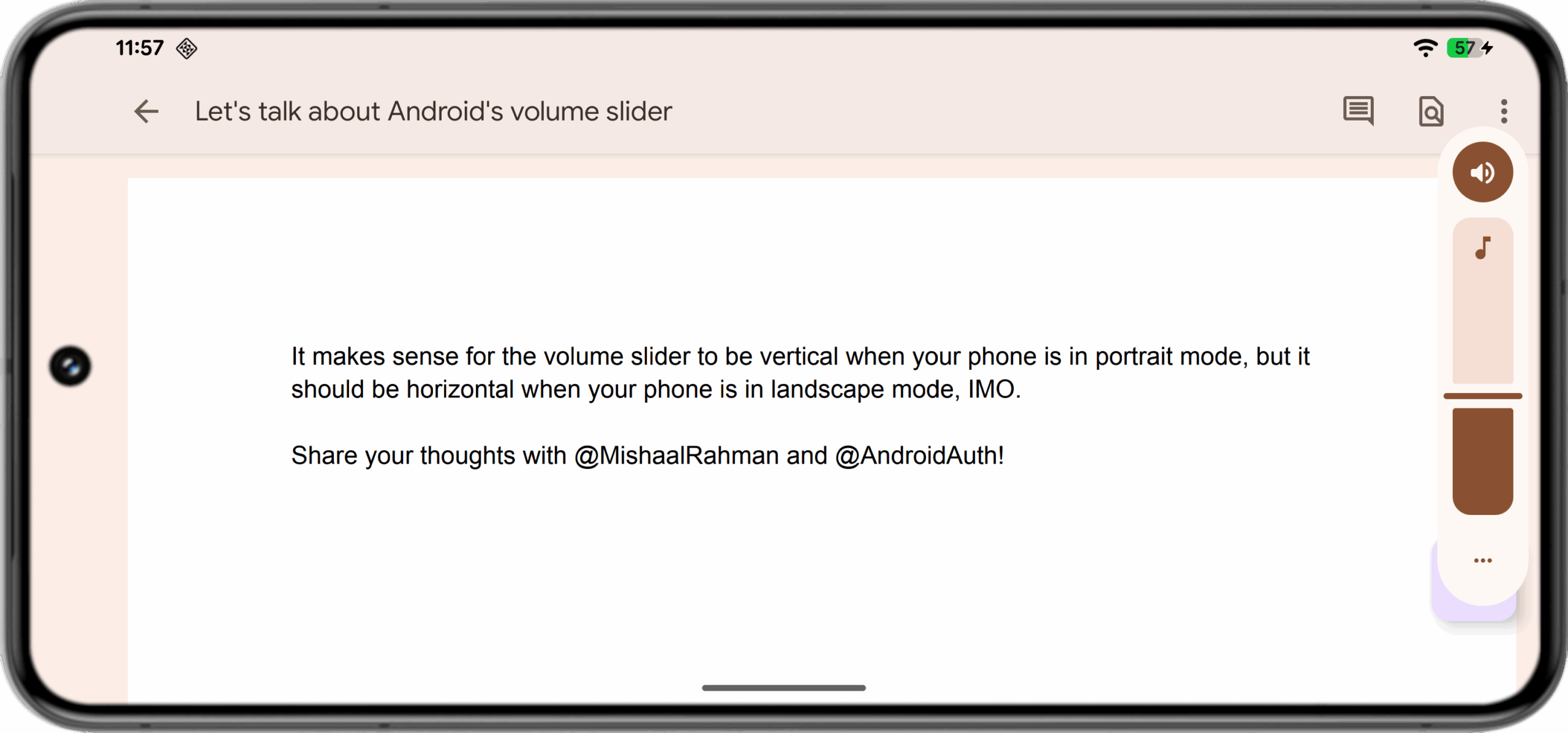
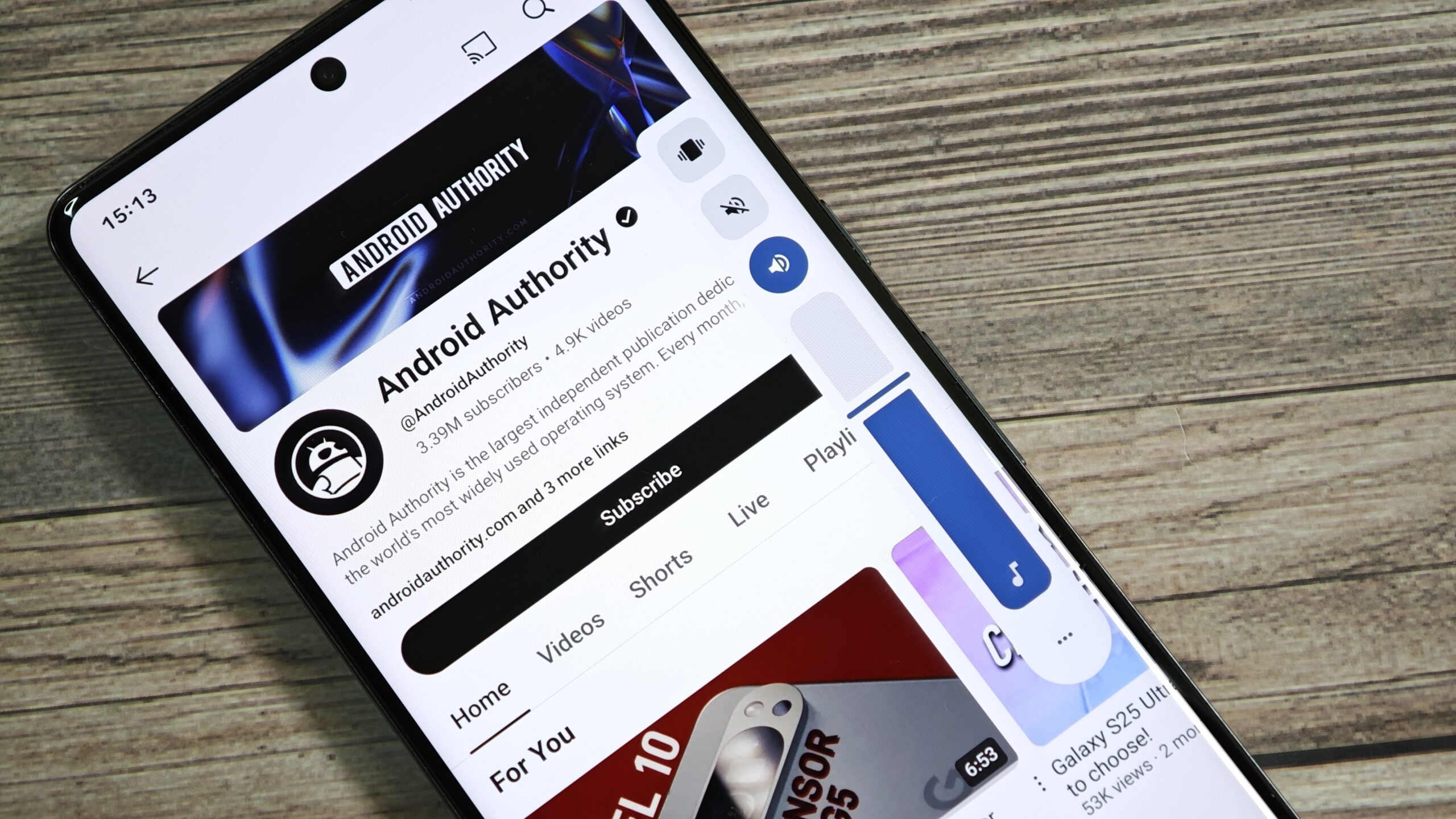
In the latest Android 16 QPR1 release, the volume slider is positioned vertically along the middle of the screen’s right edge. This layout makes sense when holding a tall smartphone in portrait orientation, as the slider is easy to reach. In landscape mode, however, this vertical layout is less ideal, as it can cover important elements in a game or visuals in a video.

Mishaal Rahman / Android Authority
Android’s current volume slider layout.
Apple solves this problem on iOS by having the volume slider adapt to the phone’s orientation. In portrait mode, the slider is vertical (though on the left side of the screen), similar to Android. In landscape mode, however, it becomes a horizontal slider positioned at the top-center of the screen.

Mishaal Rahman / Android Authority
Volume slider layout in iOS when in landscape mode
Since iPhones are much taller than they are wide, the slider remains easy to reach in this top position. Most Android phones share a similar tall aspect ratio, so the benefits of a horizontal layout apply there, too. Google seems to agree, which is why the company is experimenting with a new horizontal design for Android’s volume slider.
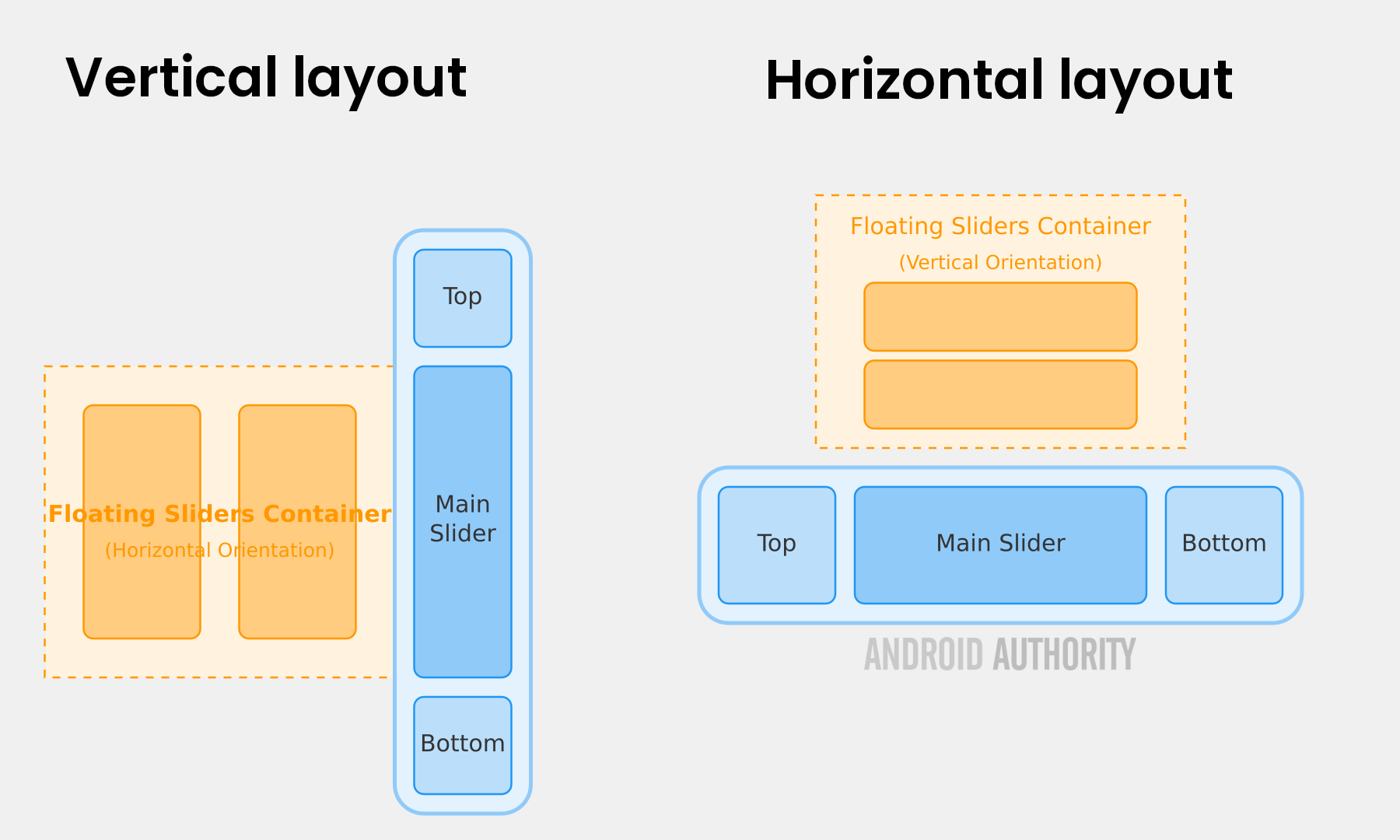
While digging through the latest Android 16 QPR2 Beta 1 release, I found a new layout file in Android’s SystemUI app named “volume_dialog_horizontal.” This layout is currently unused because a flag called ‘isVolumeDialogVertical’ is hardcoded to true, preventing the horizontal slider from appearing anywhere. Although I couldn’t activate the new UI, I was able to piece together its design by analyzing the layout file and comparing it with the standard vertical one.

Mishaal Rahman / Android Authority
The new horizontal slider will be positioned at the top-center of the screen, much like on iOS. Similar to the current vertical version, it will feature several key parts: an icon for the current sound mode, the main volume slider itself, and a three-dot menu button. A separate section with additional sliders will also appear above the main one when there are multiple active volume streams, such as during an Auracast broadcast.
It’s unclear when Google might introduce this new horizontal volume slider or in which situations it will appear. The layout may not be used on all devices, especially larger ones like tablets where reaching the top of the screen is less convenient than the sides. For now, this change remains a hidden experiment, but it’s a clear sign that Google is working to refine Android’s user interface for landscape mode.
Don’t want to miss the best from Android Authority?
Thank you for being part of our community. Read our Comment Policy before posting.


