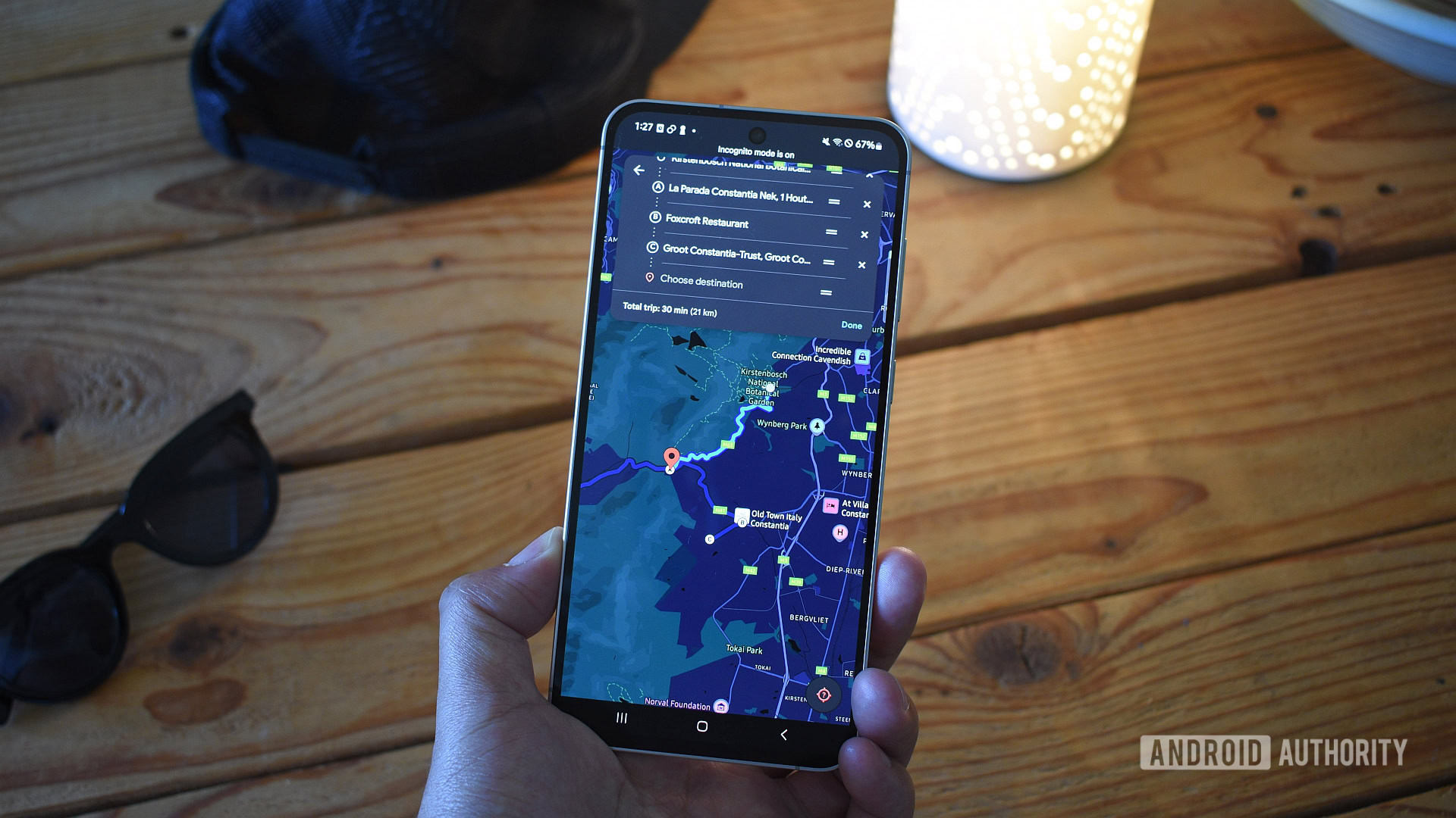
Andy Walker / Android Authority
TL;DR
- Google Maps developers are working on a bunch of small tweaks to the app’s interface.
- Some of those include a new setting menu, icons, and search UI.
- Place cards could also be getting a reorganization, flipping the placement of some options.
This week may be all about new hardware with the introduction of the Pixel 10 series, but maybe that just means that Google’s software devs have all the more to prove, because that group has been one busy bunch. Today we’re looking at a whole mess of new changes currently in the works for Google Maps on Android.
We’ve got a lot to go through, so let’s get started straight away with an overhaul coming to the app’s settings. So far, everything’s kind of been unceremoniously tossed together in one place, with a mix of toggles for individual options and settings sub-pages you’d need to tap through to — all without obvious rhyme or reason.
In version 25.34.00.796159725 of Maps, we see Google working to do something about that, now organizing all these settings into a handful of categories. While than can mean an extra tap to get where you’re going, it also just makes it a whole lot easier to find that destination in the first place.
Don’t want to miss the best from Android Authority?
Next up, we’ve spotted a few iconography changes in the works. Here we’re looking at three: the button directly above the compass in the upper-right that you tap to select alternate map views getting a dash of color, the compass itself dropping that white dot in the middle, and a whole new look for the current-location crosshairs.
⚠️ An APK teardown helps predict features that may arrive on a service in the future based on work-in-progress code. However, it is possible that such predicted features may not make it to a public release.
We’ve also noticed a slightly reorganized look for how the app shows you information about places you tap on. Here’s a screen recording of the new UI in development:
Compared to the old view, those buttons for Directions, Tickets, and more are no longer right at the top of the place card, and instead stay tucked at the bottom of the screen as it expands. You’ll also note the Street View preview is now a squircle, fitting with Google’s ongoing Material 3 Expressive efforts.
Finally, we’re seeing a new look for the app’s search interface. So far, Maps gets you started with a search by pulling up all your recent activity, in case you wanted to repeat a recent destination. Instead of that, developers are also considering an alternate layout that would add an Explore option to check out place categories:
Granted, we could already access this same list of place options from the main map view, but maybe having all this stuff together on the search interface makes sense, too? Maps has a lot of moving parts, and the best way to fit them together isn’t always going to be intuitive — sometimes devs have to throw a bunch of ideas at the wall to see what sticks.
Right now, that seems to be pretty much what they’re doing, as we’d classify most of this as experimental for the time being — you won’t see these changes live in Google Maps today, but don’t be surprised to come face-to-face with at least a few of these tweaks in the weeks and months to come.
Thank you for being part of our community. Read our Comment Policy before posting.


