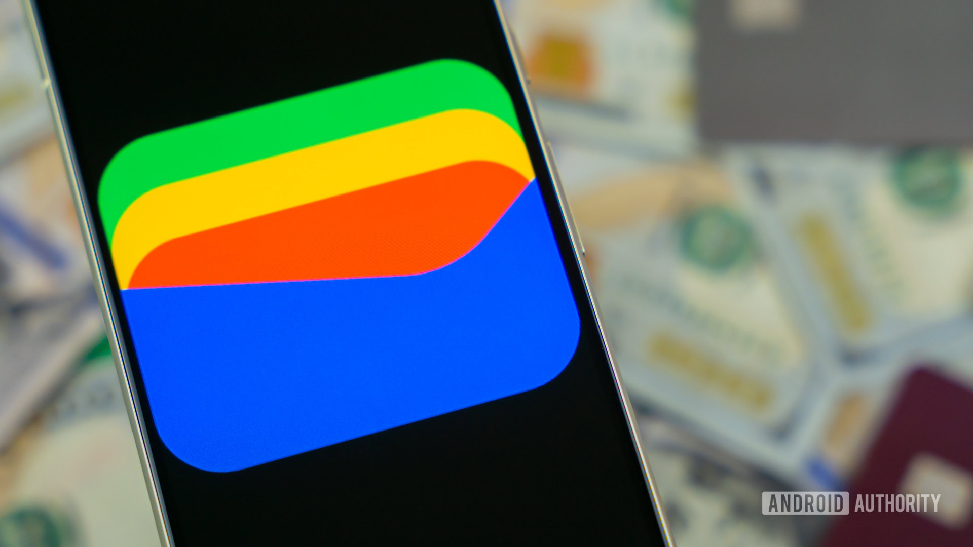
Edgar Cervantes / Android Authority
TL;DR
- Google Wallet is getting a new design that adopts Google’s Material 3 Expressive aesthetic.
- The update is now rolling out widely, and Google has also made it official in its latest Play System update.
- With the update, Google Wallet has a more modern layout, with new icons, rounded rectangle containers, fresh buttons, and more.
Google is officially rolling out a new Google Wallet experience with the latest Play System update (version 25.25). The redesign brings elements from Google’s Material 3 Expressive design language to Google Wallet, freshening up its look with a more modern aesthetic.
Some folks spotted Google Wallet’s Material 3 Expressive makeover last week, but Google is now rolling it out more widely on version 25.24.772650276 of the app.
With the update, Google Wallet now has new icons and rounded rectangle containers that are a trademark of the Material 3 Expressive look. You’ll also notice a new Google Wallet logo in the top left corner of the app instead of the “Wallet” text. Buttons are also getting a bit of an update, and you’ll now notice a more minimalistic “+” FAB (floating action button) instead of the “Add to Wallet” button.
Nothing much is changing in terms of functionality, so you don’t have to relearn how to use the app. The new design may make it more intuitive and pleasurable to use.


