
Want to create a burndown chart in Excel?
Burndown charts are one of the most intuitive ways of measuring your project’s progress against targets and deadlines.
And tracking them in Microsoft Excel is the go-to option for many teams.
But are the rows and columns in Excel giving you vertigo?
Fear no more.
This article will explain what a burndown chart is, the three steps of creating one in Excel, and a better Excel alternative to the process!
⏰ 60-Second Summary
- Burndown charts visually track project progress
- Two chart types exist – sprint and product
- Excel creation involves a table and line chart
- Excel is tedious and lacks collaboration and mobile support
- Templates ease Excel creation but limitations remain
- offers real-time updates and collaboration
- provides extra features like Gantt charts and automation
What Is a Burndown Chart?
A burndown chart is a visual representation of how much work is remaining against the amount of work completed in a sprint or a project.
In a typical Agile Scrum project, there could be two kinds of burndown charts:
- Sprint burndown chart: to track the amount of work left in a particular sprint (a 2-week iteration). It’s also known as a release burndown chart
- Product burndown chart: to track the amount of work left in the entire project
We bet you’re asking, “all that’s fine, but how do I recognize a burndown chart?”
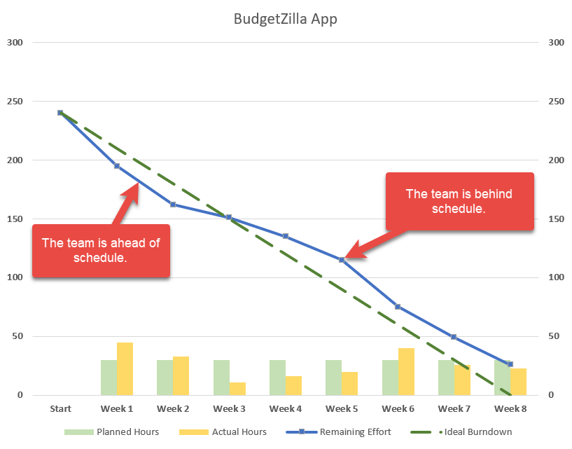
Here’s what a typical sprint burndown chart looks like.
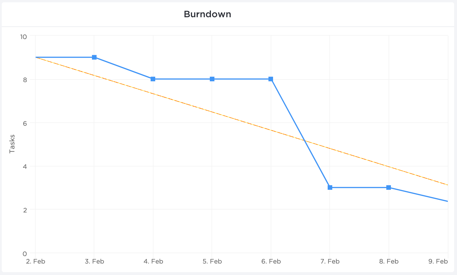
Now let’s break this down.
The ‘X’ axis (horizontal) represents the time set aside for a particular sprint or project completion.
The ‘Y’ axis (vertical) represents the remaining work.
The top left corner is where the project (or sprint) begins, and the bottom right corner is where it ends.
As for the two lines running between the two points, here’s what they represent:
- Ideal work remaining line (orange)
This represents how the team will ‘burn down’ all the remaining work if all things went as planned. It’s an ideal estimation that works as a baseline for all project calculations.
- Actual work remaining line (blue)
This is a representation of the actual work done and how much is left in the pipeline. It’s usually not a straight line as it’s subject to real-life events and delays in the team’s way. Ideally, you want the actual work line to stay under the ideal line.
But how does one create this chart?
You could always use handy project management tools that automatically generate such essential charts. On the other hand, you could opt for a more manual approach with good ol’ Microsoft Excel.
How to Create a Burndown Chart in Excel
Here’s how you can make a burn down chart in Excel in three simple steps.
In this article, we’ll focus on creating a work burndown chart for a sprint.
This example sprint is 10 days long and contains 10 tasks.
Ready to get down to cell-ular level in Excel?! Bring your microscopes 🔍
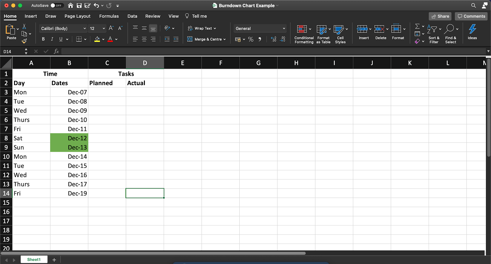
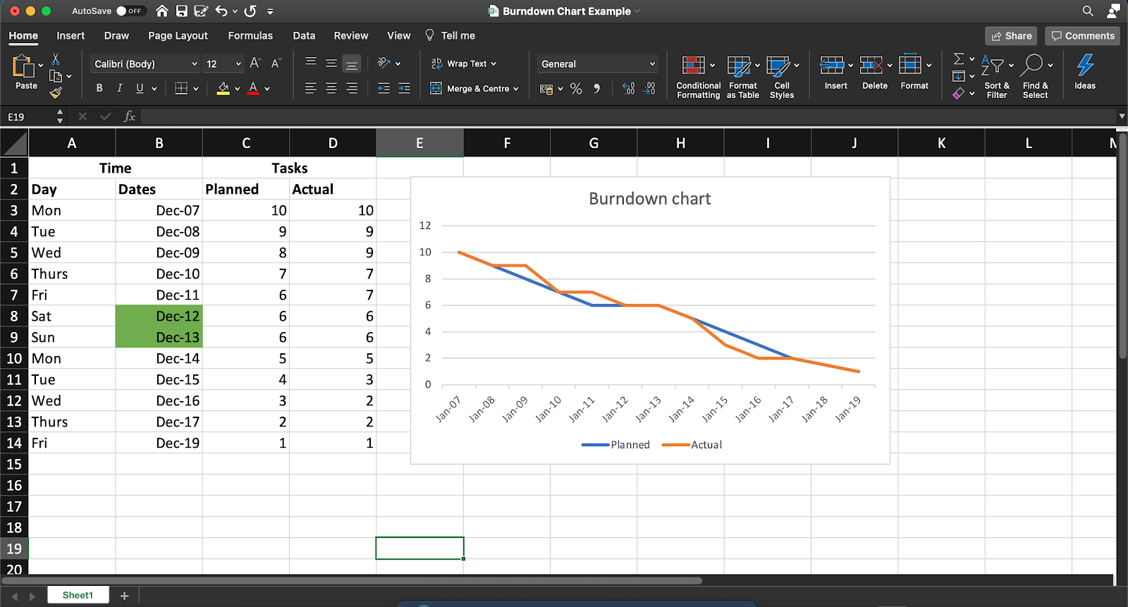
Step 1: Create a table
We’ll lay the groundwork for the work burndown chart with a table. This will contain your basic information on time and the tasks remaining.
For the tasks, split it into two columns, representing the number of remaining tasks you estimate you’ll have (your planned effort) and the actual tasks remaining on that day.
Open a new sheet in Excel and create columns as per your project’s needs.
You can add details to this table for your work burndown chart, such as:
- The name of each product backlog item
- Story points
- Estimated effort (in hours)
- Actual effort (in hours)
- Remaining effort (in hours)
Step 2: Add data in the planned column
Now, we add our values to the planned column, representing how many tasks you ideally want remaining at the end of each day of the 10-day sprint.
Remember, this is an ideal scenario.
So whatever numbers you add here do not account for any real-world complications that your team may face in the sprint duration.
In our example, we’ve assumed an ideal burndown rate of one task or user story per working day. We’ve not accounted for weekends, and hence the number of tasks doesn’t reduce on Saturday and Sunday in this table.
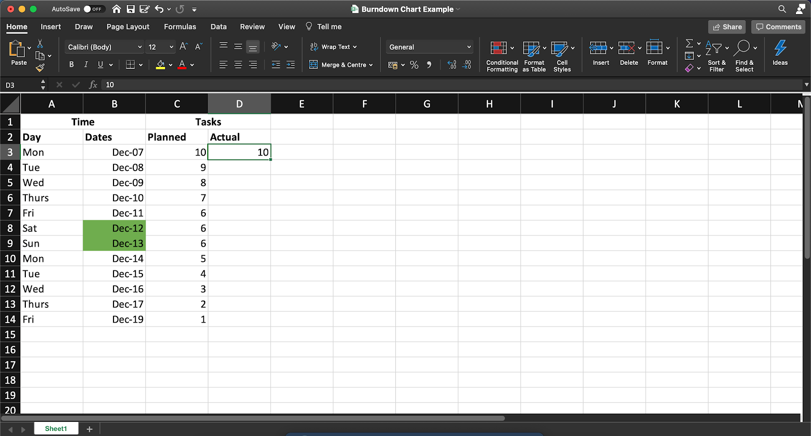
Note: You’ll have to manually update the Actual column at the end of each day to reflect the number of tasks that actually remain.
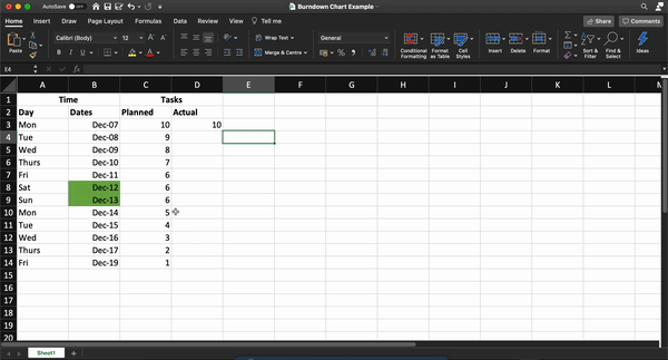
Step 3: Generate a chart
Once you’ve assembled your hard-earned data in one place, Excel will take over the rest of your process!
To do this, follow these steps:
- Select the ‘Dates,’ ‘Planned,’ and ‘Actual’ columns
- Click on Insert in the top menu bar
- Click on the line chart icon
- Select any simple line chart from here
Once you’ve generated your graph, you can change the values in the ‘Actual’ column to edit the chart.
Your final Excel work burndown chart may resemble this:
So what do you think? Easy enough to create an Excel burndown chart, right?
After all, it’s just three simple steps.
But if you’d like to skip them too, we have a solution to help you cut to the chase.
4 Excel Burndown Chart Templates
Let’s face it. Between day-zero and your project deadline, you’re barely going to have time to breathe.
So building a project burn down chart from scratch is pretty much out of the question.
That’s why we’ve gathered three simple Excel burndown templates to make your life easier; so you can focus on what you do best.
Productive too, but being fabulous is never bad!
Just pick a burndown chart excel template from here.
1. Simple Burndown Chart Template

Use this Burndown Chart Whiteboard template to visualize your “Sprint” points expectation and actual burn rate.
2. Actual and estimated hours burndown chart template
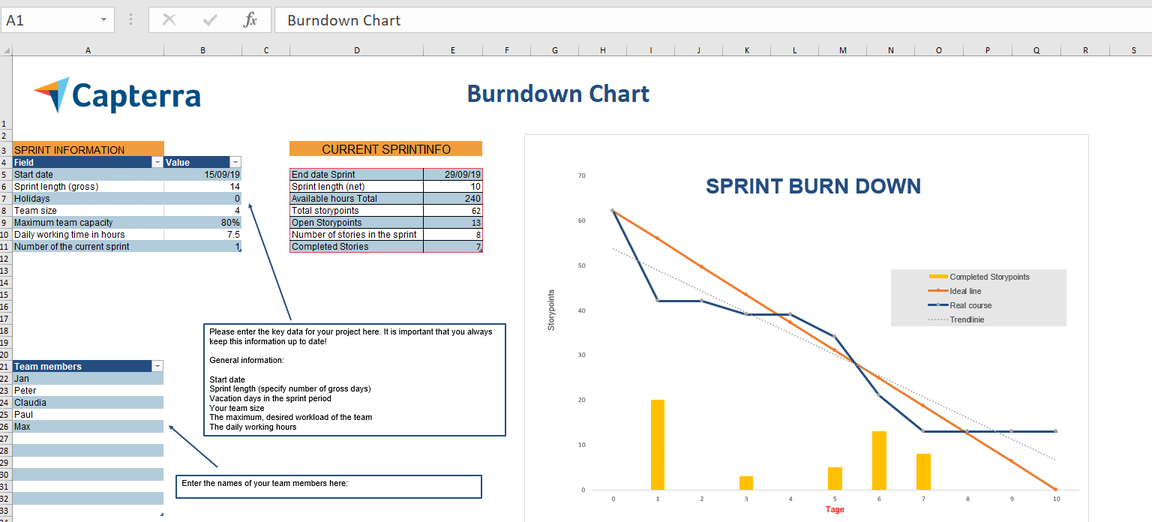
3. Agile Scrum burndown chart Excel template
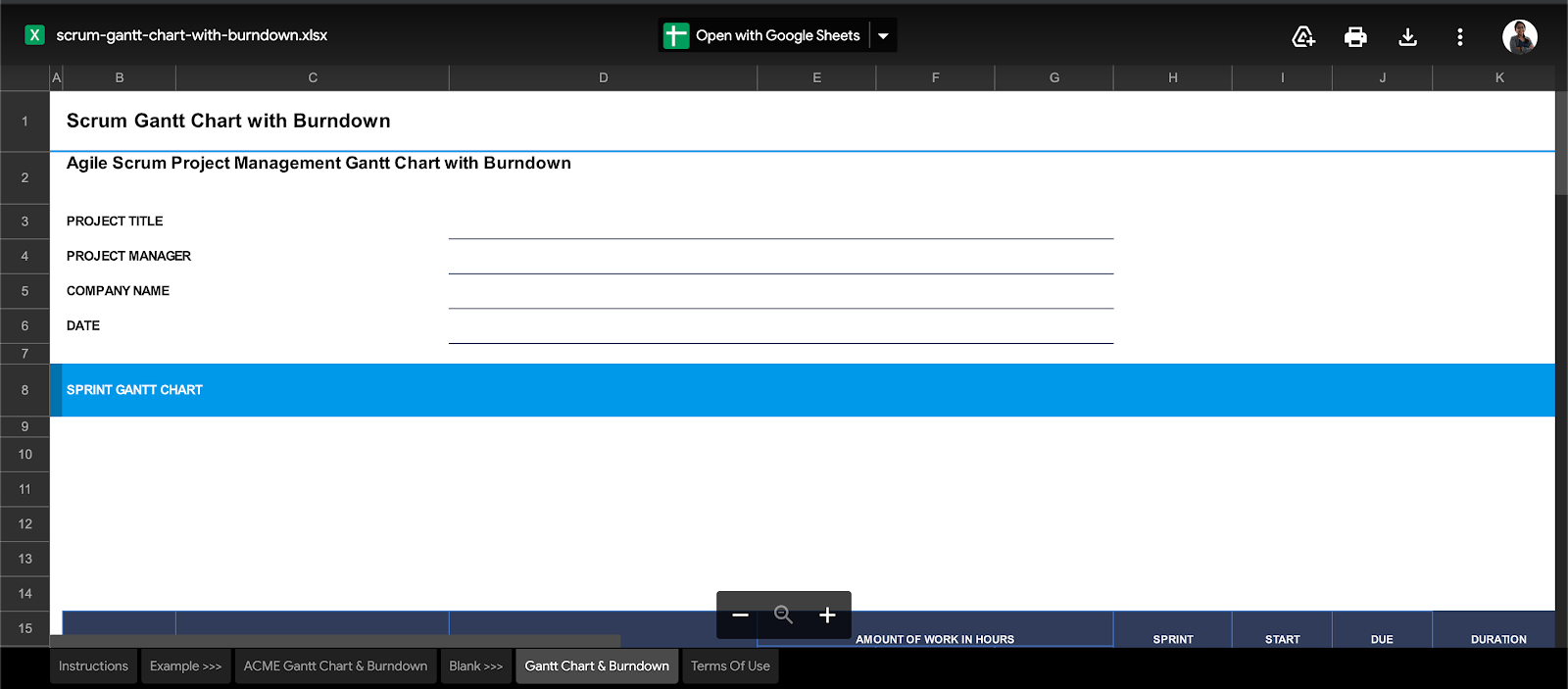
4. Gantt chart + burndown chart template
However, even with templates to save the day, it’s not all smooth sailing with Excel work burndown charts.
The 3 Limitations of Excel for Burndown Charts
When it comes to data management, Excel is a lot of things. It makes data simple, reliable, readily available. But some things about it will make you feel like Cinderella’s stepsisters, trying on those glass slippers.
Because Excel will never be enough for all your burndown chart needs.
Take a look at its glaring flaws.
1. Tedious, manual process
The point of a burndown chart is to give you quick, visual feedback about the sprint’s progress.
But working on Excel defeats this purpose.
Think about it.
Each sprint or project is different.
What’re you going to do?
Build a different table for each of them?
Pfff, please. That’s way too much effort.
Even if you decide to work with templates, how will you present these charts?
Last we checked, if you’re a Scrum master, presenting an MS Excel or Google spreadsheet at your daily scrum isn’t really the best idea.
This means you’ll need to migrate the charts and tables to your company’s intranet or wherever else you’re presenting!
2. Non-collaborative
If working in an Agile Scrum team is like sharing a large, family-sized pizza, MS Excel is like a lonely slice. 🍕
It’s awesome, as long as it’s only a party of one. 👀
Excel does provide basic support for collaborative editing.
It’s simply not smooth enough for an entire Agile team.
3. Inadequate mobile support
Mobile-friendliness is one of the top 10 things to watch out for in any software.
But looking at your Excel burndown chart on your phone is going to be like trying to fit the world map on your palm!
This is just the tip of the iceberg for why Excel is inadequate for most teams. Check out what makes Excel really unfit for project management.
Essentially, Excel is like a set of training wheels for your bicycle.
Everyone needs them. But they also eventually outgrow them.
And that’s the point!
You learn the basics of data management on MS Excel.
But as you move up the project management ladder, it’s time to move on to more significant, better, more powerful tools.
Like , the world’s highest-rated productivity tool.
Create Effortless Burndown Charts with
is your one-stop-shop for every single project management need.
From setting Goals to tracking time on projects, has you covered.
As for burndown charts, they’re well within our wheelhouse too!
Dashboards give you real-time updates about your project’s health at one glance.
And you can populate your Dashboard with Sprint Widgets like burndown charts!
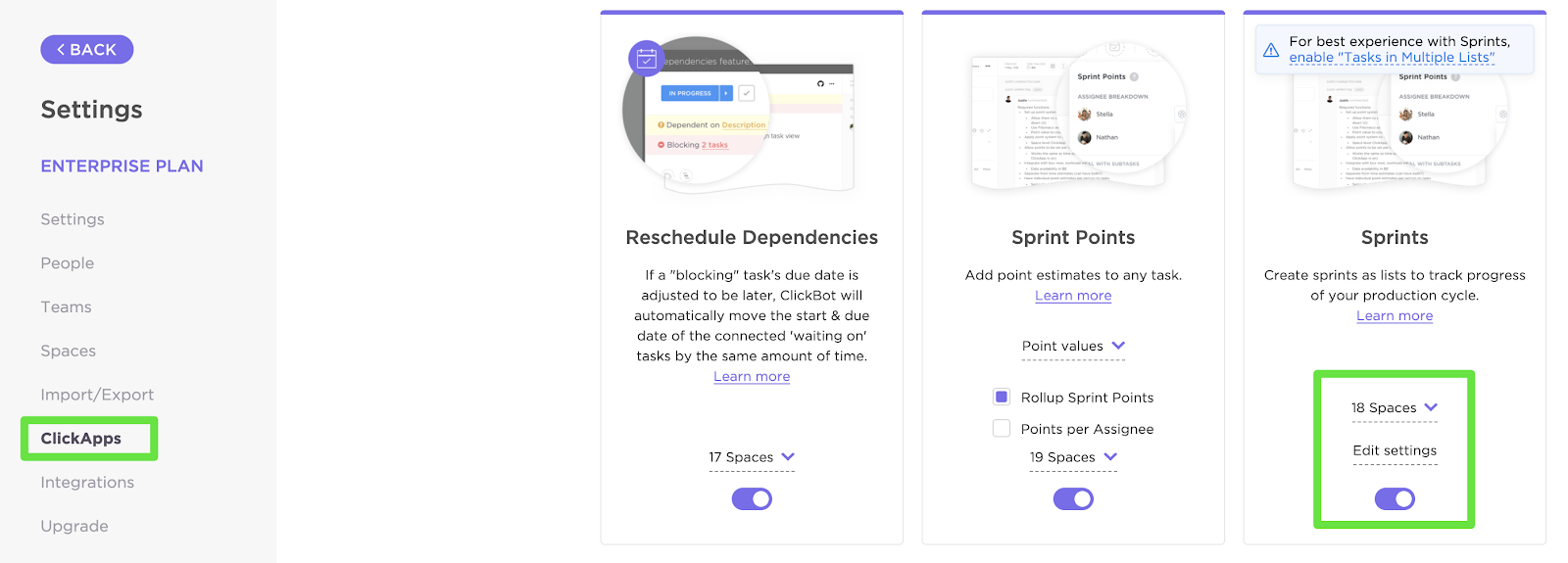
To set one up, first enable the Sprints ClickApp that lets you set and measure sprints on your project.
You can customize your Sprint Widgets by:
- Selecting the source of data
- Setting the time range
- Setting the workload type
Now that your data is in place, here’s how you can add a Burndown chart (or any other Sprint Widget) to your Dashboard:
- Enable Dashboards ClickApp (if you don’t find them by default)
- Click on the ‘+’ sign in the sidebar to add a new Dashboard
- On the Dashboard, click on ‘+ Add Widget’
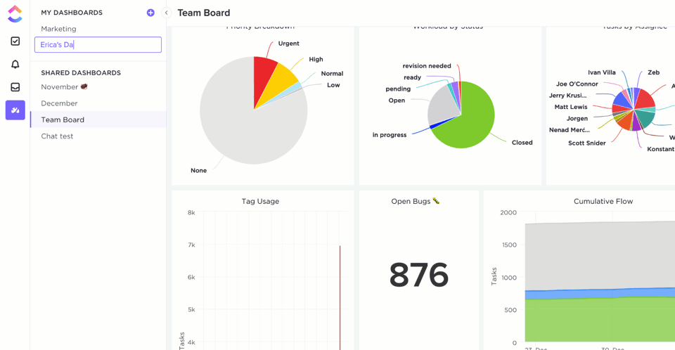
And just like that, you’ll have the Burndown chart that’ll update you on project progress in real-time. Pretty nifty, right?
But notice how we said Sprint Widgets.
Yes, there are more!
These are some other handy Agile Widgets you can add to your Dashboard:
- Burnup chart: measure the scope of completed against the total work
- Velocity chart: calculate the amount of work your team can handle in a sprint
- Cumulative flow diagram chart: identify potential bottlenecks in the sprint’s progress
- Lead time chart: measure the time taken to complete a project (or a portion of it) from start to finish
- Cycle time chart: calculate the time taken to complete a single task from start to finish
And that isn’t all!
is full of more project-friendly features such as:
- Gantt charts: take a look at everything in your project’s timeline at one glance
- Time Tracking: keep a record of time spent per task
- Assigned Comments: assign tasks to team members by tagging them in comments
- Goals: split your sprint Goals into easy-to-achieve Targets
- Automation: choose from over 50+ automations to save time
- Multiple Views: customize your home page by selecting from List, Board, Box, Calendar, or Table views
- Docs: created a detailed knowledge base for your agile and scrum projects
- Powerful iOS and Android mobile apps: for on the go work collaboration
Related Resources:
Burn Your Project Tracking Problems Away 🔥
Microsoft Excel laid down the foundation for advanced data management as we know it.
But let’s face it. Your project isn’t a history project.
And creating burndown charts on an Excel spreadsheet is going to keep you stuck in the dark ages of project management.
To run a high-power, fast-paced, Agile project, you’ll need equally nimble software.
Excel can still play a supporting role. But for your showstopper, you need .
Set up your sprints, track their progress, manage your teams, all in one place with ’s features.
So get for free today and burn past all your project problems!

Everything you need to stay organized and get work done.


