The secret to building an icon library that stays consistent yet flexible is to start with a strong design foundation and set it up for scalability. Icons form a shared visual language that helps users understand actions and ideas across your product. As your company evolves, your icon library should also evolve and grow, with no loss in consistency.
A rigid icon system risks becoming outdated, while one that’s too loose undermines brand recognition. Let’s look at how to build an icon library that grows with your needs while keeping your brand consistent across all products.
Why do icon libraries matter?
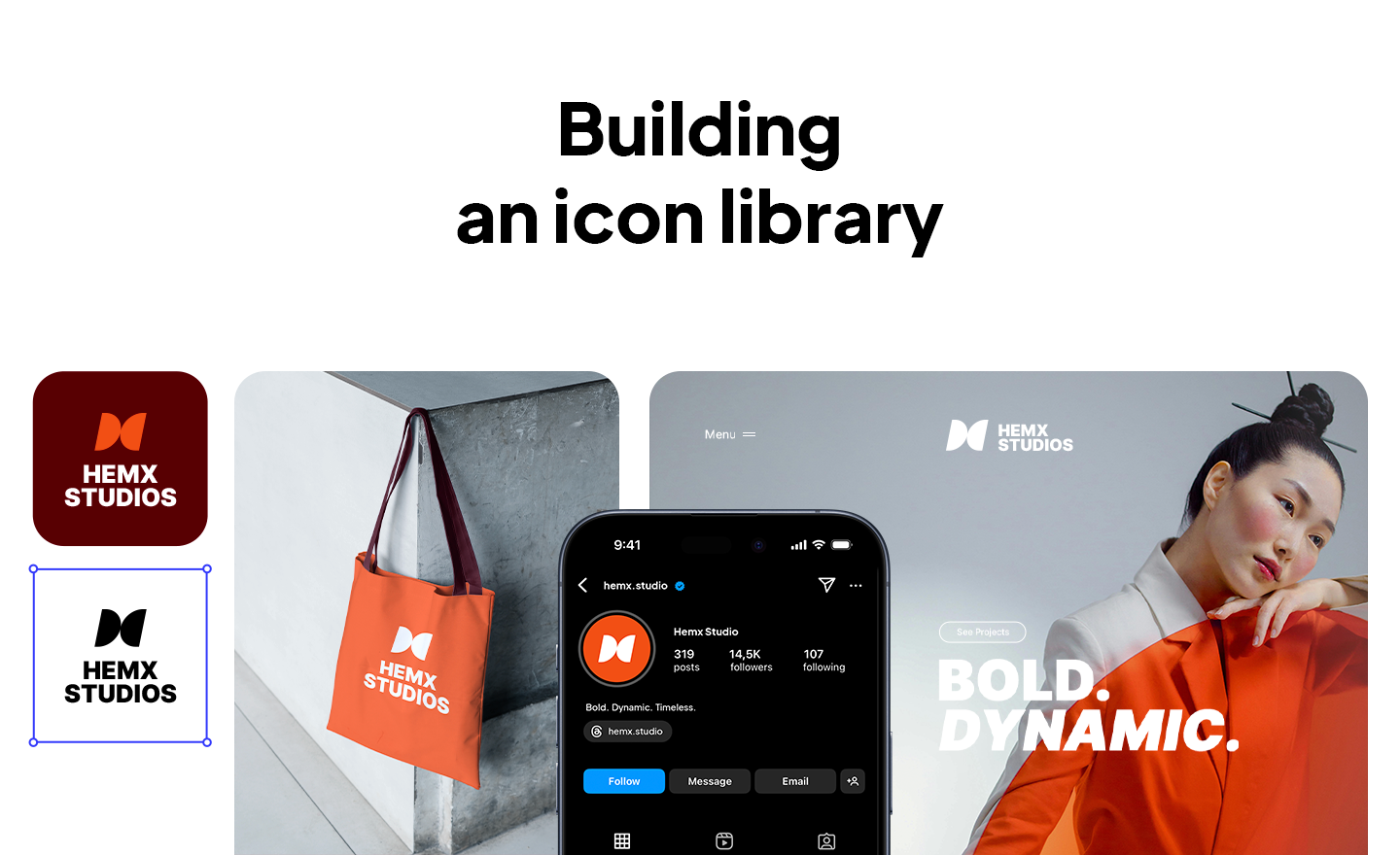
Essentially, an icon library is a collection of icons that a design and development team uses across products. But in practice, it’s the visual dictionary of your brand. Instead of each designer creating their own version of an icon (like a download arrow) every time, teams can rely on a single source that keeps designs consistent, efficient, and recognizable.
It’s smart to have a unified icon library; otherwise, your company’s designers might draw their own version of a search icon. As a result, the product may feel messy. So why are icon libraries foundational?
- Consistency: Using the same icons everywhere makes your product feel familiar and trustworthy.
- Scalability: As your product grows, the icon library can grow with it, so you don’t have to start from scratch each time.
- Performance: Having one set of clean, lightweight icons (like SVGs) helps your product load faster.
- Brand alignment: Icons are part of your brand identity. A well-made library makes every tiny symbol on-brand.
What are the principles of a coherent yet flexible icon library?
The strength of an icon library starts with its foundation. Without clear rules in place, every new addition risks drifting off-brand or breaking the visual flow. Here are the principles that you should follow:
- Set a visual foundation: Define the basics: a consistent grid, stroke weight, and shape style.
- Design for recognition։ Icons should communicate at a glance. Keep them simple, and rely on familiar metaphors (for instance, a magnifying glass for search).
- Plan for flexibility: Think modular. Reusable components, like standard corner radii or stroke widths, make it easy to expand the library quickly.
- Use conventions wisely։ Use established design conventions so users instantly understand your icons, but add subtle brand details, like curves, line endings, or proportions, that make them yours.
How to structure an icon library for growth across products and sub-brands?
Treat your icon library like a system, not just a folder of files. With the right organization, style flexibility, and technical setup, you can build a library that grows naturally with new features, product lines, and sub-brands.
Organize by category
A growing library can quickly become unmanageable if there’s no system behind it. Grouping icons into categories, like navigation, actions, media, or status, makes them easier to find and maintain.
Create style variants
Different products and sub-brands often call for slightly different looks. Offering outlined, filled, and two-tone versions of each icon gives teams flexibility while keeping the core design language intact. This way, you can adapt to different interfaces without creating a completely new library.
Make scalable architecture
Where and how your icons are stored matters as much as their design. Store them in a centralized, shared library. It can be in Figma for designers or as code packages for developers. One source ensures every team pulls from the same set, and the architecture allows for easy extensions without breaking what already works.
Govern and align with brand evolution
A library is only as strong as the rules that protect it. Define ownership so there’s a clear process for approving and auditing new icons. Document rules in an accessible guide to prevent style drift and help new team members onboard quickly.
What’s the best way to build and implement an icon library?
To keep things consistent and scalable in your icon library, you need a workflow that bridges design and development, making icons easy to use across teams and products.
Work in SVG
SVG is the accepted format for icons. Designing in SVG (Scalable Vector Graphics) keeps icons crisp at any size, lightweight for performance, and easy to edit. SVGs also integrate easily into modern design and development pipelines.
Use shared design tools
Keeping your library in a tool like Figma makes collaboration fast. Shared components, plugins, and version control help designers stay aligned, while a centralized library ensures every new project pulls from the same source. This setup also makes it simple to push updates without breaking existing designs.
Enable smooth developer integration
A library only succeeds if developers can use it easily. Exporting your icons as React or Angular components, or publishing them as an NPM package, makes them instantly reusable in codebases. This keeps design and development in sync and avoids the dreaded “designer handoff gap” where icons look great in mockups but don’t translate to production.
Build an icon library that lasts
Building an icon library that’s coherent and scalable means laying down a system that can carry your brand forward. An icon library needs to be structured and have a workflow. Organizing icons into categories, offering style variants, and housing them in a shared, centralized system makes scaling far easier.
A well-crafted icon library saves time, reduces inconsistency, strengthens brand recognition, and adapts gracefully as new features, sub-brands, and products come to life. Follow this guide to create one that lasts.
FAQ
What is an icon library?
An icon library is a shared collection of icons that designers and developers use across products. Instead of creating new icons every time, teams pull from this library to keep everything consistent and efficient.
Why should I build my own icon library instead of using free sets?
Free sets can be a good start, but they rarely match your brand’s voice. A custom library ensures every icon fits your style, scales as your product grows, and strengthens brand recognition.
How do I keep an icon library consistent across multiple products?
Set clear rules for grid, stroke, and shape style. Use a centralized library (like in Figma or as an NPM package) so every team pulls from the same source.
What makes an icon library scalable?
Scalability comes from modular design (reusable components), style variants (filled, outlined, two-tone), and flexible architecture. This way, new icons can be added easily without breaking consistency.
What’s the best file format for icons?
SVG (Scalable Vector Graphics) is the standard. It keeps icons sharp at any size, lightweight for performance, and easy to integrate into both design tools and code.
How often should an icon library be updated?
Update the library whenever new features require new icons, or when brand guidelines evolve. Regular audits (quarterly or bi-annually) help keep it clean and consistent.


