Think of a company that’s generating millions in revenue. With bar graphs or pie charts, tracking changes from the initial value and cumulative effect becomes tricky, as there’s no clear visual comparison.
A waterfall chart in Google Sheets solves this problem by ensuring that the beginning of each bar starts where the previous bar ends.
This approach makes it easy for viewers to understand how positive values and negative values impact overall results.
Even though these are imperative data visualization tools, many experienced professionals struggle with how to make a waterfall chart in Google Sheets.
In this article, we will go through a step-by-step guide that’ll make it easy for you to make waterfall charts.
How to Make a Waterfall Chart in Google Sheets for Data Analysis
How to Make a Waterfall Chart in Google Sheets
Before creating a waterfall chart, organize your data table correctly. You’ll need:
✅ A first column for category labels (e.g., Revenue, Expenses, Profit)
✅ A second column for numeric data, including:
- A starting value
- Positive values (gains)
- Negative values (losses)
- A final cumulative value
Here’s an example data set:

Now, let’s start with the step-by-step guide to creating a waterfall chart.
Step 1: Select your data
- Open your Google Sheets spreadsheet
- Click and drag to highlight your entire data table, including both category labels and values

Step 2: Insert a chart
- With your data selected, go to the top menu and click “Insert” > “Chart”

- This will open the Chart editor sidebar on the right

💡 Pro Tip: Struggling to make sense of complex data in Excel? How To Create A Dashboard In Excel walks you through building dynamic dashboards that simplify data analysis.
Step 3: Choose the waterfall chart type
- In the Chart editor, go to the Setup tab
- Click on the “Chart type” dropdown menu

- Scroll down and select “Waterfall” under the “Other” category

Your waterfall chart will now appear in the spreadsheet, showing how each data point contributes to the final total.
Step 4: Customize your waterfall chart
- In the Chart editor, navigate to the Customize tab
- Adjust chart title, colors, and data labels as needed

- Enable connector lines to improve readability

- If necessary, use reverse axis order to change the x-axis or horizontal axis layout
Here are some best practices to keep in mind when adding this feature to your Google Sheets:
- Check data labels: Ensure each bar is properly labeled to reflect positive and negative values
- Use different colors: Differentiate gains and losses visually
- Resize the chart: Click and drag the edges to make it more readable
📮 Insight: 13% of our survey respondents are eager to leverage AI for complex decision-making, yet only 28% use AI regularly at work.
Why? Security concerns. Many hesitate to share sensitive decision-making data with external AI tools. eliminates this worry by integrating AI-powered problem-solving directly into your secure Workspace. With SOC 2, ISO compliance, and enterprise-grade security, ensures you can safely harness generative AI technology without compromising data privacy.
Limitations of Charts in Google Sheets
More recently, Google Sheets has become frustratingly slow for some users. As one Reddit user described:
There’s no doubt that Google Sheets is a powerful tool for businesses and everyday tasks, but at times, it can become more of a hassle than a solution, especially when working with charts and large datasets.
Here are some flaws to be aware of:
- Struggles when handling large datasets or complex queries. Even a few hundred rows can cause noticeable lag, especially when charts depend on real-time QUERY, VLOOKUP, or ARRAYFORMULA functions. This slows down chart rendering and overall spreadsheet responsiveness
- Offers basic formatting but lacks advanced customization compared to Excel or specialized data visualization tools. Users have minimal control over axis scaling, data labels, and number formatting, making it harder to create professional-grade visualizations
- Updates many charts automatically after every small change, which can be inefficient. Unlike database-driven dashboards, there’s no built-in option to refresh charts only on command—forcing users to rely on Apps Script or manual workarounds to optimize performance
- Supports basic types of charts but lacks specialized options like Pareto charts, Box & Whisker plots, and Sankey diagrams. Even within supported charts, features like customizing connector lines in waterfall charts or adding dynamic trendlines are limited
- Not great at with pulling live data from sources like GOOGLEFINANCE or IMPORTRANGE, causing charts to break, refresh unpredictably, or display “No Data” errors. Unlike dedicated BI tools, Sheets doesn’t offer seamless real-time updates, making it unreliable for dynamic dashboards
💡 Pro Tip: Struggling to turn raw data into clear, impactful visuals? How to Make a Chart in Google Docs walks you through the simple steps to create, customize, and enhance charts—so you can present data with clarity
Create Charts with
While Google Sheets offers a simple way to visualize data, its performance limitations and lack of advanced customization can make it frustrating for businesses handling large datasets.
You might try reducing the load by introducing additional tools, but the process often leads to a new challenge—relying on multiple platforms for different functions. As information becomes fragmented, tracking progress becomes difficult, and the outcome uncertain.
, the everything app for work, steals the show here. With , you get a powerful data visualization and collaboration platform that allows you to create waterfall charts, bar charts, donut charts, line graphs, and more, all without the limitations of Google Sheets:
How Dashboards offers a real-time solution for data visualization
Dashboards offer customizable visual workspaces that consolidate key data points, charts, and reports in one place.

Unlike Google Sheets, where users must create separate sheets for different reports and update them manually, Dashboards automatically pull in live data from tasks, lists, and projects. Here’s how:
- No more manual updates: Charts refresh automatically as data changes
- Better performance: Handles large data sets without the lag that Google Sheets experiences with QUERY() and VLOOKUP()
- Interactive reports: Unlike static Google Sheets graphs, charts allow users to filter, sort, and drill down into specific data points
💡 Pro Tip: Drowning in endless rows of data? How to Make a Graph in Excel simplifies the process of turning spreadsheets into insightful graphs—so you can analyze and present data without the headache.
Creating a waterfall chart in
When you create waterfall charts using , you get automatic updates to track value changes in real-time based on task or project progress. also allows dynamic grouping of income, expenses, and net changes without manual data manipulation.
Step-by-step: Creating a waterfall chart in Dashboards
- Go to your Dashboard and click “+ Add Card”

- Under Custom Widgets, select “Bar Chart Card”

- Choose your data source — this could be revenue, costs, or financial milestones
- Configure the X-axis for categories like revenue, expenses, and net profit
- Set the Y-axis to reflect numeric data (monetary values, KPIs, etc.)
- Enable data labels and color coding for positive and negative values
- Click “Save” — your waterfall chart will now update dynamically
Don’t have time to start from scratch? It’s okay. has your back.
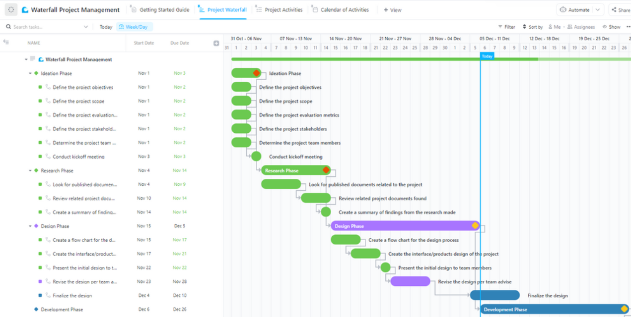
’s Waterfall Management Template provides clear project visibility. Meaning your team can easily track tasks, deadlines, and dependencies with precision.

By offering structured planning and real-time adjustments, this template helps organizations anticipate delays, improve collaboration, and reduce the risk of missed milestones, making project execution more efficient and predictable.
Additional powerful charting features
Everybody loves a good chart (even your boss.) With , you don’t even have to put in much effort to create tables that perfectly align your data.
Here are some options for you to try out:
1. Line Chart widget—track trends in real time
A Line Chart is perfect for tracking changes over time, such as:
✅ Revenue trends
✅ Sales performance
✅ Project progress
Unlike Google Sheets, :
- Handles large data sets without slowing down
- Provides real-time updates instead of manually refreshing queries
- Allows precise timeline comparisons with custom date filtering
2. Bar and Pie Charts—compare and analyze data
Bar and pie charts provide a clear, quick comparison of different data points.
While creating pie charts in Excel or Google Sheets requires you to memorize often complex formulas, with :
- No need for formulas or complex functions—automatic data processing
- Interactive filtering—instant chart adjustments
- No manual chart adjustments—automatic chart updates

3. Gantt Chart View—perfect for project tracking
A Gantt Chart is essential for tracking project timelines, dependencies, and task progress.
Instead of manually doing things on Google Sheets, allow to take care of the following:
- No need for manual adjustments—automatic Gantt Chart updates as tasks progress
- Easy dependency tracking—visually connect tasks, unlike in Google Sheets
- Seamless project integration—drag and adjust timelines effortlessly

4. Table view—ideal for organizing
If you’re used to Excel-style data organization, ’s Table View is the ideal replacement.
Here’s how it stands against Google Sheets:
✅ Eliminate the need for QUERY() functions—Tables update dynamically
✅ Modify multiple rows at once with bulk edit capabilities
✅ Transfer data easily between and spreadsheets with export & import compatibility

Delays are harmful for your projects. But with clear task organization, real-time progress tracking, and deadline management—you are guaranteed success.
That’s what the Waterfall Project Management Template by delivers.

The template structured, phase-by-phase project execution, helping teams stay on schedule and maintain quality throughout the project lifecycle.
Don’t Let Your Data Drown In Waterfall Charts, Makes It All Flow
Chandu Prasad T. S., Senior Account Executive at Smallcase Technologies Pvt Ltd, shares a few things to say about ’s charting features and Dashboards:
Productivity skyrockets when progress is visual. A well-structured dashboard keeps teams motivated and informed.
With ’s Waterfall Management Template, dynamic dashboards, and real-time charting features, teams can track tasks, analyze performance, and optimize workflows effortlessly without worrying about outdated spreadsheets.
Sign up on today and turn your data into actionable insights!

Everything you need to stay organized and get work done.


