As data analysts, let’s face it, we’ve all struggled with writing complex SQL queries and wondered where to start. Things got even scarier when GROUP BY clauses, multiple joins, or window functions came into play. But not anymore.
Data Canvas is a visual data analysis tool that can save you hours of work. With BigQuery Data Canvas, you get a far more intuitive and efficient way to interact with your data—no code required. Just drag and drop.
Why Data Canvas is a Game-Changer
BigQuery data canvas lets you discover, transform, query, and visualize data using natural language. It also provides a graphical interface that lets you work with data sources, queries, and visualizations in a directed acyclic graph (DAG), giving you a view of your analysis workflow that maps to your mental model. Data Canvas addresses these challenges by:
- Simplifying Data Exploration: You can drag and drop tables to create visualizations and charts. You can also ask Gemini, in plain text, to generate a SQL query for the type of analysis you need. This makes it much easier to uncover hidden patterns in the data.
- Boosting Productivity: Since you can prompt Gemini to write SQL queries and analyze datasets, it frees up your time to focus on more critical projects and tasks.
- Empowering Business Users: Business users can perform their own data analysis without needing to learn or write complex SQL statements. In doing so, they help democratize access to data, enabling more people across the organization to generate insights.
- Bridging the Gap Between Data and Insights: Data Canvas lets you turn raw data into a visual story—making it easier to see the relationships between data points and draw meaningful conclusions.
How Data Canvas Works:
Let’s create a Data Canvas and see how BigQuery Data Canvas, powered by Gemini, can help you explore, analyze, and visualize data.
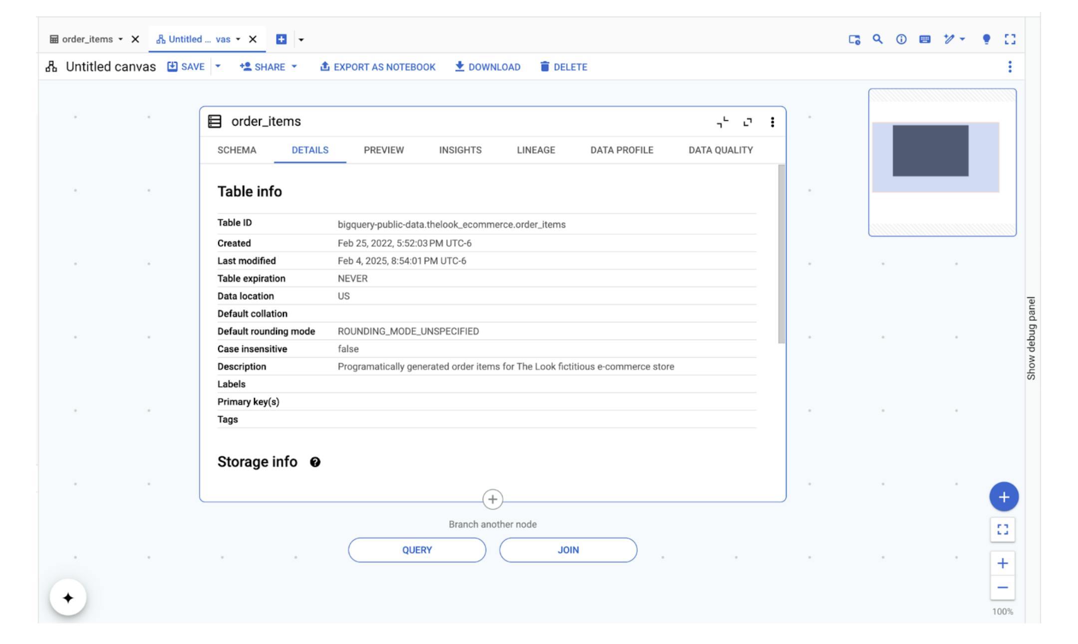
We will use the “order_items” table within the “theLook eCommerce” BigQuery public dataset. Once you have the dataset ready, click on Open In and then click on Data Canvas next.


It will take you to a blank data canvas page where the order_items table will be preselected. From here we can choose to either query this table or join it with another table for deeper analysis.


Click on the Query button and provide a prompt or command “How many unique items were placed in year 2024, and name the result column as num_items” and click on Generate.
This will generate the SQL query based on our prompt, next, click on Run to run the query generated by Gemini.


Upon running the query, it creates a column named num_items and returns the number of unique items placed in the year 2024.
Let’s try another prompt. Click on Query and type:
“Give me a monthly breakdown of unique order items in 2024, ordered by month in ascending order.”
After entering the prompt, click on Generate to create the SQL query. Once the query is generated, go ahead and run it.


Once the query is executed, you can click on Visualize a bar chart, and Gemini will generate the bar chart unique order items per month for the year 2024 as mentioned in the prompt.


You can also take your analysis one step further and ask Gemini to generate insights for us by clicking on Generate Insights.

When you click on generate insights, Gemini generates helpful insights based on the data and the pattern in the data, which would otherwise take so much time to analyze the data sources.
Let’s try one final prompt by clicking on the query and typing this prompt: “Show the total sale price for the orders based on their status for the year 2022.” Click on Generate and Run after the SQL query is generated.


You can also click on Visualize and say create a Pie Chart to generate the chart:


You can also click on Generate Insights and it will help you understand the underlying data in depth and some actions that you can take.


BigQuery data canvas streamlines data analysis. Using simple natural language, you can discover, combine, and analyze data, uncovering key insights. It also facilitates team collaboration with sharing capabilities and report generation with Looker Studio integrations, all within a single platform. Results can be saved, combined with other data, or exported to a notebook for further exploration.


The Future of Data Analysis
Using natural language to analyze data is definitely a step into the future. Data Canvas is a powerful tool that will enable the Data Analyst community to efficiently explore, analyze, and visualize data in a much more efficient manner.
Ready to get started? Check out the Google Cloud documentation and tutorials to learn more about BigQuery Data Canvas and start exploring your data today! You might just discover insights you never knew were there.


