Thanks to the release of Android 16 QPR1 beta 1, I got my first taste of Google’s next major OS and its Material 3 Expressive design changes. While I haven’t explored everything this beta offers, a few highlights are worth mentioning.
If you’re not on the QPR1 beta yet and want to be, it’s easy to join. We have a guide for installing Android 16 QPR1 beta on your device if needed, but the process is straightforward. Opt into the beta program by selecting your eligible phone, which includes models from the Pixel 6 to the Pixel 9 and the A series devices. I have it running on the Pixel 9a. However, remember that it’s a beta build, so some features may not work as expected, and there’s a risk of data loss. Consider this carefully before proceeding.
What do you think about Android 16’s new design?
3969 votes
For those who choose not to download it, you’re missing out. Here’s what stood out to me in Android 16 QPR1 beta 1.
The big Android 16 changes that caught my eye
Joe Maring / Android Authority
First, there are some nice visual updates thanks to Material 3 Expressive. You might love or hate these changes, but I quite like them. We first saw Material 3 Expressive last week on The Android Show, and it refreshes Android 16 with new physics-based animations, upgraded app components, fresh color themes, background blur effects, and more. While not everything will be in the stable release of Android 16 next month, the QPR gives us a glimpse of what’s to come.
There are some nice visual updates thanks to Material 3 Expressive.
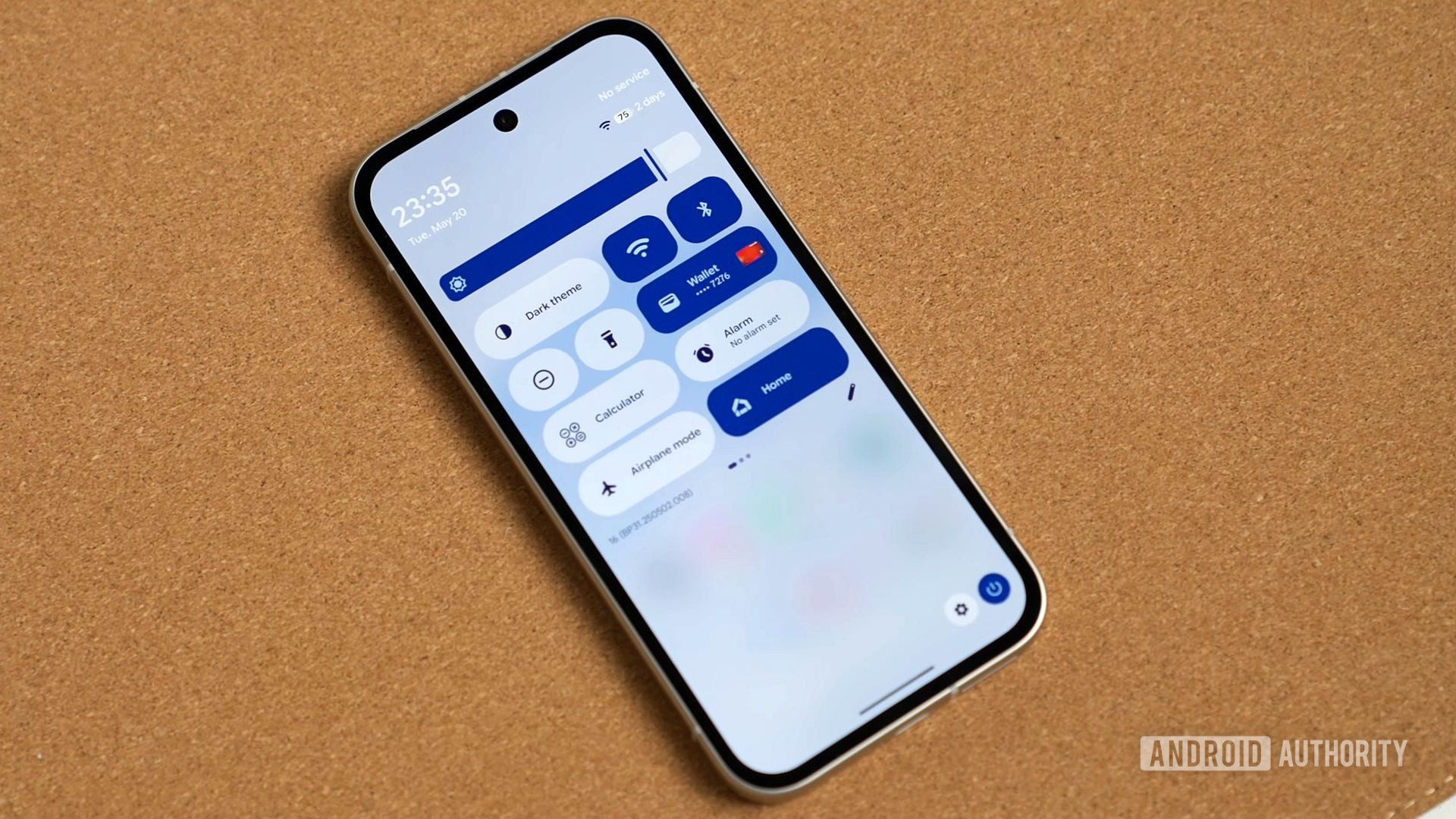
One of my favorite updates is to the Quick Settings shade. Toggles and buttons are bolder and more colorful, adding plenty of personality. The previous version felt bland and lacked customization, but now you can resize these tiles, which is a nice practical addition. There’s more customization, allowing you to make your quick settings more attuned to your needs. And if you resize your tiles to the smallest size, thereby removing their name, Android 16 has a nifty trick to show you what you’re clicking on with a flashing prompt at the bottom of the Quick Settings panel.
You now have one-click toggles for internet and Bluetooth, too. In quick settings, if you swipe down twice, you’ll notice a nice blur effect. It correlates with your background, giving a more expressive feel, which the old version of Android lacked. Blur is everywhere in Android 16, not just in quick settings. On the recent screen, you’ll see a blurred version of your wallpaper peeking through, similar to quick settings. This is more obvious, and I really like it.
Blur is everywhere in Android 16.
There are other significant changes to the UI, with the status bar’s Apple-inspired tweaks among the more noticeable.
Andy Walker / Android Authority
The biggest change is the battery icon, which now shows the percentage inside the indicator for the first time. Previously, it was on the side, showing the remaining percentage, but now that figure is displayed within the shape itself. There’s also an update to the Wi-Fi symbol in the status bar, with a more distinctive three-part design, and a new dual-SIM-friendly signal bar design for your carrier connections.
Another Material 3 Expressive change comes to the volume controls. It’s less bubbly than before, a small change I like. The pop-out volume control has also been redesigned, with sliders now similar to the simpler home screen volume control.
In Settings, you’ll notice a change in appearance. Colored symbols down the left side make it easier to identify items at a glance. This makes the Settings app feel different and more navigable than ever before.
In the fingerprint unlock section of Settings, there’s a new “Check enrolled fingerprints” button. Pressing it opens a black screen with a fingerprint symbol. When tapped, it returns to the settings menu, highlighting the saved fingerprint used to unlock your phone. If the fingerprint is not enrolled, a prompt saying “Fingerprint not recognized” shows up. It’s a good way of checking if someone has sneakily enrolled a fingerprint on your phone, or if you want to verify your fingerprint is enrolled properly.
Some of my favorite changes are in the wallpaper settings, where Google has added plenty of new customization options.
Some of my favorite changes are in the wallpaper settings, where Google has added plenty of new customization options. For example, you can now put your wallpaper into a customizable frame called Magic Portrait by clicking the effects button in wallpaper settings.

Andy Walker / Android Authority
You can pick from five frames, some of which can annoyingly cut off parts of images, like my dog’s face. The feature is still in beta, so resizing isn’t available yet. You can select frame colors from below the frames, which are determined by the dominant wallpaper colors.
Another wallpaper change I like is the addition of weather elements, a feature Samsung had before on its One UI builds. Google now lets you add weather elements to your wallpaper, like fog, rain, snow, or sun, based on your local conditions. You can change the intensity with a slider; it looks cool, especially with rain in 3D. It’s surprisingly practical too, as I can now check my wallpaper instead of opening my weather app.

Andy Walker / Android Authority
There’s also a new slider to resize the clock on the lock screen, but it’s currently only available on the default clock using a reactive font. This allows you to change size and width in one movement. Perhaps this will come to other clock styles in the future, but its scope is limited for now.
There are smaller changes, too. When closing apps and swiping up, there’s a new animation. In the recent menu, a new pill is overlaid on each app, expanding to options like screenshot, select, and pause the app.

Adamya Sharma / Android Authority
A small pop-up appears when updating your phone, indicating more space for apps and widgets on the home screen. Finally, there’s more space for apps on the Pixel Launcher home screen, and At a Glance has shrunk slightly. Is this a small step towards moving it? I hope so.
Google has borrowed some design ideas from Samsung and Apple, too.
A lot is lurking within Android 16 QPR1 beta, and I feel I’ve barely scratched the surface. But these are some of the bigger changes I’ve noticed immediately after downloading it. I’m eager to get stuck into the beta in earnest, but early signs indicate an exciting suite of practical and aesthetic changes.
What do you think of Android 16 so far? Are you going to download the first beta, or have you already? Let us know in the comments below.


