Stephen Headrick / Android Authority
I was so excited to try out one of the headlining features of Google’s latest Pixel Drop. “Was” is the keyword here, unfortunately. One of the biggest features, prominently displayed in all the marketing for this update, is Pixel VIPs, a feature promised to help you keep up with those you care about most in the most convenient way possible. I’ve tried out this sort of relationship management app in the past, and I was excited at the idea of a lighter-weight approach that’s also more deeply integrated into my device. My experience, though, didn’t live up to the promise.
Do you like Pixel’s new VIP widget?
1 votes
Where’s the widget?
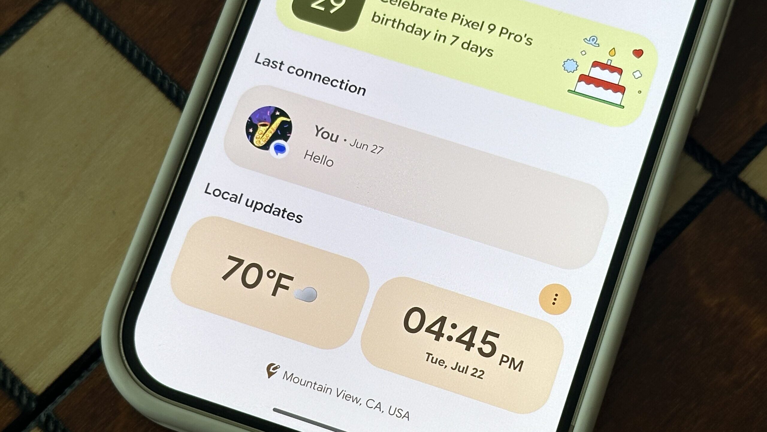
First, there was the confusion around finding the feature. Like Pixel Screenshots and Pixel Studio, which both arrived last year, VIPs appeared to be a new Pixel-exclusive app. Well, it is and it isn’t. Technically, it’s a standalone APK, but it doesn’t appear as its own icon in the launcher. Instead, it’s a widget in the Contacts app and an extension of the Highlights tab that you could already use. I always found this tab to be useful for seeing upcoming birthdays among my contacts. While the new VIPs widget feels like a perfect extension of this tab, it simply wasn’t made very clear where to find it. Maybe I was just too eager to try it out and missed something in the details of the announcement, but I saw others across the web who were equally as confused.
As for the widget itself, well, it’s…underwhelming. I want to love this feature, I really do, and there are some really useful parts that we’ll talk about in a moment, but if I’m going to put a widget on my home screen, I want it to look good. When Google is hyping up a new feature in all its marketing, I expect it to have an excellent design. But let’s be real: widgets on Pixels need some work.
Google wants better widgets, then releases this

According to Google, “Tier 1 widgets that, from the top left, properly crop content, fill the layout bounds, have appropriately sized headers and touch targets, and make good use of colors and contrast.”
Just a few months ago, Google seemed poised for a widget renaissance on Android. In March, it introduced Widget Quality Tiers, seemingly acknowledging the need for widget improvements on this platform. So when I saw a widget featured in the announcements for a brand new update, I was eager to try it out to see if it met that new high bar.
My excitement was met with reality after updating my phone. The first issue that sticks out to me is the design of the VIPs widget itself. This is probably the most disappointing part of all. After Google’s newly announced Material 3 Expressive, in addition to the recent announcements about widget quality, I was hopeful of a thoughtfully designed widget. Instead, I was met with yet another widget that I’d hesitate to keep on my second or third screen, let alone on my home screen.
I can think of a lot of ways to improve the VIP widget as it stands. Padding comes to mind, for example. You can set the widget to be many different sizes, but none offer great spacing. If you choose the smaller widget size, everything feels squeezed together, but if you choose a large widget, there’s so much open space that it just feels wasted. With Material 3 Expressive, design is supposed to be bold and forward-thinking, but this feels like most widgets on Android, most of which look and feel archaic.
Just for fun — and I’m not a professional designer by any means — I fired up Figma and tried my hand at mocking up my vision for a Pixel VIPs widget. In the smaller widget, for example, why not exclude the names and show larger photos of your VIPs with larger tap targets? I’m gonna go out on a limb and guess that you know someone’s face without their name listed underneath if you consider them VIP enough to be here. Or in the larger widget, why not make the VIP photos a lot bigger, almost a photo frame to feature your most important people? I’m sure Google’s professional designers could do better than my mock-ups, but you get the point.
Barebones notes in the AI age (or Google Keep age!)
Design aside, there’s still some basic functionality that feels half complete — again, not okay for a headlining feature! Take, for example, the notes section. Each VIP gets a section of their profile dedicated to little notes that might help you remember things about recent conversations you’ve had or what big events they might have mentioned to you. This is a manual process, of course, as you have to enter the notes yourself; there are no AI suggestions based on your conversations (yet?), but I still find the idea of it useful. I used it recently after a phone call with my brother. He told me when he’s planning to close on his home purchase, and I wanted to remember the date so I could make sure to check in around that time.
This note section is a super convenient and useful place to store these little bits of information, but it doesn’t feel finished. The notes are the most rudimentary form of notes I’ve seen in a modern app. Why can’t I set a reminder for a note? Why can’t I archive the note to keep, in case I want to review it later, but not have it in my face? You can only delete a note. Why can’t I search through or tag these notes? There are no organizational tools to be found. Without these, you might be better off using Google Keep or Tasks to store this type of information.
A good start, but not worthy of my home screen yet
There’s a lot to love with Pixel VIPs, but there’s a lot more potential that I hope gets added in a future update. I love that you get a prominent reminder for a VIP’s upcoming birthday, with a cupcake emoji on the widget and a colorful banner in the full-screen profile. I enjoy seeing my most recent interactions with my favorite contacts, although I hope they add other messaging sources in the future; currently, only Google Phone, Google Messages, and WhatsApp are being displayed here. If you enter a VIP’s address or you already share location in Find Hub, their current location is displayed in their VIP profile, along with the weather and time in their city. Notes, as I wrote above, have the potential to be even better with local AI analysis of shared messages, custom reminders, and integration with other Google note-taking apps.

Stephen Headrick / Android Authority
Pixel VIPs has so much potential to be a useful widget, but I wish it looked better.
The last section of the app is “Things to do together.” You can enter your preferences for activities you like to do with the VIP, and the app will start recommending things. So far, mine has only recommended movies and TV shows, and it doesn’t feel very customized. I’m hoping this feature evolves into a more personalized recommendation system in the future, perhaps using an on-device analysis of your interactions, or based on a shared Google Maps list or something like that. I think there are ways to build these suggestions with a privacy-first approach, and I’d love to see Google do more here. For now, it’s not very useful to me at all, but since it’s at the bottom of the app, it’s not too much in the way.
Pixel VIPs is just one example of a widget that needs work. As someone who lives multiple states away from many family members and friends, I am excited for its potential to help me stay in touch with the VIPs in my life, but both Google and third party developers alike need to put more emphasis on widgets if they hope to see a greater adoption rate among Android users.


