Designing icons for an inclusive web means making every symbol recognizable and readable in any context. Every icon you see on the web carries more weight than its handful of pixels suggests. When these visual shortcuts fall short on accessibility, visitors with low vision, color-blindness, or screen-reader workflows lose essential way-finding cues along with their patience.
That’s why 10Web’s product design team treats iconography as a core usability layer. This guide pulls straight from our team’s day-to-day work and suggests clear steps. You’ll also see how we blend good-looking design with thorough testing, showing that accessibility is the heart of a modern interface.
What is icon accessibility, and why does it matter?
Icons guide users through every app or website. If they don’t work for people with low vision, color-blindness, or screen-reader tools, the whole experience can fall apart, and that can mean lost sales and even legal trouble. Here’s why fixing icon accessibility protects your business and helps every user.
The business & legal drivers
- The DOJ’s 2024 regulation sets clear accessibility standards for state- and local-government websites and apps, and violations can spark investigations, costly fixes, civil penalties, and reputational damage.
- European Accessibility Act suggests that from 28 June 2025, any business offering digital products or services in the EU must meet the Act’s accessibility baseline or risk fines of up to €20.000 per violation and even blocked market access.
Bottom line: meeting icon-accessibility guidelines isn’t just good practice; it keeps the legal and financial teams smiling.
Inclusive design = better UX for all
I talked with Eduard Alaverdyan, Product Designer at 10Web, and he told me, “In all design fields, such as product (UX/UI) and graphic design, we focus on creating for everyone, not just for any exclusive users. Our goal is to make designs that are accessible and inclusive, ensuring everyone can easily use and enjoy what we create.”
What are the core icon accessibility standards?
Icon accessibility standards include clear contrast and semantics, familiarity, and the smart use of ARIA (Accessible Rich Internet Applications). Here is the checklist Eduard recommends following when creating accessible icons.
Contrast
Meet WCAG 2.2’s 1.4.11 Non-Text Contrast. Icons must hit 3:1 contrast against the background; 4.5:1 if the icon is interactive (e.g., navigation). That’s because 3:1 lets most people with low vision reliably distinguish non-text graphics from the background, and 4.5:1 keeps small, thin-stroke interactive icons actionable across screens.
Semantics
Every functional icon needs a descriptive title so assistive tech announces its purpose, not just “image.” Map roles and labels early, then implement with code, e.g. <svg role=”img” aria-label=”Search”>…</svg> or via aria-labelledby.
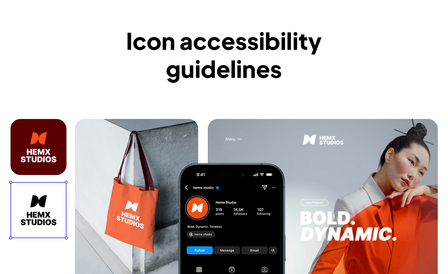
Familiarity
Use well-known symbols that users already recognise quickly. Don’t reinvent classics: a house means Home; three lines (“burger”) or three dots (“kebab”) mean Menu. New metaphors slow recognition and add friction.
Consistency
Mixing Stroke and Solid styles or using too many sizes creates visual noise and hurts readability. Eduard suggests choosing one style (Stroke or Solid), sticking to 3-4 sizes, and checking balance with rulers and grids.
- Stroke is the outer border, no fill.
- Solid is the filled shape, no outer border.
Smart ARIA usage
Use ARIA to maintain a clean and informative accessibility tree. Decorative icons get aria-hidden=”true”. If an icon triggers help text or a tooltip, connect it with aria-describedby so that the same guidance reaches assistive technology users.
Color discipline
Too many colours break cohesion and can tank contrast. Avoid multicolor sets; use neutral or brand colours to keep the set readable and consistent.
Put together, these four guidelines form a quick checklist: strong contrast, clear labels, familiar analogies, and precise ARIA roles. These make everything needed for icons that welcome every user.
How to choose the right icon format?
| Format | When to choose it | Watch-outs |
| SVG | Best for icons that need to scale, change color, or hold gradients/animation. | Slightly larger files; some controls need JavaScript. |
| PNG | Safe fallback for e-mail clients or legacy systems. | Must export at high resolution or the icon will blur on HD displays; heavier file sizes. |
| Icon Font | Handy for a huge set of single-colour glyphs; one HTTP request and colour via CSS. | Screen-readers may mispronounce ligatures—add proper ARIA, and avoid if the icon needs more than one colour. |
Eduard’s rule of thumb: “Complex, multi-color icons = SVG. Quick, monochrome sets = icon font.”
How to create an accessible icon set?
- Audit everything – List every functional icon, then map its role and the exact text you’ll expose with aria-label or <title>.
- Pick one library or draw your own – Choose a single open-source set like Lucide or Material Icons, or craft an in-house library. Mixing packs muddies style and slows dev.
- Lock one style – Decide on Stroke or Solid and stick to it. Mixing styles breaks visual rhythm.
- Limit sizes to 3-4 presets – Use grids and rulers to be sure icons feel equal, even when their frame sizes match.
- Check contrast early – Run automated tests: ≥ 3:1 for static icons, 4.5:1 for anything clickable. If an icon fails, thicken strokes or adjust colour—never settle.
- Mind the palette – Neutral or brand colours keep the set coherent; skip multi-colour experiments unless the UI truly calls for them.
- Add semantics in code – Example: <svg role=”img” aria-label=”Search”>…</svg>. Mark decorative icons aria-hidden=”true”.
- Test with real tools – Navigate the interface by keyboard and screen-reader to catch hidden traps.
- Document and enforce – Write the rules into your design system and add a lint check in CI so rogue icons never sneak in.
Conclusion
Accessible icons are the foundation of an inclusive interface. Eduard’s checklist keeps the process simple: use trusted shapes, one unified style, strong contrast, clear ARIA labels, and the right file format for the job. Audit, test with real assistive tools, then lock the rules into your design system so accessibility stays there. Follow these steps, and every user, on every device, will reach their destination with confidence.
FAQ
What does icon accessibility mean in plain language?
Icon accessibility means every icon is easy to recognize, readable in any context, and correctly announced by assistive technology. In practice, that’s a strong contrast, clear meaning, and proper code so screen readers say what the icon does.
What makes an icon accessible?
High enough color contrast, a clear, accessible name, and a familiar metaphor users decode instantly. Consistency also matters: pick one style (Stroke or Solid), limit sizes to 3-4 presets, and avoid multicolor sets that hurt contrast.
How do icons meet WCAG standards?
Follow WCAG 2.2’s Non-Text Contrast: at least 3:1 for essential graphics and 4.5:1 for interactive icons. Satisfy Name/Role/Value by adding an accessible name with aria-label, aria-labelled by, or an SVG.


