Thinkific is committed to being the best possible learning commerce platform — the place where courses, community, and commerce come together. To maintain that commitment and continue serving our customers in the face of AI competition and the growing expert economy, now was the time for our business to evolve.
The first step in that relaunch was honing in on who we serve best: subject matter experts, academies and training companies, and companies committed to building learning experiences for their customers. Next, we needed to invest in key areas of our product, including communal learning, engagement and retention features, scaling solutions, and AI (learn more about those investments in this post).
Finally, we needed a brand that showcases our renewed commitment to serving the world’s best learning businesses and shaping the future of online learning
This is the story of that final step; the story of our 2025 rebrand.
We worked with Focus Lab to build a brand that was elevated, approachable, and customer-forward, and we’re so proud of the result.
An emboldened logo and icon
While we never considered renaming the company, our logo and icon were relics from the very early days of Thinkific and needed to be updated for clarity and impact.
These are some of the most visible parts of our brand — a recognizable signature that unites all of our visual communication.
The Thinkific T icon is a time-honored symbol whose simplicity and memorability make it a timeless representation of the brand. We didn’t want to change it too much, but we refined the icon for better scalability, ensuring clarity at all sizes by reducing whitespace, thickening its elements, and adjusting for better visual balance.
For our wordmark, we squared the terminals and gave it more weight, making it feel both bold and mature — qualities that are emblematic of our customers — while optimizing legibility at smaller sizes.
Then we locked these elements together, creating a strong association between icon and wordmark that adds recognizability to both. The result is a logo that is passionate and unmissable.
Finding our type
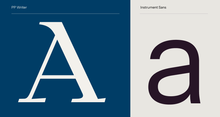
We might have spent more time debating type than anything else in the brand. The differences in typefaces/fonts might seem subtle, but they can be so noticeable in application that you need to invest the time to get it right.
We wanted a font family that felt professional but also modern, much like the experts we work with day in and day out.
Our primary typeface, PP Writer, is a modern serif with a sense of authority and experience — something we strive to embody with our customers.
And our secondary typeface, Instrument Sans, is a timeless sans-serif that’s malleable enough to be used across mediums and sizes, bringing consistency to our brand.
Coloring the brand
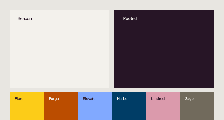
From day one, Thinkific was a very blue brand. We added and removed a number of colors from the brand over the years, but, like so many other software companies, it always seemed to focus on a basic blue.
With the new brand, we wanted to very intentionally step away from the blue and pick primary colors that really separate us from any other company in our industry while exemplifying brand qualities like approachability, maturity, and passion.
Enter Rooted.
Our new brand colors center around this beautiful plum color and an off-white pairing we’ve called Beacon. Rooted (dark plum) represents the deep foundation of expertise and experience that grounds us. Beacon (off-white) illuminates the path forward, adding clarity and offering a guiding light towards new opportunities.
These are supported by a palette of accent colors that add visual interest and complement our core, including a prominent yellow and unmissable red-orange.
The visual impact of this palette is unmistakable. Color now distinguishes the Thinkific brand, adding meaning, energy, and depth to our identity.
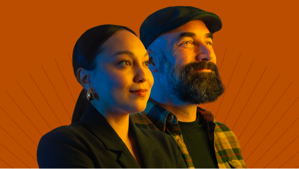
Customer-first photography
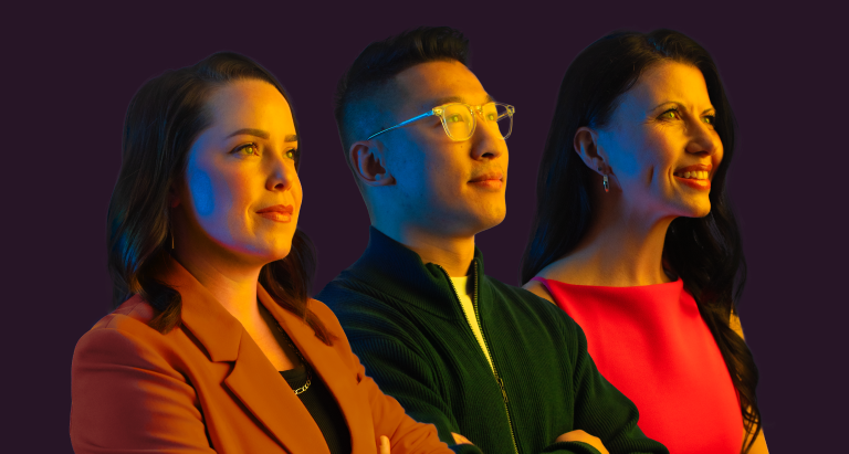
While we believe AI will accelerate and enable our customers’ growth, make no mistake: our business is a human business. Our customers are the experts driving online learning forward. They’re our heroes, and the stories of their impact (on themselves, on their businesses, and the lives of their own customers) keep us inspired and hustling day in and day out.
We wanted our photo treatment to show customers in the heroic light they deserve. This portraiture style captures the determination, optimism, and expertise of both the individuals pictured and the Thinkific brand as a whole.
Hitting the right notes

Our new messaging is also customer-centric, but is focused on our role as an enabler and supporter. When planning the tone and approach to messaging, we anchored on this concept of a Field Guide. Historically, a field guide is a book someone would bring out into nature to help them identify plants and animals, or more generally, support them in their exploration. When it comes to Thinkific’s customers, we see our role as a trusted leader who bridges the unknown with the familiar, empowering and inspiring with confidence while providing ongoing support.
With that archetype in mind, we fleshed out our brand voice, honing in on:
Confidence, as in trustworthy, grounded, optimistic, and uplifting
Friendly, as in approachable, lighthearted, and empathetic
And smart, as in clear, logical, and straightforward
If you’re looking for a trustworthy partner who will provide a clear path to growing your business while offering empathetic support along the way, you’ll find it in Thinkific.
An evolution, not a revolution

We are extremely proud of this new brand and the meaning it will convey to our customers and those who haven’t discovered us yet. But it’s important to emphasize that this isn’t a 180-degree turn. This is us doubling down on the qualities and priorities that have allowed us to serve tens of thousands of experts and companies over the past 13 years.
We’re evolving to keep pace with our incredible customers and show others like them how we’re shaping the future of online learning.


