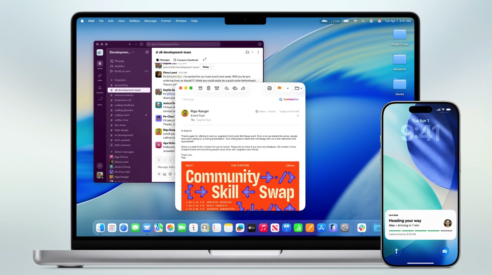
In the wake of Apple’s WWDC keynote, many people were quick to proclaim that this was one of the more boring WWDCs in recent memory. If I’m being honest, I’m inclined to agree. The rub, however, is that I don’t necessarily think that’s a bad thing. Sure, the keynote lacked any groundbreaking features. And no, I wasn’t exactly blown away by the Liquid Glass overhaul. But after the vaporware fiasco that plagued last year’s WWDC — with many Apple Intelligence features promised but still not delivered — it was nice to see Apple focus on improvements we can actually expect to see on release day.
So, while Apple’s WWDC keynote won’t go down in history as a groundbreaking event, there are enough features to make macOS Tahoe and iOS 26 compelling upgrades. All that said, there is one slight change in the upcoming macOS that will undoubtedly leave seasoned Mac users scratching their heads, if not downright furious. It may seem trite to an average user, but for folks who have been heavy Mac users for many years, the change will be annoying to say the least. Specifically, I’m talking about the new design of the macOS Finder icon.
What in the world is that?!
The new design is subtle, but once you notice the change, it cannot be unseen. As seen above, the color scheme of the two Finder faces has been flipped. For more than two decades, the Finder icon featured a darker blue hue on the left and a lighter blue/grey hue on the right.
Apple’s Finder icon has a long and storied history
For some historic evidence, on the left is a snapshot of the Finder icon from a Mac OS X Public Beta all the way back in 2000. That’s 25 years of tradition. 25 years of a familiar face now switched all around for absolutely no reason. And for longtime Mac users, you’ll remember that the Happy Mac icon as we know it today goes all the way back to Mac OS 8 in 1997, as illustrated on the right. And the icon design itself, without the colors, goes back to System 7 even before that.
The new design is unnecessary at best and off-putting at worst. While the shape of the icon itself has subtly shifted over time, the color scheme has remained consistent.
Taking a look at various social media networks like Twitter and Reddit, the Mac faithful are none too pleased with the icon shift. It certainly won’t cause a migration to Windows — and who knows, maybe we’ll all adjust after a few days of usage — but I fail to see why the design was implemented in the first place. Why unnecessarily tweak an iconic and recognizable design for no discernible reason?
One designer on Twitter showed how Apple could have applied its Liquid Glass motif to the Finder icon without shaking up the original aesthetic too much.
It’s worth noting that the original Happy Mac icon was designed by none other than Susan Kare, the famed graphic designer responsible for many of the original fonts and icon designs on early Mac systems. Following a long stint at Apple, Kare went on to design an untold number of icons for a variety of clients over the course of a few decades. To put it mildly, she’s a design legend. And with that said, it’s odd that Apple would have enough respect for nostalgia and history to repurpose the icon for its Face ID animation, but not enough reverence to maintain its iconic color scheme.
For all I know, this will all be water under the bridge as users become accustomed to it. Recall, many people found the notch on the iPhone X distracting at first. Following that, many found the Dynamic Island distracting. But over time, the human brain has a tendency to adjust to change. Perhaps the Finder icon will soon fall under the same category. But until then, I hope Apple reverses course in subsequent macOS betas. Meanwhile, make sure to check out our rundown of the 5 best macOS Tahoe features. It’s an intriguing update notwithstanding the pesky icon change to the Finder.
As a final point, it’s worth noting that macOS Tahoe will be the last major macOS update compatible with Intel Macs. The last Intel Mac from Apple was the 27-inch iMac in 2020, so it stands to reason that most Macs in use today use a variant of Apple’s M-series chips.


