Here are 7 ways to improve the UX of Flipper Zero — making it easier for new users to get started while keeping existing users more engaged as they explore its features.
1. Simplify the menus and the first-time experience
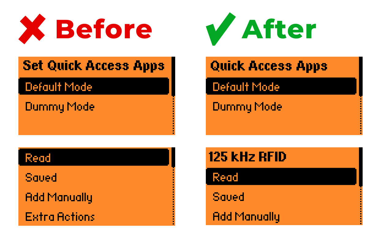
Currently, the menus are overloaded with too much information and technical jargon. It can be confusing, and users often have to dig through the documentation on the official website just to understand the basics. The onboarding process can be made smoother by presenting information more clearly. For example:
-
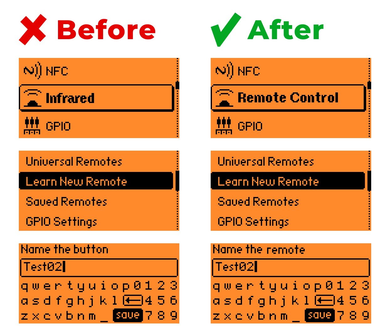
Group and rename menu items with plain, task-based labels instead of technical terms:
-
“Remote Control” for Infrared, Sub-GHz;
-
“Cards & Keys” for NFC, RFID, iButton;
-
“Hardware” for GPIO;
-
“Computers” for BadUSB, U2F.
-
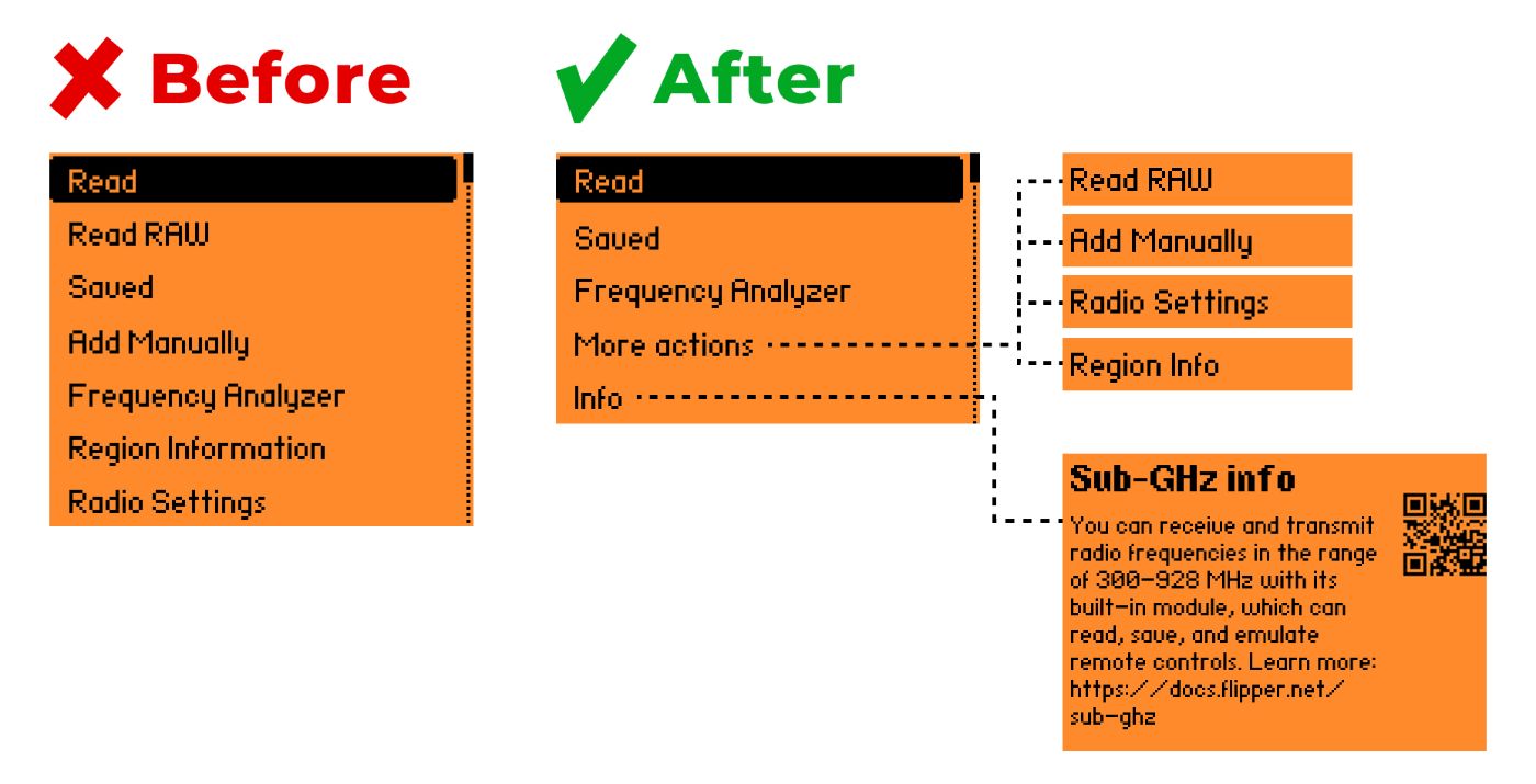
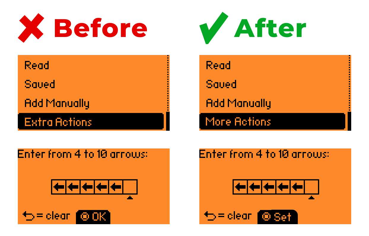
Hide rarely used features behind a “More actions” button, and move extra explanations into an “Info” section. Users can access details only when they need them. QR codes linking to detailed official documentation could also make this more convenient.
-
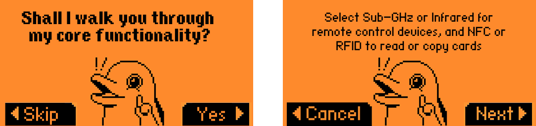
Add a short tutorial for first-time use to introduce users to the device’s core capabilities.
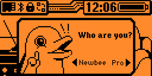
Alternatively, offer two interface modes:
-
Beginner Mode — with simplified functionality and hints;
-
Pro Mode — with the full feature set.
Ask users which mode they want when they first power on the device, and allow switching between modes later in the settings.
2. Use familiar design patterns
Flipper Zero is a unique device, and by default it implies a steep learning curve for the user. This learning process can be made much easier by applying familiar design patterns, such as:
1. Standard icons and terminology.
- Use commonly accepted terms like “More actions” instead of “Extra actions” in the RFID menu. Replace vague labels like “OK” with clearer ones such as “Save,” “Set,” or “Apply” when saving a PIN code.
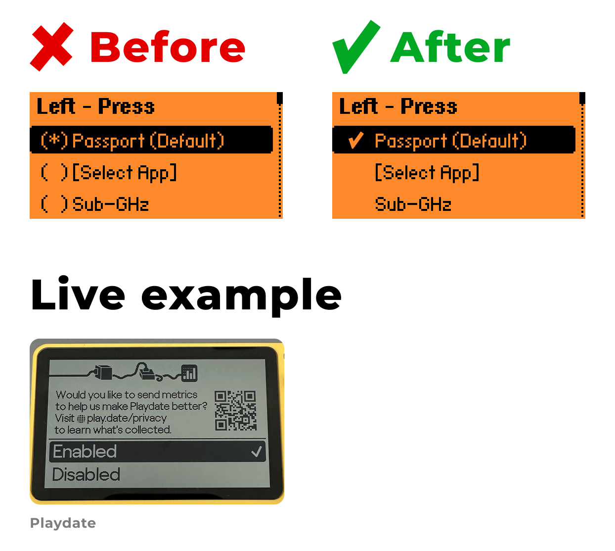
- For selected items in a list, a checkmark icon is the familiar choice — not “(*)”.
2. Recognizable navigation structure
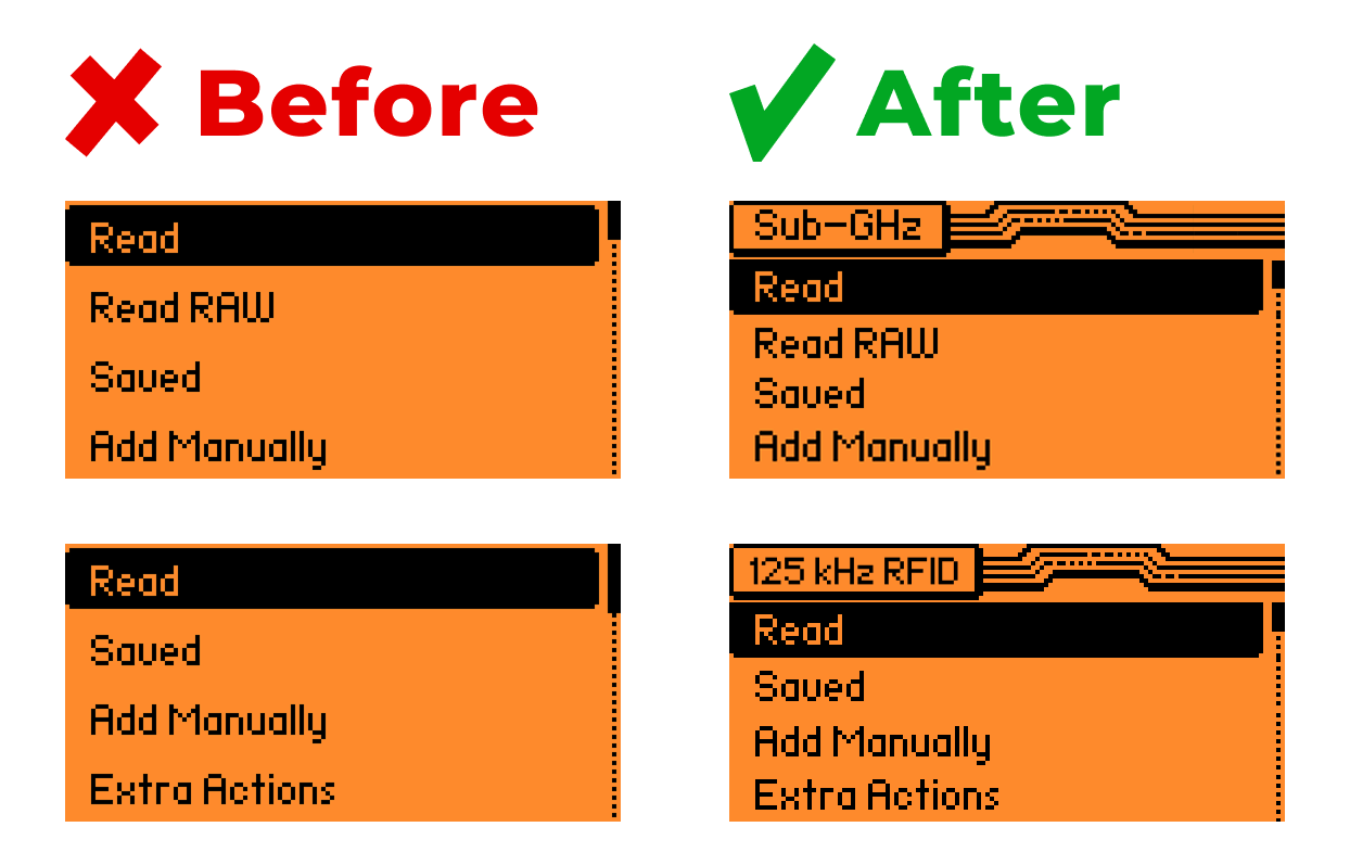
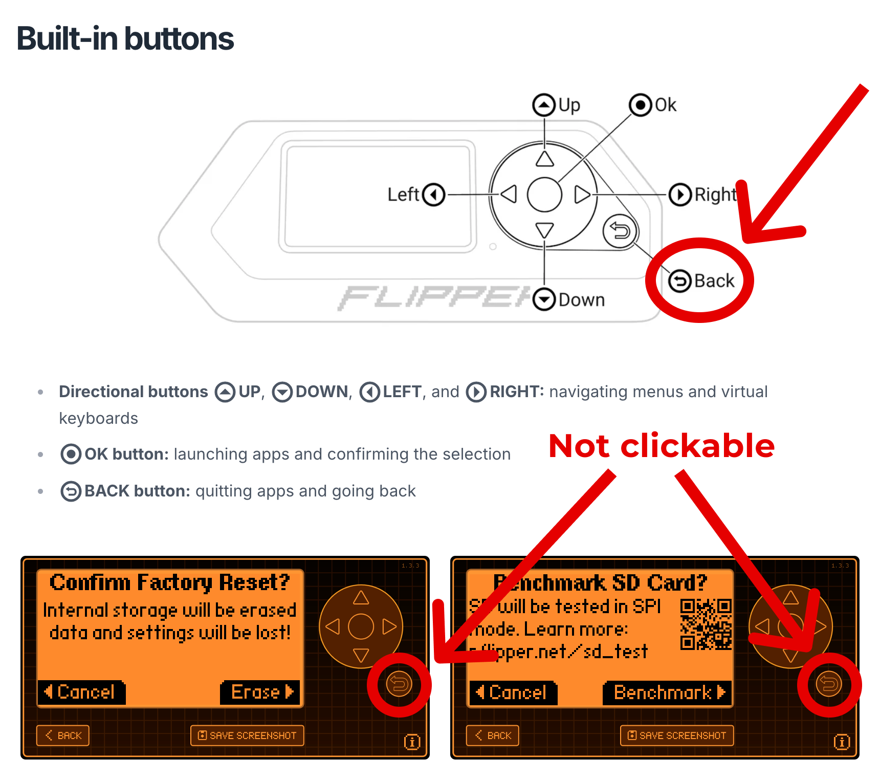
- Add headers (breadcrumbs) in object menus so users always know where they are. This is especially useful for tools with similar sets of buttons, such as Sub-GHz and 125 kHz RFID.
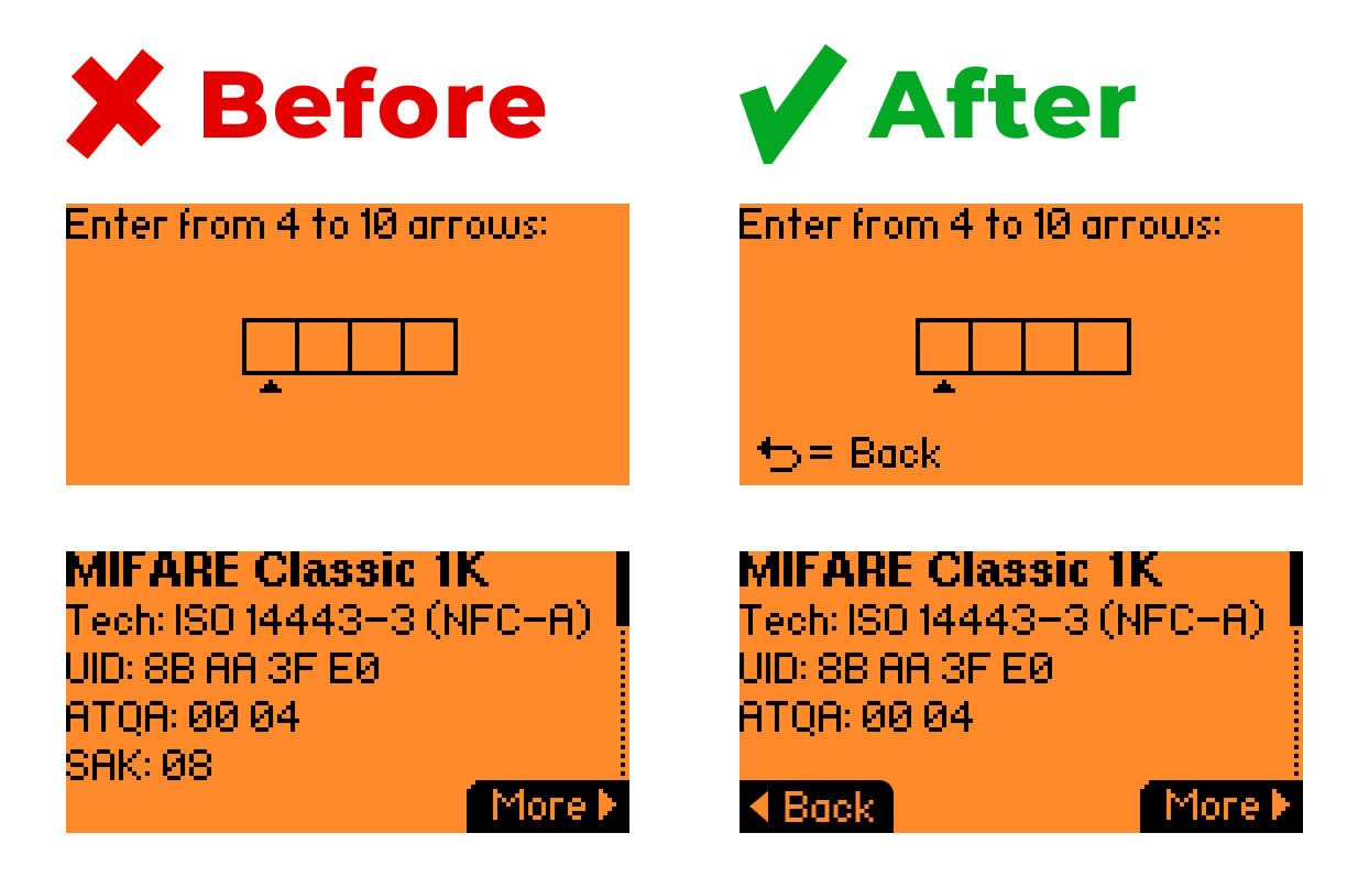
- Always show a clear way to go back. For example, in the PIN setup screen or the Mifare Classic 1K info window, the exit path isn’t obvious.
3. Predictable interactions
-
The round Back button should always return one step back, as described in the documentation — but this rule doesn’t hold in every confirmation window e.g., in Settings → Storage.
-
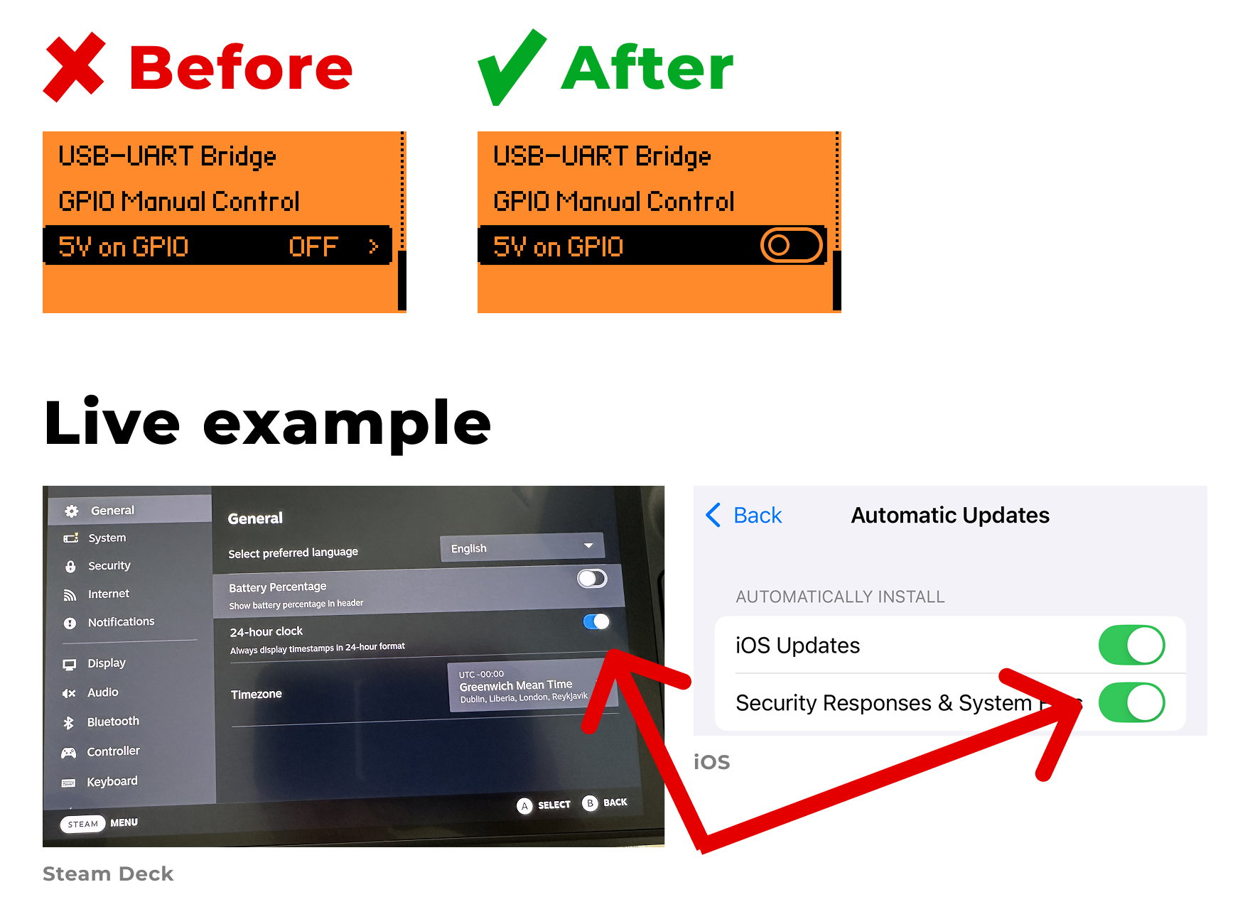
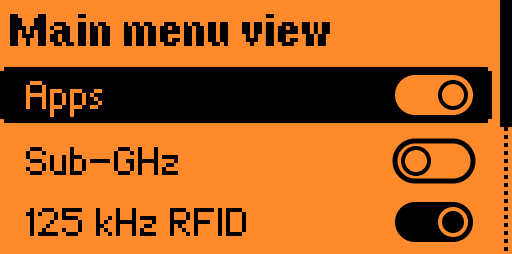
For On/Off states, a toggle switch is the most familiar option. It immediately communicates that only two states exist: on or off.
-
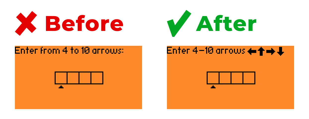
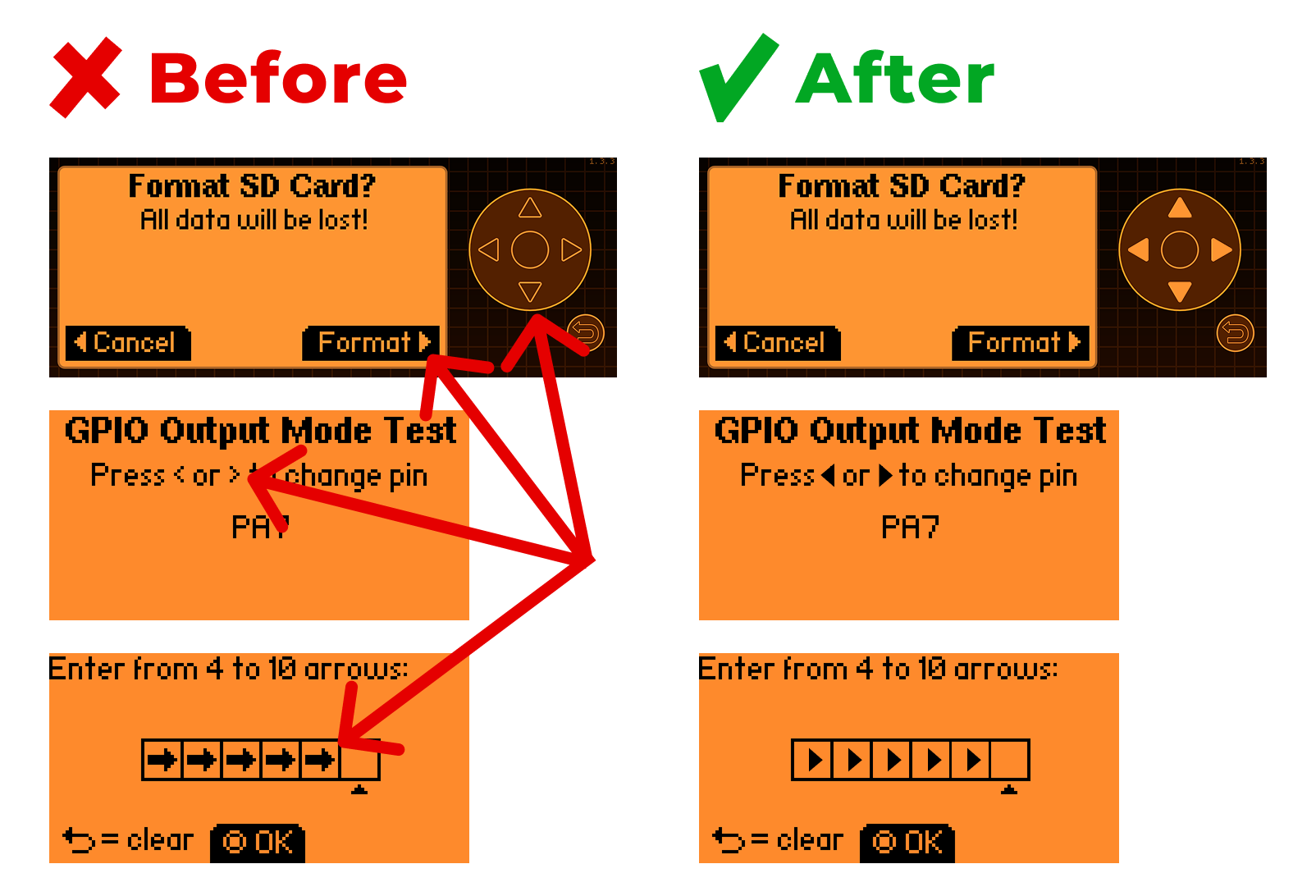
The word “arrows” in the PIN setup menu forces the user to stop and think about what’s meant. Adding arrow icons would make this far more intuitive.
-
In most interfaces, scrolling stops at the first and last item in a list or keyboard. This lets users quickly jump to the beginning or end and allows “blind” operation. On Flipper Zero, however, scrolling is continuous (wraparound).
3. Follow a consistent design system
The lack of a systematic approach across the interface forces the user to “re-learn” on every new screen, as if each one were a different UI. This lowers efficiency and slows down interactions. A proper design system should include:
1. A standardized set of components
-
For example, use a single, consistent icon style to represent the joystick’s arrow button. Every new variation makes users stop and think about what the icon means.
-
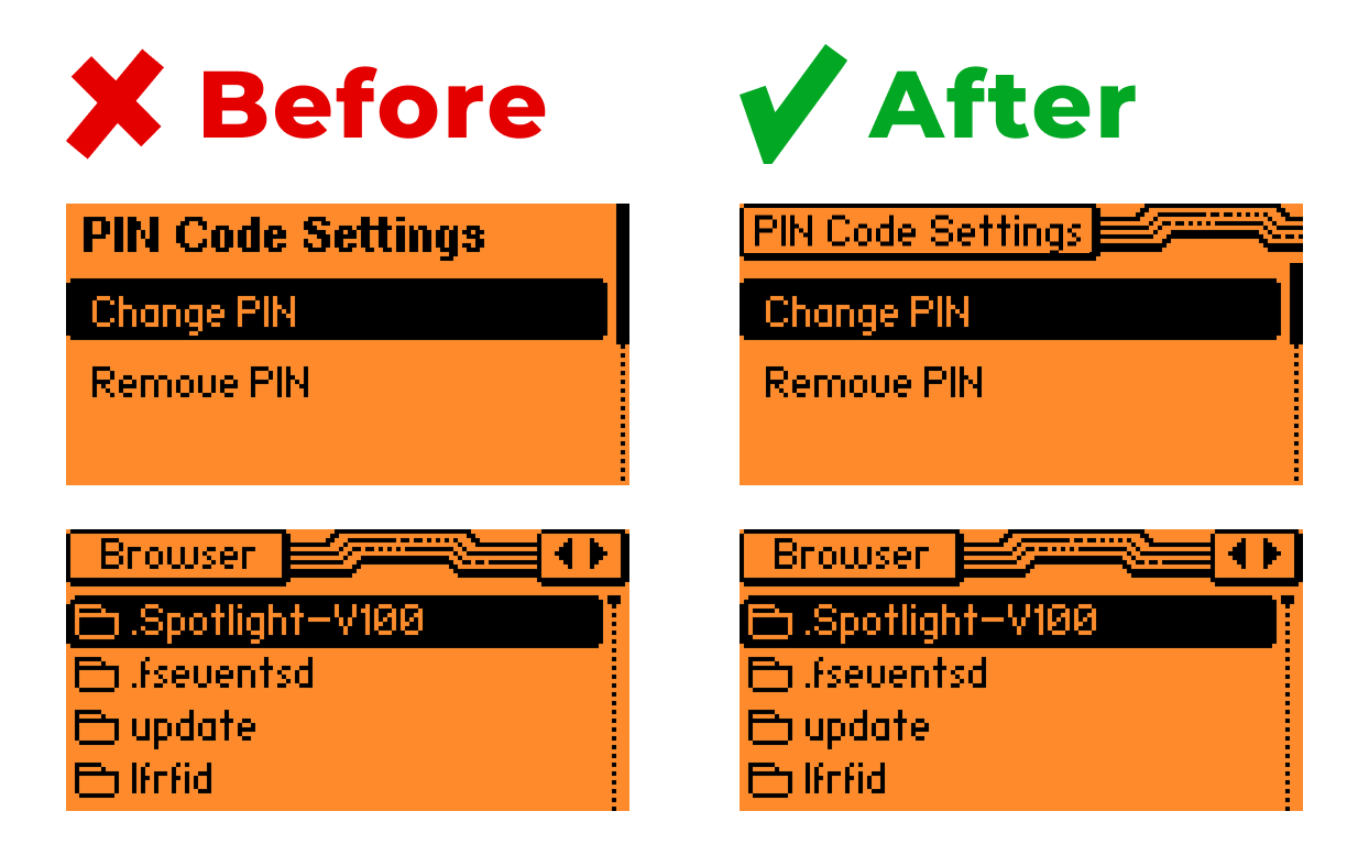
Apply a unified style for menu headers so that navigation feels predictable across the device.
2. Screen templates.
-
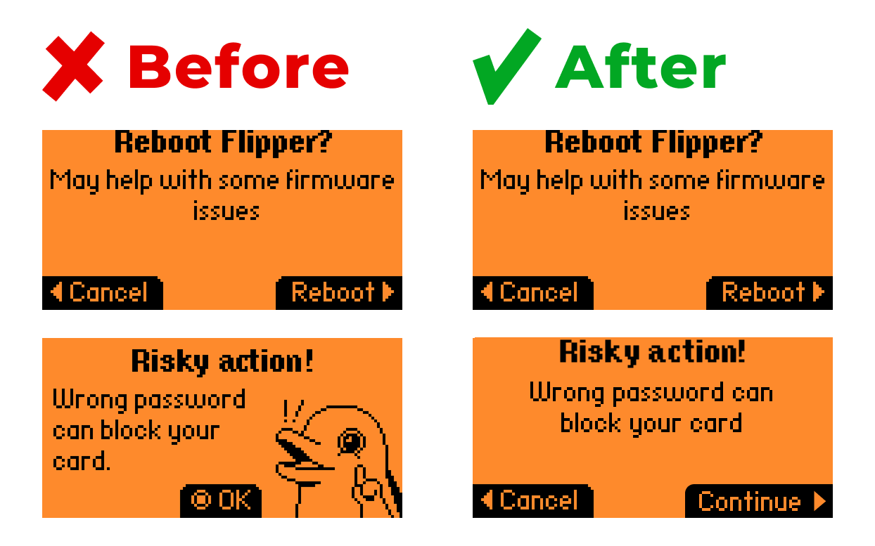
Confirmation windows should always follow the same structure:
-
Title;
-
Description;
-
Buttons: “Confirm” and “Cancel”.
-
Menus should also follow a consistent template. Currently, some screens have headers while others don’t.
-
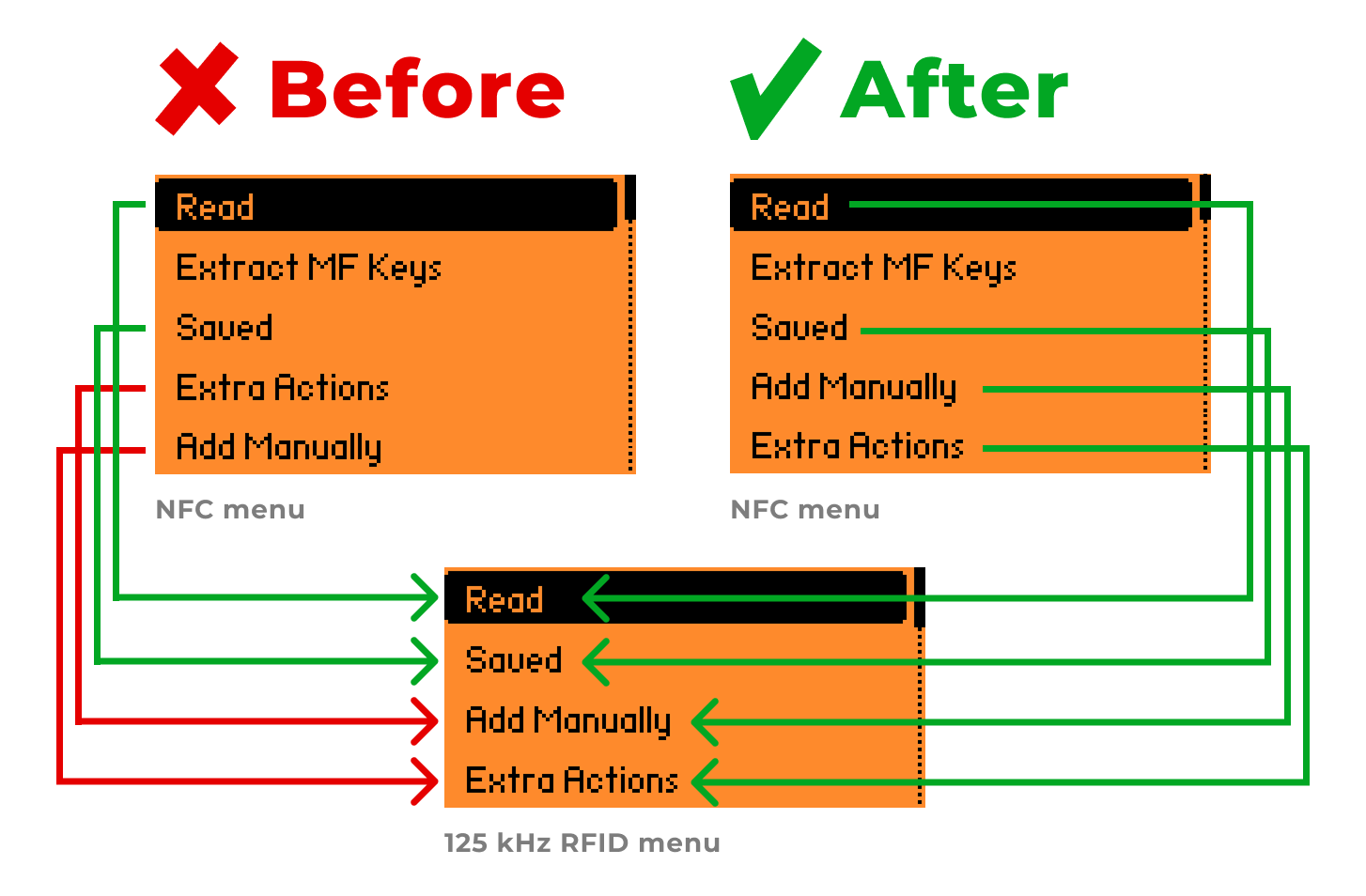
The order of actions within object menus should be standardized. For example, if the 125 kHz RFID menu sets the pattern with the order: Read → Saved → Add Manually → Extra Actions, then the NFC menu should follow the same logic: Read → Extract MF Keys → Saved → Add Manually → Extra Actions.
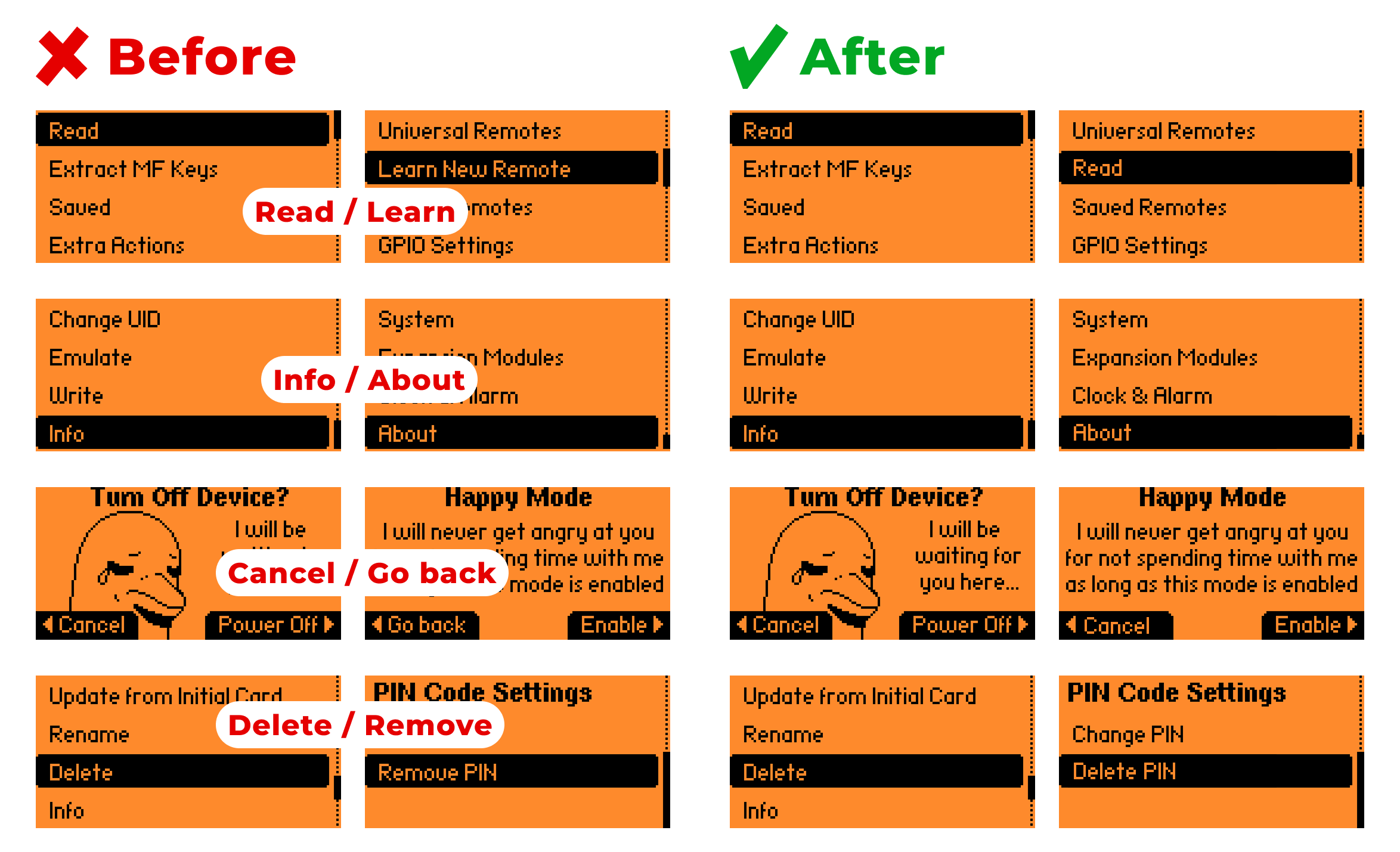
Consistency in terminology.
-
Right now, the same action is labeled differently in different places:
-
Read / Learn
-
Info / About
-
Cancel / Go back
-
Delete / Remove
-
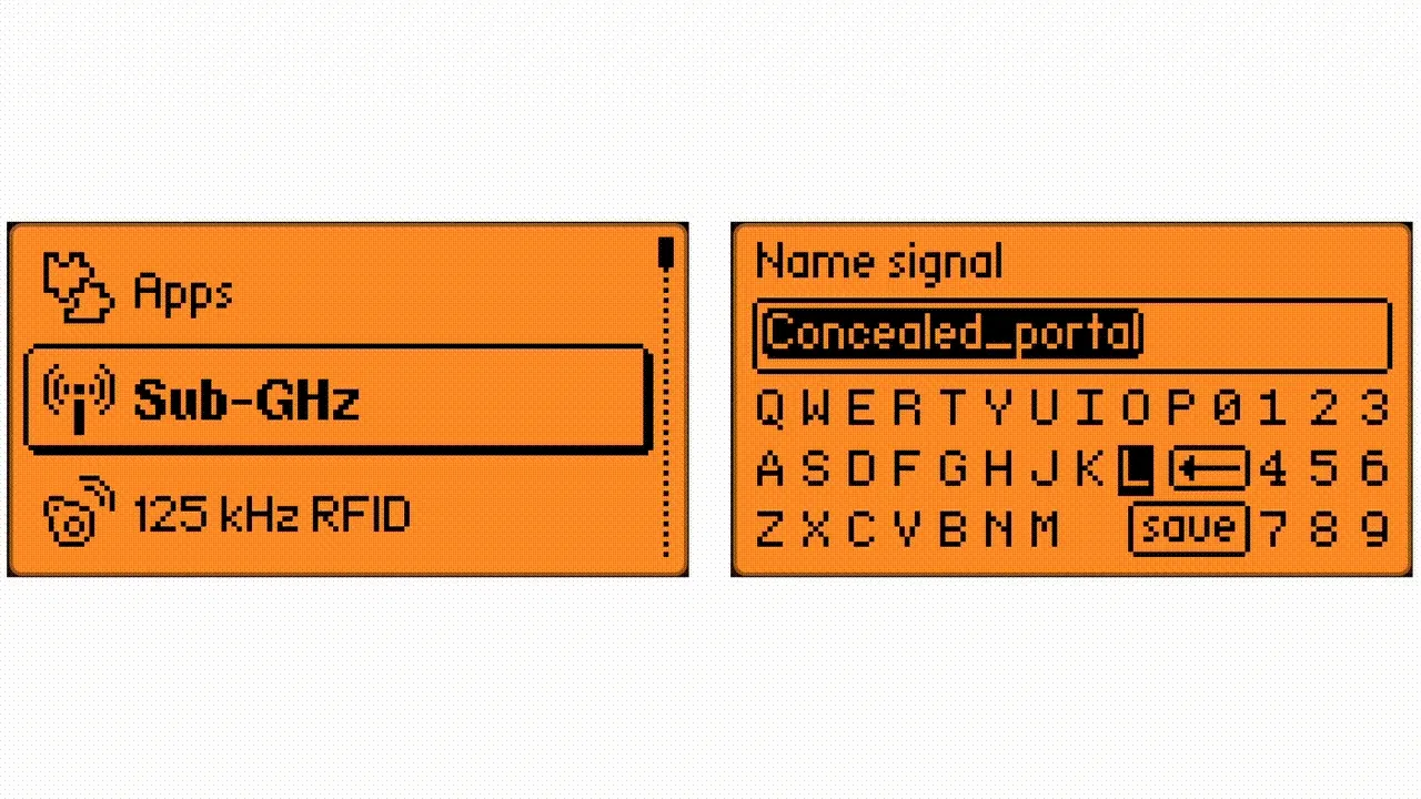
Even within a single section, terms can shift. For example, in Infrared, you add a “Remote” but save a “Button”. This inconsistency creates unnecessary confusion.
4. Allow users to recover deleted items
In complex systems like this, it’s crucial to give users the right to make mistakes — so they don’t feel afraid to experiment and can learn faster. Having the option to restore a recently deleted item would be very useful.
Currently, when something is deleted, the system only displays “Deleted”, without telling the user what was removed, and without an option to undo the action. This creates anxiety and slows down learning. 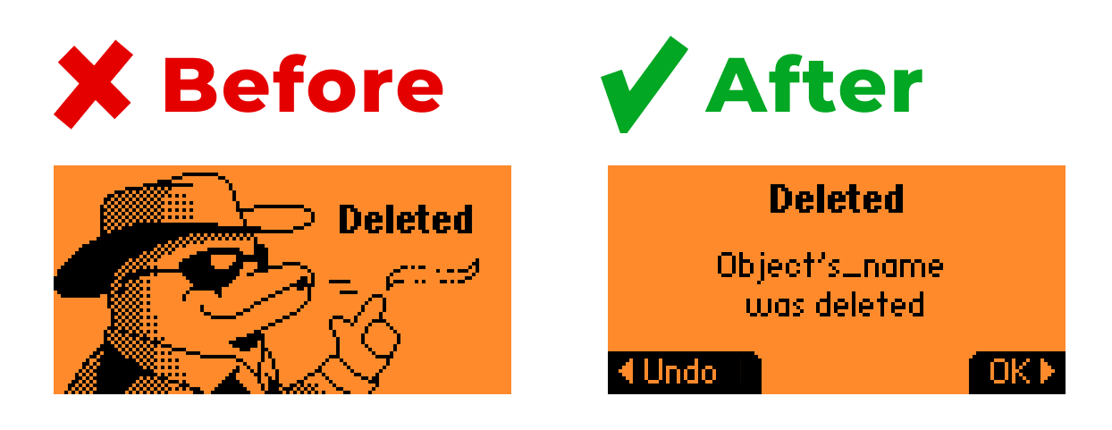
5. Provide fast and clear feedback
Timely, understandable feedback is key. Users should always see clear visual cues that reflect the results of their actions. This reduces anxiety and builds trust in the system.
-
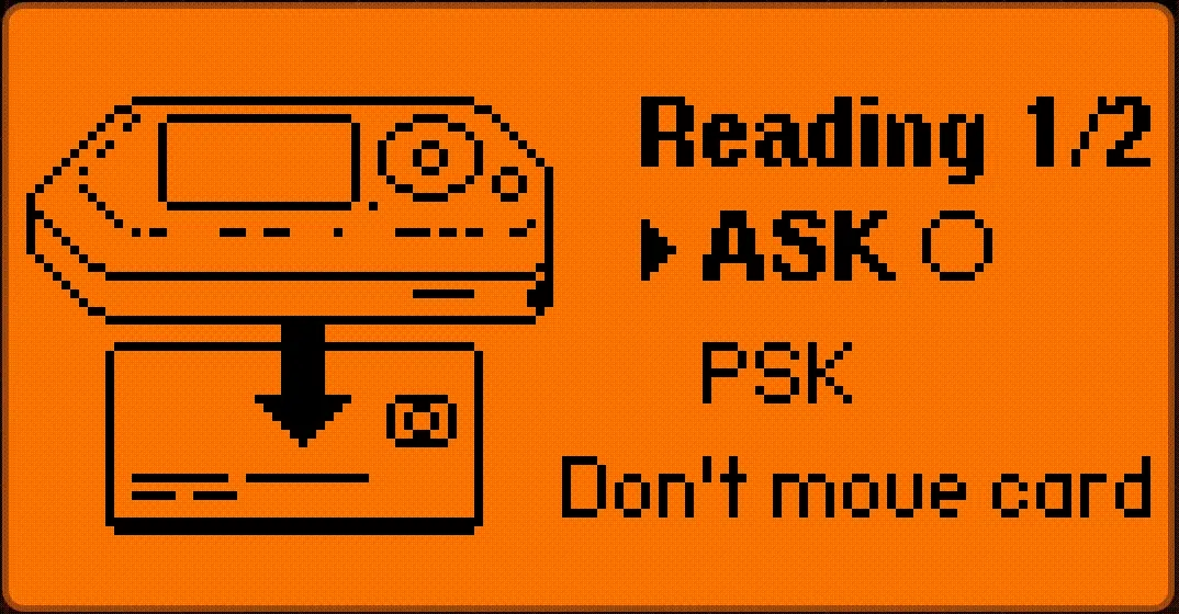
Card scanning example: At the moment, it’s unclear whether the scanning process is still running or already finished, leaving the user uncertain about whether to keep waiting.
-
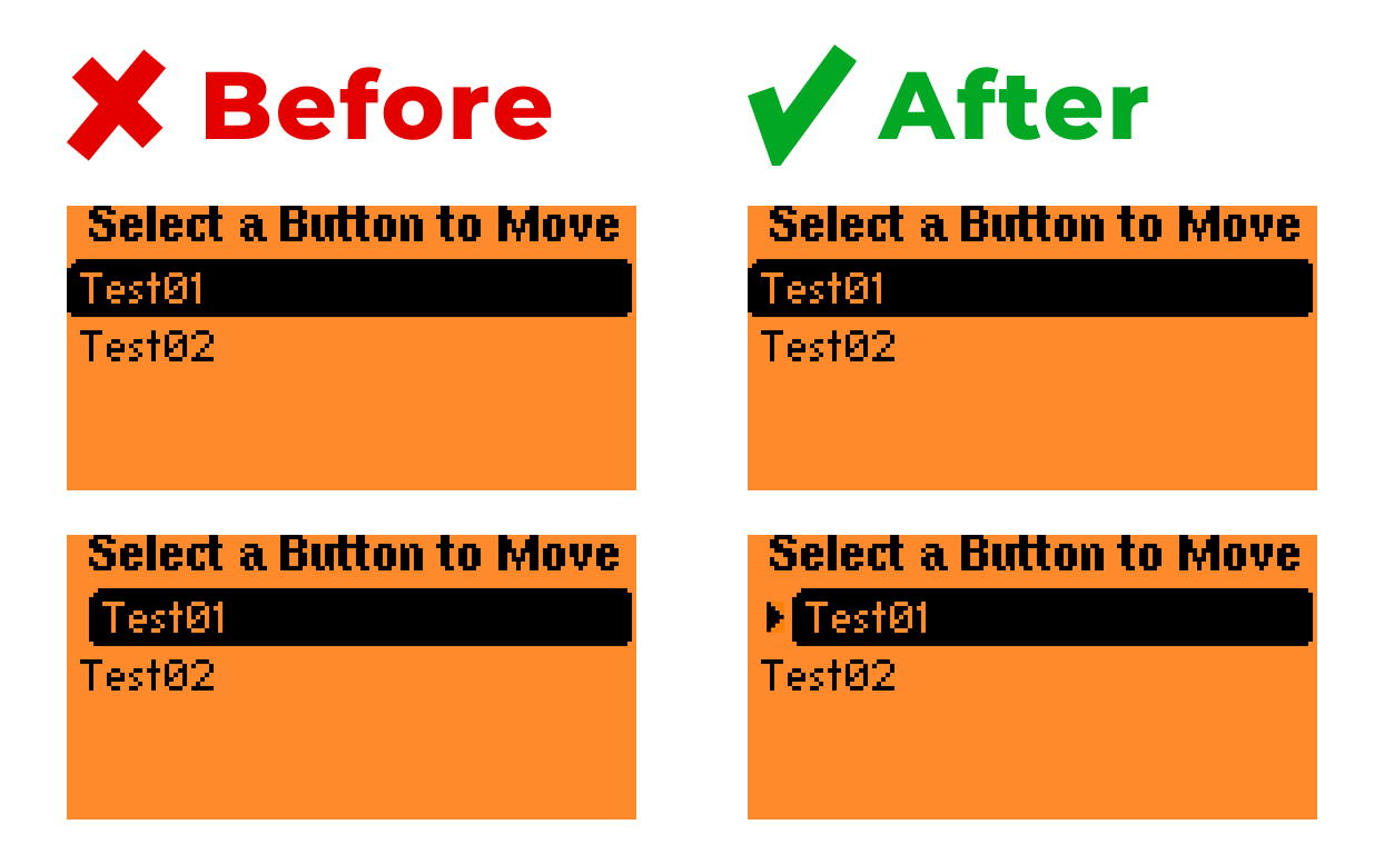
Drag & drop example: The selected item looks almost identical to the unselected one, making it hard to read the action. Adding more spacing from the screen edge and an arrow pointing to the active element would provide a clear visual cue.
6. Offer flexible menu settings
Flipper Zero already has many different settings, making it fairly customizable. However, there’s one key feature missing: the ability to hide rarely used menu items. This would let users declutter their interface and focus only on the tools they use most, making daily interactions smoother and less distracting.
7. Add gamification
Flipper Zero is a powerful and complex product, and learning it can feel overwhelming. To keep users motivated, the experience could be balanced with dopamine boosts in the form of achievements and rewards.
1. Progress tracking
The device already has a character — the dolphin, that levels up with frequent use. However, it’s not clear how the system works. What exactly should I do to earn more points? How many points are left until the next level? Where can I view my history of earned points? 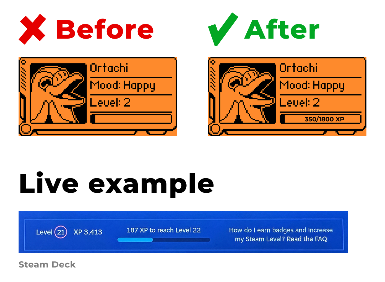
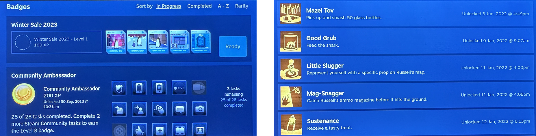
2. Challenges and competitions
Currently, leveling up is the only “achievement,” and there’s no way to share progress. This removes any real motivation to reach new levels. It would be much more engaging to:
-
Add specific achievements, such as “Successfully copied 13 NFC cards” or “Copied 5 different types of devices.”
-
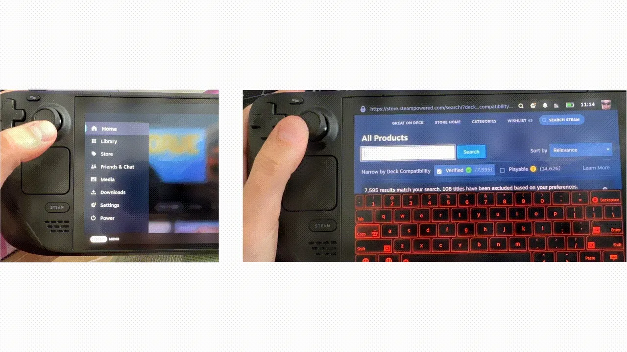
Allow users to share their achievements with the community and track stats on the official Flipper website — similar to how Steam Deck tracks achievements.
Conclusion
Flipper Zero is a powerful device with a rich and unique set of capabilities, but mastering it requires significant effort from the user. This process could be made much smoother by applying well-established UX principles — simplifying where possible, and leaving complexity only where it’s truly justified.


