
Apple just released iOS 26 beta 3, which is probably the only developer-only beta left before the first iOS 26 public beta becomes available to everyone. As expected, the beta 3 release brings a few new features and bug fixes. That’s the whole point of this testing phase. But Apple also updated the design again in iOS 26 beta 3, tweaking the “liquidity” of the brand-new Liquid Glass design even more than in beta 2.
Some iOS 26 beta 3 users have already posted screenshots showing what Apple did to the transparency of Liquid Glass, and they’re not happy.
I also installed iOS 26 beta 3 on my iPhone, and I agree with them. Apple went too far with its fixes. Liquid Glass is more opaque than ever. The overall effect now looks more like frosted glass than the transparent glass from the first beta.
Early problems with iOS 26 Liquid Glass
I told you from the first days of using iOS 26 beta 1 that you should wait to see the Liquid Glass effects before installing it. Apple applied its bold new design uniformly across buttons, text, and UI elements.
That layer of transparency, while cool to look at, made certain menus harder to read. The Control Center is the best example of that. Liquid Glass also made Notifications difficult to read. These were big problems for people with eyesight issues. Reading notifications and telling Control Center buttons apart from what’s behind them would annoy some users.
The only fix was a “Reduce transparency” menu in the Accessibility section of the Settings app.
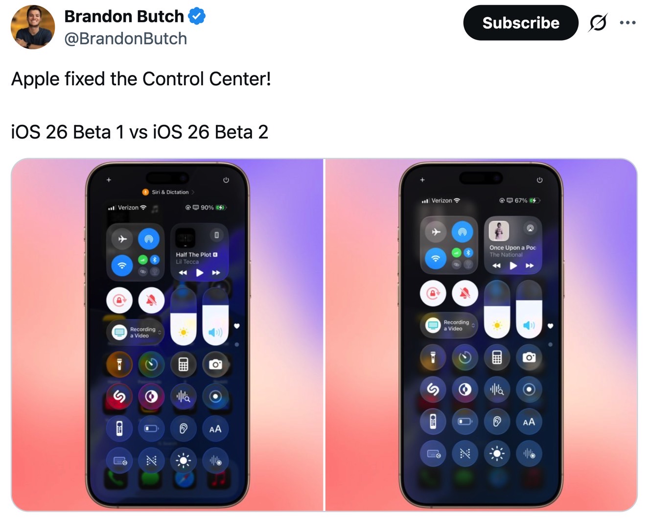
Apple corrected course in iOS 26 beta 2. Notifications were legible, as Apple improved the contrast and reduced the transparency. The Control Center blurred the background much better than in beta 1.
I thought at the time that Apple did well to respond to Liquid Glass criticism. iOS 26 beta 2 looked a lot better than the first beta.
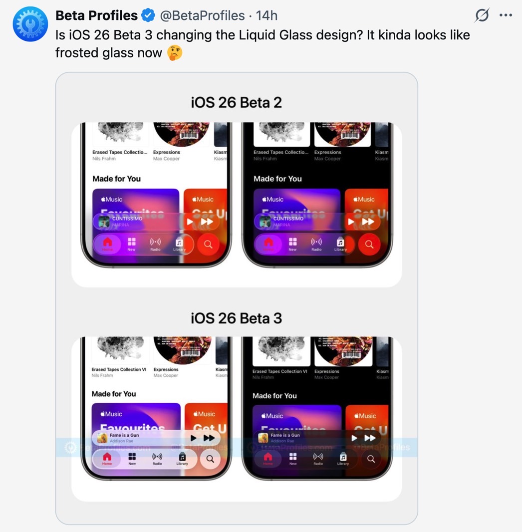
Frosted glass
Apple apparently wasn’t satisfied with the Liquid Glass look in beta 2. iOS 26 beta 3 introduces another change, and now the glass isn’t that liquid anymore. The transparency has been reduced even further, giving the overall effect of frosted glass.
Users have been quick to point out on social media that Apple dramatically reduced the transparency in iOS 26. Well-known Apple insider Mark Gurman is one of the critics.
“Announce a huge redesign just to throw much of it away,” he said on X. “Apple should be allowing users to choose how much glass they want instead of just reversing it by 75%. At least rename it now to Frosted Glass. Lol.”
I couldn’t agree more. From the beginning, I thought we needed a way to customize the Liquid Glass effect. Maybe we want more transparency on the Home and Lock Screens, and more opacity for Control Center, Notifications, and certain app menus.

It’s unlikely that Apple will give us that kind of granular control. Still, a transparency slider that lets us choose our own level of opacity could come in handy. The good news is we’re still in the early days of iOS 26. Apple can always test a different Liquid Glass look in upcoming betas.
What’s certain is that Liquid Glass is here to stay. One way or another, Apple will use transparent UI elements on all its devices. We need to get used to the new design before Apple’s advanced AR/AI smart glasses arrive.


