
I’ve been living with the iOS 26 public beta for the past week or so, and, overall, I’d describe it as a big win.
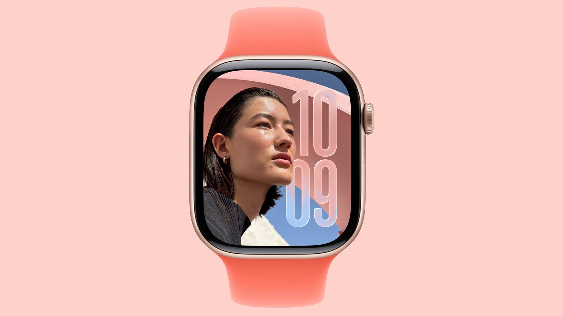
The Liquid Glass UI, while seemingly divisive, is certainly impressive. It’s somehow both reactive and subtle in design, in a way that makes the phone feel more alive without screaming for your attention 24/7.
The new lock screen options hit the sweet spot between playful and polished, the icon refresh is tastefully modern and even tiny touches like the “time remaining” estimate while charging make everyday moments feel more considered.
But the Camera app is a different story – and I’ve got a feeling it’s going to be divisive once it lands on all supported iPhones later this year.
Minimalism looks great – but it’s not very intuitive
For years, the Camera app has barely changed. That might sound boring, but I’d argue that there’s a comfortable stability to it. Everyone knew where things lived: Photo, Video, Portrait, Slow-mo, Pano, Night – left and right, tap and go.
The muscle memory was almost universal; parents, grandparents and power users all used the UI without thinking because it had been the same for years.
With iOS 26, Apple throws that well-established muscle memory out of the window. The new Camera interface is ultra minimal – basically one visible toggle for photo, and another for video – with other modes and camera settings hidden behind a series of swipes.

Swipe here for modes, swipe there for settings, swipe another direction for something else entirely. It looks clean. I mean, it is clean. But it’s also very frustrating if you don’t know how to use it. And, at least in the current beta, there’s no clear onboarding to show users where the settings now live.
To be honest, the only reason I knew how to get around is because I watched the WWDC 2025 announcement. Most people won’t have done that, and they’ll open the Camera, look for Portrait or Slow-mo, and wonder where it all went.
The problem with hidden controls
Minimalism is gorgeous – when you already know the gestures. When you don’t, it becomes a frustrating and even maddening experience.
On the camera app, that can be the difference between capturing a moment and missing it. The old design surfaced common choices and taught you the deeper ones over time. The new design hides nearly everything until you happen to swipe in the right direction. It’s elegant in theory, but a bit chaotic in practice.

The problem is that hesitation can lead to frustration, and frustration can soon become “I hate the new Camera app”. And unlike a redesigned icon or new lock screen trick, the Camera is an app people use constantly and under time pressure. It’s not an area where you want to stop and think before using it.
It’s not unfixable though
Of course, none of this means the new minimalistic approach is doomed. The minimal viewfinder is lovely after all, with fewer controls meaning your subject stands out, and that fits the Liquid Glass design language perfectly.
For brand-new users, one photo mode and one video mode actually might feel less intimidating than the current setup. But for the vast majority of users, you’ll need to rework your decade-long muscle memory.

There are some straightforward fixes Apple could employ to ease people into the new design. First and foremost, a tutorial that appears when you open the Camera app for the first time is not just nice to have but necessary. There could also be subtle icons or effects that hint at where to swipe without necessarily adding a lot of visual clutter.
There could also be an option for a “Classic Controls” toggle or even a “Labels on” accessibility option that’d make it much easier to get used to.
Until those changes are implemented, however, I’m worried. Not because the design is bad, but because it’s easy to imagine someone opening their phone to grab a quick Portrait of their kid blowing out candles, but accidentally swiping the wrong way and ending up with a 720p Slow-mo instead.
That’s not very Apple, not very ‘it just works’, is it?


