Photos in iOS 26 has reworked the iOS 18 version for the better. Here’s how the new version of Photos expected in the fall compares to the old one.
One of the most-used first-party apps on an iPhone, Photos is the home for all of the photographs and videos you take with the onboard cameras. With built-in editing tools and search capabilities, you can quickly find memories of yesteryear and make them look good too.
It is an essential app, and therefore any changes made to it will be significant. Even if they don’t seem that way from the outset.
With iOS 26, Apple brings to Photos a few alterations that should make most iPhone users even more enamored with the app. In part, for fixing changes made during the previous iteration in iOS 18.
Here’s where the two versions differ, and why you should be happier with the latest release.
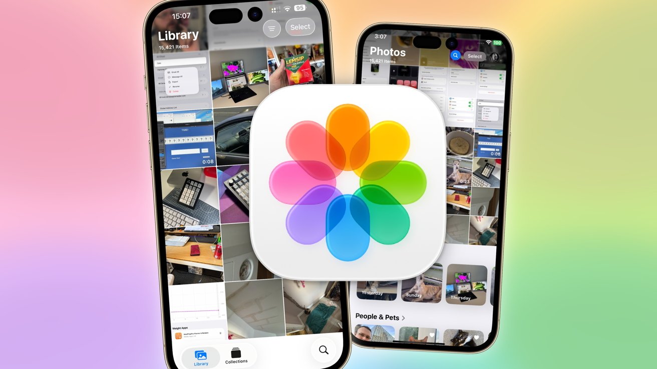
Photos iOS 26 vs Photos iOS 18 – Appearance
The most obvious thing iPhone users will spot in Photos is how its content is laid out when you open the app.
The iOS 18 edition introduced a new all-in-one design that got rid of the Library, For You, Albums, and Search tabs, in favor of a unified app experience. At the top half of the screen was your library grid, while the bottom half had collections and albums.
It was intended for users to swipe up or down to access the relevant area of the app, and for everything to be immediately accessible. In reality, the excess scrolling was a problem, and the concept needlessly made things more complicated.
In iOS 26, this has been rectified with a tiny amount of backtracking. Apple hasn’t gone back to a multi-tab structure again, but it has divided the app into two broad sections: Library and Collections.
On opening Photos in iOS 26, you are immediately presented with the Library view, showing your most recent shots. At the bottom of the screen is the small tab switcher, showing Library and Collections, as well as a Search icon.
What Apple has done here is fairly small, in that it’s simply lopped off the lower collections from the previous design, and made it into its own tab. However, it is a small change that has made the app simpler and more intuitive.
The other appearance change is Apple’s adoption of Liquid Glass in iOS 26. While the concept is meant to minimize the UI’s presence a bit in apps, it hasn’t really happened in Photos.
This is less a shortcoming of Liquid Glass and more because of the existing design’s effectiveness in already being quite minimal. You do get to see some transparency for overlaying elements, though.
Photos iOS 26 vs Photos iOS 18 – Library
The Library is represented by a grid in both editions, which can be scrolled through vertically. Pinch-to-zoom works to change the size of the cells, while tapping brings up a full view of the image or video.
Both also use the “All,” “Years,” and “Months” options at the bottom so users can see images grouped by time period, which is handy. However, there are some changes to other elements in view.
The iOS 18 app has the search icon in the top right corner, along with the Select option for selecting multiple images at a time, as well as an icon to show user profile information. At the bottom is an X icon to return to the home split view, and the two-way arrow icon for sorting and view options.
Moving to iOS 26, the interface has been rearranged. The top still has the Select button, but the sorting button has joined it, complete with a new horizontal bar icon design. At the bottom, the Years, Months, and All section expands to fill space, with Search in the bottom right, in an easier-to-tap location.
The bottom left has a button that lets you switch between the Library and Collections view.
You don’t need to worry about the missing profile button in iOS 26’s Library, as it’s in the same place in Collections instead.
Tapping search brings up the search options, which are visually different due to Liquid Glass, but functionally and laid out the same. However, the iOS 18 search page oddly uses a transparent background while the iOS 26 version does not.
The filter options are also identical, with sorting by date captured and when images are added available. Filtering and View Options are also identical, letting users choose to see only favorites, edited images, and those not in an album, for example.
Ultimately, the new Library is very close to the old one, but Apple has made it a little bit easier for people to search and get what they want, without reaching to the top of their iPhone screen.
Photos iOS 26 vs Photos iOS 18 – Collections
Instead of a firehose of images as seen in the Library, Collections groups images together in various ways. This can include the type of image as well as albums, but also collections of images that are automatically gathered together.
The automatic groupings include obvious ones like People & Pets so you can find shots of your friends or your cats, or Trips for when you spend time in an area. There are also Memories, Apple’s way of forming a slideshow of your shots and videos, set on a theme and to appropriate music.
What has changed here between iOS 18 and iOS 26 is what Apple believes you want to see.
In iOS 18, you can be shown Recent Days first, then People & Pets, then Pinned Collections, Memories, Trips, and Featured Photos. Media Types and Utilities arrive next, then Albums, Shared Albums, and Wallpaper Suggestions, then the all-important Customize and Reorder button.
On iOS 26, you’re presented with Memories first, then Pinned, Albums, People & Pets, Featured Photos, Shared Albums, Recent Days, Trips, Media Types, Utilities, Wallpaper Suggestions, then Reorder.
There are a few more crucial changes for the better under iOS 26. For a start, you have an arrow next to each group that can hide the row and minimize it to just the title.
While this is handy for general tidiness by putting rows of images out of view, it’s more handy for the Media Types and Utilities, as Apple now has rows and columns of options for each. This is a nice change from an immediacy standpoint, but hiding them is also good.
There’s also a greater encouragement for users to try out Memories, with the top and most visible item when you first enter Collections being an in-motion memory with a “Type to Create” text box below. Tap it and you are greeted by a “Create a Memory Movie” page with the Apple Intelligence logo.
Evidently, Apple really wants people to use Apple Intelligence more often.
Photos iOS 26 vs Photos iOS 18 – Viewing, Edits, and Spatial Photos
Tapping an image to bring up a full-size version hasn’t really changed much at first glance. The buttons at the bottom are the same and do the same things, and the same metadata is also provided.
Going through an edit of the image is also pretty much identical. The same Portrait, Live, Adjust, Filters, Crop, and Clean Up options are available, with identical adjustment options under each of them.
Videos are handled the same way, with editing options practically unchanged between versions.
There are very few differences, though, with one more obvious than the other. That would be the change to Liquid Glass in iOS 26, which has tweaked the interface but not made any major structural changes.
The other, less obvious change is the addition of Spatial Photos support. Tapping the new icon on a compatible photo will use machine learning to turn the flat 2D image into a 3D one that adjusts as you move the iPhone around.
This isn’t limited to TrueDepth camera portraits or any assisted with LiDAR either, as the conversion process also works for images with no depth data at all. Machine learning works out the “depth” of the image to produce the effect.
You’re left with a 3D image that can be used with the new Spatial Wallpapers feature of the lock screen, or if you’re lucky enough to have one, to view it in the Apple Vision Pro.
Photos iOS 26 vs Photos iOS 18 – Small changes, big impact
To a point, you could call Apple’s changes to Photos as quite minor, overall. With the exception of Spatial Photos, a lot of what has been performed is organizational and visual.
But, saying that on its own is a disservice to how much has changed with the app itself.
Sure, you’re not going to get brand new ways to edit a photo with the move from iOS 18 to iOS 26. You’re going to get the same sort of sorting, filtering, and grouping options as before.
What Apple has done, though, is make it more orderly and easier to get to the things you want, in a less overwhelming fashion.


