Android phones are no stranger to bizarre designs. Whether it’s the LG Wing, the Yotaphone, or the Samsung Galaxy S4 Zoom, we’ve seen some truly strange Android handsets over the years. And I love it! That variety is a large part of what makes covering Android so fun, and creativity from smartphone brands is never a bad thing.
The Nothing Phone 3a series is set to launch on March 4, but ahead of that, we got multiple in-depth design leaks for both the Nothing Phone 3a and Nothing Phone 3a Pro. The former looks like a standard upgrade to the Nothing Phone 2a, featuring a slightly longer camera bar to accommodate a third camera sensor. The Nothing Phone 3a Pro, meanwhile, has a design I simply can’t wrap my head around.
What do you think about the Nothing Phone 3a Pro’s design?
78 votes
What am I looking at?
")
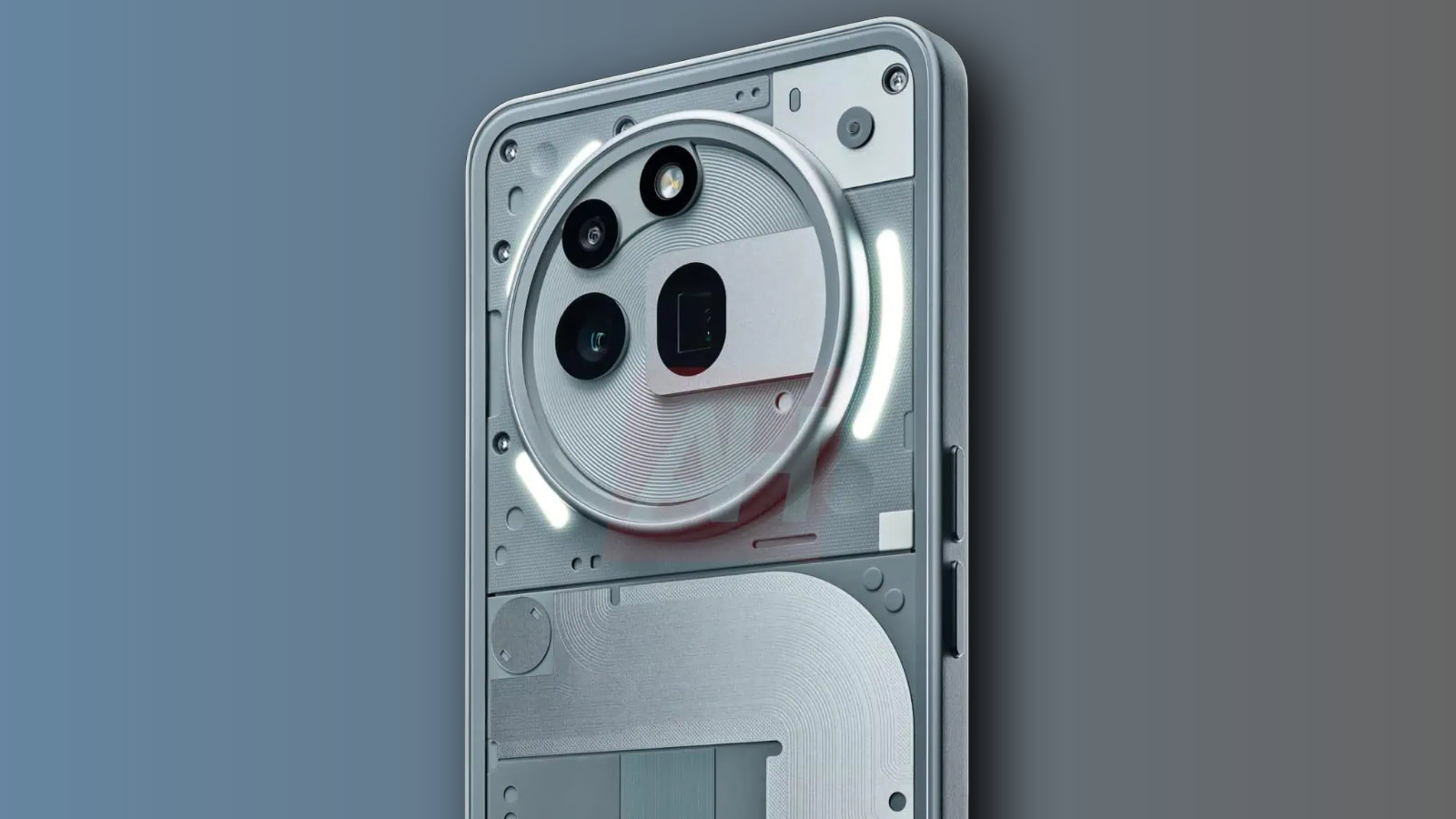
Let’s start with the elephant in the room: the camera bump.
The last few years have given us a myriad of smartphone camera designs. Some have been fantastic, others not so much, and some have been downright bad. The Nothing Phone 3a Pro may be the ugliest I’ve ever seen.
It all starts with a giant circle — one that seemingly takes up a very large portion of the phone’s backside. At the top of the circle is an LED flash. Below it is an 8MP ultrawide camera, and the 50MP primary camera is directly beneath. Then, to the right of that is a 50MP periscope telephoto camera. On paper, there’s nothing out of the ordinary here. But it’s the way everything’s arranged that makes it so off-putting.
")
The ultrawide and primary cameras are symmetrical, but the LED flash sits at an odd diagonal from them. The telephoto camera breaks the mold of circular sensors for the other cameras with an oval shape, not to mention the random rectangle jutting out from the right.
There’s also all this wasted space in the bottom one-third of the camera circle. The periscope telephoto camera demands more physical space, that’s true, but one of the leaked (and seemingly official) teaser videos shows its components tucked inside that unsightly rectangle. So, why is the camera bump so big? I’m OK with a larger camera design if the camera tech demands it, but that’s pretty clearly not the case for the Nothing Phone 3a Pro.
This camera design sure is … uh … something.
Maybe I’ll get used to this camera layout after a few more days. Perhaps I’ll change my mind once I see it in person. But from where I’m sitting right now, I’m having a hard time believing that. I rarely look at a phone and think it’s genuinely ugly, but that’s the reaction I’m having with the Nothing Phone 3a Pro.
Then there’s the rest of the phone. While a transparent design is nothing new for Nothing, something about the approach for the Nothing Phone 3a Pro feels … off.
The Nothing Phone 2‘s backside was predominantly taken up by its wireless charging coil, which was smartly outlined with its Glyph lights. It added a nice focal point to the phone and was complemented nicely by the other visible components above and below it. The Nothing Phone 2a struck a nice balance, too. It was a busy design between the small and cute camera bump, the swirling coil, and the small red square, but it felt intentional and complete.

The Nothing Phone 3a Pro appears to be the opposite of that. Beyond the camera design, the rest of the phone’s backside looks like a bunch of parts thrown together with no clear meaning. Previous Nothing Phones felt intentional in their transparent covers, but that doesn’t come through with the Nothing Phone 3a Pro — at least not for me.
There’s a big difference between bold, meaningful design and throwing everything at the wall to see what sticks. I think all Nothing Phones up until this point have struck that first balance really well, but the Nothing Phone 3a Pro is going ten steps too far, and I’m not a fan.
A divisive phone, if nothing else
")
Smartphone design — and design in general — is highly subjective. What looks good to you might look terrible to me. The beauty of Android is that we have so much to choose from. Whether you like the familiar aesthetics of the Samsung Galaxy S25, the blue vegan leather of the OnePlus 13, or the Nothing Phone 3a Pro’s messy industrial design, there’s a phone out there for all of us. And if you just chuck your phone in a case and never look at it again, then none of this matters.
I hope the Nothing Phone 3a Pro is a success. I hope it’s a contender for one of the best budget phones of the year. But if these leaked renders turn out to be true, it’s going to have to check every box possible for me to get over its looks.


