As a data analyst, you’re spending hours cleaning, merging, and manually visualizing data and insights. But you start to notice some cracks.
Your manual processes are leading to error-prone reporting.
You have a backlog of ad-hoc requests from other teams.
Here, an AI dashboard generator comes to your rescue. It speeds up data prep, reduces errors, and frees up your time for deeper analysis.
Not all dashboards are built to make your life easier. Let’s quickly go over what to look for, and then we’ll get into the 10 best AI dashboard generators out there!
Top 10 AI Dashboard Generator Tools
The right dashboard generator transforms your reporting workflow. But the wrong one can slow you down even more.
Here’s what you should consider in an AI dashboard generator tool:
- Data source integration: Make sure the tool connects seamlessly with your existing project management systems, CRMs, databases, and time trackers to avoid manual data transfer
- Customizable metrics and KPIs: Look for an AI dashboard generator that lets you analyze data based on your custom KPIs. Rigid templates will only slow your teams in visualizing valuable information
- AI-guided setup: Select a dashboard creator that automatically helps you configure your data sources, KPIs, and visualizations without needing to define every step manually
- Collaboration features: Look for the ability to comment, assign tasks, or share insights directly from the dashboard, keeping reporting and action tightly linked
- Automated KPI recommendations: Select a dashboard generator that recommends important KPIs and benchmarks based on your business model, past performance, or user behavior trends
- Natural language querying: Choose an advanced dashboard tool with AI features that let you ask questions like “Show me this month’s top-performing products” and the AI builds the chart for you, without any coding required
- Access control and sharing: Ensure you can easily set permissions, share dashboards with specific stakeholders, and export reports without compromising sensitive data
- Visualization flexibility: Good tools allow multiple visualization types (graphs, tables, bar charts, and timelines) so different teams can interpret information the way they need to
- Scalability and performance: Make sure the tool can handle increasing volumes of data and users without lagging or forcing you to rebuild dashboards manually
| Tool name | Best for | Key features | Pricing |
| AI-powered dashboards and efficient workflows | AI-guided dashboard setup, Brain, customizable cards, automations | Free Forever; Paid plans start at $7/user per month |
|
| Dashboard AI by Prototypr.ai | Design-first dashboard generation | AI-powered generation, vision integration, community marketplace | Free: 25 free credits Pay-as-you-go: 50 credits for $25 USD |
| Polymer AI Dashboard Generator | AI-driven data visualization and dashboard creation | Drag-and-drop, automatic insights, interactive visualization | Free Starter: $50/month Pro: $100/month Teams: $250/month Enterprise: Custom pricing |
| Bricks AI Dashboard Creator | Data visualization from spreadsheet data | Multi-format presentation, collaboration, data cleansing | Free Premium: $20 per seat/month Enterprise: Custom pricing |
| Mokkup.ai | Customizable BI dashboards with Power BI/Tableau integration | Drag-and-drop, 180+ templates, export wireframes | Standard: Free Mokkup Pro: $8/month Teams: $10/month per license |
| Supadash | Quick, real-time data visualization with PostHog integration | Real-time monitoring, visual query builder, customizable dashboards | Free Basic: $7/month Pro: $19/month Enterprise: Custom pricing |
| BlazeSQL | AI-powered SQL queries and visualizations with enterprise security | Natural language SQL, multi-database support, white-labeling | For Individuals Pro: $99/month Advanced: $149/month For Teams Blaze Team: $249/month Blaze Team Advanced: $499/month Blaze Enterprise: Custom pricing |
| Onvo AI | Intuitive, AI-driven dashboards with multilingual support | Plain english queries, multilingual dashboards, easy API/SDK integration | Startup: $199/month Growth: $499/month Enterprise: Custom pricing |
| Leniolabs AI Data Dashboard | Transforming raw data into interactive visualizations | Prompt-based customization, CSV uploads, interactive exploration | Free to use |
| Spotfire by TIBCO | Advanced data visualization and real-time insights with geographic context | Custom extensions, real-time streaming, responsive layouts | Custom pricing |
1. (Best for AI-powered dashboards and efficient workflows)
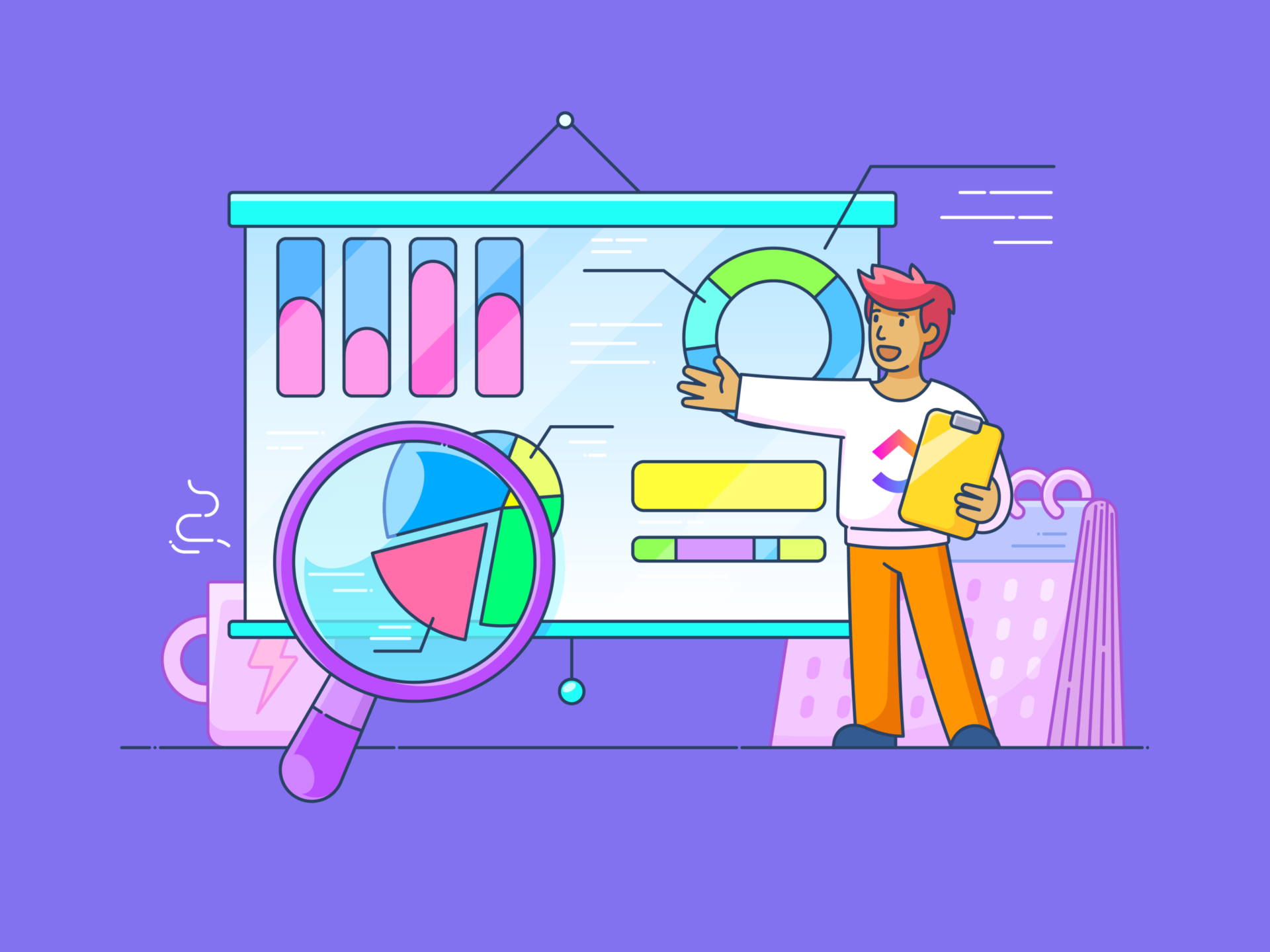
When teams manage projects across different tools, dashboards often turn into a patchwork of spreadsheets, slide decks, and scattered reports. Without a centralized system, it becomes harder to spot risks early, visualize workflow progress, or make confident decisions.
This is when teams look for a tool that displays visual data points of where they stand in terms of projects, milestones, KPIs, and business performance. And to make data visualization intuitive, , the everything app for work, introduced Dashboards.
Dashboards provide a structured way to centralize and visualize work in real time. Instead of manually compiling reports, you can build dynamic dashboards that pull live Workspace data from tasks, time tracking, goals, docs, and project performance.

Each dashboard is fully customizable, with pre-built cards to monitor workload, sprint velocity, priorities, or time estimates. All this time, advanced filters help big time to focus on exactly what matters, whether it’s tracking a single sprint or reviewing company-wide KPIs.
To make building dashboards even smarter, Brain steps in as an intelligent guide. If you’re not sure which metrics to track or how to structure your dashboard for a specific project, you can ask this AI in the workplace for suggestions.
For example, you might prompt it with, ‘What KPIs should I include for a sprint dashboard?’ or ‘What metrics matter most for tracking a marketing launch?’ Brain’s recommendations help you set up work dashboards that are not only fast to create but also more strategic and aligned with your goals.

Together, Dashboards and Brain simplify reporting, helping teams create living, breathing dashboards that keep pace with work.
Once you have the dashboard fully set up, Automations takes the manual maintenance off your plate. You can create specific rules that automatically update task statuses, move cards across your dashboard, trigger reminders, or notify teams when a goal is at risk.

This means you’re not just managing a project management dashboard, but actively keeping it up to date without needing to manage every update manually.
best features
- Instant collaboration: Discuss updates, share valuable insights, and create tasks directly from Chat to keep conversations actionable and connected
- Structured work management: Assign due dates, priorities, and custom statuses with Tasks, ensuring clear ownership and progress visibility across teams
- Flexible project tracking: Switch between List, Board, Calendar, or Gantt views with customizable Views to manage tasks and milestones in a way that matches your workflow
- Deeper productivity insights: Log hours, estimate workloads, and review time reports with Time Tracking to improve productivity, resource allocation, and efficiency
limitations
- The sheer number of features on may come with a slight learning curve for fresh users
pricing
free forever
Best for personal use
Free Free
Key Features:
unlimited
Best for small teams
$7 $10
Everything in Free Forever plus:
business
Best for mid-sized teams
$12 $19
Everything in Unlimited, plus:
enterprise
Best for many large teams
Get a custom demo and see how aligns with your goals.
Everything in Business, plus:
* Prices when billed annually
- Free Forever
- Unlimited: $7/month per user
- Business: $12/month per user
- Enterprise: Contact for pricing
- Brain: Add to any paid plan for $7 per member per month
ratings and reviews
- G2: 4.7/5 (9,000+ reviews)
- Capterra: 4.6/5 (4,000+ reviews)
What are real users saying about ?
Here’s a G2 review:
2. Dashboard AI by Prototypr.ai (Best for design-first dashboard generation)
Prototypr.ai’s Dashboard AI uses models like OpenAI’s GPT-4o, Llama 3, and Google Gemini 2.0 Flash to help users generate fully functional, high-fidelity dashboards and product analytics mockups.
You can use natural language to describe the new dashboard you need. The tool generates complete, responsive dashboards instantly. You can then ask Google Gemini 2.0 Flash to summarize dashboards into emails or reports.
Dashboard AI by Prototypr.ai best features
- AI-powered vision integration: Upload images of dashboard designs and instantly turn them into functional front-end code
- Community marketplace: Get access to a library of ready-to-use dashboard mockups to visualize and measure your prototypes
- Version history: Click on the version card to revert to an earlier design and experiment freely without losing progress
Dashboard AI by Prototypr.ai limitations
Dashboard AI by Prototypr.ai pricing
- Free: 25 free credits
- Pay-as-you-go: 50 credits for $25 USD
Dashboard AI by Prototypr.ai ratings and reviews
- G2: Not enough reviews
- Capterra: Not enough reviews
📮 Insight: 88% of our survey respondents use AI for their personal tasks, yet over 50% shy away from using it at work.
The three main barriers? Lack of seamless integration, knowledge gaps, or security concerns.
But what if AI is built into your workspace and is already secure? Brain, ’s built-in AI assistant, makes this a reality. It understands prompts in plain language, solving all three AI adoption concerns while connecting your chat, tasks, docs, and knowledge across the workspace. Find answers and insights with a single click!”
3. Polymer AI Dashboard Generator (Best for AI-driven data visualization and dashboard creation)
Designed for users without a technical background, the Polymer AI Dashboard generator helps create dashboards from your datasets using an intuitive, drag-and-drop interface.
The tool offers over 20 pre-built templates tailored for various use cases, such as e-commerce, sales, and marketing dashboards, that can be customized to match specific branding and analytical needs.
Polymer AI Dashboard generator best features
- Data integration: Supports importing data from various sources, including Google Sheets, Excel, Facebook Ads, Google Ads, etc.
- Insight explanations: Generates automatic explanations for charts, providing context and aiding in data interpretation
- Interactive visualization: Enables the creation of various chart types, including pivot tables, timelines, scatter plots, and scorecards
Polymer AI Dashboard generator limitations
- Lacks advanced real-time collaboration features
Polymer AI Dashboard generator pricing
- Free
- Starter: $50/month
- Pro: $100/month
- Teams: $250/month
- Enterprise: Custom pricing
Polymer AI Dashboard generator ratings and reviews
- G2: Not enough reviews
- Capterra: Not enough reviews
4. Bricks AI Dashboard Creator (Best for data visualization from spreadsheet data)
Bricks AI Dashboard Creator integrates AI capabilities with a user-friendly spreadsheet interface to simplify data visualization and analysis. You can import data from various sources, including Google Sheets, Excel, and CSV files, to consolidate data from different tools in your tech stack.
Additionally, the tool improves data quality by automatically identifying and correcting inconsistencies, errors, and anomalies within your datasets.
Bricks AI Dashboard Creator best features
- Collaboration: Share dashboards and reports with team members or clients via one-click sharing
- Multi-format data presentation: Convert dashboards into slide decks for meetings and data-driven discussions
- Visualization options: Create various types of visuals, including charts, calendars, timelines, roadmaps, Kanban boards, and org charts
Bricks AI Dashboard Creator limitations
- The tool lacks integrated project management features, such as task assignments, time tracking, and goal setting
Bricks AI Dashboard Creator pricing
- Free
- Premium: $20 per seat/month
- Enterprise: Custom pricing
Bricks AI Dashboard Creator ratings and reviews
- G2: Not enough reviews
- Capterra: Not enough reviews
💡 Pro Tip: Look for dashboard tools that let you comment or add notes right on specific charts or data points. It makes collaboration a lot easier when discussions stay tied to the exact numbers you’re talking about.
5. Mokkup.ai (Best for creating customizable BI dashboards with easy integration for Power BI and Tableau)
Mokkup is a wireframing dashboard generator for data analysts, BI developers, and visualizer. With an intuitive drag-and-drop interface, combined with over 180 ready-made templates and more than 20 customizable widgets, Mokkup.ai lets you create dashboard wireframes in minutes. You can apply curated color themes and branding tools to keep your dashboards visually consistent and aligned with your brand.
You can also export wireframes directly into Power BI or Tableau, saving time and eliminating the need to start from scratch. It’s built with collaboration in mind, so you can easily share designs, gather feedback, leave comments, and make real-time updates with your team.
Mokkup.ai best features
- Embed and share with ease: Share your wireframes via a simple URL or embed them directly into websites, applications, or blogs
- Preview before you build: Instantly preview how your dashboard wireframes will appear in Power BI and Tableau and find issues early
- Customize to match your vision: Tailor every aspect of your dashboard from widget styles to color themes and ensure your design aligns perfectly with your brand and goals
Mokkup.ai limitations
- Lacks additional chart options, such as Pivot Table View and Activity Log View, that BI developers most commonly use
Mokkup.ai pricing
- Standard: Free
- Mokkup Pro: $8/month
- Teams: $10/month per license
Mokkup.ai ratings and reviews
- G2: Not enough reviews
- Capterra: 4.4/5
What are real users saying about Mokkup.ai?
Here is a Capterra review:
6. Supadash.co (Best for quick, real-time data visualization with seamless PostHog integration)
Supadash makes it easy for you to visualize and analyze your data without needing to write complex SQL queries or deal with complicated setups. Once you connect your database, Supadash automatically generates time series charts and other visualizations in just a few seconds and offers you an immediate overview of your data.
From there, you can easily expand your dashboard by adding extra charts using either raw SQL queries or the built-in visual query builder, whichever suits your workflow best. It also integrates seamlessly with PostHog, allowing you to paste your API key, select the events you want to track, and instantly get a tailored dashboard.
Supadash best features
- Real-time monitoring: Stay updated with your data in real-time, allowing for quicker and more informed decisions
- Customizable dashboards: Select your data tables and fields to build dashboards that match your specific needs
- Streamlined data access: Instantly turn any SQL query into a chart, so you can track all your metrics in one place without switching between platforms
Supadash limitations
- It does not natively support complex front-end frameworks like React, Angular, or Vue.js out of the box
Supadash pricing
- Free
- Basic: $7/month
- Pro: $19/month
- Enterprise: Custom pricing
Supadash ratings and reviews
- G2: Not enough reviews
- Capterra: Not enough reviews
🔍 Did You Know? While it’s making headlines today, the concept of artificial intelligence has been around since the early 1900s! Long before intelligent assistants, early scientists were already dreaming up machines that could think. The real breakthroughs didn’t occur until the 1950s, but the groundwork had been laid decades before most of us were born.
7. BlazeSQL (Best for AI-powered SQL queries and visualizations with multi-database support and enterprise security)
BlazeSQL lets you effortlessly convert natural language into SQL queries and visualizations using powerful AI models like OpenAI’s GPT-4 and Claude-3.5-Sonnet. Once you’re connected to your SQL databases, simply tell the AI what kind of graph or table you need and it’ll generate it in seconds.
You can also use the simple drag-and-drop interface to arrange charts and tables exactly how you want them, all tailored to your specific needs. BlazeSQL also offers proactive insights by automatically surfacing key metrics and trends based on your roles and priorities, so you don’t have to go searching for updates.
BlazeSQL best features
- Multi-database support: Supports a wide range of SQL databases, including Snowflake, BigQuery, Microsoft SQL Server, PostgreSQL, MySQL, MariaDB, Oracle, Redshift, and SAP SQL Anywhere
- Enterprise-grade security: Offers features like Single Sign-On (SSO) authentication and the option for self-hosted solutions to enhance security and compliance for enterprise users
- White-labeling and embedding: Customize, rebrand, and embed BlazeSQL into your website or software with seamless integration into your existing infrastructure
BlazeSQL limitations
- BlazeSQL only supports a limited set of SQL features, so more advanced functionalities like full JOIN operations, window functions, subqueries, and complex aggregations may be restricted
BlazeSQL pricing
For Individuals
- Pro: $99/month
- Advanced: $149/month
For Teams
- Blaze Team: $249/month
- Blaze Team Advanced: $499/month
- Blaze Enterprise: Custom pricing
BlazeSQL ratings and reviews
- G2: Not enough reviews
- Capterra: Not enough reviews
8. Onvo AI (Best for intuitive, AI-driven dashboards with multilingual support and easy integration)
Instead of struggling with complex queries, you can simply type your questions in plain English and Onvo AI will automatically generate the visualizations and charts you need. The platform makes connecting to your data sources incredibly easy. With just one click, you can integrate with SQL/NoSQL databases, Redshift, Snowflake, BigQuery, and popular SaaS apps like Salesforce and Google Analytics to import data.
Onvo.ai also gives you the freedom to customize your dashboards to match your branding, color schemes, and fonts based on dashboard design examples. Create a look and feel that works for you. Plus, with flexible APIs and SDKs, you can embed your dashboards into web and mobile apps with minimal hassle.
Onvo AI best features
- Effortless version control: Manage dashboard versions like Git branches, making it easy to track changes and revert when needed
- Streamlined user management: Assign role-based access and permissions to control secure sharing of dashboards across teams
- Multilingual support: Access dashboards and AI in over 30 languages and promote smooth collaboration across diverse teams
Onvo AI limitations
- While Onvo AI offers customization options, some users may find them less extensive compared to dedicated data visualization tools
Onvo AI pricing
- Startup: $199/month
- Growth: $499/month
- Enterprise: Custom pricing
Onvo AI ratings and reviews
- G2: Not enough reviews
- Capterra: Not enough reviews
What are real users saying about Onvo AI?
Here’s a Capterra review:
9. Leniolabs AI Data Dashboard ( Best for transforming raw data into interactive visualizations)
Leniolabs AI Data Dashboard, powered by OpenAI’s GPT-3 transforms raw datasets into meaningful, visually engaging charts without requiring users to manually set up titles, labels, or data mappings. You can upload your own CSV files to see your data come to life or play around with random datasets if you just want to explore. Once done, you can export the charts as JavaScript code, so it’s easy to plug them right into your web projects.
Leniolabs AI Data Dashboard best features
- Customize visualizations with prompts: Guide the AI by adding your own context through custom prompts and help it generate charts that reflect your specific analytical goals
- Filter data for deeper insights: Apply filters before visualizing your dataset to focus on key segments or drill down into particular data points
- Explore results in an interactive dashboard: Switch to a user-friendly dashboard view that lets you interact with and explore your charts more intuitively
Leniolabs AI Data Dashboard limitations
- The dashboard currently supports a maximum of 1,000 records per dataset. This constraint may hinder its utility for users working with larger datasets
Leniolabs AI Data Dashboard pricing
Leniolabs AI Data Dashboard ratings and reviews
- G2: Not enough reviews
- Capterra: Not enough reviews
10. Spotfire by TIBCO (Best for advanced data visualization and real-time insights with geographic context)
By integrating geographic context into data analysis, Spotfire helps businesses monitor geological conditions and identify regional trends in health, energy, manufacturing, and supply chains.
To make multi-layer data mapping more intuitive, the tool allows you to interact with data using natural language queries, and the map layers respond to actions such as marking and selection. The platform also suggests optimal visualizations and analytical methods based on the data context.
Spotfire by TIBCO best features
- Custom extensions: Develop and integrate custom visualizations and analytical functions using R, Python, or JavaScript
- Real-time data streaming: Ingest and analyze streaming data for timely insights and decision-making
- Responsive layouts: Create dashboards that adapt to various screen sizes for easy accessibility across devices
Spotfire by TIBCO limitations
- Customizing the dashboard requires advanced technical skills
Spotfire by TIBCO pricing
Spotfire by TIBCO ratings and reviews
- G2: 4.2/5 (300+ reviews)
- Capterra: 4.4/5 (50+ reviews)
What are real users saying about Spotfire?
Here’s a G2 review:
Supercharge Decision-Making and Enhance Project Control With Dashboards
Rather than spending time pulling data from multiple sources and piecing together manual reports, you can now access real-time insights into your KPIs, project progress, and overall performance in one place. AI dashboard generators streamline the entire process, eliminating busywork and allowing your team to focus on what matters.
Among the top solutions driving this change, stands out. With its powerful AI capabilities, fully customisable dashboards, and built-in automation, makes it simple to track project progress, monitor KPIs, and collaborate seamlessly.
Sign up on for free to start visualizing your data.

Everything you need to stay organized and get work done.


