When you’re selling digital products online, you rarely have the chance to pitch your product in person.
Your landing page does the job for you.
Your landing page is one of the first things your prospective customers see – and it’s often the thing that will convince them to make a purchase, sign up for an event, or join your email list.
To help you build an effective landing page that will maximize conversions, we’ve compiled a wide range of digital product landing page examples from successful online educators to give you inspiration, ideas, and best practices.
Follow along or skip ahead:
What makes a landing page effective?
If you’re selling digital products, a landing page is a key tool to drive your customers to make a purchase or sign up for a demo.
Your digital product landing page has one purpose – to encourage visitors to take a specific action. This action could be:
- Making a purchase
- Joining your mailing list
- Booking a call
- Requesting a demo
- Downloading a resource
The core difference between a landing page and a regular website page is in the content. Landing pages are optimized to convert visitors by concentrating on one goal – and all the content on the page works to direct visitors towards that goal.
Here are 6 key elements of an effective landing page.
6 elements of a high-converting digital product landing page
-
Compelling headline
The first – and arguably most important – element of your digital product landing page is your headline. This is the thing your visitors see when they reach your landing page.
Your headline should clearly communicate your product’s top use and benefit in as few words as possible.
Here are a few tips to help:
- Keep it short and sweet: Try to keep your headline as simple and concise as possible, it should be easy to read and understand at a glance.
- Avoid jargon and complex language: Make sure that anyone who visits your landing page can understand exactly what you’re offering, so avoid jargon and overly technical words.
- Focus on the benefit: Make sure your headline speaks to your audience’s needs and highlights the core problem your digital product solves or the best outcome your customers can expect.
- Use action words: Try using action-led language to inspire potential customers and encourage them to take action. For example,‘Build’, Boost’, and ‘Transform’.
Looking for an example? Check out this headline on the Literally Academy course landing page. The message is short, simple, and focused on the outcome: “Build a 6-figure Personal Brand on LinkedIn in 90 days”.
In an instant, visitors to this digital product landing page know what results they can expect from the course – and the subheadline speaks to customers’ top pain points such as “spending hours writing” or worrying about sounding “cringe”. This makes it feel like the landing page is talking directly to them, helping to boost conversions.
-
Clear subheadline
The main job of your subheadline is to support your headline and give your landing page visitors more context, extra information, or key benefits.
Like your headline, your subheadline needs to communicate fast. Make it quick, simple, and straightforward so your potential customers can instantly understand what you’re offering and why they’d want to buy from you.
Here are a few things you can include in your subheadline:
- Highlight your unique selling point (USP): Add your product USPs in your subheadline. What makes your digital product different from your competitors and similar products on the market?
- Use problem-solution framing: Use your subheadline to explain what problem your product solves or the top outcomes your audience can expect.
- Speak to your target audience: Your subheadline is an opportunity to speak to your target audience. What are their priorities and pain points? How will your digital product help?
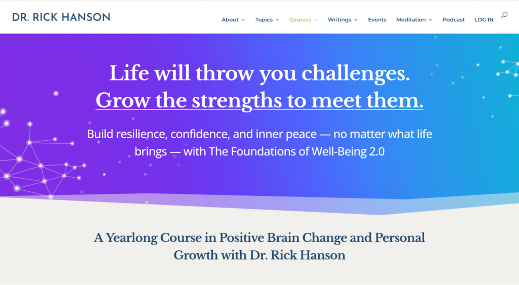
Here’s an example from Dr Rick Hanson’s landing page for his course on the Foundations of Well-Being.
The subheadline helps prospective customers understand the outcomes they can expect from taking the course: “Build resilience, confidence, and inner peace – no matter what life brings”.
-
Engaging visuals, sneak peaks, and demos
Of course, your written content isn’t the only thing that matters on your digital product landing page. Visuals are vital.
Use images and video on your landing page to catch the attention of visitors and help them understand the value of your product faster.
The right visuals can also create powerful emotions – for example, helping your potential customers to see the transformation they could achieve from buying your product.
Here are some ideas for visuals to include on your landing page:
- Product images
- Screenshots
- Video walkthroughs and demos
- Before-and-after photos
- Headshots of the instructors or educator
- Interactive elements
Use visuals to build trust with your audience by showing what they can expect from your digital product – including screenshots, walkthroughs, and before-and-after photos.
Depending on your digital product, include images of your course instructor, ebook author, or community members to give your business a friendly face and build a stronger connection with your audience before they buy.
Here’s an example from Sunny Lenarduzzi’s online course landing page. As she’s the person leading the course, Sunny includes plenty of images of herself throughout her content – including a photo with Oprah – to build trust and authority.

-
Direct call-to-action (CTA)
Every good landing page includes a direct call-to-action (CTA). The purpose of a CTA is to encourage a specific action from your landing page visitors, such as signing up for your newsletter or buying your online course. Your CTA should be action-focused and create a sense of urgency or anticipation.
Here are a few examples of compelling CTAs:
- Join today
- Get it now
- Get started free
- Save your spot
- Get full access
Add a CTA above-the-fold on your landing page – so visitors don’t have to scroll down your page to see how they can take action.
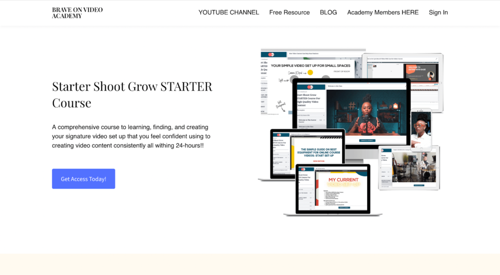
Here’s a CTA example from Thinkific Creator Educator XayLi Barclay’s Brave on Video Academy. The ‘Get Access Today!’ CTA is simple and adds a feeling of action and excitement.
Check out the digital landing page examples below for more CTA ideas.
-
Trust-building social proof
An essential element to include in your landing page is social proof. Social proof is a tool used in marketing to convince prospective customers to buy your product by highlighting the people who’ve already made a purchase.
For best results, use a range of different types of social proof on your landing page, including:
- Testimonials and reviews: Use customer testimonials to help convince your landing page visitors to make a purchase – include the name and headshot of your customers whenever possible.
- Business logos: If you’ve ever clicked on a landing page and seen a line of logos, that’s an example of social proof. For example, show off businesses who’ve bought your product, companies you’ve partnered with, or publications you’ve been published in.
- Customer statistics: Impressive customer stats, such as the number of sign-ups or how many $$$ customers have earned from using your product are effective ways to enhance your landing page content.
- Certificates and credentials: If you’ve got specific certificates, credentials, or awards, add these to your landing page to boost authority and instantly build trust with your prospective customers.
- Case studies: Add customer case studies to your digital product landing page and highlight the transformation your customers achieved after using your product or service. Use stats, customer quotes, and images to tell a story with your case study.
Social proof helps build trust with your prospective customers. If you can show that other people have bought and loved your product – and the successes they’ve achieved thanks to your product – you make the buying decision easier for your audience.
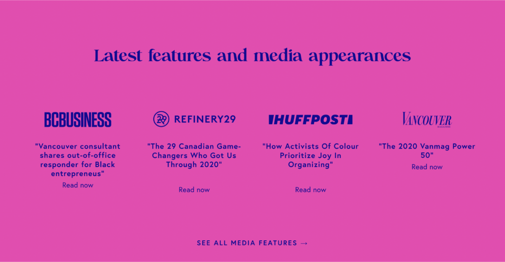
Check out this example from Creator Educator Cicely Belle Blain’s landing page highlighting her top media features to boost social proof on her landing page.
-
Mobile-friendly design
For best results, your landing page needs to be mobile-friendly. Over 60% of website traffic comes from mobile devices and 92.3% of internet users access the internet using a mobile phone. That means it’s essential to make sure you use a mobile-responsive design for your landing page.
Here are a few tips to make your digital product landing page easy-to-read for mobile users:
- Break up content into blocks: It’s difficult to read big blocks of text on a mobile device so break up your content into bite-sized chunks so it’s more scannable.
- Limit text, prioritize visuals: Use powerful visuals to quickly and easily convey information, without mobile visitors having to read through all your content.
- Make sure CTAs are visible: If you want your landing page to be effective at converting prospects into customers, make your CTAs easily visible and tappable on mobile devices.
When you’re designing your landing page, test it on mobile devices as well as desktop to make sure your content is accessible for all users. No matter where they are.
Top 10 digital product landing page examples
Example 1: Kristen Bousquet
Digital product name: The Soulcial Suite
Type of digital product: Community
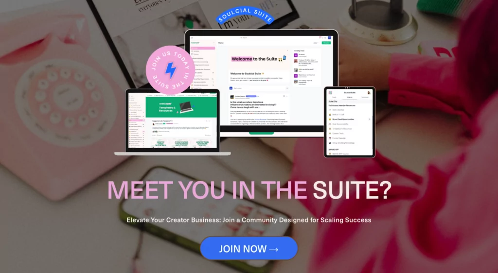
Kristen Bousquet knows her audience inside out. This allows her to speak directly to them in the landing page for her community space where customers can sign up for a monthly, quarterly, or annual subscription.
This digital product landing page example really goes above and beyond to answer prospective customer’s questions and concerns, including:
- Who it’s for
- What’s included
- The time commitment
- Access to Kristen
- How to make your money back from your membership fee
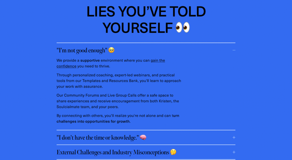
There’s also a section on “Lies you’ve told yourself” where Kristen highlights the challenges her audience are facing and how the community can help.
Kristen’s landing page also contains in-depth customer success stories, including photos of her members and a detailed breakdown of what they’ve achieved since joining the community – such as “Boosted sponsorship rates from $250-300 to $950 per Reel”.
The landing page design is also fun and approachable with emojis dotted throughout the content, fitting with Kristen’s brand and the social-media style focus of the community.
Landing page highlights:
- Addresses customer pain points
- Detailed success stories
- Distinctive branding and design
Example 2: Senna Filter
Digital product name: Online Course Institute
Type of digital product: Online course
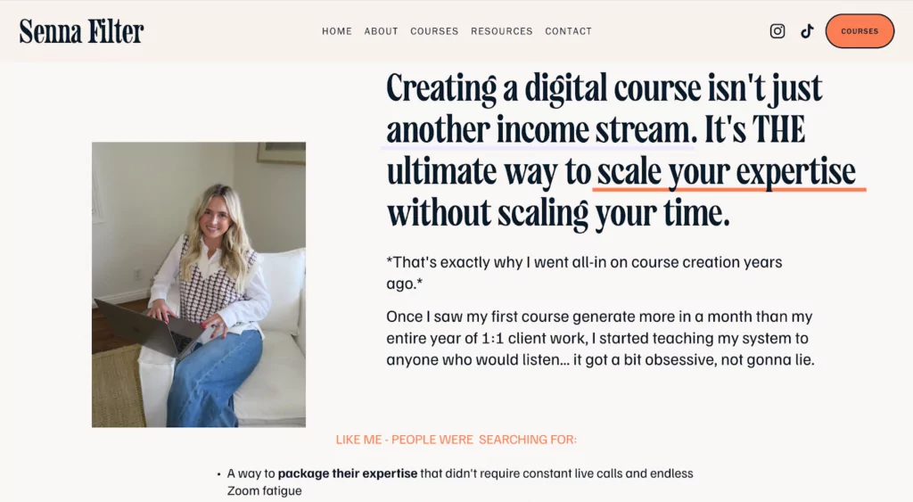
To sell her Online Course Institute, Creator Educator Senna Filter created a detailed landing page to drive prospective customers to make a purchase.
Where this digital product landing page stands out is in the storytelling. Senna draws on her personal experience to tell a story in her landing page content, including emotive language and common frustrations to encourage buy-in from her audience.
Senna also uses plenty of personality throughout her content to connect with her prospective customers, helping them feel as though she understands their struggles and frustrations.
This landing page contains a detailed breakdown of what’s included in the course. By including information on the different modules and lessons, customers can have a clear idea of what they’re getting before they hit buy, helping them to see the value of the product.
Landing page highlights:
- Emotive language
- Strong storytelling through the content
- Detailed breakdown of each course module
Example 3: Happier App
Digital product name: Happier
Type of digital product: App
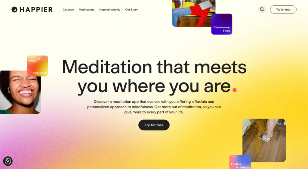
Derek Haswell and Ben Rubin teamed up with author, podcaster, and news anchor Dan Harris to launch meditation app Happier, a digital product that’s designed to give users a personalized approach to self-improvement and mindfulness.
This digital product landing page example is really effective thanks to its eye-catching visuals that include plenty of product images, gifs, and videos. The landing page gives visitors an insight into what it’s like to use the app, supported by testimonials from current users.
The feel of this landing page is perfectly on-brand with bright colors and fun graphics that feel upbeat and optimistic. The result? The landing page itself feels happy. And that’s exactly the mood Happier app are trying to convey.
Landing page highlights:
- Tons of product images and videos
- Video testimonials from customers
- Strong branding
Example 4: Entrepreneurs on Fire
Digital product name: The Common Path to Uncommon Success
Type of digital product: Ebook

John Lee Dumas, founder and host of the successful podcast Entrepreneurs on Fire (EoFire) is no stranger to digital products. One of EoFire’s top products – the Common Path to Uncommon Success – is an ebook and print book that outlines a 17-step roadmap to financial freedom and fulfillment.
This digital product landing page example has a few top features that make it effective. One of the first things on the page is a carousel of top book reviews from prominent authors and business leaders. It also includes an interactive element that gives you the chance to flick through the first few pages of the book, giving potential buyers a sneak peak inside.
The landing page also highlights John Lee Dumas’ expertise and authority in his field with key stats like:
- Insights from 3,000 of the world’s most successful entrepreneurs
- Over 100,000,000 podcast listens
- 3,000 5-star reviews
These statistics help build trust with prospective customers – and encourage them to hit the buy button.
Landing page highlights:
- Interactive preview of the book
- Impressive customer testimonials
- Key stats to build authority
Example 5: Baking for Business
Digital product name: Baking for Business
Type of digital product: Community
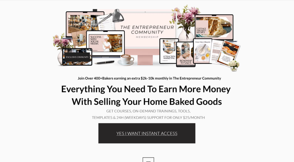
Creator Educator and Chef Amanda Schonberg has built a thriving business teaching bakers how to build successful businesses of their own – and her Baking for Business community includes resources, an online course, recipes, and more.
This digital product landing page is a top example of how to use social proof. Amanda’s landing page includes several different types of social proof, including:
- Numbers and statistics (“400+ bakers earning $2-$10k”)
- Business logos (“As featured in…”)
- Customer testimonials
Amanda has also included screenshots of resources within the community with a clear CTA of “YES I WANT INSTANT ACCESS”. This helps give prospective customers a sense of urgency and anticipation – all they have to do is make a payment to get access to all the resources Amanda is offering. This makes signing up an easy choice.
Landing page highlights:
- Range of social proof
- Breakdown of resources + bonuses
- Clear, straightforward content
Example 6: Matt Barker
Digital product name: The Digital Copywriter
Type of digital product: Online course
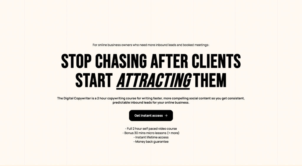
Matt Barker’s online course ‘The Digital Copywriter’ is aimed at business owners looking to get more clients and drive more revenue through copywriting.
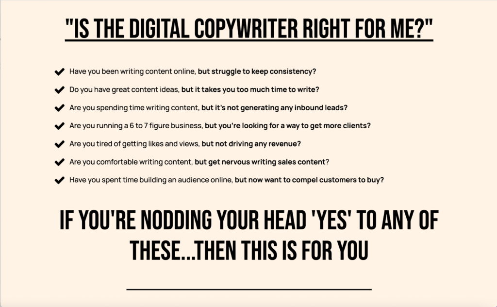
What this digital product landing page does really well is telling potential customers exactly what they can expect if they buy. It starts with a strong headline and subheadline. It also includes a detailed breakdown of what’s included in the course – such as self-led videos, templates, and worksheets. And Matt backs all of the info up with tons of social proof thanks to glowing reviews from past students.
Matt immediately answer’s his audience’s most burning question “Is The Digital Copywriter right for me?” using a checklist style format to help visitors understand who the product is aimed at and what benefits it delivers while talking directly to his audience’s pain points.
Landing page highlights:
- Clear headline
- ‘Is this right for me?’ section
- Breakdown of the course contents
Example 7: Ellievated Academy
Digital product name: The Mommy to Millionaire Club
Type of digital product: Membership
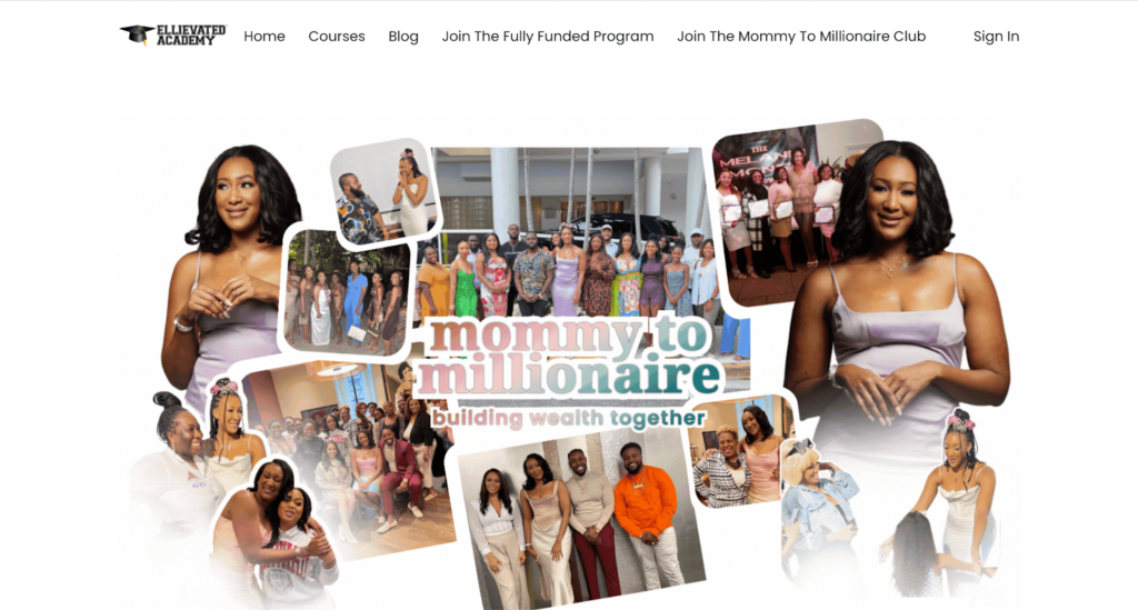
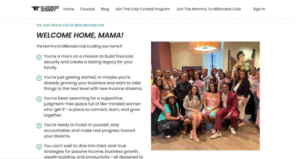
Creator Educator Ellie Diop has created a strong membership program. The secret to the effectiveness of this digital product landing page is the focus on transformation. Every element of the landing page – including the membership name, the content, and the photos – highlights the transformation that prospective customers can expect if they join the membership program.
From ‘Mommy to Millionaire’ is a strong promise and Ellie Diop’s product landing page focuses on human connection, transformation, and empowerment. By including lots of photos of current members, this landing page creates the feeling of a strong, supportive community of like-minded people. And as the copy says “This is the safe space you’ve been praying for”.
Landing page highlights:
- Detailed outline of who the club is for
- Focus on the transformation
- Lots of photos of current members
Example 8: Dr Richard Baxter
Digital product name: Tongue-Tied Academy
Type of digital product: Online course
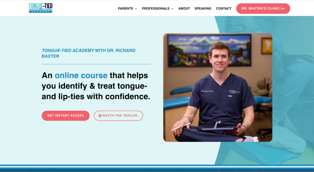
This digital product landing page example is as simple as it gets. Right away, visitors to the Tongue-Tied Academy landing page can understand exactly what this course is offering thanks to the clear headline.
There’s also a friendly, approachable image of Dr Richard Baxter himself, who leads the course, helping to immediately build trust with landing page visitors. Next to the call-to-action button, there’s the option to watch a video trailer to get more details.
The design of this digital product landing page is straightforward and scannable. The format is easy-to-read, allowing Dr Richard Baxter’s prospective customers to easily make their decision whether or not to hit buy. And the CTA is bold red so it stands out on the page.
A step-by-step breakdown of the course tells customers what to expect, how they can complete the course, and how long they’ll have access for. This landing page also lets prospective customers browse the course modules and individual lessons.
Landing page highlights:
- Simple, scannable layout
- Good introduction to course instructor
- Clear headline
Example 9: Sew it Academy
Digital product name: Learn To Sew Clothes For Beginners
Type of digital product: Online course
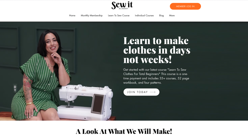
Mimi Goodwin’s Sew It Academy has a range of digital products – including online courses, a monthly membership, and digital downloads – all aimed at helping people learn how to sew.
This landing page example is great for a range of reasons. The headline is super clear and compelling, focusing on the outcome prospective customers can expect if they sign up for the beginner sewing course.
The subheadline supports the action-focused headline by adding more information about what it is, what’s included, and what customers can achieve.
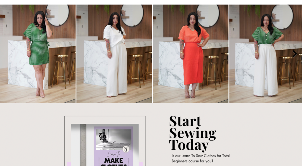
This landing page is also heavy on visuals. As customers will be learning to sew their own clothes, Mimi has included tons of photos of the beautiful clothes you can learn to make, plus a video trailer for the course. This means it’s easy to understand if the course is going to be right for you and the kind of outcomes you could get.
Landing page highlights:
- Compelling headline
- Detailed subheadline
- Lots of Images of transformation
Example 10: Her Design Media
Digital product name: The Digital Income Workshop
Type of digital product: Workshop
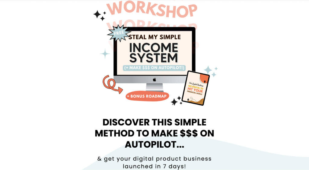
Creator Educator Diamond Lee has a range of digital products – including this free Digital Income workshop. For her workshop landing page, Diamond opted for a clear, minimalist layout that’s easily scannable and straightforward so customers can get the information they need to make a purchase decision as quickly as possible.
This landing page example includes glowing customer testimonials and a short bio of who Diamond is and what she’s achieved in her career to show off her expertise. There’s also a powerful CTA that focuses on the transformation customers can expect: “Ready to make money on autopilot?”. By highlighting the problem the product solves, Diamond’s landing page speaks directly to her target audience.
Landing page highlights:
- Simple, clean design
- Strong customer testimonials
- Emotive CTA
7 tips to create your own digital product landing page
-
Customize with your branding
When you’re creating a landing page for your digital products, it’s important to make sure it fits your brand so it’s recognizable to your target audience and potential customers.
Your branding includes:
- Your brand positioning
- Your brand colors
- Your brand voice
When you’re building your landing page, keep your ideal customer in mind. Imagine you’re speaking directly to them. This will help you to build a landing page that’s tailored to your customers, rather than creating generic content.
Take inspiration from the digital landing page examples in this blog post but remember to make your landing page feel like you.
-
Focus on your customers’ pain points
The best landing page content speaks to your customers’ pain points. That includes their biggest challenges, frustrations, and needs. After all, people want to buy your digital product because they have a specific problem they need to solve.
Here are some questions to keep in mind when you’re writing your content:
- What are the biggest challenges your audience are facing?
- How does this challenge make them feel on a daily basis?
- What could happen if this issue goes on unresolved?
- What are your audience’s top priorities for the next month/quarter/year?
- What’s one thing about their current solution or process that frustrates them?
- What tools or resources have they tried that didn’t work? Why didn’t they work?
- What would solving this problem allow them to achieve or accomplish?
- What does an ideal version of this solution look like?
- What transformation will they achieve?
- What value would this transformation bring to their work or life?
The more data you can gather from your existing customers, followers, and prospects, the more you can tailor your landing page content – and your digital product – to their needs. The deeper and more personalized you can get, the better.
Check out this landing page example from Elizabeth Rider. Her Wellness Business Bootcamp is aimed at wellness entrepreneurs who are starting their own business. Every word on the page is written with Elizabeth’s ideal customer in mind.
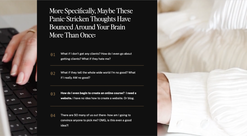
Elizabeth directly addresses her customer’s pain points in this section of her landing page, for example “What if I don’t get any clients? and “How do I even begin to create an online course?”.
By listing the specific pain points of her ideal customer, Elizabeth helps prospective customers feel like she understands their struggles, fears, and frustration. The content feels like it’s written for them.
-
Make your design scannable
The best landing pages are easy and quick to read. Your reader can scan through your page and find the information they need asap without having to think too hard.
To make your design scannable, break your text up into small chunks and include eye-catching visuals that illustrate what your digital product includes and the benefits customers can expect.
Here are more ways to may your content scannable:
- Bullet points
- Numbered lists and checklists
- Comparison tables
- Charts and diagrams
Very few people who visit your landing page will read every word. That means you need to convey information as quickly and effectively as possible. Test out different layouts, formats, and content types to see what’s most effective for boosting conversions.
-
Highlight CTAs
As the goal of your landing page is to convert prospects into customers, you need to prioritize the call-to-actions (CTAs) on your page.
Make your CTAs stand out when readers are scrolling.
Here are some tips to make your CTAs pop:
- Use contrasting colours
- Ensure the text is easy to read
- Avoid competing elements and distractions
- Test different button colors, sizes, and text
Add a CTA above-the-fold so users don’t have to scroll down the page to see it – your CTA is visible as soon as they click on the page. You can also place CTAs at key touchpoints throughout your landing page, such as after the benefits or features sections.
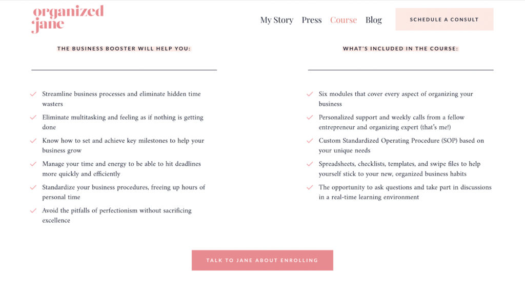
Take a look at this example from Jane Stoller’s landing page for her Organized Jane Business Booster digital product.
The CTA immediately stands out on the white page in a bright, contrasting pink colour and it’s placed after the list of benefits. This button is also surrounded by blank space so the reader’s eye is drawn to the CTA and visitors have no doubt about what action to take.
-
Remove competing links
Your landing page is all about converting your visitors. To do that, you need to remove as many distractions as possible – including competing links.
Keep your landing page clear of both external and internal links – that means eliminating links to other websites or to other pages on your website, even if you’re linking to your products or blog posts.
By removing competing links, you help to increase the amount of time visitors spend on your page and boost the likelihood of them converting.
-
Test and refine your landing page
For best results, test and tweak your landing page as you go. This will allow you to create the best possible landing page for your digital products.
Use A/B testing to gather data and find out what design and content is most effective at increasing conversions – then use this to shape your digital product landing page.
Here are some tips to help you get started with A/B testing:
- Test one element at a time: To make your A/B tests effective, you need to test one page element at a time and change one aspect about that element so you can understand what changes work. For example, test different button colors while keeping the text the same. This allows you to get clearer, more accurate results.
- Focus on priority elements: Test the elements of your landing page that will have the biggest impact on conversions, including your headlines and subheadlines, CTA, images, and page layout.
- Use A/B testing tools: To help you do A/B testing for your landing page, use a dedicated tool such as Google Optimize, Optimizely, or Hubspot. Some landing page builders also include built-in A/B testing features.
Testing is an ongoing process. Once you have completed a test, use that information to help you with future tests – the more testing you can do, the better you can optimize your landing page for conversions.
-
Choose a landing page builder
If you’re creating your own landing page without the help of a designer or developer, there are a range of dedicated landing page tools you can use to make the process easier.
Here are 3 top landing page builders:
- Thinkific: An all-in-one platform for building digital products that actually sell, Thinkific includes a dedicated site builder to create customized landing pages using your brand colors, content, different elements, and more.
- Unbounce: Tailored to marketers and agencies, Unbounce is a landing page builder tool that’s designed to help you maximize conversions without coding.
- Carrd: A free platform for building one-page sites, Carrd is a no-code tool designed to help you create custom, professional websites easily.
Look out for the features you need to choose the right landing page builder for you – and remember to test your content to see what elements are most effective at converting your audience.
Ready to build your own digital product landing page?
These digital product landing page examples feature a wide range of different designs, content, and audiences to help spark your ideas and imagination. Use these examples to get started with building your own landing page and create engaging, eye-catching content that converts casual visitors into eager customers.
If you’re looking for a one-stop-shop to build, market, and sell digital products, Thinkific is tailored to Creator Educators looking to monetize their expertise and share their knowledge with the world.
With a beginner-friendly drag-and-drop digital product builder, easy-to-use marketing tools, and a dedicated landing page tool, it has everything you need to get started. Try Thinkific for free today and get ready to make your digital product dreams a reality.


