Rita El Khoury / Android Authority
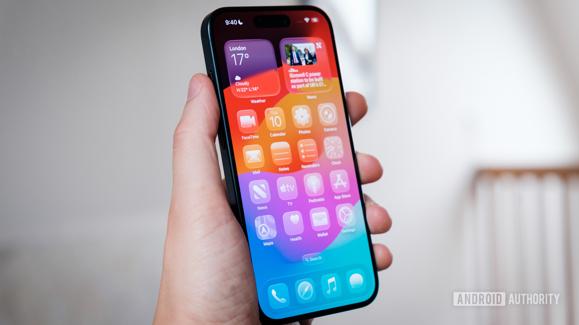
Blur is currently in vogue, and no, not in the 1990s indie rock sense either. iOS 26 and its Liquid Glass aesthetic might be divisive, but it is certainly striking. We’ve seen more Android OEMs add additional blur effects to their skins in recent months, too. Now, it seems that Google is turning up the blur dial for Android 17.
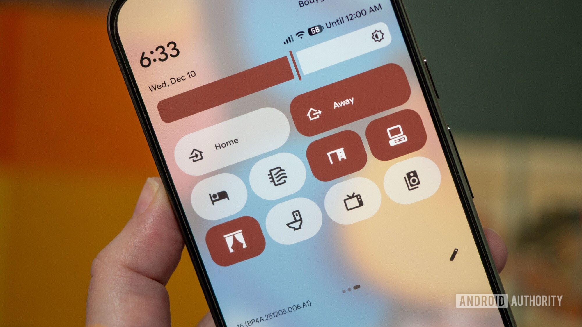
Thanks to the first few leaked images of the next Google mobile OS version, we have a good idea of what it could look like. Several elements are heavily blurred, allowing colors from the wallpapers and menus behind to seep through. While I have largely negative opinions, we wanted to know what you think about this change.
We ran two surveys, specifically asking readers what they thought about the changes and if Google is perhaps peeking over Cupertino’s wall a little too longingly.
Don’t want to miss the best from Android Authority?


Let’s get into the results of the first poll. It received over 2,600 votes, and there is a consensus. Nearly three-quarters of surveyed users either loved Android’s embrace of blur or were open to it but needed more evidence to decide.
It appears that the early Material You days, complete with solid backgrounds and sharp shapes, are all but dead.
Notably, Android 17’s early blur leaks aren’t a home run just yet. Android Authority reader Nicolas Vettese writes:
I like the blur that Android uses, but feel it needs to be more contrasty but subtle. I am not a fan of the Liquid Glass on iOS though.
Others had fiercer takes. User omkarjtg lamented Google’s Material You design language as a whole and believes the use of blur is akin to putting “lipstick on a pig.”
Reader maave.maave explained why transparency isn’t a favorite UI element of theirs:
Nope, not a fan of transparency. I think it’s visually noisy. Nor am I a fan of the autopick color schemes from Material You; they look bland and faded. So now it’s blurry, bland, and faded. I liked the original paper-esque Material Design with its contrast, sharp corners, and appearance of depth or layers.
Commenter OldeIronsides offered this measured take:
If they’re going to follow up M3E with some form of blur or glassiness, they need to tread carefully. I want more transparency and blur, but not iOS-level. And give users some control over how strong it is. Hope you’re reading, Google.
No iOS clone here

Robert Triggs / Android Authority
Is Google’s use of transparency a response to iOS 26? We asked readers what they thought about the risk that Android 17 would become too similar in appearance to Apple’s mobile OS. Readers were almost evenly split.
52% of surveyed readers disagreed that Android 17 is at risk of growing too similar to iOS and confirmed that the “new blur/glass effects aren’t that big of a deal.” That leaves just under half worrying about how much inspiration Google is drawing from Apple.
The comments largely reflect this balance, with several arguing that Google and Apple’s use of blur and transparency is simply not the same.
“This is nowhere near Liquid Glass. The difference is night and day. You don’t call a chicken a peacock because they’re both birds,” writes reader August.
Commenter Luke Vesty followed up:
This has nothing to do with liquid glass. Liquid glass on iOS is all the light refraction and bending within buttons and other elements. This is just a variant of Gaussian blur. Calm down.
These surveys clearly support Google’s move towards implementing more blur across Android’s various UI elements. There are still plenty of other elements in the upcoming OS build we haven’t seen yet, so opinions could change depending on the direction Google takes. Nevertheless, it appears that, for once, the company is giving most of its users what they want.
What do you think of the use of blur on Android 17’s leaked images? And how much blur do you believe would be too much? Let’s continue the conversation below.
Thank you for being part of our community. Read our Comment Policy before posting.


