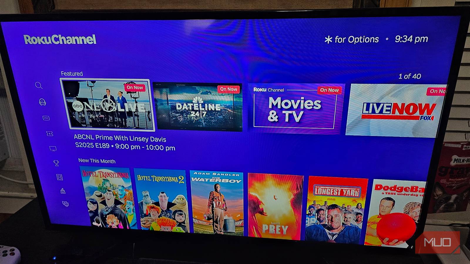
Roku’s home screen menu is like dealing with a fever dream. All the menu options are on the left side, in a short, squat box, while a flood of apps is listed on the right, followed by advertisements. Not only is it maddening to the eyes, it costs my streaming device precious performance.
Luckily, most of the gripes I have with the Roku UI can be altered or outright disabled, like content suggestions and tile sizes. I swear, once you tweak just a few settings, it feels like a completely different platform. Not to mention making it much easier to access my favorite Roku apps!
Adjust the size of the apps on your homepage
Now I can for sure tell apps apart from far away
The first problem I had with Roku’s UI was the size of the tiles for the apps. They were just a little too small for how far I’m sitting, and the color scheme isn’t enough to tell them apart (and waste time entering and exiting the wrong app).
- Go into Settings and select Home screen.
- Now choose Tile size.
- Pick between Smaller or Larger.
The difference between the two tile sizes is night and day. HBO Max, Hulu, Apple TV, and Plex were all difficult to distinguish given their similar dark, almost black backgrounds. I do wish I could go a little bigger, though—at least big enough that only two tiles fit each row.
I rearranged my apps by importance
I want my favorite ones easily accessible
Speaking of tiles, another issue I ran into was app tiles being out of order. Luckily, Roku does have an option for arranging them in your favor, so I immediately moved my favorite streaming apps closer to the top.
Go to Roku’s home screen and move into your apps menu. Highlight any app you want to move, then open Options with the star button on your Roku remote. Any apps that are below the first row will have two options: Move app and Move app to top.
Of course, you can also remove apps, which I also recommend, as there may be a couple you don’t use. I don’t have Hulu, so why bother having the app on my home screen, right?
Personalize Roku by installing a theme
My favorite is the colorful sci-fi one
Themes can have an impact on navigation if they’re set to something that bleeds along with apps and menu options. Roku offers a basic level of customization, allowing you to change your UI’s wallpaper, screensaver, and UI sounds. There are also theme packs containing a cohesive set of wallpaper, screensavers, and sound effects.
Go into Settings, then Theme to get a look at everything. Go ahead and choose anything you want from Wallpapers, Screensavers, Sounds, or Theme packs. More importantly, you can change whether wallpapers use animations and the time your Roku has to be idle for the screensaver to kick in.
Roku felt snappier without videos auto-playing
Once disabled, I could move around quickly
I don’t have the most powerful Roku streaming stick—it’s a couple of years old now. There’s a notable lag when I transition from one app to the next or between menu options. I noticed part of the problem was coming from Roku automatically playing videos whenever I highlight content.
- Go into Settings and choose Accessibility.
- Under the Reduce motion section, choose Auto-play video.
- Toggle the option to Off.
Once videos stopped auto-playing, transitioning from one tile to the next just felt so much better. Now I’m just dealing with the age of the device catching up, and not so much the UI itself. That performance bump comes in handy if you plan on using your Roku device in other ways, too.
I just want a cleaner UI, please
In addition to disabling auto-play, Roku has other ways of reducing the clutter on the home screen. In doing so, I was able to further reduce the time it takes for my Roku device to register a button press. Go into Settings and choose Home screen.
Now you’re going to see two sections: Layout and Menu items. Personally, I disabled every single option when I was given the option. The menu for my home screen is now just four options. With that said, you’re welcome to enable options you want, like Roku’s free channels.
I don’t mind reading subtitles during a movie
I like my captions big and bold
The last customization option I altered to make Roku feel better than ever was adjusting the appearance of subtitles. Now, this only applies to content on Roku, not the apps you use. So, if you want to adjust captions on Netflix, you have to do that in-app.
Go into Settings and choose Accessibility. Every menu option under Captioning will alter the way subtitles appear on-screen, like text color, opacity, size, and even edge effect. I prefer a serif proportional text style with a black edge effect to keep text legible during bright scenes, but you’re also welcome to add a background.
With a few tweaks, Roku’s UI is infinitely more usable
Once I had all these settings adjusted, Roku was so much easier to navigate, especially when I disabled most of the menu options that included content suggestions. Now my Roku home screen has no more than four options, accompanied by apps I can actually recognize.


