Ryan Haines / Android Authority
I’m a Pixel guy, have been for years — everyone knows it. So, you can imagine I was pretty pleased when Google unveiled Material 3 Expressive, and it looked like a refinement of the Pixel UI design that I already loved.
And then came Apple with its new Liquid Glass interface as part of iOS 26. Simply put, I thought it looked awful. It was hard to read, and the original glass effects looked clunky.
Now, though, I’ve given iOS 26 a shot. I’ve loaded it onto my iPhone 16 for a quick trip around the block and realized I was wrong. My least favorite part about Apple’s latest software isn’t the look, but what it’s done to the navigation buttons I spent years getting used to. I’m nearly ready to go back to iOS 18, and here’s why.
Liquid Glass looks actually kinda cool… once you figure it out

Ryan Haines / Android Authority
At first, Liquid Glass threw me for a loop. It automatically applied itself, well, everywhere, and I wasn’t sure how to navigate. My app icons suddenly looked like frosted glass pebbles, and most of my on-screen buttons were just a little harder to see. But after a few minutes, my eyes adjusted. I adapted to the new icons just like I had adapted when they were barely visible against dark gray backgrounds, and I quickly relearned my way around.
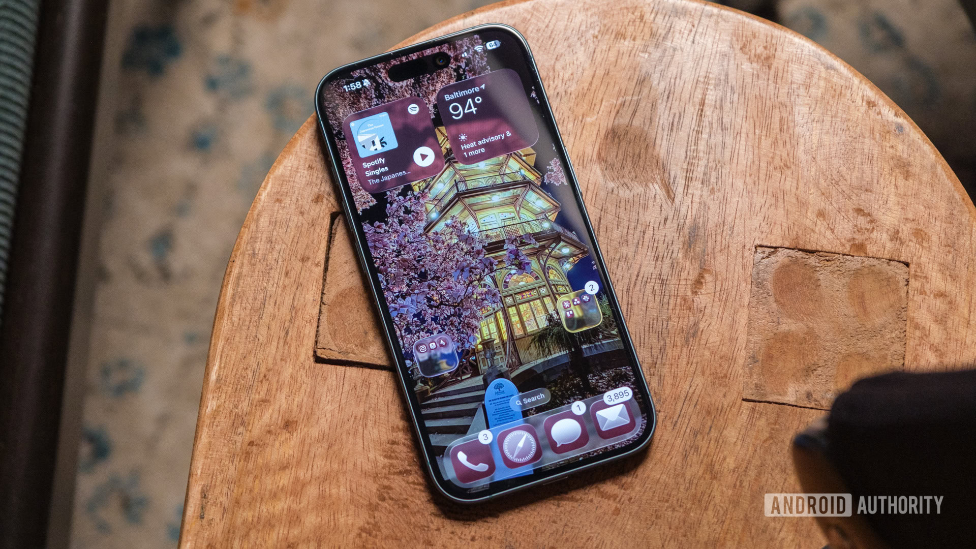
Once I did, I began to see how Liquid Glass is an improvement over whatever Apple called its iOS 18 design. Where that styling felt like a quick, dirty response to one of my favorite Android customizations, Liquid Glass feels considered. The app icons feel textured, and the slight difference in coloring makes it much easier to pick out which app I’m looking for — I no longer get mixed up between Spotify, Find My, and Apple Fitness.
Liquid Glass treats my app icons much, much better than iOS 18 ever did.
Of course, Liquid Glass isn’t just about recoloring app icons; it’s also about spicing up widgets and reworking the folders that adorn my home screen. On both fronts, I love what Apple is going for. I keep my home screen pretty lean, with two folders at the bottom and two widgets at the top, and Liquid Glass does just enough to minimize both of them while bringing out the details in my wallpaper.
I particularly like that my productivity folder — which houses Slack, Asana, and Google Authenticator — pulls from the golden evening glow of the iconic pagoda in Patterson Park and loops it around the edge of the folder as if I were looking through a slightly rounded window.
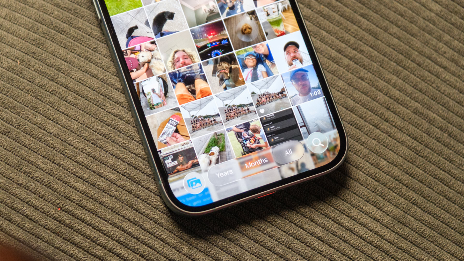
There are, however, times when I’m not sure the Liquid Glass treatment is necessary. One is when I drag down from the top edge to check my notifications. Sure, it’s neat that you can see the glass texture take over, acting like a wave as it descends over your apps, but it’s not the most noticeable. The part of Liquid Glass that’s really gotten old is when I swipe into apps like Photos. Everything is fine at first, with easily visible buttons along the bottom of my library, but when I swipe up and the glass takes over, it becomes almost impossible to find everything from Select to Search.
And, now that I’m annoyed at that, let’s talk about the buttons themselves.
Bubbles are no good for glass, Apple

Ryan Haines / Android Authority
As I saw it, Apple’s existing controls were good enough — maybe even great for some people. I certainly had no problem with how the buttons looked in Photos on iOS 18, and I even asked Google to copy Apple’s bottom-mounted search bar from Safari to Chrome (which it later did). I would have been content for them to stay the same from one version of iOS to the next and beyond, but Apple had something else in mind. It put everything in its little bubble, making it all hard to find.
Perhaps the worst example of this — and the one that inspired me — is what Apple did to its Safari controls. Previously, they were set up just right. The forward and backward arrows took up just enough space, and it was easy to read the address bar at a glance. I could jump from one tab to the next with a single button and access all other tab-related controls right from the same one. Now, though, I have to press a button to open the tab menu, then press a second button to view all of my tabs, taking a few unnecessary extra seconds to display those options.
Apple’s search for bubbly goodness has also led it to ruin its camera app with one simple change. It decided that Google had the right idea a few years ago with its minimalist Pixel camera interface, and now the iPhone should have the same one. On one hand, Apple always kept one tab for video and one tab for photos, but this new interface just doesn’t work for me.
I think my problem is that it’s both bubbly and backwards. A swipe to the left makes the settings go left, while a swipe to the right makes them go right. It’s exactly the opposite behavior of the previous camera interface, and now it’s the opposite of how the Camera Control behaves, too. An easy fix for this is to make them swipe in the same direction, but I fear I’ll be waiting impatiently until Apple realizes it.
Unfortunately, Apple’s hard-to-see buttons are pretty much everywhere in iOS 26. Nothing shares a safe, reliable bar anymore, and pretty much everything has been moved from its original position. New messages now start from the bottom of the interface rather than the top, the Phone app now has one unified menu, and the button to start navigating in Apple Maps practically needs its own navigation feature. It’s confusing, it’s a mess, and I’m ready to pack up my things and go back to my Pixel 9 Pro.
I’m sorry, Apple. Maybe I’ll try a future version of iOS 26 — one where I can actually find my way around.
Thank you for being part of our community. Read our Comment Policy before posting.


