
To get more experience working with AI, I decided to renovate an old website I created in 2018.
Emisary.com was an art project designed to demonstrate a metric I created to measure the demeanor of any person in a given situation. Visitors would write about their lives, then analyze each other’s work using this metric, and eventually receive a crowdsourced psychological profile of how they would be perceived by others socially. Unfortunately for them, the onboarding was a massive burden; users had to write 5 essays and critique 25 others. The delay this caused meant most people never saw their analysis. I moved on to other things.
But a few months ago, I realized I could train an AI model to do the work automatically. Visitors could write about specific moments from their lives and receive ongoing AI feedback about how their demeanor would have been perceived. They would be able to track their personality over time and make changes.
But with a product like this one that is not so easily pigeon-holed, the visual presentation has a tremendous impact on conversion. If I chose badly, users might be turned off before they had a chance to try it out. So, once I got the AI analysis portion up and running, I took some time out to work on landing page optimization. n
My first stab used a dynamic animation, which maybe I became a little too attached to.
Users arrive to see the ad copy against a blue background. Then tiny motes of teal and blue squirm from the edges of the screen. As the visitor reads through the copy, they begin to realize that the motes of light have left colorful trails that all end in a circle around our messaging. Over the course of ten seconds, it creates an expressionistic eyeball, graphically echoing the idea that we are constantly being perceived. I liked it, but had no idea if it would resonate with the expected demographic of 18 to 24-year-olds who might want to use the product. Chances are, probably not.
In other situations, I’d work with copywriters and designers to generate a variety of different takes and get feedback through UserTesting.com or some other paid testers. But I don’t have the money for that, so I decided to make the app do its own user testing and divide up incoming traffic to optimize the landing page dynamically.
I didn’t want to conflate our messaging with the means of its expression, so my plan was to first determine the best visual take and then fine-tune the text through repeated iteration.
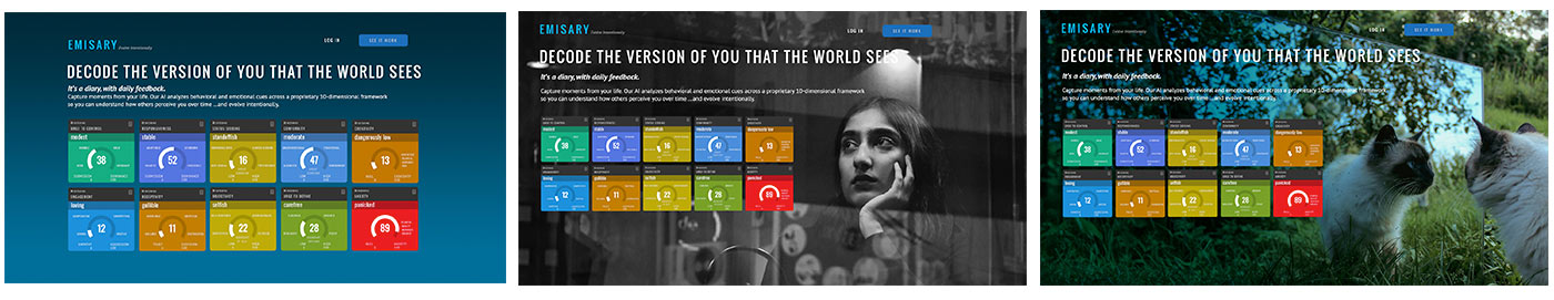
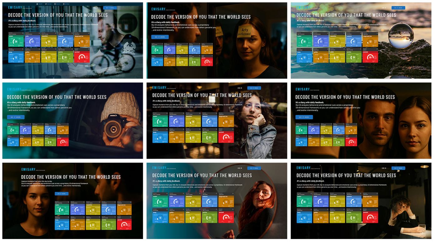
I quickly created 12 different landing pages using the same headline and body copy, so I could effectively compare them against one another. Initially, I tried working with the visual metaphor of that party game where people have famous names attached to their foreheads and they have to discover who they are by asking questions. It seemed like a good metaphor for life in general. But in practice, the AI-generated images I spun up fell into the uncanny valley in all the worst ways. Probably not usable unless I wanted to start a cult.
Ultimately, I found my salvation with Unsplash.com and eventually worked up three additional avenues to test out, as well as a few more I might try another day.
Building out the landing pages and the functionality was pretty straightforward. Total time from conception to delivery was about 2.5 days.
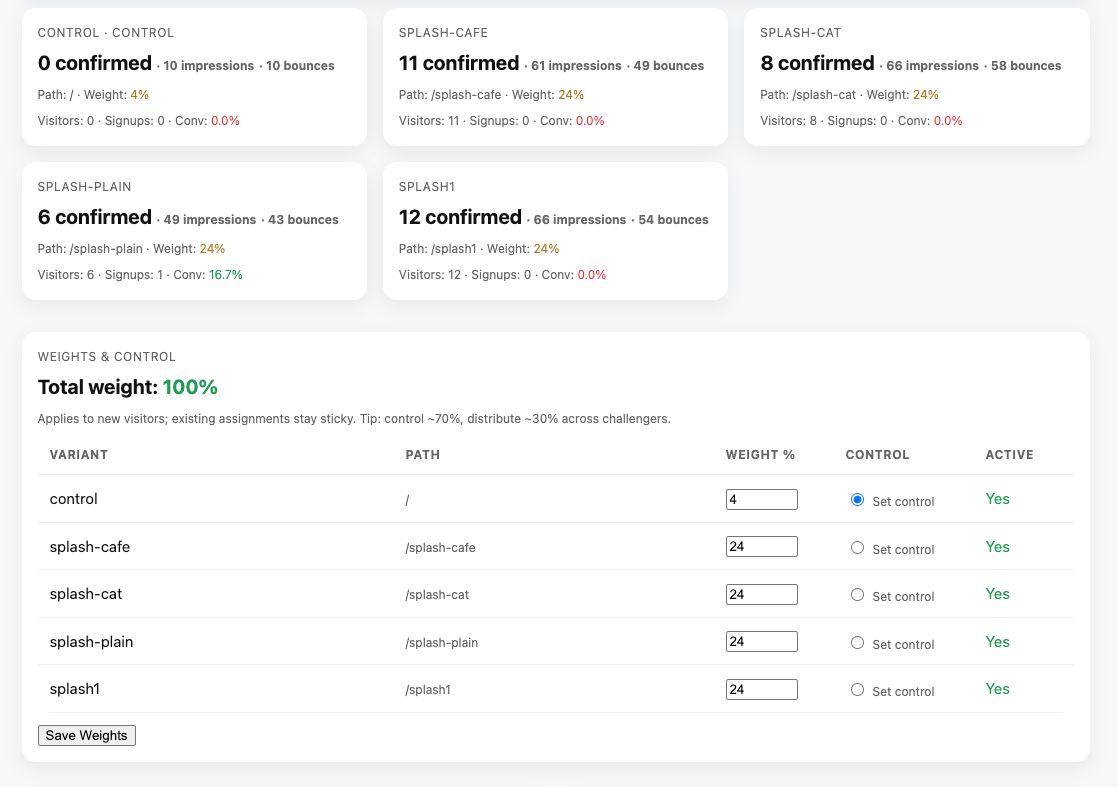
Now, on every incoming visit, a tiny Laravel middleware directs the visitor based on weights that are defined in the database. The assignment is sticky (via a long-lived cookie plus session), so a visitor will continue to see the same variant on return visits, which keeps our data honest.
Each assignment creates a lightweight “impression” record with the chosen variant, a timestamp, and any UTMs. With that record, we can count impressions per variant, look at confirmed visits, and track signups attributed to the first page a visitor lands on. For attribution, we capture UTMs on the first request and bind them to the assignment record so we can slice performance by channel later (Reddit vs. Product Hunt vs. email, etc.). We also allow forcing a specific variant via a query string (e.g., ?ab=splash-plain) for when we want a campaign to land on one design consistently.
All of this flows into an admin panel that I had already built to monitor the server and my workers. We list each variant’s path, weight, control flag, impressions, confirmed visits, signups, and conversion rate. And I can re-weight the variants or the control dynamically without having to change any code.
For this initial run (to determine the control), I want to keep everything manual, so I have placed my automated re-weighting feature behind a flag called out in the .env file. The goal at this point is to gather enough visitors to reach a statistical conclusion, turn on automated re-weighting, and then keep iterating.
But then, after pushing the update live, I woke the next morning to something weird.
Without driving any traffic, I had in the neighborhood of 200 visitors, none of whom created an account. In contrast, Google Analytics claimed 0 visitors, which made a lot more sense.
Bots were clearly the problem.
This is the most shocking realization coming out of the project: that a random, un-promoted web page might get 400 bots a day. Imagine all those automated pings floating out there at any given time; it’s like the microwave background radiation of the internet. I eventually realized we were marking a visit “confirmed” on the first page load, whereas Google was smart enough to filter out the robots in some other fashion.
Now, we only confirm a visit after the page’s JavaScript posts a tiny beacon back to the server. That requires a real browser, session cookies, and a CSRF token. We also shifted “unique visitor” increments to happen at confirmation time, not impression time. The data seems accurate now, and the admin panel lines up with Google. Bots still ping the site—but now they inflate impressions, not the numbers we’ll use to make decisions.
My goal ultimately is to maintain our winning landing page traffic at about 70% and to use the remaining 30% for testing.
As a feature for the future, I’d like to divide the control traffic into two identical buckets that I can compare against each other to measure the variability of the data. That would allow me to better understand when a variant should become the control and fine-tune decision-making.
In the meantime, I’m going to assume that if we get more than a 5% improvement over time, we have a winner.
Black and white woman pensive: Photo by Nilay Sozbir on UnsplashCat in mirror: Photo by Yurii Khomitskyi on UnsplashGuy in a bar looking pensive: cottonbro studioWoman Wearing Blue Denim Jacket Putting Her Right Arm on Her Cheek: juan pablo serranoBike guy reflection: by Filipp RomanovskiGlass globe at beach: Photo by Ines Cvitić on UnsplashPerson taking photo of you from car: Photo by Bianca Suri on UnsplashWoman looking down at camera: Photo by Valentin Lacoste on Unsplash


 | HackerNoon")

