By using this site, you agree to the Privacy Policy and Terms of Use.
Accept
World of SoftwareWorld of SoftwareWorld of Software
  • News
  • Software
  • Mobile
  • Computing
  • Gaming
  • Videos
  • More
    • Gadget
    • Web Stories
    • Trending
    • Press Release
Search
  • Privacy
  • Terms
  • Advertise
  • Contact
Copyright © All Rights Reserved. World of Software.
Reading: Microsoft’s new Office icons are more curvy and colorful
Share
Sign In
Notification Show More
Font ResizerAa
World of SoftwareWorld of Software
Font ResizerAa
  • Software
  • Mobile
  • Computing
  • Gadget
  • Gaming
  • Videos
Search
  • News
  • Software
  • Mobile
  • Computing
  • Gaming
  • Videos
  • More
    • Gadget
    • Web Stories
    • Trending
    • Press Release
Have an existing account? Sign In
Follow US
  • Privacy
  • Terms
  • Advertise
  • Contact
Copyright © All Rights Reserved. World of Software.
World of Software > News > Microsoft’s new Office icons are more curvy and colorful
News

Microsoft’s new Office icons are more curvy and colorful

News Room
Last updated: 2025/10/01 at 5:24 PM
News Room Published 1 October 2025
Share
SHARE

Microsoft is officially unveiling its new Office icons today, after they leaked earlier this year. The icons have a modern design that’s more colorful and playful, with subtle changes that match Microsoft’s recent work with its Fluent illustrations.

All of Microsoft’s 10 core Office icons are being refreshed, with a design that was inspired by Microsoft’s work on the Copilot icon. This is the first major change to the Office icons since their overhaul in 2018, and it’s meant to represent a more connected design system and Copilot’s influence on Microsoft 365.

“The core 10 Office apps were last updated in 2018 and the way we described what the designs represented is almost identical to language used today: connection, coherence, seamless collaboration, fluid transitions,” explains Jon Friedman, corporate vice president of design and research for Microsoft 365. “The new icons emanate a sense of fluidity and play, while also being simpler, more intuitive, and highly accessible.”

Much like Google’s new logo, Microsoft has picked gradients of color for its Office icons. “Where gradients were once subtle, they’re now richer and more vibrant, featuring exaggerated analogous transitions that improve contrast and accessibility,” Friedman says.

The new icons are also a little more simplified, with the Word icon previously using four horizontal bars and now using three, to improve legibility at smaller sizes. “We’ve moved away from bold, static solidity to embrace softer, more fluid forms,” Friedman explains. “Sharp edges and crisp lines are replaced by smooth folds and curves, giving the icons a sense of playful motion and approachability.”

The new icons will start rolling out in the coming weeks across web, desktop, and mobile for both consumers and commercial users of Microsoft 365.

Sign Up For Daily Newsletter

Be keep up! Get the latest breaking news delivered straight to your inbox.
By signing up, you agree to our Terms of Use and acknowledge the data practices in our Privacy Policy. You may unsubscribe at any time.
Share This Article
Facebook Twitter Email Print
Share
What do you think?
Love0
Sad0
Happy0
Sleepy0
Angry0
Dead0
Wink0
Previous Article Amazon’s ‘model factory’ is training the next generation of AI on the tech giant’s own business
Next Article Did someone really get the Xbox ROG Ally X early?
Leave a comment

Leave a Reply Cancel reply

Your email address will not be published. Required fields are marked *

Stay Connected

248.1k Like
69.1k Follow
134k Pin
54.3k Follow

Latest News

TrueNAS 25.10-RC1 Brings Better Disk Import/Export, ZFS Rewrite Improvements
Computing
Home Assistant Finally Lets You Undo and Redo in Automations
News
3 reasons your HDMI cable isn’t working (and how to fix them)
News
China’s state broadcaster takes small stake in iQIYI as revenue falls · TechNode
Computing

You Might also Like

News

Home Assistant Finally Lets You Undo and Redo in Automations

4 Min Read
News

3 reasons your HDMI cable isn’t working (and how to fix them)

5 Min Read
News

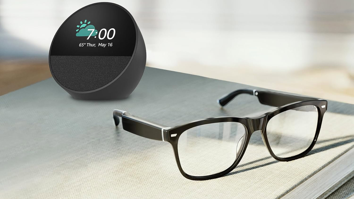
Save $230 with this bundle: Amazon Echo Spot and Echo Frames

3 Min Read

Open wide: AI receptionists are becoming more popular for dental practices

3 Min Read
//

World of Software is your one-stop website for the latest tech news and updates, follow us now to get the news that matters to you.

Quick Link

  • Privacy Policy
  • Terms of use
  • Advertise
  • Contact

Topics

  • Computing
  • Software
  • Press Release
  • Trending

Sign Up for Our Newsletter

Subscribe to our newsletter to get our newest articles instantly!

World of SoftwareWorld of Software
Follow US
Copyright © All Rights Reserved. World of Software.
Welcome Back!

Sign in to your account

Lost your password?