Have you ever wondered why we instantly recognize the WWF panda logo, even though it’s made up of just a few black shapes on a white background?
The answer lies in Gestalt principles; a set of psychological rules that explain how we naturally perceive visual elements as unified wholes, not just as scattered parts.
Understanding Gestalt theory is like unlocking the blueprint behind intuitive, powerful design.
These principles guide everything from how users scan the web design to how they emotionally connect with a brand logo.
Let’s break down each Gestalt principle with practical, visual examples so you can stop guessing and start designing with intention.
What Are the Gestalt Principles of Design? (+Examples)
What Are the Gestalt Principles of Design?
The Gestalt Principles of Design were introduced in the 1920s by German psychologists Max Wertheimer, Kurt Koffka, and Wolfgang Köhler. The word “Gestalt” comes from German and means “form” or “whole.”
These principles describe how the human brain naturally perceives visual elements. The Gestalt psychology suggests that instead of seeing separate parts, we tend to view complex images as organized patterns or unified wholes.
These principles are especially useful in graphic design, UI/UX, web design, product interfaces, and branding. They help users instinctively understand your design without requiring much thought.
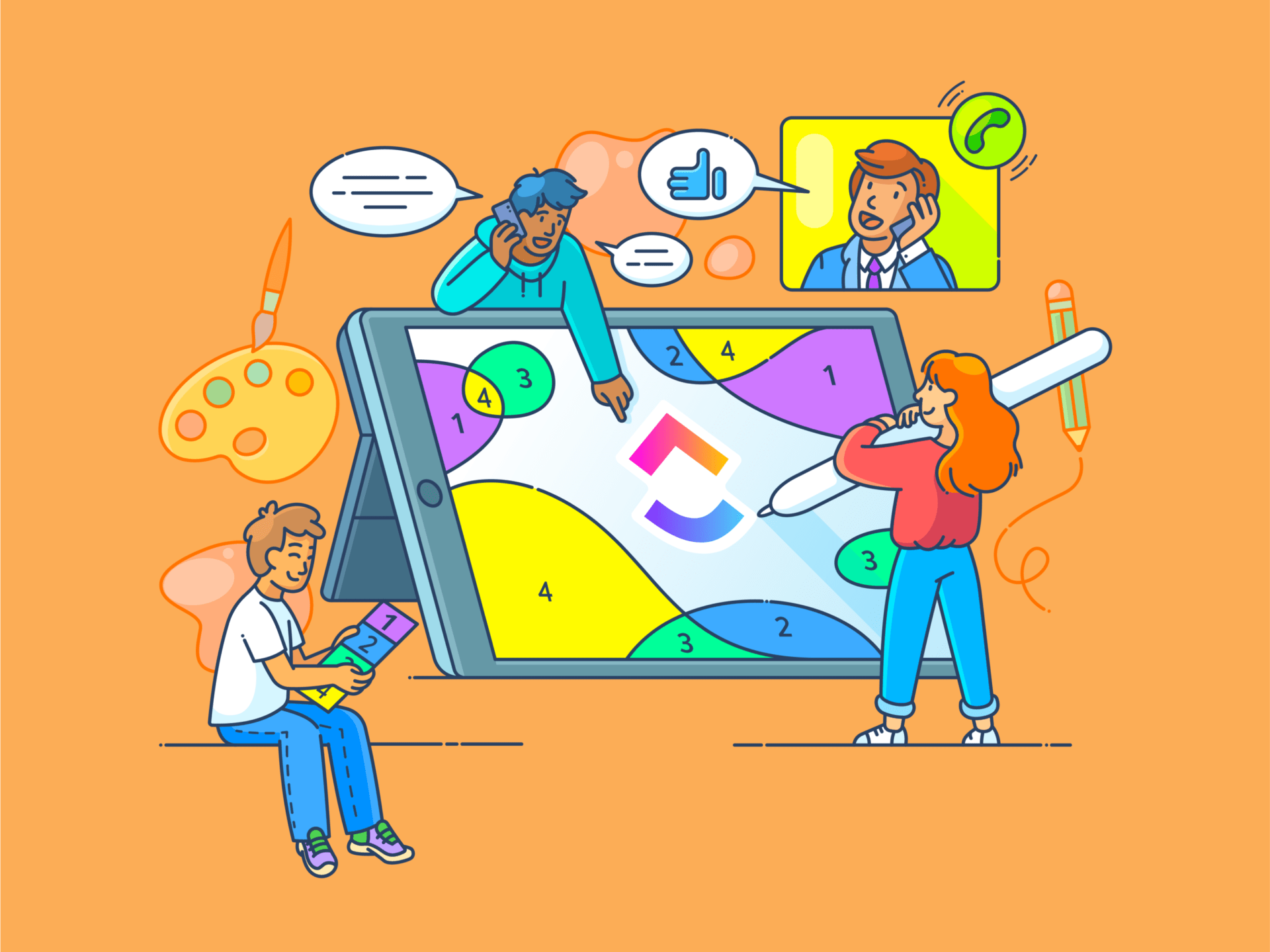
🌟Featured Template
The Design Brief Whiteboard template is a highly interactive tool designed to help design teams visually plan, organize, collaborate, and keep stakeholders aligned on projects.
On this digital whiteboard space, you can:
- Set up labeled zones or frames for relevant Gestalt principles, brand guidelines, key objectives, and the target market
- Use sticky notes, boxes, and arrows to sketch wireframes or mockups
- Invite team members to leave comments, emoji reactions, or suggestions on how well a mockup applies a principle, or where it falls short
Core Gestalt Principles with Real-World Examples
Let’s look at the core Gestalt principles:
1. Proximity: Grouping related elements
When things are close together, we perceive objects as related or part of the same group. This helps designers organize information in a way that feels natural and easy to understand.
Where to use it: Navigation menus on websites, pricing tables, input fields in forms, dashboard widgets, etc.
Example: displays its pricing plans in columns, with each plan’s features grouped under its heading. The spacing between plans is larger than the spacing between a plan’s features.👇🏼

Why it works: Users can easily distinguish individual plans and their details, and decide which one best suits their needs.
2. Similarity: Creating consistency in design
The similarity principle explains how our brains group things that look alike. When elements share similar colors, shapes, sizes, or styles, we naturally see them as connected or part of the same ‘family.’
Designers use this trick to create order and reinforce visual hierarchy. They guide your attention without you even realizing it!
Where to use it: Top and side navigation bars, section headers, legends/labels, tutorial steps, CTA buttons, etc.
Example: LinkedIn extensively applies the Gestalt principle of Similarity to group related items in the top menu bar, feed cards, connection cards, job boards, and so on, creating visual consistency in structure and function.
Why it works: Visual grouping and consistent patterns reduce cognitive load, enhance content comprehension, and encourage user engagement through familiarity.

📮 Insight: 24% of workers say repetitive tasks prevent them from doing more meaningful work, and another 24% feel their skills are underutilized. That’s nearly half the workforce feeling creatively blocked and undervalued. 💔
helps shift the focus back to high-impact work with easy-to-set-up AI agents, automating recurring tasks based on triggers. For example, when a task is marked as complete, ’s AI Agent can automatically assign the next step, send reminders, or update project statuses, freeing you from manual follow-ups.💫
Real Results: STANLEY Security reduced time spent building reports by 50% or more with ’s customizable reporting tools—freeing their teams to focus less on formatting and more on forecasting.
3. Continuity: Guiding the viewer’s eye naturally
The continuity principle explains how visual perception leads our brains to follow smooth, unbroken paths.
When design elements line up along a curve or a straight line, we see them as connected, even if they overlap or get interrupted. Your eyes naturally glide along the easiest route.
Where to use it: Image/content carousels, real estate listings, checkout processes, portfolio layouts, ecommerce product listings, product tours, etc.
Example: The Amazon website’s product recommendation module shows alternative products closely related to the one you’re currently viewing. Products are shown with uniform layouts (image, price, star rating) and are grouped visually to indicate they are comparable.
Why it works: Even though individual items sit in their box, the horizontal alignment pulls your eyes sideways, like following a trail. The tiny arrows on the sides hint that there’s more to explore. This design uses continuity to make scrolling feel easy and natural.
🎯 Quick Hack: Want to guide your user’s eye? Use the focal point principle to make one element pop using contrast, size, or color. It grabs attention fast and drives action (like clicking that CTA!).
Looking for a tool to make collaboration effortless for creative teams? See what Whiteboards has to offer!
4. Closure: Encouraging the brain to fill in gaps
The Closure principle refers to our mind’s tendency to fill in missing parts of ambiguous or complex images to perceive a complete, whole object. It allows designers to suggest forms rather than fully illustrate them, relying on the viewer’s perception to mentally ‘close the shape.’
Where to use it: Brand logos, icons, symbols, progress indicators, product teasers, etc.
Example: The IBM Logo uses horizontal stripes to suggest the letters I, B, and M, leveraging closure for visual interest.
Why it works: Closure lets designers do more with less. The clever use of negative space uses minimal detail, saves visual effort, and sticks in memory.
Want to see more iconic examples of ‘Closure’ in corporate branding? Logos of FedEx, NBC, Adobe, Unilever, and Major League Baseball are the best examples.
5: Figure/Ground: Differentiating subject from background
Figure/Ground is all about creating subtle contrasts. Our brain naturally tries to separate what’s important (the ‘figure’) from everything else (the ‘ground’), and this is how we instantly know where to look first in a design. This principle ensures that important elements stand out, even in complex or busy designs.
Where to use it: Hero sections on websites, call-to-action buttons, forms, input fields, dashboards, search boxes, etc.
Example: On the Google Search homepage, the white search bar is the central element on an otherwise minimal background. This extreme contrast draws immediate attention to the input field.
Why it works: There’s no visual clutter, and your eye is instantly drawn to where action is expected. When the figure stands out clearly, there’s no confusion about what to focus on, and that’s key for smooth user experiences.
6. Symmetry and order: Promoting balance and harmony
Our brains love things that look clean and put together. Symmetry and order give us that sense of balance when things are laid out evenly or follow a clear structure.
Where to use it: Product grids and layouts, forms, newsletters, onboarding steps, dashboard widgets, dual-pane views, etc.
Example: Nike’s product listing page displays shoes arranged in neat rows, facing the same direction. Each shoe is shown in the same-sized box against consistent negative space. This symmetrical layout helps you scan through options without feeling overwhelmed.
Why it works: Symmetrical designs are easier for the brain to process, which leads to faster interaction. A balanced layout reduces visual anxiety, helping users feel more at ease as they explore options or complete a purchase.
7. Common fate: Indicating movement and direction
The common fate principle kicks in when things move or change together, and we instantly group them as being connected. It’s a smart way to show relationships or guide someone through a process.
Where to use it: Kanban boards, hover effects on icons, animation in dropdown menu items, sliding images or content blocks, loading indicators, multi-step progress bars, etc.
Example: In ’s Board View, when you move a task card from one column to another, the card, along with all its attached elements like labels, due dates, and checklists, moves as a single unit.
Why it works: The left-to-right or top-to-bottom movement creates a clear directional narrative that mirrors task progression. This design minimizes confusion by grouping related items through motion, allowing users to easily track what is being moved or acted upon.

🧠 Did You Know? Visuals are processed 60,000x faster than words. Gestalt principles help structure those visuals so your brain can understand them in milliseconds.
How Gestalt Principles Improve UI/UX Design
Gestalt principles are psychological rules about how people naturally perceive and group visual elements. Designs that follow Gestalt guidelines promote clarity and consistency, guide attention, reduce cognitive load, and improve usability.
Here’s how UX designers use them in practical, meaningful ways:
Makes interfaces feel more intuitive
Gestalt principles tap into how our brains are wired to make sense of visuals. When you use them well, your design just makes sense. Users can quickly figure out what goes together and where to go next, even without reading every single label.
📌 Example: On Amazon’s checkout page, everything is broken into clear steps: Group, Business Info, Delivery Address, Payment Method, etc. You don’t have to wonder what’s next or where you are in the process. The layout does the thinking for you.
Takes the pressure off the user’s brain
Great design should feel effortless. Gestalt principles help organize information in a way that’s easy to scan and instantly makes sense, allowing users to focus on what they came for, rather than how to use the interface.
Example: Head to PUMA’s homepage and you’ll see two bold, clear options right away: For Him and For Her. No hunting, no scrolling. Just quick, clear choices that help you get where you want to go, fast.
Helps guide the user’s attention
With smart grouping, spacing, contrast, and alignment, you can gently guide users from the most important info (like a headline) all the way to the next action (like a button) without them even realizing they’re being led.
📌 Example: Take a look at Forrester’s homepage. The yellow CTAs stand out in high contrast against a soft background. Your eyes naturally flow along the seamless visual path from what it is and why it matters to how to act.
Brings consistency and makes things clearer
By applying the same layout rules to similar elements, such as icons, text, or images, the design appears organized and tidy. Your eyes know where to go, even if a lot is happening on the screen.
Consistency guides users smoothly through the experience, making navigation feel natural and stress-free.
📌 Example: In Spotify’s Top Global Songs list, each song entry follows the exact same format: song number on the left, song title and artist name displayed, and the song duration on the right. The consistent layout helps you quickly find your favorite tracks or discover new hits with zero confusion.
🎯 Quick Hack: Use the Same Closed Region principle to group elements. Just place them inside a box, circle, or shaded area. Your users will instantly see them as related, even if they look different!
Applying Gestalt Principles in Your Design Workflow
By applying all the principles in a thoughtful order, you can create designs that feel clear, connected, visually appealing, and easy to use.
Here’s how to apply them step by step in a way that builds naturally from one to the next:
- Start with grouping: Use the principle of similarity to group related elements by color, shape, or size
- Guide the eye with proximity and continuity: Arrange elements close to each other to indicate relationships and use alignment to create smooth visual paths
- Create hierarchy through contrast and figure-ground: Use contrast in color, size, or spacing to highlight important information and make key content stand out
- Use closure to encourage engagement: Design logos or icons that use negative space cleverly to spark curiosity and improve brand recall
- Test and iterate with real users: Test how people perceive your design, helping you fine-tune groupings, alignments, and contrasts for maximum clarity and impact
But, how do you put these design principles into action? Let’s break it down:
1. Analyze your current designs using Gestalt
Before jumping into a redesign, take a moment to step back and evaluate what you’ve already built. Use the Gestalt principles as a lens to spot what’s working and what’s not.
Ask yourself:
- Proximity: Are related elements placed close together so they feel connected?
- Similarity: Do similar items share a consistent look, color, shape, or size?
- Figure/Ground: Is there a clear focal point, or are elements competing for attention?
- Continuity: Does the layout guide the eye naturally, or does it feel scattered?
- Closure: Are incomplete shapes still forming a complete image in the viewer’s mind?
Each of these questions ties back to how human perception processes structure and order.
💡 Pro Tip: Review one screen at a time to evaluate the functionality of individual elements. Still stuck? View it in grayscale to focus on structure, not color.
2. Use design tools and frameworks to incorporate these design principles
Aesthetic decisions matter, but they only work when grounded in structure and intention.
Applying Gestalt principles across a project takes more than static assets or scattered tools. It demands a system that captures ideas, structures work, and evolves with feedback.
Here’s what to look for in a tool:
- Smart layout features: Pick a tool with auto layout or smart spacing features for grouping related elements and maintaining clean, consistent alignment
- Reusable components and style: Go for a tool that allows you to reuse components (e.g., buttons, cards, input fields) to help users recognize patterns faster
- Prototyping and animation: Choose tools that let you animate transitions between screens and simulate user journeys through visual storytelling
- Collaboration and design documentation: Go for a tool that supports idea sharing, commenting, feedback, shared docs, version control, and real-time collaboration
’s Design Project Management Software is excellent for structuring your design process in a way that reflects Gestalt principles, especially when collaborating with teams or managing UI/UX workflows. It connects brainstorming, execution, feedback, and documentation in one place, so designers can stay creative while maintaining structure and momentum.
Here’s how you can use it for design project management:
Organizing and planning visual elements
Whiteboards is a great starting point for organizing ideas visually and planning your interface before you move into detailed design.
Color-coded shapes, sticky notes, tags, or notes can indicate similar components or categories, such as all navigation items in blue and all CTAs in green. Arrows and connectors help map the flow and plan how users will move through your interface in a logical, seamless way.

🧩 Design Tip: Got disparate elements on a page? Use visual information like spacing, borders, or background shapes to create order. For example, place related content inside a shared background or border (like a card or container). Even if they look different, users will perceive them as a group, instantly improving clarity and flow.
Looking for a ready-to-use framework to accelerate the ideation-to-implementation process?
Use Docs for context that evolves with the project. Add design briefs, user research, competitor analysis, or design rationale, organized and linked to the tasks they support. This ensures everyone, from designers to stakeholders, sees what needs doing and why.

Brainstorming and visualizing layouts
Design teams can and do go through creative slumps. And when that happens, Brain helps keep the momentum going by suggesting visuals for homepage layouts, UI samples, color palettes, style inspirations, icons, and thumbnails etc.

Need AI suggestions on your design? Upload an existing design file and ask Brain to provide feedback, suggest enhancements, revise your layout ideas, or redesign particular sections to match the overall theme outlined in the creative brief.
Watch this video to learn more about generating images with Brain:
Collaborating on feedback and design iterations
Once designs are in motion, feedback can make or break momentum. Tasks are dedicated hubs for each asset, such as the homepage hero image, navigation menus, product carousel, input fields in forms, etc. Attach design files, assign reviewers, and keep threaded feedback right where it’s needed.
Reviewers can leave contextual comments on designs or tag teammates for quick fixes with Assigned Comments and @mentions.

Documenting design guidelines and style guides
As your design evolves, maintaining consistency becomes critical. Use Docs to create centralized brand guidelines, encompassing typography and color systems, component libraries, and usage dos and don’ts.
Designers working on separate features can reference the same shared Doc, whether they’re choosing icon sets or aligning on tone for microcopy. As Docs connect directly to your workflow, a task like ‘Update About page footer’ can instantly link to the relevant style guide templates, typography specifications, or color palette.

Tracking revisions and design stages
Bring visibility to every stage of the design cycle with Kanban Boards. Build custom workflows with columns like ‘Ideation,’ ‘Design,’ ‘Internal Review,’ ‘Client Review,’ and ‘Final.’
If you are running a design agency that manages multiple branding projects, boards can be grouped by client or designer, making it easy to balance workloads and prioritize critical timelines.
Power Up Your Creative Process with
Gestalt principles hold your design together in a way that feels right. When something feels intuitive, users don’t just notice—they remember.
However, applying these principles consistently across projects takes more than just theory. You need the right tools to create real, functional design workflows.
With Whiteboards, you can visually map out design ideas like proximity, alignment, and continuity. Docs help document design decisions, explain the “why” behind your choices, and build internal design guides for your team. And with Brain, you can generate creative ideas and summarize design feedback.
Sign up for today to apply Gestalt principles to your workflows.
Everything you need to stay organized and get work done.


