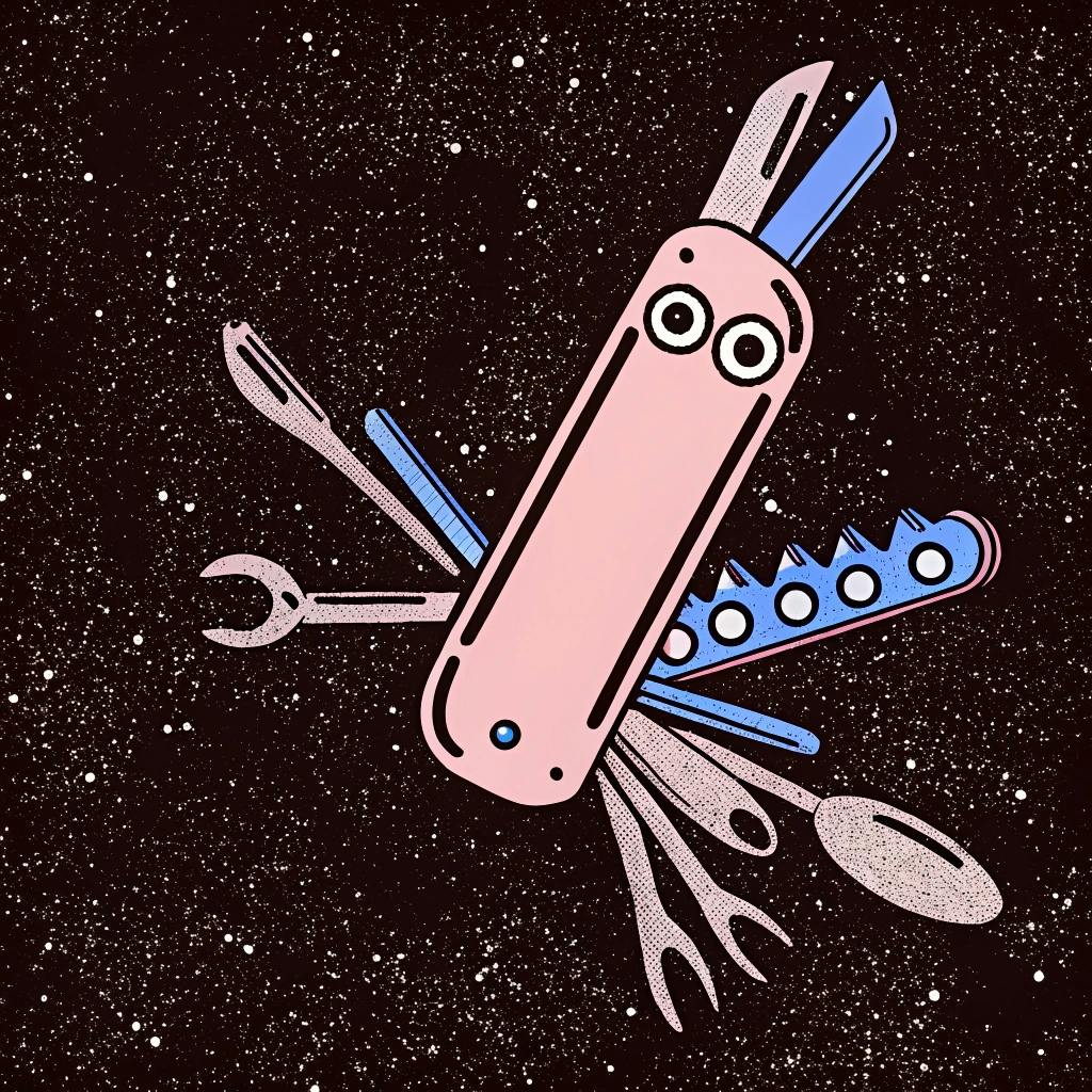
I logged into a project management tool I’d used happily for three years. Went to create a task. Got presented with 14 fields, 6 dropdown menus, and a “Quick add” button that opened a modal with 8 more options. The thing I wanted – type text, press enter, task created – now lived somewhere behind “Advanced settings” because they’d added dependencies, and automations, and AI suggestions, and sprint planning, and about forty other things I didn’t ask for.
I closed the tab and opened a text file.
Text files don’t have product roadmaps. That’s their main feature.
⸻
When adding options became the only option
Another example. I opened a CRM last week to add one contact. One person’s name and email. The “Add Contact” button had a dropdown: Add Contact. Add Company. Add Deal. Add Contact + Company. Add Contact + Deal. Add Company + Deal. Add All Three. Quick Add (which somehow wasn’t the quickest).
Eight options for “save one person’s information.” Took me 40 seconds to figure out which one wouldn’t trigger a workflow, create a pipeline stage, or notify someone’s sales team that I’d made a strategic account decision by typing “Alex” and pressing enter.
I used to think this was careful feature design. Accommodating different use cases. Respecting user preferences. Now I know it’s product cowardice – an inability to decide what matters, dressed up as flexibility.
The product that does everything is the product that defaults to doing nothing simply.
⸻
What adding features actually says (when nobody’s keeping count)
- Every new section in your navigation says: we’re no longer sure what you’re here for.
- Twenty settings for one feature says: we built something confusing and decided configuration was cheaper than clarity.
- “Basic” and “Advanced” mode says: we know this is too much, but we shipped it anyway and made you choose your pain level.
- The Settings page that needs its own navigation says: we’ve built a product inside your product. (Congratulations?)
- The “Getting started” checklist that never dismisses says: we’ve added so much that even we don’t think you’ll figure it out on your own.
Users don’t email angry complaints about this. They ghost.
⸻
The degradation I watched happen in real time
One project management tool over four years. Not audit work – actual use. Watched it go from essential to obstacle.
Year 1: Five actions. Create task, assign, complete, comment, share. Clean. Activation around 73%. I recommended it to everyone.
Year 2: Dependencies added. Then sprint planning. Then time tracking. Then custom fields. The “Create task” button asked: Quick add or detailed? (Quick opened a modal with 8 fields. Detailed had 14.) Activation: 68%. I stopped recommending it quite as enthusiastically.
Year 3: “Power user features” arrived. Custom views. Template library. Workflow automation. Advanced filters. Settings page got so long it needed collapse panels. Support costs up 40%. Activation: 61%. I started hedging my recommendations with “it’s powerful but has a learning curve.”
Year 4: Watched a new user try to create their first task. Took them 90 seconds to find the right button. They asked: “Where’s just… type and press enter?” It was there. Hidden behind “Advanced settings” because advanced had quietly become the default and simple got demoted to legacy behavior. Activation: 54%.
Year 5: Major redesign announced. “Simplifying everything.” Translation: moving 80% of features to new locations, removing zero features, adding three more. Activation: 51%. I stopped recommending it. Started opening text files instead.
The product didn’t break. It just kept winning internal feature debates until the foundation disappeared under additions. Every feature had a champion. Every one got used by someone. But the core job now required navigating past seventeen adjacent jobs the product had learned to do.
⸻
What actually works (when you stop collecting features)
One obvious path to value. A CRM I worked on buried “Add contact” three clicks deep under Contacts > New > Contact (not Company). We moved it to a persistent header button. Activation jumped 23% in two weeks. Because we stopped hiding what mattered most.
Features you can ignore without knowing they exist. Notion lets power users build databases with relations and formulas. Casual users see pages and can stay there forever. Same product, different depths, nobody forced into complexity they don’t need.
Settings that default to sensible. One analytics platform had 34 settings for data refresh rates. Thirty-four. Usage data showed 91% stayed on default. The other 33 settings were solving problems for seventeen people. That’s not comprehensive – that’s hoarding edge cases.
Navigation that reflects jobs, not org charts. If you have 12 navigation items, you don’t have comprehensive features. You have an information architecture problem with a product marketing name. Users came to do five things. Show them five things.
Subtraction as craft. Basecamp removes features below adoption thresholds. Every six months. No grandfathering. Archive it, watch if anyone screams. They usually don’t. And when they do, you learn if those eleven people are worth the complexity cost for everyone else. (They usually aren’t.)
⸻
How to know if you’re the problem
The two-minute test. New user. Most common task. No tutorial. Timer starts.
Under two minutes: your core workflow is clear. Over two minutes with “where do I…?” questions: something’s blocking obvious value. Ninety seconds of clicking around before giving up: you’ve buried your purpose under capabilities.
I’ve run this on seventeen products. Twelve failed. Every failure had double-digit navigation items.
The return user test. Someone who used your product regularly six months ago. Ask them to complete their old frequent task. Watch how long they need to reorient.
Under 30 seconds: muscle memory intact. Over 90 seconds: they’re relearning. Google opened: you made a simple thing complicated.
The adoption forensics. Pull analytics. List features shipped in the last 18 months. Note adoption rates. Be honest.
Five features below 15% adoption: you’re building for hypothetical users. Most-used features still from version 1.0: everything since added weight, not value. Last year’s features adopted faster than three-year-old features: you might be trend-chasing instead of job-serving.
The data doesn’t lie about what matters. Your roadmap might.
⸻
If your product feels harder to use than it did two years ago
Your users didn’t get less patient. Your product got more ambitious. Every capability adds friction, even valuable ones. Especially valuable ones that serve 11% and confuse 89%.
The question isn’t “should we build this?” It’s “should we add this to everything already there, knowing it’ll make the simple path longer for most people?”
Start removing. Not reorganizing. Not redesigning the navigation. Removing.
Archive features below 10% adoption. Collapse redundant sections. Delete settings with 95%+ default rates. Make the thing do less so users can do more without thinking about your product’s entire capability surface.
Your product isn’t a museum catalog of everything you’ve shipped. It’s a tool for jobs. The more you add, the more you obscure which jobs actually matter.
Adding features is easy. Every PM can justify their roadmap item. Every stakeholder can explain why their ask matters. Choosing what not to include – that’s expensive. That requires saying no to good ideas because they’d make the core experience worse for most users.
Simple isn’t simple. Simple is expensive discipline applied consistently over years.
But simple is also the only thing that scales without eventually breaking under its own weight.
And maybe – just maybe – if your product got simple enough, users would close their text files and open yours instead.


